2.11: Graphing Quantitative Data- Scatterplots
- Page ID
- 17308
\( \newcommand{\vecs}[1]{\overset { \scriptstyle \rightharpoonup} {\mathbf{#1}} } \)
\( \newcommand{\vecd}[1]{\overset{-\!-\!\rightharpoonup}{\vphantom{a}\smash {#1}}} \)
\( \newcommand{\id}{\mathrm{id}}\) \( \newcommand{\Span}{\mathrm{span}}\)
( \newcommand{\kernel}{\mathrm{null}\,}\) \( \newcommand{\range}{\mathrm{range}\,}\)
\( \newcommand{\RealPart}{\mathrm{Re}}\) \( \newcommand{\ImaginaryPart}{\mathrm{Im}}\)
\( \newcommand{\Argument}{\mathrm{Arg}}\) \( \newcommand{\norm}[1]{\| #1 \|}\)
\( \newcommand{\inner}[2]{\langle #1, #2 \rangle}\)
\( \newcommand{\Span}{\mathrm{span}}\)
\( \newcommand{\id}{\mathrm{id}}\)
\( \newcommand{\Span}{\mathrm{span}}\)
\( \newcommand{\kernel}{\mathrm{null}\,}\)
\( \newcommand{\range}{\mathrm{range}\,}\)
\( \newcommand{\RealPart}{\mathrm{Re}}\)
\( \newcommand{\ImaginaryPart}{\mathrm{Im}}\)
\( \newcommand{\Argument}{\mathrm{Arg}}\)
\( \newcommand{\norm}[1]{\| #1 \|}\)
\( \newcommand{\inner}[2]{\langle #1, #2 \rangle}\)
\( \newcommand{\Span}{\mathrm{span}}\) \( \newcommand{\AA}{\unicode[.8,0]{x212B}}\)
\( \newcommand{\vectorA}[1]{\vec{#1}} % arrow\)
\( \newcommand{\vectorAt}[1]{\vec{\text{#1}}} % arrow\)
\( \newcommand{\vectorB}[1]{\overset { \scriptstyle \rightharpoonup} {\mathbf{#1}} } \)
\( \newcommand{\vectorC}[1]{\textbf{#1}} \)
\( \newcommand{\vectorD}[1]{\overrightarrow{#1}} \)
\( \newcommand{\vectorDt}[1]{\overrightarrow{\text{#1}}} \)
\( \newcommand{\vectE}[1]{\overset{-\!-\!\rightharpoonup}{\vphantom{a}\smash{\mathbf {#1}}}} \)
\( \newcommand{\vecs}[1]{\overset { \scriptstyle \rightharpoonup} {\mathbf{#1}} } \)
\( \newcommand{\vecd}[1]{\overset{-\!-\!\rightharpoonup}{\vphantom{a}\smash {#1}}} \)
\(\newcommand{\avec}{\mathbf a}\) \(\newcommand{\bvec}{\mathbf b}\) \(\newcommand{\cvec}{\mathbf c}\) \(\newcommand{\dvec}{\mathbf d}\) \(\newcommand{\dtil}{\widetilde{\mathbf d}}\) \(\newcommand{\evec}{\mathbf e}\) \(\newcommand{\fvec}{\mathbf f}\) \(\newcommand{\nvec}{\mathbf n}\) \(\newcommand{\pvec}{\mathbf p}\) \(\newcommand{\qvec}{\mathbf q}\) \(\newcommand{\svec}{\mathbf s}\) \(\newcommand{\tvec}{\mathbf t}\) \(\newcommand{\uvec}{\mathbf u}\) \(\newcommand{\vvec}{\mathbf v}\) \(\newcommand{\wvec}{\mathbf w}\) \(\newcommand{\xvec}{\mathbf x}\) \(\newcommand{\yvec}{\mathbf y}\) \(\newcommand{\zvec}{\mathbf z}\) \(\newcommand{\rvec}{\mathbf r}\) \(\newcommand{\mvec}{\mathbf m}\) \(\newcommand{\zerovec}{\mathbf 0}\) \(\newcommand{\onevec}{\mathbf 1}\) \(\newcommand{\real}{\mathbb R}\) \(\newcommand{\twovec}[2]{\left[\begin{array}{r}#1 \\ #2 \end{array}\right]}\) \(\newcommand{\ctwovec}[2]{\left[\begin{array}{c}#1 \\ #2 \end{array}\right]}\) \(\newcommand{\threevec}[3]{\left[\begin{array}{r}#1 \\ #2 \\ #3 \end{array}\right]}\) \(\newcommand{\cthreevec}[3]{\left[\begin{array}{c}#1 \\ #2 \\ #3 \end{array}\right]}\) \(\newcommand{\fourvec}[4]{\left[\begin{array}{r}#1 \\ #2 \\ #3 \\ #4 \end{array}\right]}\) \(\newcommand{\cfourvec}[4]{\left[\begin{array}{c}#1 \\ #2 \\ #3 \\ #4 \end{array}\right]}\) \(\newcommand{\fivevec}[5]{\left[\begin{array}{r}#1 \\ #2 \\ #3 \\ #4 \\ #5 \\ \end{array}\right]}\) \(\newcommand{\cfivevec}[5]{\left[\begin{array}{c}#1 \\ #2 \\ #3 \\ #4 \\ #5 \\ \end{array}\right]}\) \(\newcommand{\mattwo}[4]{\left[\begin{array}{rr}#1 \amp #2 \\ #3 \amp #4 \\ \end{array}\right]}\) \(\newcommand{\laspan}[1]{\text{Span}\{#1\}}\) \(\newcommand{\bcal}{\cal B}\) \(\newcommand{\ccal}{\cal C}\) \(\newcommand{\scal}{\cal S}\) \(\newcommand{\wcal}{\cal W}\) \(\newcommand{\ecal}{\cal E}\) \(\newcommand{\coords}[2]{\left\{#1\right\}_{#2}}\) \(\newcommand{\gray}[1]{\color{gray}{#1}}\) \(\newcommand{\lgray}[1]{\color{lightgray}{#1}}\) \(\newcommand{\rank}{\operatorname{rank}}\) \(\newcommand{\row}{\text{Row}}\) \(\newcommand{\col}{\text{Col}}\) \(\renewcommand{\row}{\text{Row}}\) \(\newcommand{\nul}{\text{Nul}}\) \(\newcommand{\var}{\text{Var}}\) \(\newcommand{\corr}{\text{corr}}\) \(\newcommand{\len}[1]{\left|#1\right|}\) \(\newcommand{\bbar}{\overline{\bvec}}\) \(\newcommand{\bhat}{\widehat{\bvec}}\) \(\newcommand{\bperp}{\bvec^\perp}\) \(\newcommand{\xhat}{\widehat{\xvec}}\) \(\newcommand{\vhat}{\widehat{\vvec}}\) \(\newcommand{\uhat}{\widehat{\uvec}}\) \(\newcommand{\what}{\widehat{\wvec}}\) \(\newcommand{\Sighat}{\widehat{\Sigma}}\) \(\newcommand{\lt}{<}\) \(\newcommand{\gt}{>}\) \(\newcommand{\amp}{&}\) \(\definecolor{fillinmathshade}{gray}{0.9}\)So far, we’ve mostly covered charts that show how many people were in each category or earned each score. Scatterplots are a different kind of chart that can show you about how many people scored each variable, but the real purpose is show two a person’s score on two quantitative variables (ratio or interval scale of measurement) at once. In scatterplots, the both the x-axis and the y-axis are scores on a quantitative variable, and there is no direct measurement of frequency. Figure \(\PageIndex{1}\) shows an example with GPA and the hours that the student studied (the GPA_Study_Hours file from OpenIntro.org). Each dot represents a student, and shows both their GPA and how many hours they studied. Find the dot that’s most right; that student who spent 70 hours studying, and did not quite earn a 4.0. In fact, it looks like no one who studied over 35 hours earned a 4.0; what do you think that can tell you about time spent studying? On the other hand, only a few people who spent less than 20 hours studying earned a 4.0; what can that tell you about how the time you spend studying leads to your GPA?
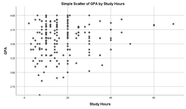
Remember IVs and DVs from Ch. 1? In scatterplots, the cause (IV) is usually plotted on the x-axis, and the effect (DV) is plotted on the y-axis. What we are looking for is: what happens to the DV when the IV increases? In Figure \(\PageIndex{1}\), as Study Hours increase, GPA tends to increase. However, this isn’t a strong relationship because there are a couple students who spend a lot of time studying and don’t get the GPA payoff, while there are even more students who spend 5-10 hours studying but still earn good grades. In general, however, it looks like spending more time studying is related to higher GPAs.
Note
Use this Statistics How To to practice making a scatterplot. Once you can make one, with the IV on the bottom and the DV on the side, you’ll better understand what they can show.
Scatterplot Interpretation
- What kind of graph is Figure \(\PageIndex{1}\)?
- This is a scatterplot. Scatterplots are used to plot two quantitative variables for each person. In Figure \(\PageIndex{1}\), the two variables are Study Hours and GPA.
- What does the x-axis measure in Figure \(\PageIndex{1}\)?
- The x-axis in Figure \(\PageIndex{1}\) shows the hours that each person studied. Lower hours of studying are on the left, and higher hours of studying are on the right.
- What does the y-axis measure in Figure \(\PageIndex{1}\)?
- The y-axis is the axis that goes up and down. For most charts discussed in this textbook, the y-axis will be frequencies. However, the y-axis of the scatterplot in Figure \(\PageIndex{1}\) shows another quantitative variable, GPA of each person. Lower GPAs are towards the bottom of the axis, and higher GPAs are towards the top.
- Is Figure \(\PageIndex{1}\) skewed? If so positively or negatively? If not, is the graph tall/narrow, medium/normal, or wide/flat?
- Trick question! Because scatterplots do not show frequency distributions, they aren’t described as skewed and they don’t have kurtosis. Instead, we look to see if there is a general trend; as one variable goes up, does the other go up, go down, or are they unrelated? It does look like more studying is related to higher GPAs, but this isn’t quite as strong of a relationship as we’d like to see.
- What do you notice from Figure \(\PageIndex{1}\)? What pops out to you?
- What I first noticed is that a lot of students study 20 hours or less, and still have high GPAs. I also noticed that there are lots of scores in 5-hour increments (e.g., 5 hours, 10 hours, 15 hours, etc.). This suggests that students were estimated the number of hours that they studied, and rounding to the nearest 5-hour mark.
- What does Figure \(\PageIndex{1}\) make you wonder about?
- I wonder if the results would change if the hours studied were measured more accurately, rather than having students estimate at a later time? I also wonder what was going with those two students who studied more than 60 hours (and still didn’t earn a 4.0). What were they doing that they considered “studying”? Or is this a data-entry mistake? Like, did someone say that they studied 6 hours but it was entered as 60 hours?
- What is a catchy headline for Figure \(\PageIndex{1}\)?
- Study Less and Still Get a 4.0!
- How could you summarize the info in Figure \(\PageIndex{1}\) into one sentence?
- A lot of students studied about 5 to 20 hours and earned GPAs above 3.0.
- Who might want to know the information in Figure \(\PageIndex{1}\)?
- I still am guessing that students who might be interested. Maybe tutors and folks working in a Learning Center would find this useful?
Remember those videos about the best way to learn from Dr. Chew, a cognitive psychologist? First discussed in 1.3: The Scientific Method and all 5 linked in 1.8 (What can you do to learn material for this class?). Well, Dr. Chew’s first video has a scatter plot (Part 1: Beliefs that Make You Fail)! I suggest that you watch the whole video, but the experiment and scatterplot show up around 4:30 minutes.
Exercise \(\PageIndex{1}\)
Watch Dr. Chew’s first video (Part 1: Beliefs that Make You Fail), then answer the same set of questions. I suggest that you watch the whole video, but the experiment and scatterplot show up around 4:30 minutes.
- Answer
-
- What kind of graph is in Dr. Chew’s Beliefs that Make you Fail video?
- This is a scatterplot. Scatterplots are used to plot two quantitative variables for each person. In the scatterplot in the video, the two variables are Estimated Percentage Correct and Actual Percentage Correct on an exam.
- What does the x-axis measure in the scatterplot in Dr. Chew’s Beliefs that Make you Fail video?
- The x-axis in the scatterplot in Dr. Chew’s Beliefs that Make you Fail video shows the percentage that students thought that they got correct on the exam. Lower scores are on the left, and higher percentages are on the right.
- What does the y-axis measure iin the scatterplot in Dr. Chew’s Beliefs that Make you Fail video?
- The y-axis is the axis that goes up and down. For most charts discussed in this textbook, the y-axis will be frequencies. However, the y-axis of the scatterplot in the scatterplot in Dr. Chew’s Beliefs that Make you Fail video shows another quantitative variable, the actual percentage correct on the exam. Lower scores are towards the bottom of the axis, and higher percentages are towards the top.
- Is the scatterplot in Dr. Chew’s Beliefs that Make you Fail video skewed? If so positively or negatively? If not, is the graph tall/narrow, medium/normal, or wide/flat?
- Trick question! Because scatterplots do not show frequency distributions, they aren’t described as skewed and they don’t have kurtosis. Instead, we look to see if there is a general trend; as one variable goes up, does the other go up, go down, or are they unrelated? It does look like most students estimated their percentage correct pretty close to their actual percentage correct, but were a few students who estimated that they did way better than they actually did. Dr. Chew says that these students have low meta-cognition, meaning that they are unclear on what material they actually know.
- What do you notice from the scatterplot in Dr. Chew’s Beliefs that Make you Fail video? What pops out to you?
- What I first noticed was that most students’ estimates were pretty close to their actual percentages earned. Yay, most students had good meta-cognition!
- What does the scatterplot in Dr. Chew’s Beliefs that Make you Fail video make you wonder about?
- I wonder if students get better at estimating what they know throughout the semester?
- What is a catchy headline for the scatterplot in Dr. Chew’s Beliefs that Make you Fail video?
- Meta-Cognition: Predicting Your Future!
- How could you summarize the info in the scatterplot in Dr. Chew’s Beliefs that Make you Fail video into one sentence?
- Most students’ estimates of their exam grades were relatively close to their actual exam grades, but there were a few students who badly overestimated their scores.
- Who might want to know the information in the scatterplot in Dr. Chew’s Beliefs that Make you Fail video?
- I still am guessing that students might be interested. Maybe tutors and folks working in a Learning Center would find this useful?
- What kind of graph is in Dr. Chew’s Beliefs that Make you Fail video?
Positive or Negative?
Scatterplots can show when there is a linear relationship., meaning that the two variables vary together and when plotted look like a straight line. Scatterplots can show positive linear relationships, negative linear relationships, or show that there is no relationship between the two variables.
- Positive linear relationship: When one variable goes up, the other goes up.
- Positive doesn’t mean good!! It means that the two variables change in the same direction.
- Negative linear relationship: When one variable goes up, the other variable goes down.
- Negative doesn’t mean bad!!! It means that the two variables change in different directions.
Figure \(\PageIndex{2}\) shows a scatterplot for hypothetical scores on Job Satisfaction (x-axis) and Well-Being of the worker (on the y-axis). We can see from the axes that each of these variables is measured on a 10-point scale, with 10 being the highest on both variables (high satisfaction and good health and well-being) and 1 being the lowest (dissatisfaction and poor health). This scale suggests an interval scale of measurement for both variables, which means that there are two quantitative variables.
When we look at this plot, we can see that the variables do seem to be related. The higher scores on Job Satisfaction tend to also be the higher scores on Well-Being, and the same is true of the lower scores.
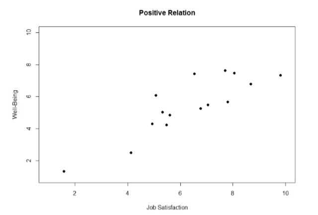
Figure \(\PageIndex{2}\) demonstrates a positive relation. As Job Satisfacation scores increase, Well-Being scores also tend to increase. Although this is not a perfect relation (if it were, the points would form a single straight line), it is nonetheless very clearly positive. This is one of the key benefits to scatterplots: they make it very easy to see the direction of the relation.
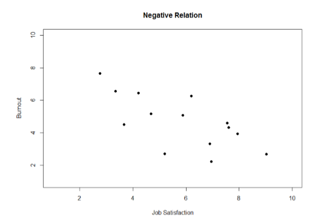
As another example, Figure \(\PageIndex{3}\) shows a negative relation between Job Satisfacation on the x-axis and Burnout on the y-axis. As we can see from Figure \(\PageIndex{3}\), higher scores on Job Satisfacation tend to correspond to lower scores on Burnout, which is how stressed, un-energetic, and unhappy someone is at their job. As with Figure \(\PageIndex{2}\), this is not a perfect relation, but it is still a clear one. As these figures show, points in a positive relation moves from the bottom left of the plot to the top right, and points in a negative relation move from the top left to the bottom right.
Or None?
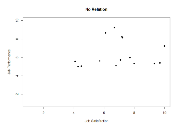
Scatterplots can also indicate that there is no relation between the two variables. In these scatterplots (an example is shown below in Figure \(\PageIndex{4}\) plotting Job Satisfaction and Job Performance) there is no interpretable shape or line in the scatterplot. The points appear randomly throughout the plot. If we tried to draw a straight line through these points, it would basically be flat. The low scores on job satisfaction have roughly the same scores on job performance as do the high scores on job satisfaction. Scores in the middle or average range of job satisfaction have some scores on job performance that are about equal to the high and low levels and some scores on job performance that are a little higher, but the overall picture is one of inconsistency.
As we can see, scatterplots are very useful for giving us an approximate idea of whether or not there is a relation between the two variables and, if there is, if that relation is positive or negative. They are also useful for another reason: they are the only way to determine one of the characteristics of correlations that are discussed next: form.
Curvilinear Relationships
Sometimes the fastest way isn't a straight line...
A linear relation is what we saw in Figure \(\PageIndex{2}\) and Figure \(\PageIndex{3}\). If we drew a line through the middle points in the any of the scatterplots, we would be best suited with a straight line. The term “linear” comes from the word “line”. The relation between two variables can also be curvilinear. As the name suggests, a curvilinear relation is one in which a line through the middle of the points will be curved rather than straight. Two examples are presented in Figures \(\PageIndex{5}\) and \(\PageIndex{6}\).
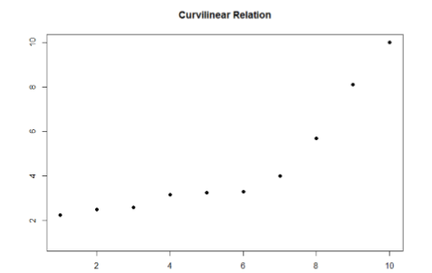
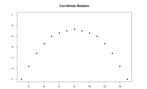
Curvilinear relations can take many shapes, and the two examples above are only a small sample of the possibilities. What they have in common is that they both have a very clear pattern but that pattern is not a straight line.
Sometimes when we look at scatterplots, it is tempting to get biased by a few points that fall far away from the rest of the points and seem to imply that there may be some sort of relation. These points are outliers, which we discussed before.
We’ll return to scatterplots in Chapters 14 and 15 to discuss ways to statistically analyze this relationship to see if what the scatterplot looks like it shows is really what is happening.
Contributors and Attributions
Foster et al. (University of Missouri-St. Louis, Rice University, & University of Houston, Downtown Campus)


