2.9: Graphing Quantitative Data- Histograms
- Page ID
- 17306
\( \newcommand{\vecs}[1]{\overset { \scriptstyle \rightharpoonup} {\mathbf{#1}} } \)
\( \newcommand{\vecd}[1]{\overset{-\!-\!\rightharpoonup}{\vphantom{a}\smash {#1}}} \)
\( \newcommand{\id}{\mathrm{id}}\) \( \newcommand{\Span}{\mathrm{span}}\)
( \newcommand{\kernel}{\mathrm{null}\,}\) \( \newcommand{\range}{\mathrm{range}\,}\)
\( \newcommand{\RealPart}{\mathrm{Re}}\) \( \newcommand{\ImaginaryPart}{\mathrm{Im}}\)
\( \newcommand{\Argument}{\mathrm{Arg}}\) \( \newcommand{\norm}[1]{\| #1 \|}\)
\( \newcommand{\inner}[2]{\langle #1, #2 \rangle}\)
\( \newcommand{\Span}{\mathrm{span}}\)
\( \newcommand{\id}{\mathrm{id}}\)
\( \newcommand{\Span}{\mathrm{span}}\)
\( \newcommand{\kernel}{\mathrm{null}\,}\)
\( \newcommand{\range}{\mathrm{range}\,}\)
\( \newcommand{\RealPart}{\mathrm{Re}}\)
\( \newcommand{\ImaginaryPart}{\mathrm{Im}}\)
\( \newcommand{\Argument}{\mathrm{Arg}}\)
\( \newcommand{\norm}[1]{\| #1 \|}\)
\( \newcommand{\inner}[2]{\langle #1, #2 \rangle}\)
\( \newcommand{\Span}{\mathrm{span}}\) \( \newcommand{\AA}{\unicode[.8,0]{x212B}}\)
\( \newcommand{\vectorA}[1]{\vec{#1}} % arrow\)
\( \newcommand{\vectorAt}[1]{\vec{\text{#1}}} % arrow\)
\( \newcommand{\vectorB}[1]{\overset { \scriptstyle \rightharpoonup} {\mathbf{#1}} } \)
\( \newcommand{\vectorC}[1]{\textbf{#1}} \)
\( \newcommand{\vectorD}[1]{\overrightarrow{#1}} \)
\( \newcommand{\vectorDt}[1]{\overrightarrow{\text{#1}}} \)
\( \newcommand{\vectE}[1]{\overset{-\!-\!\rightharpoonup}{\vphantom{a}\smash{\mathbf {#1}}}} \)
\( \newcommand{\vecs}[1]{\overset { \scriptstyle \rightharpoonup} {\mathbf{#1}} } \)
\( \newcommand{\vecd}[1]{\overset{-\!-\!\rightharpoonup}{\vphantom{a}\smash {#1}}} \)
\(\newcommand{\avec}{\mathbf a}\) \(\newcommand{\bvec}{\mathbf b}\) \(\newcommand{\cvec}{\mathbf c}\) \(\newcommand{\dvec}{\mathbf d}\) \(\newcommand{\dtil}{\widetilde{\mathbf d}}\) \(\newcommand{\evec}{\mathbf e}\) \(\newcommand{\fvec}{\mathbf f}\) \(\newcommand{\nvec}{\mathbf n}\) \(\newcommand{\pvec}{\mathbf p}\) \(\newcommand{\qvec}{\mathbf q}\) \(\newcommand{\svec}{\mathbf s}\) \(\newcommand{\tvec}{\mathbf t}\) \(\newcommand{\uvec}{\mathbf u}\) \(\newcommand{\vvec}{\mathbf v}\) \(\newcommand{\wvec}{\mathbf w}\) \(\newcommand{\xvec}{\mathbf x}\) \(\newcommand{\yvec}{\mathbf y}\) \(\newcommand{\zvec}{\mathbf z}\) \(\newcommand{\rvec}{\mathbf r}\) \(\newcommand{\mvec}{\mathbf m}\) \(\newcommand{\zerovec}{\mathbf 0}\) \(\newcommand{\onevec}{\mathbf 1}\) \(\newcommand{\real}{\mathbb R}\) \(\newcommand{\twovec}[2]{\left[\begin{array}{r}#1 \\ #2 \end{array}\right]}\) \(\newcommand{\ctwovec}[2]{\left[\begin{array}{c}#1 \\ #2 \end{array}\right]}\) \(\newcommand{\threevec}[3]{\left[\begin{array}{r}#1 \\ #2 \\ #3 \end{array}\right]}\) \(\newcommand{\cthreevec}[3]{\left[\begin{array}{c}#1 \\ #2 \\ #3 \end{array}\right]}\) \(\newcommand{\fourvec}[4]{\left[\begin{array}{r}#1 \\ #2 \\ #3 \\ #4 \end{array}\right]}\) \(\newcommand{\cfourvec}[4]{\left[\begin{array}{c}#1 \\ #2 \\ #3 \\ #4 \end{array}\right]}\) \(\newcommand{\fivevec}[5]{\left[\begin{array}{r}#1 \\ #2 \\ #3 \\ #4 \\ #5 \\ \end{array}\right]}\) \(\newcommand{\cfivevec}[5]{\left[\begin{array}{c}#1 \\ #2 \\ #3 \\ #4 \\ #5 \\ \end{array}\right]}\) \(\newcommand{\mattwo}[4]{\left[\begin{array}{rr}#1 \amp #2 \\ #3 \amp #4 \\ \end{array}\right]}\) \(\newcommand{\laspan}[1]{\text{Span}\{#1\}}\) \(\newcommand{\bcal}{\cal B}\) \(\newcommand{\ccal}{\cal C}\) \(\newcommand{\scal}{\cal S}\) \(\newcommand{\wcal}{\cal W}\) \(\newcommand{\ecal}{\cal E}\) \(\newcommand{\coords}[2]{\left\{#1\right\}_{#2}}\) \(\newcommand{\gray}[1]{\color{gray}{#1}}\) \(\newcommand{\lgray}[1]{\color{lightgray}{#1}}\) \(\newcommand{\rank}{\operatorname{rank}}\) \(\newcommand{\row}{\text{Row}}\) \(\newcommand{\col}{\text{Col}}\) \(\renewcommand{\row}{\text{Row}}\) \(\newcommand{\nul}{\text{Nul}}\) \(\newcommand{\var}{\text{Var}}\) \(\newcommand{\corr}{\text{corr}}\) \(\newcommand{\len}[1]{\left|#1\right|}\) \(\newcommand{\bbar}{\overline{\bvec}}\) \(\newcommand{\bhat}{\widehat{\bvec}}\) \(\newcommand{\bperp}{\bvec^\perp}\) \(\newcommand{\xhat}{\widehat{\xvec}}\) \(\newcommand{\vhat}{\widehat{\vvec}}\) \(\newcommand{\uhat}{\widehat{\uvec}}\) \(\newcommand{\what}{\widehat{\wvec}}\) \(\newcommand{\Sighat}{\widehat{\Sigma}}\) \(\newcommand{\lt}{<}\) \(\newcommand{\gt}{>}\) \(\newcommand{\amp}{&}\) \(\definecolor{fillinmathshade}{gray}{0.9}\)Another common type of graph for frequency distributions for quantitative variables (interval or ratio scales of measurement) is a histogram.
Exercise \(\PageIndex{1}\)
What other type of chart shows a frequency distribution for quantitative variables? Hint: We've already talked about it.
- Answer
-
Line graph (sometimes called a frequency polygon)
Exercise \(\PageIndex{1}\)
Histograms look more like bar graphs, but are actually more like line graphs. Why?
- Answer
-
Your answer probably talks about how the bars in bar charts don't touch, but the bars (or bins) in histograms do touch. Your answer should say something about the type of variable: quantitative variables (ratio or interval scale of measurements) should be graphed with histograms, and qualitative variables (nominal scale of measurement) should be graphed with bar charts.
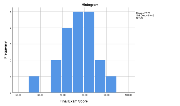
Figure \(\PageIndex{1}\) shows a histogram (created by SPSS) of the frequency distribution of the final exam score data from Table 2.2.2 (and also shown in the line graph in Figure 2.8.1.

As with all frequency distributions, the y-axis of a histogram shows the frequency of each score (how many people had each score) and the x-axis has each score. Figure \(\PageIndex{1}\) shows the number of students who in each score category on the y-axis (Frequency), and labels the score categories on the x-axis (Final Exam Score, with each 10 points labeled). To make the histogram, we just count up the number of data points falling inside each bin, then plot those frequency counts as a function of the bins. Voila, a histogram.The 10-point categories are called bins. Bin #1 goes from about 55 to abou 59 points, bin #2 goes about 65 to 69 points, and so on until the last bin. The difference in the x-axis between a line graph and a histogram is that the scores are combined into ranges, or categories, in a histogram. This makes it easier to quickly understand what a graph is showing if there are a lot of different scores (like everyone’s GPA in your class), but it does lose some accuracy.
Each bar (bin), and can be used to answer questions about the frequency of scores within these bin categories. For example, how many people scored between 90 to 100 points on the Final Exam? The seventh bar (or first on the right), the one between 90 and 100 on the x-axis, tells you how many. Look how tall that bar is. How tall is it? The height is shown on the y-axis, which provides the frequency. One person scored between 90 points and 100 points on the Final Exam.
Just like a line graph, a histogram can show the shape (kurtosis) or skew, and the range of our data set. The shape of the histogram refers to how it goes up and down. The shape tells us where the data is. For example, when the bars are low we know there isn’t much data there. When the bars are high, we know there is more data there. So, where is most of the data? It looks like it’s mostly in the middle two bins, between 75-85 points. The range of the data tells us the minimum (lowest score) and the maximum (highest score) of the data. In Figure \(\PageIndex{1}\), most of teh scores are between 65 points and 95 points, but the minimum scores is between 55-59 points.
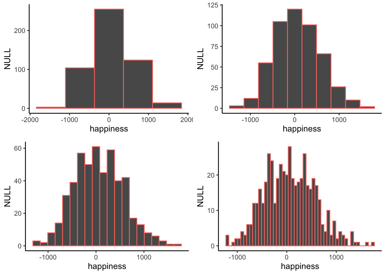
When you make a histogram you get to choose how wide each bar will be. For example, below are four different histograms of the same data (a happiness survey). What changes is the width of the bins.

All of the histograms have roughly the same overall shape: From left to right, the bars start off small, then go up, then get small again. In other words, as the numbers get closer to zero, they start to occur more frequently. We see this general trend across all the histograms. But, some aspects of the trend fall apart when the bars get really narrow. For example, although the bars generally get taller when moving from -1000 to 0, there are some exceptions and the bars seem to fluctuate a little bit. When the bars are wider, there are less exceptions to the general trend. How wide or narrow should your histogram be? It’s a Goldilocks question. Make it just right for your data.
Students often get confused between a bar graph and a histogram because they both have bars. There are two differences, however. First, in a histogram, the bars must touch; there should not be space between the categories that were created from the quantitative data. This leads to the second difference between histograms and bar charts: Histograms show quantitative variables, while bar charts show qualitative variables (nominal scale of measurement).
Histogram Interpretation
The following are the same questions asked about the Figure 2.8.1, the line graph showing the frequency distribution of this same data. You might find it interesting how the answers change a little depending on how the data is presented.
- What kind of graph is Figure \(\PageIndex{1}\)?
- This is a histogram. Histograms are used to display quantitative data, but it combines each score into groups. In Figure 2.xxx, the groups are 10-point ranges.
- What does the x-axis measure in Figure \(\PageIndex{1}\)?
- The x-axis on histograms show categories based on each score. In Figure \(\PageIndex{1}\), the software created 10-point categories for each Final Exam Score that a student earned.
- What does the y-axis measure in Figure \(\PageIndex{1}\)?
- The y-axis is the axis that goes up and down. For most charts discussed in this textbook, the y-axis will be frequencies. In Figure \(\PageIndex{1}\), that means that the y-axis shows how many students earned scores on the Final Exam in each 10-point range.
- Is Figure \(\PageIndex{1}\) skewed? If so positively or negatively? If not, is the graph tall/narrow, medium/normal, or wide/flat?
- Because there is a gap between the lowest score category and the next one, I would say that this histrogram is negatively skewed. However, it looks less skewed than the same data in the line graph in Figure 2.8.1. In fact, just by looking at Figure \(\PageIndex{1}\) and not knowing the exact scores, I might have said that it is not skewed and that is has approximately normal kurtosis (mesokurtic).
- What do you notice from Figure \(\PageIndex{1}\)? What pops out to you?
- Two things that pop out to me. First, there seemed to be the most scores around the middle of the distribution. The second thing I notice is that one column that’s to the left. This shows that one student (frequency = 1) score below 60 points on the Final Exam.
- What does Figure \(\PageIndex{1}\) make you wonder about?
- This histogram still makes me wonder if the professor ended up “curving” the exam so that the highest earning score was now like earning 100% on the Final Exam. If I haven’t said this before, THIS IS NOT MY CLASS.
- What is a catchy headline for Figure \(\PageIndex{1}\)?
- Final Exam Scores are Normal [This is catchy if you know what a Normal Distribution is; more in Ch. 4!]
- How could you summarize the info in Figure \(\PageIndex{1}\) into one sentence?
- The class did really well on the Final Exam, although one student scored pretty low.
- Who might want to know the information in Figure \(\PageIndex{1}\)?
- I still am guessing that students who are going to take this class from this professor might be interested. College administrators might also want to know so that they can see that most students are passing their classes.
Summary
Making a histogram is our first act of officially summarizing the data. We are no longer look at the individual bits of data, instead we will see how the numbers group together. Let’s look at a histogram of the happiness data, and then explain it.


