
2.4: Box Plots
- Page ID
- 29589
\( \newcommand{\vecs}[1]{\overset { \scriptstyle \rightharpoonup} {\mathbf{#1}} } \)
\( \newcommand{\vecd}[1]{\overset{-\!-\!\rightharpoonup}{\vphantom{a}\smash {#1}}} \)
\( \newcommand{\id}{\mathrm{id}}\) \( \newcommand{\Span}{\mathrm{span}}\)
( \newcommand{\kernel}{\mathrm{null}\,}\) \( \newcommand{\range}{\mathrm{range}\,}\)
\( \newcommand{\RealPart}{\mathrm{Re}}\) \( \newcommand{\ImaginaryPart}{\mathrm{Im}}\)
\( \newcommand{\Argument}{\mathrm{Arg}}\) \( \newcommand{\norm}[1]{\| #1 \|}\)
\( \newcommand{\inner}[2]{\langle #1, #2 \rangle}\)
\( \newcommand{\Span}{\mathrm{span}}\)
\( \newcommand{\id}{\mathrm{id}}\)
\( \newcommand{\Span}{\mathrm{span}}\)
\( \newcommand{\kernel}{\mathrm{null}\,}\)
\( \newcommand{\range}{\mathrm{range}\,}\)
\( \newcommand{\RealPart}{\mathrm{Re}}\)
\( \newcommand{\ImaginaryPart}{\mathrm{Im}}\)
\( \newcommand{\Argument}{\mathrm{Arg}}\)
\( \newcommand{\norm}[1]{\| #1 \|}\)
\( \newcommand{\inner}[2]{\langle #1, #2 \rangle}\)
\( \newcommand{\Span}{\mathrm{span}}\) \( \newcommand{\AA}{\unicode[.8,0]{x212B}}\)
\( \newcommand{\vectorA}[1]{\vec{#1}} % arrow\)
\( \newcommand{\vectorAt}[1]{\vec{\text{#1}}} % arrow\)
\( \newcommand{\vectorB}[1]{\overset { \scriptstyle \rightharpoonup} {\mathbf{#1}} } \)
\( \newcommand{\vectorC}[1]{\textbf{#1}} \)
\( \newcommand{\vectorD}[1]{\overrightarrow{#1}} \)
\( \newcommand{\vectorDt}[1]{\overrightarrow{\text{#1}}} \)
\( \newcommand{\vectE}[1]{\overset{-\!-\!\rightharpoonup}{\vphantom{a}\smash{\mathbf {#1}}}} \)
\( \newcommand{\vecs}[1]{\overset { \scriptstyle \rightharpoonup} {\mathbf{#1}} } \)
\( \newcommand{\vecd}[1]{\overset{-\!-\!\rightharpoonup}{\vphantom{a}\smash {#1}}} \)
8
Box Plots
jkesler
Box plots (also called box-and-whisker plots or box-whisker plots) give a good graphical image of the concentration of the data. They also show how far the extreme values are from most of the data. A box plot is constructed from five values: the minimum value, the first quartile, the median, the third quartile, and the maximum value. We use these values to compare how close other data values are to them.
To construct a box plot, use a horizontal or vertical number line and a rectangular box. The smallest and largest data values label the endpoints of the axis. The first quartile marks one end of the box and the third quartile marks the other end of the box. Approximately the middle 50 percent of the data fall inside the box. The “whiskers” extend from the ends of the box to the smallest and largest data values. The median or second quartile can be between the first and third quartiles, or it can be one, or the other, or both. The box plot gives a good, quick picture of the data.
NOTE
You may encounter box-and-whisker plots that have dots marking outlier values. In those cases, the whiskers are not extending to the minimum and maximum values.
Consider, again, this dataset.
1; 1; 2; 2; 4; 6; 6.8; 7.2; 8; 8.3; 9; 10; 10; 11.5
The first quartile is two, the median is seven, and the third quartile is nine. The smallest value is one, and the largest value is 11.5. The following image shows the constructed box plot.
The two whiskers extend from the first quartile to the smallest value and from the third quartile to the largest value. The median is shown with a dashed line.
NOTE
It is important to start a box plot with a scaled number line. Otherwise the box plot may not be useful.
Example 2.23
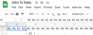
The following data are the heights of 40 students in a statistics class.
59; 60; 61; 62; 62; 63; 63; 64; 64; 64; 65; 65; 65; 65; 65; 65; 65; 65; 65; 66; 66; 67; 67; 68; 68; 69; 70; 70; 70; 70; 70; 71; 71; 72; 72; 73; 74; 74; 75; 77
Construct a box plot with the following properties; the calculator intructions for the minimum and maximum values as well as the quartiles follow the example.
- Minimum value = 59
- Maximum value = 77
- Q1: First quartile = 64.5
- Q2: Second quartile or median= 66
- Q3: Third quartile = 70
- Each quarter has approximately 25% of the data.
- The spreads of the four quarters are 64.5 – 59 = 5.5 (first quarter), 66 – 64.5 = 1.5 (second quarter), 70 – 66 = 4 (third quarter), and 77 – 70 = 7 (fourth quarter). So, the second quarter has the smallest spread and the fourth quarter has the largest spread.
- Range = maximum value – the minimum value = 77 – 59 = 18
- Interquartile Range: IQR = Q3 – Q1 = 70 – 64.5 = 5.5.
- The interval 59–65 has more than 25% of the data so it has more data in it than the interval 66 through 70 which has 25% of the data.
- The middle 50% (middle half) of the data has a range of 5.5 inches.
Using Google Sheets
To find the minimum, maximum, and quartiles:
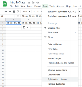
- Enter the data into a spreadsheet by copying and pasting into a cell. This will likely copy all the data into one cell, but we need to have each data in it’s own cell in order to perform calculations (like calculating the minimum, maximum, etc), so let’s do that first.
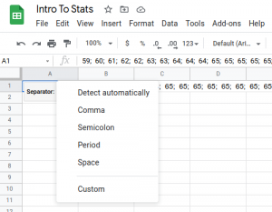
- With the data cell selected, choose the Data menu, and select Split Data to Columns
- Select the correct separator between the data; it is a semicolon in this case.
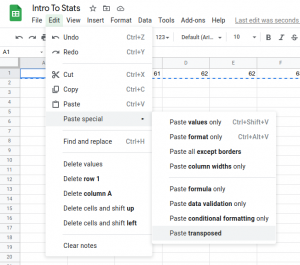
- Our data is split into columns, but if we want to display the data vertically, we can select it, hit Ctrl X (or Command X on a Mac) and select Edit > Paste Special > Paste Transposed (and delete the original data in the columns)
- With the data cell selected, choose the Data menu, and select Split Data to Columns
- In empty cells, say in row 1, column C, enter the headings “Minimum”, “Q1”, “Q2”, “Q3”, “Maximum”
- In the next row, below each of the corresponding headings, enter the following formulas:
=MIN(A:A)(this calculates the minimum value of all data in the A column)=QUARTILE(A:A, 1) **see note below=QUARTILE(A:A, 2)**see note below
=QUARTILE(A:A, 3)**see note below=MAX(A:A)
- To create the the Box plot, Google Sheets demands a label to the left of our data. Let’s put something generic like “Data Set” in column B. Then select all the data.

- From the Insert menu, choose Chart
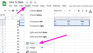
- Be sure that the Candlestick Chart is selected. Be sure Low is set to “Min”, Open is set to “Q1”, Close is set to “Q3” and High is set to “Max”.

- To make it look nicer, let’s not start the chart at zero. Select the Customize menu, and under Vertical axis, change Min to something closer to our data minimum, perhaps 55.

** There is no consensus in the world of statistics on a definitive way to calculate percentiles and quartiles, and in fact, Google Sheets’ method differs from ours. For example, using our method, you would calculate the location of the first quartile as $L = $frac{25}{100}\cdot 40 = 10$ so you would average the 10th and 11th values; but the average of 64 and 65 is 64.5, which differs from 64.75 that Google Sheets came up with. If you want a formula that uses our method, it’s a bit more cumbersome but you can replace the quartile formulas with the following. (Note that these assume your data is in column A starting in cell A1 and in ascending order.)
- Q1:
=IF(INT(COUNT(A:A)*0.25)=COUNT(A:A)*0.25,AVERAGE(INDEX(A:A,COUNT(A:A)*0.25,1),INDEX(A:A,COUNT(A:A)*0.25+1,1)),INDEX(A:A,CEILING(COUNT(A:A)*0.25))) - Q2:
=IF(INT(COUNT(A:A)*0.5)=COUNT(A:A)*0.5,AVERAGE(INDEX(A:A,COUNT(A:A)*0.5,1),INDEX(A:A,COUNT(A:A)*0.5+1,1)),INDEX(A:A,CEILING(COUNT(A:A)*0.5))) - Q3:
=IF(INT(COUNT(A:A)*0.75)=COUNT(A:A)*0.75,AVERAGE(INDEX(A:A,COUNT(A:A)*0.75,1),INDEX(A:A,COUNT(A:A)*0.75+1,1)),INDEX(A:A,CEILING(COUNT(A:A)*0.75)))
To order the data, if it were not already, just select a cell in the A column, and from the Data menu, select Sort Sheet by Column A, A → Z

Try It 2.23
The following data are the number of pages in 40 books on a shelf. Construct a box plot using a graphing calculator, and state the interquartile range.
136; 140; 178; 190; 205; 215; 217; 218; 232; 234; 240; 255; 270; 275; 290; 301; 303; 315; 317; 318; 326; 333; 343; 349; 360; 369; 377; 388; 391; 392; 398; 400; 402; 405; 408; 422; 429; 450; 475; 512
For some sets of data, some of the largest value, smallest value, first quartile, median, and third quartile may be the same. For instance, you might have a data set in which the median and the third quartile are the same. In this case, the diagram would not have a dotted line inside the box displaying the median. The right side of the box would display both the third quartile and the median. For example, if the smallest value and the first quartile were both one, the median and the third quartile were both five, and the largest value was seven, the box plot would look like:
In this case, at least 25% of the values are equal to one. Twenty-five percent of the values are between one and five, inclusive. At least 25% of the values are equal to five. The top 25% of the values fall between five and seven, inclusive.
Example 2.24
Test scores for a college statistics class held during the day are:
99; 56; 78; 55.5; 32; 90; 80; 81; 56; 59; 45; 77; 84.5; 84; 70; 72; 68; 32; 79; 90
Test scores for a college statistics class held during the evening are:
98; 78; 68; 83; 81; 89; 88; 76; 65; 45; 98; 90; 80; 84.5; 85; 79; 78; 98; 90; 79; 81; 25.5
- Find the smallest and largest values, the median, and the first and third quartile for the day class.
- Find the smallest and largest values, the median, and the first and third quartile for the night class.
- For each data set, what percentage of the data is between the smallest value and the first quartile? the first quartile and the median? the median and the third quartile? the third quartile and the largest value? What percentage of the data is between the first quartile and the largest value?
- Create a box plot for each set of data. Use one number line for both box plots.
- Which box plot has the widest spread for the middle 50% of the data (the data between the first and third quartiles)? What does this mean for that set of data in comparison to the other set of data?
Solution 2.24
- Min = 32
- Q1 = 56
- M = 74.5
- Q3 = 82.5
- Max = 99
- Min = 25.5
- Q1 = 78
- M = 81
- Q3 = 89
- Max = 98
- Day class: There are six data values ranging from 32 to 56: 30%. There are six data values ranging from 56 to 74.5: 30%. There are five data values ranging from 74.5 to 82.5: 25%. There are five data values ranging from 82.5 to 99: 25%. There are 16 data values between the first quartile, 56, and the largest value, 99: 75%. Night class:
- Figure 2.14
- The first data set has the wider spread for the middle 50% of the data. The IQR for the first data set is greater than the IQR for the second set. This means that there is more variability in the middle 50% of the first data set.
Try It 2.24
The following data set shows the heights in inches for the boys in a class of 40 students.
66; 66; 67; 67; 68; 68; 68; 68; 68; 69; 69; 69; 70; 71; 72; 72; 72; 73; 73; 74
The following data set shows the heights in inches for the girls in a class of 40 students.
61; 61; 62; 62; 63; 63; 63; 65; 65; 65; 66; 66; 66; 67; 68; 68; 68; 69; 69; 69
Construct a box plot using a graphing calculator for each data set, and state which box plot has the wider spread for the middle 50% of the data.
Example 2.25
Graph a box-and-whisker plot for the data values shown.
10; 10; 10; 15; 35; 75; 90; 95; 100; 175; 420; 490; 515; 515; 790
The five numbers used to create a box-and-whisker plot are:
- Min: 10
- Q1: 15
- Med: 95
- Q3: 490
- Max: 790
The following graph shows the box-and-whisker plot.
Try It 2.25
Follow the steps you used to graph a box-and-whisker plot for the data values shown.
0; 5; 5; 15; 30; 30; 45; 50; 50; 60; 75; 110; 140; 240; 330