
1.7: Examining Numerical Data
- Page ID
- 307

\( \newcommand{\vecs}[1]{\overset { \scriptstyle \rightharpoonup} {\mathbf{#1}} } \)
\( \newcommand{\vecd}[1]{\overset{-\!-\!\rightharpoonup}{\vphantom{a}\smash {#1}}} \)
\( \newcommand{\dsum}{\displaystyle\sum\limits} \)
\( \newcommand{\dint}{\displaystyle\int\limits} \)
\( \newcommand{\dlim}{\displaystyle\lim\limits} \)
\( \newcommand{\id}{\mathrm{id}}\) \( \newcommand{\Span}{\mathrm{span}}\)
( \newcommand{\kernel}{\mathrm{null}\,}\) \( \newcommand{\range}{\mathrm{range}\,}\)
\( \newcommand{\RealPart}{\mathrm{Re}}\) \( \newcommand{\ImaginaryPart}{\mathrm{Im}}\)
\( \newcommand{\Argument}{\mathrm{Arg}}\) \( \newcommand{\norm}[1]{\| #1 \|}\)
\( \newcommand{\inner}[2]{\langle #1, #2 \rangle}\)
\( \newcommand{\Span}{\mathrm{span}}\)
\( \newcommand{\id}{\mathrm{id}}\)
\( \newcommand{\Span}{\mathrm{span}}\)
\( \newcommand{\kernel}{\mathrm{null}\,}\)
\( \newcommand{\range}{\mathrm{range}\,}\)
\( \newcommand{\RealPart}{\mathrm{Re}}\)
\( \newcommand{\ImaginaryPart}{\mathrm{Im}}\)
\( \newcommand{\Argument}{\mathrm{Arg}}\)
\( \newcommand{\norm}[1]{\| #1 \|}\)
\( \newcommand{\inner}[2]{\langle #1, #2 \rangle}\)
\( \newcommand{\Span}{\mathrm{span}}\) \( \newcommand{\AA}{\unicode[.8,0]{x212B}}\)
\( \newcommand{\vectorA}[1]{\vec{#1}} % arrow\)
\( \newcommand{\vectorAt}[1]{\vec{\text{#1}}} % arrow\)
\( \newcommand{\vectorB}[1]{\overset { \scriptstyle \rightharpoonup} {\mathbf{#1}} } \)
\( \newcommand{\vectorC}[1]{\textbf{#1}} \)
\( \newcommand{\vectorD}[1]{\overrightarrow{#1}} \)
\( \newcommand{\vectorDt}[1]{\overrightarrow{\text{#1}}} \)
\( \newcommand{\vectE}[1]{\overset{-\!-\!\rightharpoonup}{\vphantom{a}\smash{\mathbf {#1}}}} \)
\( \newcommand{\vecs}[1]{\overset { \scriptstyle \rightharpoonup} {\mathbf{#1}} } \)
\(\newcommand{\longvect}{\overrightarrow}\)
\( \newcommand{\vecd}[1]{\overset{-\!-\!\rightharpoonup}{\vphantom{a}\smash {#1}}} \)
\(\newcommand{\avec}{\mathbf a}\) \(\newcommand{\bvec}{\mathbf b}\) \(\newcommand{\cvec}{\mathbf c}\) \(\newcommand{\dvec}{\mathbf d}\) \(\newcommand{\dtil}{\widetilde{\mathbf d}}\) \(\newcommand{\evec}{\mathbf e}\) \(\newcommand{\fvec}{\mathbf f}\) \(\newcommand{\nvec}{\mathbf n}\) \(\newcommand{\pvec}{\mathbf p}\) \(\newcommand{\qvec}{\mathbf q}\) \(\newcommand{\svec}{\mathbf s}\) \(\newcommand{\tvec}{\mathbf t}\) \(\newcommand{\uvec}{\mathbf u}\) \(\newcommand{\vvec}{\mathbf v}\) \(\newcommand{\wvec}{\mathbf w}\) \(\newcommand{\xvec}{\mathbf x}\) \(\newcommand{\yvec}{\mathbf y}\) \(\newcommand{\zvec}{\mathbf z}\) \(\newcommand{\rvec}{\mathbf r}\) \(\newcommand{\mvec}{\mathbf m}\) \(\newcommand{\zerovec}{\mathbf 0}\) \(\newcommand{\onevec}{\mathbf 1}\) \(\newcommand{\real}{\mathbb R}\) \(\newcommand{\twovec}[2]{\left[\begin{array}{r}#1 \\ #2 \end{array}\right]}\) \(\newcommand{\ctwovec}[2]{\left[\begin{array}{c}#1 \\ #2 \end{array}\right]}\) \(\newcommand{\threevec}[3]{\left[\begin{array}{r}#1 \\ #2 \\ #3 \end{array}\right]}\) \(\newcommand{\cthreevec}[3]{\left[\begin{array}{c}#1 \\ #2 \\ #3 \end{array}\right]}\) \(\newcommand{\fourvec}[4]{\left[\begin{array}{r}#1 \\ #2 \\ #3 \\ #4 \end{array}\right]}\) \(\newcommand{\cfourvec}[4]{\left[\begin{array}{c}#1 \\ #2 \\ #3 \\ #4 \end{array}\right]}\) \(\newcommand{\fivevec}[5]{\left[\begin{array}{r}#1 \\ #2 \\ #3 \\ #4 \\ #5 \\ \end{array}\right]}\) \(\newcommand{\cfivevec}[5]{\left[\begin{array}{c}#1 \\ #2 \\ #3 \\ #4 \\ #5 \\ \end{array}\right]}\) \(\newcommand{\mattwo}[4]{\left[\begin{array}{rr}#1 \amp #2 \\ #3 \amp #4 \\ \end{array}\right]}\) \(\newcommand{\laspan}[1]{\text{Span}\{#1\}}\) \(\newcommand{\bcal}{\cal B}\) \(\newcommand{\ccal}{\cal C}\) \(\newcommand{\scal}{\cal S}\) \(\newcommand{\wcal}{\cal W}\) \(\newcommand{\ecal}{\cal E}\) \(\newcommand{\coords}[2]{\left\{#1\right\}_{#2}}\) \(\newcommand{\gray}[1]{\color{gray}{#1}}\) \(\newcommand{\lgray}[1]{\color{lightgray}{#1}}\) \(\newcommand{\rank}{\operatorname{rank}}\) \(\newcommand{\row}{\text{Row}}\) \(\newcommand{\col}{\text{Col}}\) \(\renewcommand{\row}{\text{Row}}\) \(\newcommand{\nul}{\text{Nul}}\) \(\newcommand{\var}{\text{Var}}\) \(\newcommand{\corr}{\text{corr}}\) \(\newcommand{\len}[1]{\left|#1\right|}\) \(\newcommand{\bbar}{\overline{\bvec}}\) \(\newcommand{\bhat}{\widehat{\bvec}}\) \(\newcommand{\bperp}{\bvec^\perp}\) \(\newcommand{\xhat}{\widehat{\xvec}}\) \(\newcommand{\vhat}{\widehat{\vvec}}\) \(\newcommand{\uhat}{\widehat{\uvec}}\) \(\newcommand{\what}{\widehat{\wvec}}\) \(\newcommand{\Sighat}{\widehat{\Sigma}}\) \(\newcommand{\lt}{<}\) \(\newcommand{\gt}{>}\) \(\newcommand{\amp}{&}\) \(\definecolor{fillinmathshade}{gray}{0.9}\)In this section we will be introduced to techniques for exploring and summarizing numerical variables. The email50 and county data sets from Section 1.2 provide rich opportunities for examples. Recall that outcomes of numerical variables are numbers on which it is reasonable to perform basic arithmetic operations. For example, the pop2010 variable, which represents the populations of counties in 2010, is in 2010, is numerical since we can sensibly discuss the difference or ratio of the populations in two counties. On the other hand, area codes and zip codes are not numerical, but rather they are categorical variables.
18Human subjects are often called patients, volunteers, or study participants.
19There are always some researchers involved in the study who do know which patients are receiving which treatment. However, they do not interact with the study's patients and do not tell the blinded health care professionals who is receiving which treatment.
20The researchers assigned the patients into their treatment groups, so this study was an experiment. However, the patients could distinguish what treatment they received, so this study was not blind. The study could not be double-blind since it was not blind.
Scatterplots for Paired Data
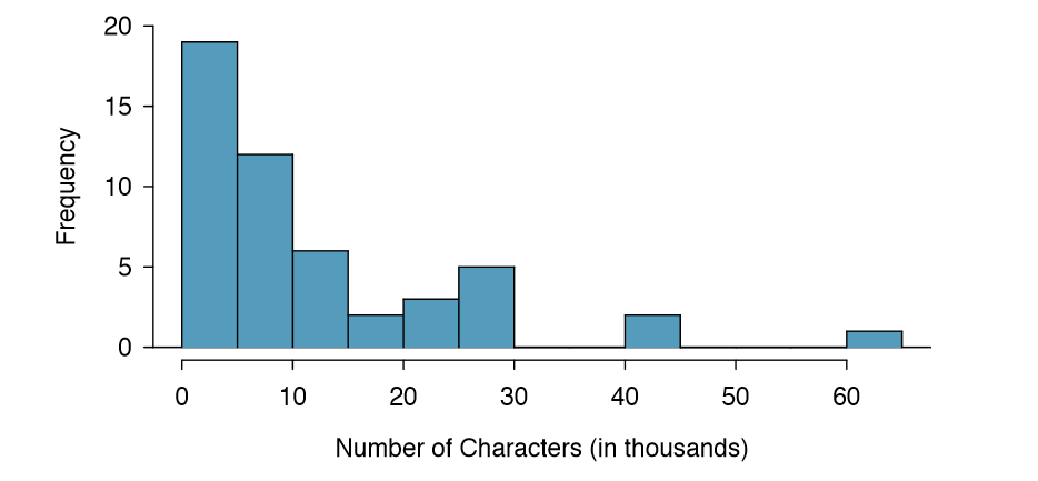
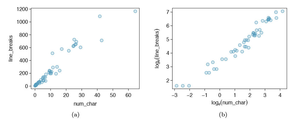
A scatterplot provides a case-by-case view of data for two numerical variables. In Figure 1.8 on page 7, a scatterplot was used to examine how federal spending and poverty were related in the county data set. Another scatterplot is shown in Figure 1.16, comparing the number of line breaks (line breaks) and number of characters (num char) in emails for the email50 data set. In any scatterplot, each point represents a single case. Since there are 50 cases in email50, there are 50 points in Figure 1.17.
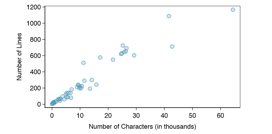
To put the number of characters in perspective, this paragraph has 363 characters. Looking at Figure 1.16, it seems that some emails are incredibly verbose! Upon further investigation, we would actually find that most of the long emails use the HTML format, which means most of the characters in those emails are used to format the email rather than provide text.
Exercise \(\PageIndex{1}\)
What do scatterplots reveal about the data, and how might they be useful?
Solution
Answers may vary. Scatterplots are helpful in quickly spotting associations relating variables, whether those associations come in the form of simple trends or whether those relationships are more complex.
Exercise \(\PageIndex{1}\)
Example 1.16 Consider a new data set of 54 cars with two variables: vehicle price and weight.22 A scatterplot of vehicle price versus weight is shown in Figure 1.17.
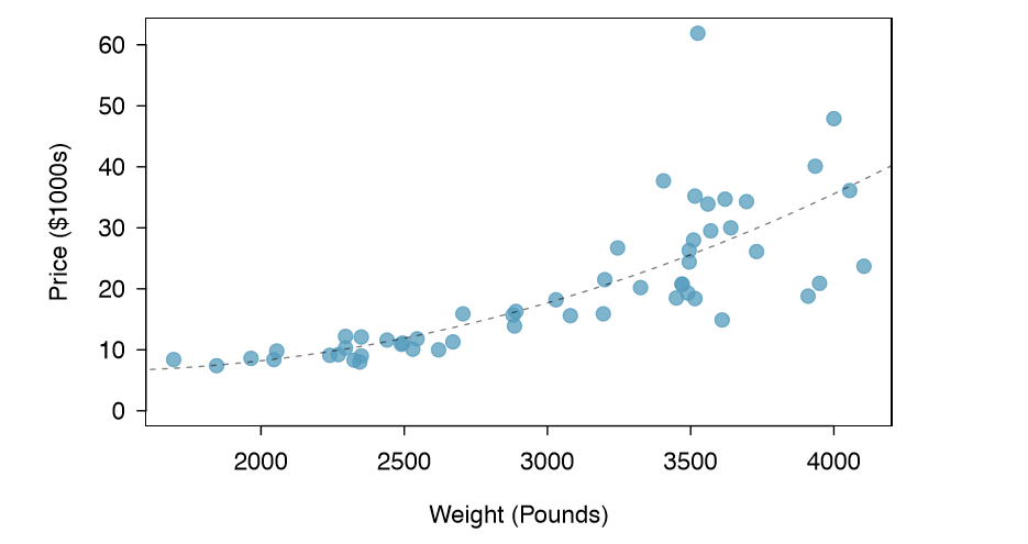
What can be said about the relationship between these variables?
The relationship is evidently nonlinear, as highlighted by the dashed line. This is different from previous scatterplots we've seen, such as Figure 1.8 on page 7 and Figure 1.16, which show relationships that are very linear.
Exercise \(\PageIndex{1}\)
Describe two variables that would have a horseshoe shaped association in a scatterplot.
Solution
Consider the case where your vertical axis represents something "good" and your horizontal axis represents something that is only good in moderation. Health and water consumption t this description since water becomes toxic when consumed in excessive quantities.
Dot Plots and the Mean
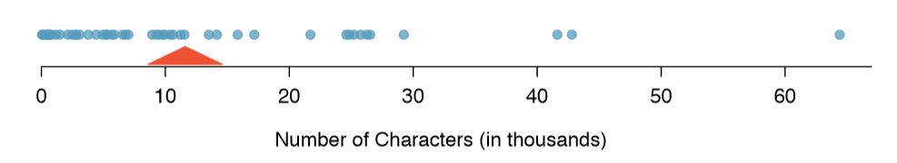
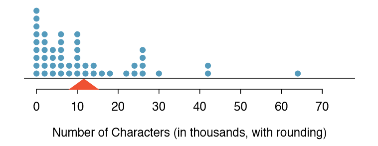
Sometimes two variables is one too many: only one variable may be of interest. In these cases, a dot plot provides the most basic of displays. A dot plot is a one-variable scatterplot; an example using the number of characters from 50 emails is shown in Figure 1.17. A stacked version of this dot plot is shown in Figure 1.19.
The mean, sometimes called the average, is a common way to measure the center of a distribution of data. To find the mean number of characters in the 50 emails, we add up all the character counts and divide by the number of emails. For computational convenience, the number of characters is listed in the thousands and rounded to the first decimal.
\[ \bar {X} = \frac {21.7 + 7.0 + \dots + 15.8}{50} = 11.6 \]
The sample mean is often labeled \( \bar{X}\). The letter x is being used as a generic placeholder for the variable of interest, num char, and the bar says it is the average number of characters in the 50 emails was 11,600. It is useful to think of the mean as the balancing point of the distribution. The sample mean is shown as a triangle in Figures 1.19 and 1.20.
Definition: Mean
The sample mean of a numerical variable is computed as the sum of all of the observations divided by the number of observations:
\[ \bar {X} = \frac {x_1 + x_2 + \dots + x_n}{n} \label {1.19} \]
where \(x_1, x_2, \dots, x_n\) represent the n observed values.
Exercise \(\PageIndex{1}\)
Examine Equations \ref{1.18} and \ref{1.19} above. What does x1 correspond to? And x2? Can you infer a general meaning to what xi might represent?
Solution
x1 corresponds to the number of characters in the first email in the sample (21.7, in thousands), x2 to the number of characters in the second email (7.0, in thousands), and xi corresponds to the number of characters in the ith email in the data set.
Exercise \(\PageIndex{1}\)
What was n in this sample of emails?
Solution
The sample size was n = 50.
Exercise 1.21
The email50 data set represents a sample from a larger population of emails that were received in January and March. We could compute a mean for this population in the same \( \mu\) way as the sample mean, however, the population mean has a special label: \( \mu\) The symbol \( \mu\) is the Greek letter mu and represents the average of all observations in the population. Sometimes a subscript, such as x, is used to represent which variable the population mean refers to, e.g. \( \mu_x\).
Example 1.22 The average number of characters across all emails can be estimated using the sample data. Based on the sample of 50 emails, what would be a reasonable estimate of \( \mu_x\), the mean number of characters in all emails in the email data set? (Recall that email50 is a sample from email.)
The sample mean, 11,600, may provide a reasonable estimate of \( \mu_x\). While this number will not be perfect, it provides a point estimate of the population mean. In Chapter 4 and beyond, we will develop tools to characterize the accuracy of point estimates, and we will nd that point estimates based on larger samples tend to be more accurate than those based on smaller samples.
Example 1.23 We might like to compute the average income per person in the US. To do so, we might first think to take the mean of the per capita incomes across the 3,143 counties in the county data set. What would be a better approach?
The county data set is special in that each county actually represents many individual people. If we were to simply average across the income variable, we would be treating counties with 5,000 and 5,000,000 residents equally in the calculations. Instead, we should compute the total income for each county, add up all the counties' totals, and then divide by the number of people in all the counties. If we completed these steps with the county data, we would nd that the per capita income for the US is $27,348.43. Had we computed the simple mean of per capita income across counties, the result would have been just $22,504.70!
Example 1.23 used what is called a weighted mean, which will not be a key topic in this textbook. However, we have provided an online supplement on weighted means for interested readers:
Histograms and Shape
Dot plots show the exact value for each observation. This is useful for small data sets, but they can become hard to read with larger samples. Rather than showing the value of each observation, we prefer to think of the value as belonging to a bin. For example, in the email50 data set, we create a table of counts for the number of cases with character counts between 0 and 5,000, then the number of cases between 5,000 and 10,000, and so on. Observations that fall on the boundary of a bin (e.g. 5,000) are allocated to the lower bin. This tabulation is shown in Table 1.20. These binned counts are plotted as bars in Figure 1.21 into what is called a histogram, which resembles the stacked dot plot shown
| Characters (in thousands) | 0-5 | 5-10 | 10-15 | 15-20 | 20-25 | 25-30 | \(\dots\) | 55-60 | 60-65 |
|---|---|---|---|---|---|---|---|---|---|
| Count | 19 | 12 | 6 | 2 | 3 | 5 | \(\dots\) | 0 | 1 |
Histograms provide a view of the data density. Higher bars represent where the data are relatively more common. For instance, there are many more emails with fewer than 20,000 characters than emails with at least 20,000 in the data set. The bars make it easy to see how the density of the data changes relative to the number of characters.
Histograms are especially convenient for describing the shape of the data distribution. Figure 1.21 shows that most emails have a relatively small number of characters, while fewer emails have a very large number of characters. When data trail off to the right in this way and have a longer right tail, the shape is said to be right skewed.26
Data sets with the reverse characteristic - a long, thin tail to the left - are said to be left skewed. We also say that such a distribution has a long left tail. Data sets that show roughly equal trailing off in both directions are called symmetric.
26Other ways to describe data that are skewed to the right: skewed to the right, skewed to the high end, or skewed to the positive end.
Long tails to identify skew
When data trail off in one direction, the distribution has a long tail. If a distribution has a long left tail, it is left skewed. If a distribution has a long right tail, it is right skewed.
Exercise \(\PageIndex{1}\)
Take a look at the dot plots in Figures 1.18 and 1.19. Can you see the skew in the data? Is it easier to see the skew in this histogram or the dot plots?
Solution
The skew is visible in all three plots, though the at dot plot is the least useful. The stacked dot plot and histogram are helpful visualizations for identifying skew.
Exercise \(\PageIndex{1}\)
Besides the mean (since it was labeled), what can you see in the dot plots that you cannot see in the histogram?
Solution
Character counts for individual emails.
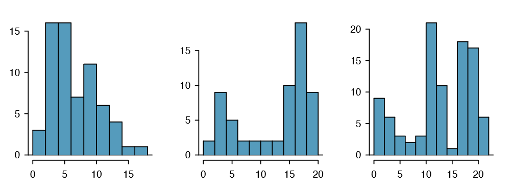
In addition to looking at whether a distribution is skewed or symmetric, histograms can be used to identify modes. A mode is represented by a prominent peak in the distribution. There is only one prominent peak in the histogram of num char.
Another Definition: Mode
Another definition of mode, which is not typically used in statistics, is the value with the most occurrences. It is common to have no observations with the same value in a data set, which makes this other definition useless for many real data sets.
Figure 1.22 shows histograms that have one, two, or three prominent peaks. Such distributions are called unimodal, bimodal, and multimodal, respectively. Any distribution with more than 2 prominent peaks is called multimodal. Notice that there was one prominent peak in the unimodal distribution with a second less prominent peak that was not counted since it only differs from its neighboring bins by a few observations.
Exercise \(\PageIndex{1}\)
Figure 1.21 reveals only one prominent mode in the number of characters. Is the distribution unimodal, bimodal, or multimodal?
Solution
Unimodal. Remember that uni stands for 1 (think unicycles). Similarly, bi stands for 2 (think bicycles). (We're hoping a multicycle will be invented to complete this analogy.)
Exercise 1.27 Height measurements of young students and adult teachers at a K-3 elementary school were taken. How many modes would you anticipate in this height data set?31
TIP: Looking for modes
Looking for modes isn't about nding a clear and correct answer about the number of modes in a distribution, which is why prominent is not rigorously de ned in this book. The important part of this examination is to better understand your data and how it might be structured.
Variance and Standard Deviation
The mean was introduced as a method to describe the center of a data set, but the variability in the data is also important. Here, we introduce two measures of variability: the variance and the standard deviation. Both of these are very useful in data analysis, even though their formulas are a bit tedious to calculate by hand. The standard deviation is the easier of the two to understand, and it roughly describes how far away the typical observation is from the mean.
We call the distance of an observation from its mean its deviation. Below are the deviations for the 1st, 2nd, 3rd, and 50th observations in the num char variable. For computational convenience, the number of characters is listed in the thousands and rounded to the first decimal.
\[ x_1 - \bar {x} = 21.7 - 11.6 = 10.1\]
\[x_2 - \bar {x} = 7.0 - 11.6 = -4.6\]
\[x_3 - \bar {x} = 0.6 - 11.6 = --11.0\]
\[ \vdots\]
\[x_{50}- \bar {x} = 15.8 - 11.6 = 4.2\]
31There might be two height groups visible in the data set: one of the students and one of the adults. That is, the data are probably bimodal.
If we square these deviations and then take an average, the result is about equal to the s2 sample variance, denoted by s2:
\[ s^2 = \frac {10.1^2 + (-4.6)^2 + (-11.0)^2 + \dots + 4.2^2}{ 50 - 1}\]
\[ = \frac {102.01 + 21.16 + 121.00 + \dots + 17.64}{49}\]
\[ = 172.44\]
We divide by n - 1, rather than dividing by n, when computing the variance; you need not worry about this mathematical nuance for the material in this textbook. Notice that squaring the deviations does two things. First, it makes large values much larger, seen by comparing 10:12, \((-4:6)^2\), \((-11:0)^2\), and \(4.2^2\). Second, it gets rid of any negative signs.
The standard deviation is de ned as the square root of the variance:
\[ s = \sqrt {172.44} = 13.13\]
The standard deviation of the number of characters in an email is about 13.13 thousand. A subscript of x may be added to the variance and standard deviation, i.e. \( s^2_x and s_x\), as a reminder that these are the variance and standard deviation of the observations represented by x1, x2, ..., xn. The x subscript is usually omitted when it is clear which data the variance or standard deviation is referencing.
Variance and standard deviation
The variance is roughly the average squared distance from the mean. The standard deviation is the square root of the variance. The standard deviation is useful when considering how close the data are to the mean.
Formulas and methods used to compute the variance and standard deviation for a population are similar to those used for a sample (the only difference is that the population variance has a division by n instead of n - 1). However, like the mean, the population values have special symbols: \( \sigma^2\) for the variance and \(\sigma\) for the standard deviation. The symbol \( \sigma\) is the Greek letter sigma.
TIP: standard deviation describes variability
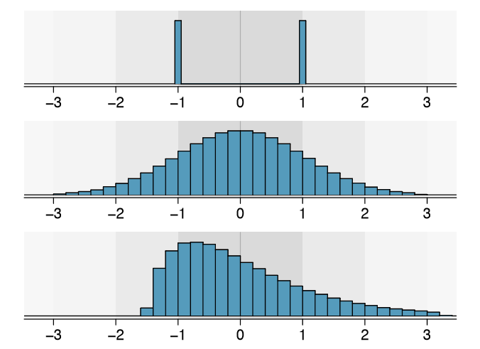
Focus on the conceptual meaning of the standard deviation as a descriptor of variability rather than the formulas. Usually 70% of the data will be within one standard deviation of the mean and about 95% will be within two standard deviations. However, as seen in Figures 1.23 and 1.24, these percentages are not strict rules.
Exercise \(\PageIndex{1}\)
On page 23, the concept of shape of a distribution was introduced. A good description of the shape of a distribution should include modality and whether the distribution is symmetric or skewed to one side. Using Figure 1.24 as an example, explain why such a description is important.33
Solution
Figure 1.24 shows three distributions that look quite different, but all have the same mean, variance, and standard deviation. Using modality, we can distinguish between the first plot (bimodal) and the last two (unimodal). Using skewness, we can distinguish between the last plot (right skewed) and the first two. While a picture, like a histogram, tells a more complete story, we can use modality and shape (symmetry/skew) to characterize basic information about a distribution.
Example 1.29 Describe the distribution of the num char variable using the histogram in Figure 1.21 on page 24. The description should incorporate the center, variability, and shape of the distribution, and it should also be placed in context: the number of characters in emails. Also note any especially unusual cases.
The distribution of email character counts is unimodal and very strongly skewed to the high end. Many of the counts fall near the mean at 11,600, and most fall within one standard deviation (13,130) of the mean. There is one exceptionally long email with about 65,000 characters.
In practice, the variance and standard deviation are sometimes used as a means to an end, where the "end" is being able to accurately estimate the uncertainty associated with a sample statistic. For example, in Chapter 4 we will use the variance and standard deviation to assess how close the sample mean is to the population mean.
Box plots, Quartiles, and the Median
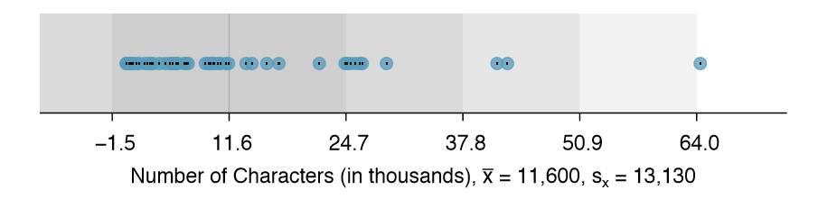
A box plot summarizes a data set using ve statistics while also plotting unusual observations. Figure 1.25 provides a vertical dot plot alongside a box plot of the num char variable from the email50 data set.
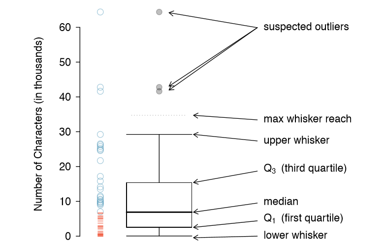
The first step in building a box plot is drawing a dark line denoting the median, which splits the data in half. Figure 1.25 shows 50% of the data falling below the median (dashes) and other 50% falling above the median (open circles). There are 50 character counts in the data set (an even number) so the data are perfectly split into two groups of 25. We take the median in this case to be the average of the two observations closest to the 50th percentile: (6,768+7,012)/2 = 6,890. When there are an odd number of observations, there will be exactly one observation that splits the data into two halves, and in this case that observation is the median (no average needed).
Definition: Median - the number in the middle
If the data are ordered from smallest to largest, the median is the observation right in the middle. If there are an even number of observations, there will be two values in the middle, and the median is taken as their average.
The second step in building a box plot is drawing a rectangle to represent the middle 50% of the data. The total length of the box, shown vertically in Figure 1.25, is called the interquartile range (IQR, for short). It, like the standard deviation, is a measure of variability in data. The more variable the data, the larger the standard deviation and IQR. The two boundaries of the box are called the first quartile (the 25th percentile, i.e. 25% of the data fall below this value) and the third quartile (the 75th percentile), and these are often labeled Q1 and Q3, respectively.
Definition: Interquartile range (IQR)
The IQR is the length of the box in a box plot. It is computed as
\[ IQR = Q_3 - Q_1\]
where Q1 and Q3 are the 25th and 75th percentiles.
Exercise \(\PageIndex{1}\)
What percent of the data fall between \(Q_1\) and the median? What percent is between the median and \(Q_3\)?34
34Since \(Q_1\) and \(Q_3\) capture the middle 50% of the data and the median splits the data in the middle, 25% of the data fall between \(Q_1\) and the median, and another 25% falls between the median and \(Q_3\).
Extending out from the box, the whiskers attempt to capture the data outside of the box, however, their reach is never allowed to be more than\( 1.5 \times IQR \) (while the choice of exactly 1.5 is arbitrary, it is the most commonly used value for box plots). They capture everything within this reach. In Figure 1.25, the upper whisker does not extend to the last three points, which is beyond \(Q_3 + 1.5 \times IQR \), and so it extends only to the last point below this limit. The lower whisker stops at the lowest value, 33, since there is no additional data to reach; the lower whisker's limit is not shown in the gure because the plot does not extend down to \( Q_1 - 1.5 \times IQR\). In a sense, the box is like the body of the box plot and the whiskers are like its arms trying to reach the rest of the data.
Any observation that lies beyond the whiskers is labeled with a dot. The purpose of labeling these points - instead of just extending the whiskers to the minimum and maximum observed values - is to help identify any observations that appear to be unusually distant from the rest of the data. Unusually distant observations are called outliers. In this case, it would be reasonable to classify the emails with character counts of 41,623, 42,793, and 64,401 as outliers since they are numerically distant from most of the data.
Definition: Outliers are extreme
An outlier is an observation that appears extreme relative to the rest of the data.
TIP: Why it is important to look for outliers
Examination of data for possible outliers serves many useful purposes, including
- Identifying strong skew in the distribution.
- Identifying data collection or entry errors. For instance, we re-examined the email purported to have 64,401 characters to ensure this value was accurate.
- Providing insight into interesting properties of the data.
Exercise \(\PageIndex{1}\)
The observation 64,401, a suspected outlier, was found to be an accurate observation. What would such an observation suggest about the nature of character counts in emails?36
36That occasionally there may be very long emails.
Exercise \(\PageIndex{1}\)
Using Figure 1.25, estimate the following values for num char in the email50 data set: (a) Q1, (b) Q3, and (c) IQR.37
37These visual estimates will vary a little from one person to the next: \(Q_1\) = 3,000, \(Q_3\) = 15,000, IQR = \(Q_3 - Q_1\) = 12,000. (The true values: \(Q_1\) = 2,536, \(Q_3\) = 15,411, IQR = 12,875.)
Robust Statistics
How are the sample statistics of the num char data set affected by the observation, 64,401?
What would have happened if this email wasn't observed? What would happen to these summary statistics if the observation at 64,401 had been even larger, say 150,000? These scenarios are plotted alongside the original data in Figure 1.26, and sample statistics are computed under each scenario in Table 1.27.
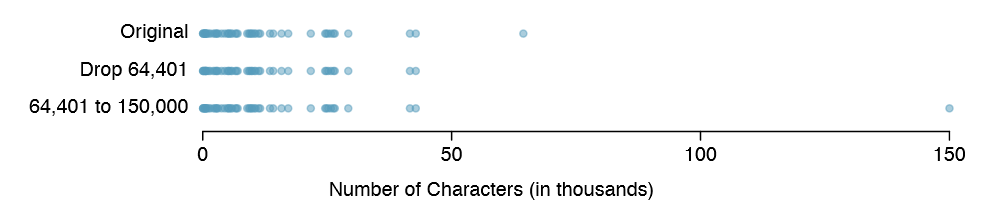
| robust | not robust | |||
|---|---|---|---|---|
| scenario | median | IQR | \(\bar {x}\) | s |
| original num_char data | 6,890 | 12,875 | 11,600 |
13,130 |
| drop 66,924 observation | 6,768 | 11,702 | 10,521 |
10,798 |
| move 66,924 to 150,000 | 6,890 | 12,875 | 13,310 |
22,434 |
Exercise \(\PageIndex{1}\)
(a) Which is more affected by extreme observations, the mean or median? Table 1.27 may be helpful. (b) Is the standard deviation or IQR more a ected by extreme observations?38
38(a) Mean is affected more. (b) Standard deviation is affected more. Complete explanations are provided in the material following Exercise 1.33.
The median and IQR are called robust estimates because extreme observations have little effect on their values. The mean and standard deviation are much more a ected by changes in extreme observations.
Example 1.34 The median and IQR do not change much under the three scenarios in Table 1.27. Why might this be the case?
The median and IQR are only sensitive to numbers near Q1, the median, and Q3. Since values in these regions are relatively stable - there aren't large jumps between observations - the median and IQR estimates are also quite stable.
Exercise \(\PageIndex{1}\)
The distribution of vehicle prices tends to be right skewed, with a few luxury and sports cars lingering out into the right tail. If you were searching for a new car and cared about price, should you be more interested in the mean or median price of vehicles sold, assuming you are in the market for a regular car?39
39Buyers of a "regular car" should be concerned about the median price. High-end car sales can drastically inate the mean price while the median will be more robust to the inuence of those sales.
Transforming data (special topic)
When data are very strongly skewed, we sometimes transform them so they are easier to model. Consider the histogram of salaries for Major League Baseball players' salaries from 2010, which is shown in Figure 1.28(a).
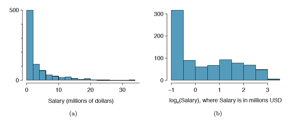
Example 1.36 The histogram of MLB player salaries is useful in that we can see the data are extremely skewed and centered (as gauged by the median) at about $1million. What isn't useful about this plot?
Most of the data are collected into one bin in the histogram and the data are so strongly skewed that many details in the data are obscured.
There are some standard transformations that are often applied when much of the data cluster near zero (relative to the larger values in the data set) and all observations are positive. A transformation is a rescaling of the data using a function. For instance, a plot of the natural logarithm40 of player salaries results in a new histogram in Figure 1.28(b). Transformed data are sometimes easier to work with when applying statistical models because the transformed data are much less skewed and outliers are usually less extreme.
Transformations can also be applied to one or both variables in a scatterplot. A scatterplot of the line breaks and num char variables is shown in Figure 1.29(a), which was earlier shown in Figure 1.16. We can see a positive association between the variables and that many observations are clustered near zero. In Chapter 7, we might want to use a straight line to model the data. However, we'll nd that the data in their current state cannot be modeled very well. Figure 1.29(b) shows a scatterplot where both the line breaks and num char variables have been transformed using a log (base e) transformation. While there is a positive association in each plot, the transformed data show a steadier trend, which is easier to model than the untransformed data.
Transformations other than the logarithm can be useful, too. For instance, the square root \( \sqrt { 0riginal observation} \) and inverse \(( \frac {1}{original observation}\)) are used by statisticians. Common goals in transforming data are to see the data structure differently, reduce skew, assist in modeling, or straighten a nonlinear relationship in a scatterplot.
40Statisticians often write the natural logarithm as log. You might be more familiar with it being written as ln.
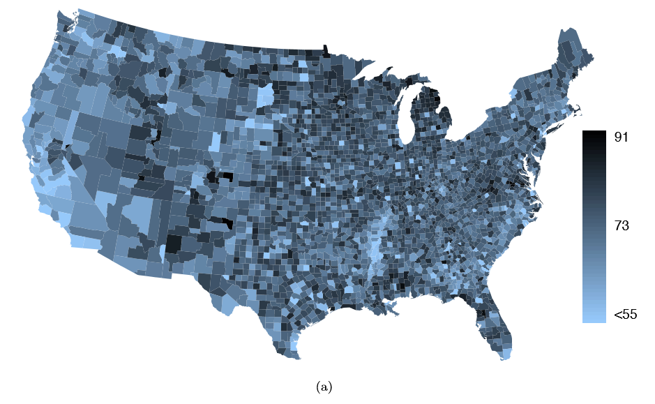
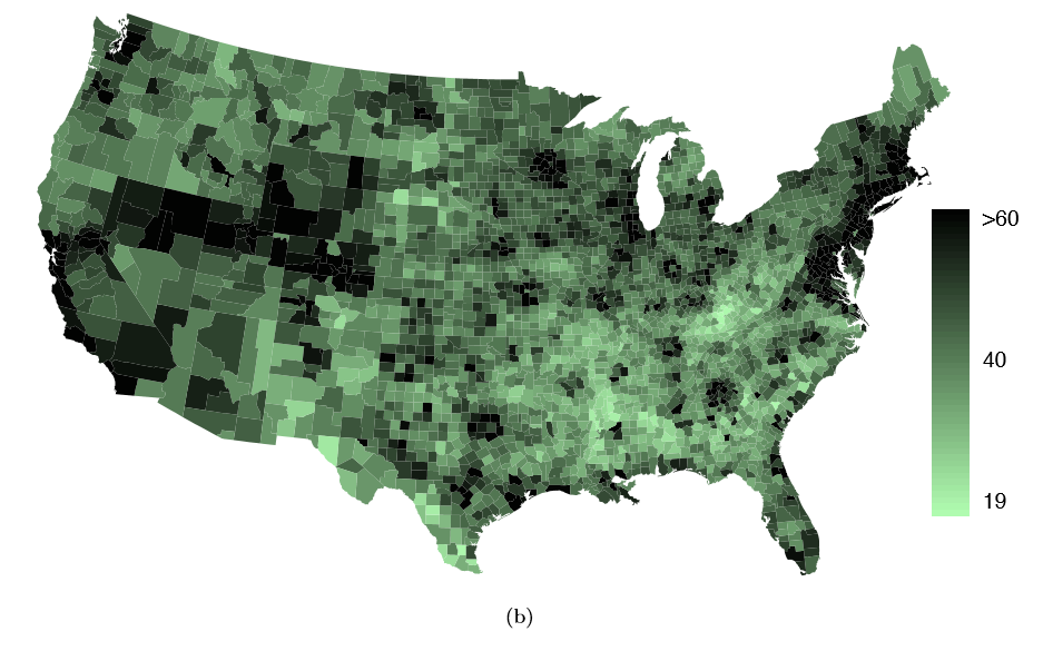
Mapping data (special topic)
The county data set offers many numerical variables that we could plot using dot plots, scatterplots, or box plots, but these miss the true nature of the data. Rather, when we encounter geographic data, we should map it using an intensity map, where colors are used to show higher and lower values of a variable. Figures 1.30 and 1.31 shows intensity maps for federal spending per capita (fed spend), poverty rate in percent (poverty), homeownership rate in percent (homeownership), and median household income (medincome). The color key indicates which colors correspond to which values. Note that the intensity maps are not generally very helpful for getting precise values in any given county, but they are very helpful for seeing geographic trends and generating interesting research questions.
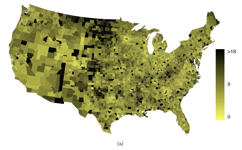
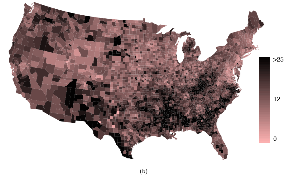
Example 1.37 What interesting features are evident in the fed spend and poverty intensity maps?
The federal spending intensity map shows substantial spending in the Dakotas and along the central-to-western part of the Canadian border, which may be related to the oil boom in this region. There are several other patches of federal spending, such as a vertical strip in eastern Utah and Arizona and the area where Colorado, Nebraska, and Kansas meet. There are also seemingly random counties with very high federal spending relative to their neighbors. If we did not cap the federal spending range at $18 per capita, we would actually nd that some counties have extremely high federal spending while there is almost no federal spending in the neighboring counties. These high-spending counties might contain military bases, companies with large government contracts, or other government facilities with many employees.
Poverty rates are evidently higher in a few locations. Notably, the deep south shows higher poverty rates, as does the southwest border of Texas. The vertical strip of eastern Utah and Arizona, noted above for its higher federal spending, also appears to have higher rates of poverty (though generally little correspondence is seen between the two variables). High poverty rates are evident in the Mississippi ood plains a little north of New Orleans and also in a large section of Kentucky andWest Virginia.
Exercise \(\PageIndex{1}\)
Exercise 1.38 What interesting features are evident in the med income intensity map?41