
2.1: Stem-and-Leaf Graphs, Line Graphs, Bar Graphs, and Pie Charts
- Page ID
- 16233
Stem-and-leaf Graphs
One simple graph, the stem-and-leaf graph or stemplot, comes from the field of exploratory data analysis. It is a good choice when the data sets are small. To create the plot, divide each observation of data into a stem and a leaf. The leaf consists of a final significant digit. For example, 23 has stem two and leaf three. The number 432 has stem 43 and leaf two. Likewise, the number 5,432 has stem 543 and leaf two. The decimal 9.3 has stem nine and leaf three. Write the stems in a vertical line from smallest to largest. Draw a vertical line to the right of the stems. Then write the leaves in increasing order next to their corresponding stem.
Example 1
For Susan Dean’s spring pre-calculus class, scores for the first exam were as follows (smallest to largest):
33; 42; 49; 49; 53; 55; 55; 61; 63; 67; 68; 68; 69; 69; 72; 73; 74; 78; 80; 83; 88; 88; 88; 90; 92; 94; 94; 94; 94; 96; 100
Form a stem-and-leaf graph.
[reveal-answer q=”65536″]Show Answer[/reveal-answer]
[hidden-answer a=”65536″]
| Stem | Leaf |
|---|---|
| 3 | 3 |
| 4 | 2 9 9 |
| 5 | 3 5 5 |
| 6 | 1 3 7 8 8 9 9 |
| 7 | 2 3 4 8 |
| 8 | 0 3 8 8 8 |
| 9 | 0 2 4 4 4 4 6 |
| 10 | 0 |
The stem-and-leaf plot shows that most scores fell in the 60s, 70s, 80s, and 90s.
Eight out of the 31 scores or approximately 26% were in the 90s or 100, a fairly high number of As. [/hidden-answer]
Try It
For the Park City basketball team, scores for the last 30 games were as follows (smallest to largest):
32; 32; 33; 34; 38; 40; 42; 42; 43; 44; 46; 47; 47; 48; 48; 48; 49; 50; 50; 51; 52; 52; 52; 53; 54; 56; 57; 57; 60; 61
Construct a stem plot for the data.[practice-area rows=”3″][/practice-area]
[reveal-answer q=”265621″]Show Answer[/reveal-answer]
[hidden-answer a=”265621″]
| Stem | Leaf |
|---|---|
| 3 | 2 2 3 4 8 |
| 4 | 0 2 2 3 4 6 7 7 8 8 8 9 |
| 5 | 0 0 1 2 2 2 3 4 6 7 7 |
| 6 | 0 1 |
The stemplot is a quick way to graph data and gives an exact picture of the data.[/hidden-answer]
Try It
The following data show the distances (in miles) from the homes of off-campus statistics students to the college.
0.5; 0.7; 1.1; 1.2; 1.2; 1.3; 1.3; 1.5; 1.5; 1.7; 1.7; 1.8; 1.9; 2.0; 2.2; 2.5; 2.6; 2.8; 2.8; 2.8; 3.5; 3.8; 4.4; 4.8; 4.9; 5.2; 5.5; 5.7; 5.8; 8.0
Create a stem plot using the data and identify any outliers:
[reveal-answer q=”294219″]Show Answer[/reveal-answer]
[hidden-answer a=”294219″]
| Stem | Leaf |
|---|---|
| 0 | 5 7 |
| 1 | 1 2 2 3 3 5 5 7 7 8 9 |
| 2 | 0 2 5 6 8 8 8 |
| 3 | 5 8 |
| 4 | 4 8 9 |
| 5 | 2 5 7 8 |
| 6 | |
| 7 | |
| 8 | 0 |
The value 8.0 may be an outlier. Values appear to concentrate at one and two miles.[/hidden-answer]
Watch this video to see an example of how to create a stem plot.

A YouTube element has been excluded from this version of the text. You can view it online here: http://pb.libretexts.org/esm/?p=42
Example 2
A side-by-side stem-and-leaf plot allows a comparison of the two data sets in two columns. In a side-by-side stem-and-leaf plot, two sets of leaves share the same stem. The leaves are to the left and the right of the stems. The two following tables show the ages of presidents at their inauguration and at their death. Construct a side-by-side stem-and-leaf plot using this data.
Presidential Ages at Inauguration
| President | Age | President | Age | President | Age |
|---|---|---|---|---|---|
| Washington | 57 | Lincoln | 52 | Hoover | 54 |
| J. Adams | 61 | A. Johnson | 56 | F. Roosevelt | 51 |
| Jefferson | 57 | Grant | 46 | Truman | 60 |
| Madison | 57 | Hayes | 54 | Eisenhower | 62 |
| Monroe | 58 | Garfield | 49 | Kennedy | 43 |
| J. Q. Adams | 57 | Arthur | 51 | L. Johnson | 55 |
| Jackson | 61 | Cleveland | 47 | Nixon | 56 |
| Van Buren | 54 | B. Harrison | 55 | Ford | 61 |
| W. H. Harrison | 68 | Cleveland | 55 | Carter | 52 |
| Tyler | 51 | McKinley | 54 | Reagan | 69 |
| Polk | 49 | T. Roosevelt | 42 | G.H.W. Bush | 64 |
| Taylor | 64 | Taft | 51 | Clinton | 47 |
| Fillmore | 50 | Wilson | 56 | G. W. Bush | 54 |
| Pierce | 48 | Harding | 55 | Obama | 47 |
| Buchanan | 65 | Coolidge | 51 |
Presidential Age at Death
| President | Age | President | Age | President | Age |
|---|---|---|---|---|---|
| Washington | 67 | Lincoln | 56 | Hoover | 90 |
| J. Adams | 90 | A. Johnson | 66 | F. Roosevelt | 63 |
| Jefferson | 83 | Grant | 63 | Truman | 88 |
| Madison | 85 | Hayes | 70 | Eisenhower | 78 |
| Monroe | 73 | Garfield | 49 | Kennedy | 46 |
| J. Q. Adams | 80 | Arthur | 56 | L. Johnson | 64 |
| Jackson | 78 | Cleveland | 71 | Nixon | 81 |
| Van Buren | 79 | B. Harrison | 67 | Ford | 93 |
| W. H. Harrison | 68 | Cleveland | 71 | Reagan | 93 |
| Tyler | 71 | McKinley | 58 | ||
| Polk | 53 | T. Roosevelt | 60 | ||
| Taylor | 65 | Taft | 72 | ||
| Fillmore | 74 | Wilson | 67 | ||
| Pierce | 64 | Harding | 57 | ||
| Buchanan | 77 | Coolidge | 60 |
[reveal-answer q=”154052″]Show Answer[/reveal-answer]
[hidden-answer a=”154052″]
Ages at Inauguration
| Ages at Inauguration | Ages at Death | |
|---|---|---|
| 9 9 8 7 7 7 6 3 2 | 4 | 6 9 |
| 8 7 7 7 7 6 6 6 5 5 5 5 4 4 4 4 4 2 1 1 1 1 1 0 | 5 | 3 6 6 7 7 8 |
| 9 5 4 4 2 1 1 1 0 | 6 | 0 0 3 3 4 4 5 6 7 7 7 8 |
| 7 | 0 0 1 1 1 4 7 8 8 9 | |
| 8 | 0 1 3 5 8 | |
| 9 | 0 0 3 3 |
[/hidden-answer]
Example 3
The table shows the number of wins and losses the Atlanta Hawks have had in 42 seasons. Create a side-by-side stem-and-leaf plot of these wins and losses.
| Losses | Wins | Year | Losses | Wins | Year |
|---|---|---|---|---|---|
| 34 | 48 | 1968–1969 | 41 | 41 | 1989–1990 |
| 34 | 48 | 1969–1970 | 39 | 43 | 1990–1991 |
| 46 | 36 | 1970–1971 | 44 | 38 | 1991–1992 |
| 46 | 36 | 1971–1972 | 39 | 43 | 1992–1993 |
| 36 | 46 | 1972–1973 | 25 | 57 | 1993–1994 |
| 47 | 35 | 1973–1974 | 40 | 42 | 1994–1995 |
| 51 | 31 | 1974–1975 | 36 | 46 | 1995–1996 |
| 53 | 29 | 1975–1976 | 26 | 56 | 1996–1997 |
| 51 | 31 | 1976–1977 | 32 | 50 | 1997–1998 |
| 41 | 41 | 1977–1978 | 19 | 31 | 1998–1999 |
| 36 | 46 | 1978–1979 | 54 | 28 | 1999–2000 |
| 32 | 50 | 1979–1980 | 57 | 25 | 2000–2001 |
| 51 | 31 | 1980–1981 | 49 | 33 | 2001–2002 |
| 40 | 42 | 1981–1982 | 47 | 35 | 2002–2003 |
| 39 | 43 | 1982–1983 | 54 | 28 | 2003–2004 |
| 42 | 40 | 1983–1984 | 69 | 13 | 2004–2005 |
| 48 | 34 | 1984–1985 | 56 | 26 | 2005–2006 |
| 32 | 50 | 1985–1986 | 52 | 30 | 2006–2007 |
| 25 | 57 | 1986–1987 | 45 | 37 | 2007–2008 |
| 32 | 50 | 1987–1988 | 35 | 47 | 2008–2009 |
| 30 | 52 | 1988–1989 | 29 | 53 | 2009–2010 |
[reveal-answer q=”863761″]Show Answer[/reveal-answer]
[hidden-answer a=”863761″]
Number of losses
| Atalanta Hawks Wins and Leaves | ||
| Number of Wins | Number of Loses | |
| 3 | 1 | 9 |
| 9 8 8 6 5 | 2 | 5 5 9 |
| 8 7 6 6 5 5 4 3 1 1 1 1 0 | 3 | 0 2 2 2 2 4 4 5 6 6 6 9 9 9 |
| 8 8 7 6 6 6 3 3 3 2 2 1 1 0 | 4 | 0 0 1 1 2 4 5 6 6 7 7 8 9 |
| 7 7 6 3 2 0 0 0 0 | 5 | 1 1 1 2 3 4 4 6 7 |
| 6 | 9 | |
[/hidden-answer]
Line Graph
Another type of graph that is useful for specific data values is a line graph.
Example 1
In a survey, 40 mothers were asked how many times per week a teenager must be reminded to do his or her chores.
| Number of times teenager is reminded | Frequency |
|---|---|
| 0 | 2 |
| 1 | 5 |
| 2 | 8 |
| 3 | 14 |
| 4 | 7 |
| 5 | 4 |
[reveal-answer q=”510661″]Show Answer[/reveal-answer]
[hidden-answer a=”510661″]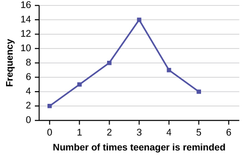 [/hidden-answer]
Try It
In a survey, 40 people were asked how many times per year they had their car in the shop for repairs.
| Number of times in shop | Frequency |
|---|---|
| 0 | 7 |
| 1 | 10 |
| 2 | 14 |
| 3 | 9 |
Construct a line graph.
[reveal-answer q=”727928″]Show Answer[/reveal-answer]
[hidden-answer a=”727928″]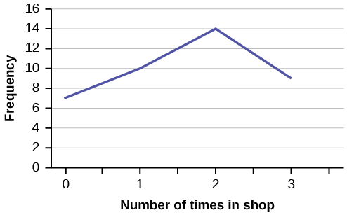 [/hidden-answer]
Bar Graphs & Pie Charts
Bar graphs consist of bars that are separated from each other. The bars can be rectangles or they can be rectangular boxes (used in three-dimensional plots), and they can be vertical or horizontal.
Pie Charts is another method to “visualize” the data. Each proportion on a pie chart represents the proportion of the corresponding class in the data set.
Example 1
By the end of 2011, Facebook had over 146 million users in the United States. The table shows three age groups, the number of users in each age group, and the proportion (%) of users in each age group. Construct a bar graph and a pie chart using this data.
| Age groups | Number of Facebook users | Proportion (%) of Facebook users |
|---|---|---|
| 13–25 | 65,082,280 | 45% |
| 26–44 | 53,300,200 | 36% |
| 45–64 | 27,885,100 | 19% |
[reveal-answer q=”310877″]Bar Graph[/reveal-answer]
[hidden-answer a=”310877″]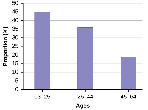 The bar graph has age groups represented on the x-axis and proportions on the y-axis.[/hidden-answer]
[reveal-answer q=”283830″]Pie Chart[/reveal-answer]
[hidden-answer a=”283830″]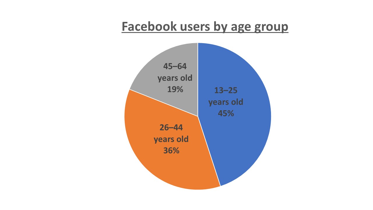 [/hidden-answer]
Try It
The population in Park City is made up of children, working-age adults, and retirees. The table shows the three age groups, the number of people in the town from each age group, and the proportion (%) of people in each age group.
| Age groups | Number of people | Proportion of population |
|---|---|---|
| Children | 67,059 | 19% |
| Working-age adults | 152,198 | 43% |
| Retirees | 131,662 | 38% |
Construct a bar graph and a pie chart showing the proportions.
[reveal-answer q=”759238″]Bar Graph[/reveal-answer]
[hidden-answer a=”759238″]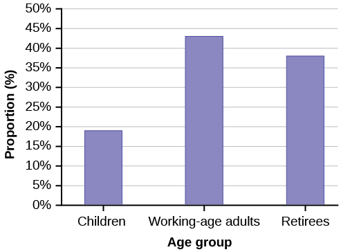 [/hidden-answer]
[reveal-answer q=”951719″]Pie Chart[/reveal-answer]
[hidden-answer a=”951719″]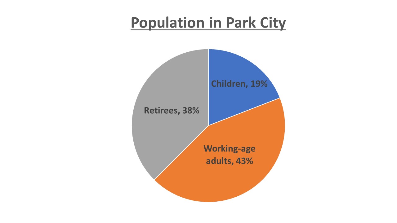 [/hidden-answer]
Example 2
The columns in the table contain: the race or ethnicity of students in U.S. Public Schools for the class of 2011, percentages for the Advanced Placement examine population for that class, and percentages for the overall student population.
| Race/Ethnicity | AP Examinee Population | Overall Student Population |
|---|---|---|
| 1 = Asian, Asian American or Pacific Islander | 10.3% | 5.7% |
| 2 = Black or African American | 9.0% | 14.7% |
| 3 = Hispanic or Latino | 17.0% | 17.6% |
| 4 = American Indian or Alaska Native | 0.6% | 1.1% |
| 5 = White | 57.1% | 59.2% |
| 6 = Not reported/other | 6.0% | 1.7% |
Create a bar graph and a pie chart with the student race or ethnicity (qualitative data) on the x-axis, and the Advanced Placement examinee population percentages on the y-axis.
[reveal-answer q=”875617″]Show Answer[/reveal-answer]
[hidden-answer a=”875617″]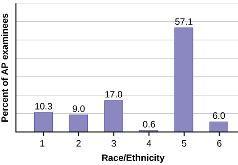 [/hidden-answer]
[reveal-answer q=”523702″]Pie Chart[/reveal-answer]
[hidden-answer a=”523702″]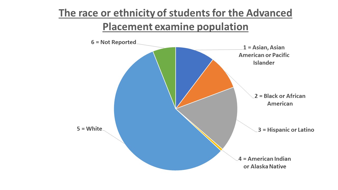 [/hidden-answer]
Try It
Park city is broken down into six voting districts. The table shows the percentage of the total registered voter population that lives in each district as well as the percent total of the entire population that lives in each district.
| District | Registered voter population | Overall city population |
|---|---|---|
| 1 | 15.5% | 19.4% |
| 2 | 12.2% | 15.6% |
| 3 | 9.8% | 9.0% |
| 4 | 17.4% | 18.5% |
| 5 | 22.8% | 20.7% |
| 6 | 22.3% | 16.8% |
Construct a bar graph and a pie chart that shows the registered voter population by district.
[reveal-answer q=”16013″]Bar Graph[/reveal-answer]
[hidden-answer a=”16013″]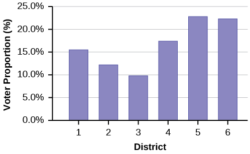 [/hidden-answer]
[reveal-answer q=”533178″]Pie Chart[/reveal-answer]
[hidden-answer a=”533178″]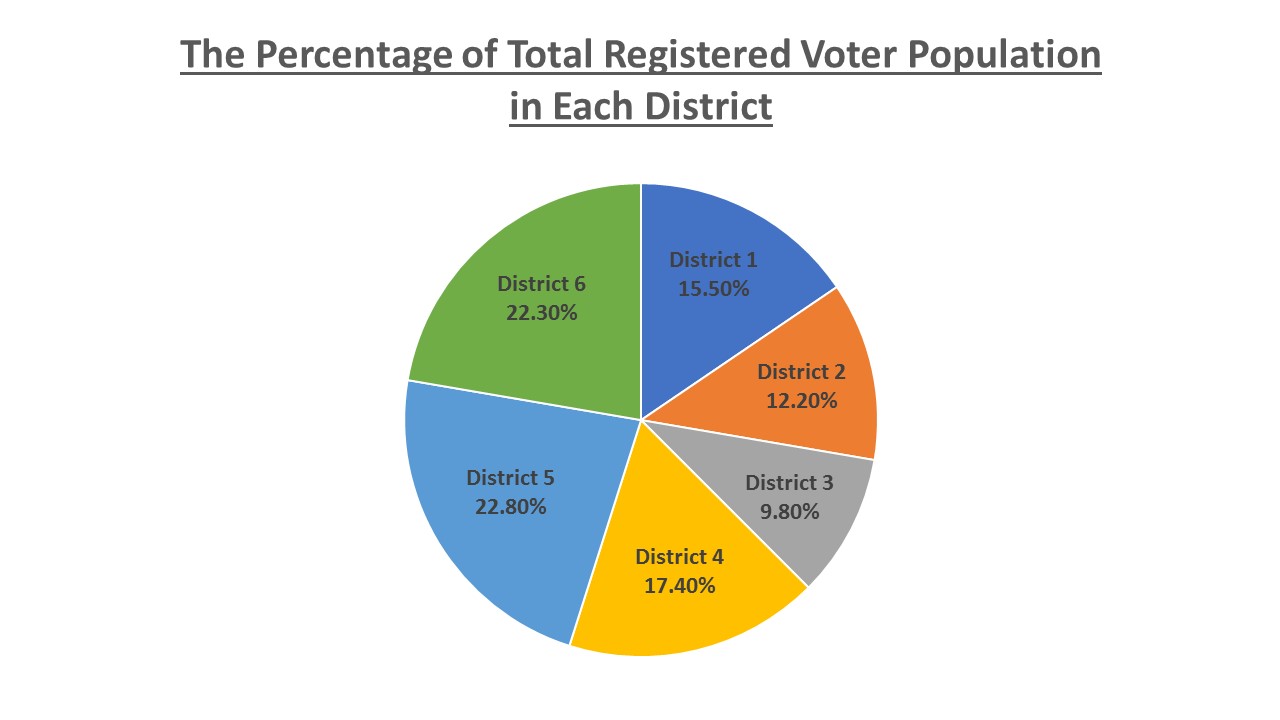
[/hidden-answer]
- Pie Charts & The Examples. Authored by: Eng Hong Sin. License: CC BY: Attribution
- OpenStax, Statistics, Stem-and-Leaf Graphs (Stemplots), Line Graphs, and Bar Graphs. Located at: https://cnx.org/contents/MBiUQmmY@18.53:KFOdKxbi@5/Stem-and-Leaf-Graphs-Stemplots. License: CC BY: Attribution. License Terms: Download for free at http://cnx.org/contents/30189442-699...2b91b9de@18.53.
- Introductory Statistics . Authored by: Barbara Illowski, Susan Dean. Provided by: Open Stax. Located at: https://cnx.org/contents/MBiUQmmY@18.53:KFOdKxbi@5/Stem-and-Leaf-Graphs-Stemplots. License: CC BY: Attribution. License Terms: Download for free at http://cnx.org/contents/30189442-699...2b91b9de@18.53.
- Stem and Leaf Plots aka Stemplots. Authored by: patrickJMT. Located at: https://www.youtube.com/watch?v=839OzHIsI-E. License: All Rights Reserved. License Terms: Standard YouTube License