
1.21 Creating a Frequency Table and Histogram in Excel - Using the Data Analysis Toolpak
- Page ID
- 20809
\( \newcommand{\vecs}[1]{\overset { \scriptstyle \rightharpoonup} {\mathbf{#1}} } \)
\( \newcommand{\vecd}[1]{\overset{-\!-\!\rightharpoonup}{\vphantom{a}\smash {#1}}} \)
\( \newcommand{\dsum}{\displaystyle\sum\limits} \)
\( \newcommand{\dint}{\displaystyle\int\limits} \)
\( \newcommand{\dlim}{\displaystyle\lim\limits} \)
\( \newcommand{\id}{\mathrm{id}}\) \( \newcommand{\Span}{\mathrm{span}}\)
( \newcommand{\kernel}{\mathrm{null}\,}\) \( \newcommand{\range}{\mathrm{range}\,}\)
\( \newcommand{\RealPart}{\mathrm{Re}}\) \( \newcommand{\ImaginaryPart}{\mathrm{Im}}\)
\( \newcommand{\Argument}{\mathrm{Arg}}\) \( \newcommand{\norm}[1]{\| #1 \|}\)
\( \newcommand{\inner}[2]{\langle #1, #2 \rangle}\)
\( \newcommand{\Span}{\mathrm{span}}\)
\( \newcommand{\id}{\mathrm{id}}\)
\( \newcommand{\Span}{\mathrm{span}}\)
\( \newcommand{\kernel}{\mathrm{null}\,}\)
\( \newcommand{\range}{\mathrm{range}\,}\)
\( \newcommand{\RealPart}{\mathrm{Re}}\)
\( \newcommand{\ImaginaryPart}{\mathrm{Im}}\)
\( \newcommand{\Argument}{\mathrm{Arg}}\)
\( \newcommand{\norm}[1]{\| #1 \|}\)
\( \newcommand{\inner}[2]{\langle #1, #2 \rangle}\)
\( \newcommand{\Span}{\mathrm{span}}\) \( \newcommand{\AA}{\unicode[.8,0]{x212B}}\)
\( \newcommand{\vectorA}[1]{\vec{#1}} % arrow\)
\( \newcommand{\vectorAt}[1]{\vec{\text{#1}}} % arrow\)
\( \newcommand{\vectorB}[1]{\overset { \scriptstyle \rightharpoonup} {\mathbf{#1}} } \)
\( \newcommand{\vectorC}[1]{\textbf{#1}} \)
\( \newcommand{\vectorD}[1]{\overrightarrow{#1}} \)
\( \newcommand{\vectorDt}[1]{\overrightarrow{\text{#1}}} \)
\( \newcommand{\vectE}[1]{\overset{-\!-\!\rightharpoonup}{\vphantom{a}\smash{\mathbf {#1}}}} \)
\( \newcommand{\vecs}[1]{\overset { \scriptstyle \rightharpoonup} {\mathbf{#1}} } \)
\(\newcommand{\longvect}{\overrightarrow}\)
\( \newcommand{\vecd}[1]{\overset{-\!-\!\rightharpoonup}{\vphantom{a}\smash {#1}}} \)
\(\newcommand{\avec}{\mathbf a}\) \(\newcommand{\bvec}{\mathbf b}\) \(\newcommand{\cvec}{\mathbf c}\) \(\newcommand{\dvec}{\mathbf d}\) \(\newcommand{\dtil}{\widetilde{\mathbf d}}\) \(\newcommand{\evec}{\mathbf e}\) \(\newcommand{\fvec}{\mathbf f}\) \(\newcommand{\nvec}{\mathbf n}\) \(\newcommand{\pvec}{\mathbf p}\) \(\newcommand{\qvec}{\mathbf q}\) \(\newcommand{\svec}{\mathbf s}\) \(\newcommand{\tvec}{\mathbf t}\) \(\newcommand{\uvec}{\mathbf u}\) \(\newcommand{\vvec}{\mathbf v}\) \(\newcommand{\wvec}{\mathbf w}\) \(\newcommand{\xvec}{\mathbf x}\) \(\newcommand{\yvec}{\mathbf y}\) \(\newcommand{\zvec}{\mathbf z}\) \(\newcommand{\rvec}{\mathbf r}\) \(\newcommand{\mvec}{\mathbf m}\) \(\newcommand{\zerovec}{\mathbf 0}\) \(\newcommand{\onevec}{\mathbf 1}\) \(\newcommand{\real}{\mathbb R}\) \(\newcommand{\twovec}[2]{\left[\begin{array}{r}#1 \\ #2 \end{array}\right]}\) \(\newcommand{\ctwovec}[2]{\left[\begin{array}{c}#1 \\ #2 \end{array}\right]}\) \(\newcommand{\threevec}[3]{\left[\begin{array}{r}#1 \\ #2 \\ #3 \end{array}\right]}\) \(\newcommand{\cthreevec}[3]{\left[\begin{array}{c}#1 \\ #2 \\ #3 \end{array}\right]}\) \(\newcommand{\fourvec}[4]{\left[\begin{array}{r}#1 \\ #2 \\ #3 \\ #4 \end{array}\right]}\) \(\newcommand{\cfourvec}[4]{\left[\begin{array}{c}#1 \\ #2 \\ #3 \\ #4 \end{array}\right]}\) \(\newcommand{\fivevec}[5]{\left[\begin{array}{r}#1 \\ #2 \\ #3 \\ #4 \\ #5 \\ \end{array}\right]}\) \(\newcommand{\cfivevec}[5]{\left[\begin{array}{c}#1 \\ #2 \\ #3 \\ #4 \\ #5 \\ \end{array}\right]}\) \(\newcommand{\mattwo}[4]{\left[\begin{array}{rr}#1 \amp #2 \\ #3 \amp #4 \\ \end{array}\right]}\) \(\newcommand{\laspan}[1]{\text{Span}\{#1\}}\) \(\newcommand{\bcal}{\cal B}\) \(\newcommand{\ccal}{\cal C}\) \(\newcommand{\scal}{\cal S}\) \(\newcommand{\wcal}{\cal W}\) \(\newcommand{\ecal}{\cal E}\) \(\newcommand{\coords}[2]{\left\{#1\right\}_{#2}}\) \(\newcommand{\gray}[1]{\color{gray}{#1}}\) \(\newcommand{\lgray}[1]{\color{lightgray}{#1}}\) \(\newcommand{\rank}{\operatorname{rank}}\) \(\newcommand{\row}{\text{Row}}\) \(\newcommand{\col}{\text{Col}}\) \(\renewcommand{\row}{\text{Row}}\) \(\newcommand{\nul}{\text{Nul}}\) \(\newcommand{\var}{\text{Var}}\) \(\newcommand{\corr}{\text{corr}}\) \(\newcommand{\len}[1]{\left|#1\right|}\) \(\newcommand{\bbar}{\overline{\bvec}}\) \(\newcommand{\bhat}{\widehat{\bvec}}\) \(\newcommand{\bperp}{\bvec^\perp}\) \(\newcommand{\xhat}{\widehat{\xvec}}\) \(\newcommand{\vhat}{\widehat{\vvec}}\) \(\newcommand{\uhat}{\widehat{\uvec}}\) \(\newcommand{\what}{\widehat{\wvec}}\) \(\newcommand{\Sighat}{\widehat{\Sigma}}\) \(\newcommand{\lt}{<}\) \(\newcommand{\gt}{>}\) \(\newcommand{\amp}{&}\) \(\definecolor{fillinmathshade}{gray}{0.9}\)Once the Data Analysis Toolpak is installed, you can create a frequency table.
Following the steps below to create a frequency table and histogram.
Step 1: Open an Excel spreadsheet and copy the data from this file FreqData.xlsx (click the link to download the file) to your spreadsheet. To copy the data, highlight the data in cells A1:A60 in the FreqData.xls Excel file and click the copy button. Then move to the new Excel Spreadsheet, click cell A1, and paste the data.
Step 2: Determine the number of classes to use for the Frequency table. In this example, we will create six classes. Why six classes? We will use the 2k rule. k is the minimum number of classes to use for the data set. The rule states 2k> n, where n is the total number of data points. Therefore, k > log(n)/log(2). In our case, k > log(60)/log(2) = 5.9068. The number of classes, k, must be an integer. As a result, the number of classes is six, which is the next integer greater than 5.9068.
Step 3: Determine the minimum (11) and maximum (100) data values. To find the minimum value enter =min(A1:A60) in a cell. To find the maximum value enter the formula into a cell =max(A1:A60).
Step 4: Decide where the first class will begin. In this case, the beginning value will be the minimum value, 11.
Step 5: Decide where the last class will end. In this case, the ending value is 101, one more than the maximum value. This value makes sure the largest value is in the final class.
Step 6: Determine the class width by applying the following formula, (101 - 11)/6 = 15.
Step 7: Start with the beginning class value for the start value and add the class width, 15, to get the ending value. The next class begins with the ending class value and adds 15 to the ending. Continue adding 15, creating classes until the ending class value of 101.
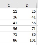
| Start | End |
| 11 | 11+15 = 26 |
| 26 | 26 + 15 = 41 |
| 41 | 41 + 15 = 56 |
| 56 | 56 + 15 = 71 |
| 71 | 71 + 15 = 86 |
| 86 | 86 + 15 = 101 |
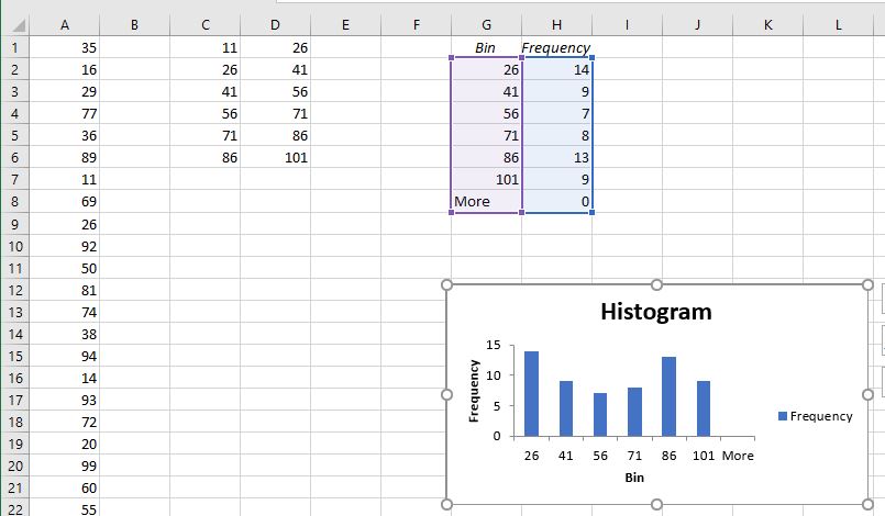
Step 8: Enter the classes into the Excel spreadsheet starting with cell C1 through D6
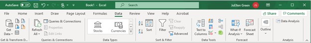
Step 9: Click on the Data Tab and select Data Analysis.
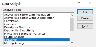
Step 10: Select Histogram on the Data Analysis Menu and click the OK button.
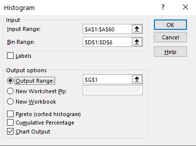
Step 11: A dialog box will appear with the following options. The first option tells Excel where to find the data. Enter the range A1:A60. The next option tells Excel where to find the ending values for each class. In the Bin Range, enter D1:D6. Next, tell Excel where to put the results for the Frequency Table. Enter G1 in the Output range. Click the box next to the Chart Output option to display a graph with the numerical results.
Finish the Frequency Table.
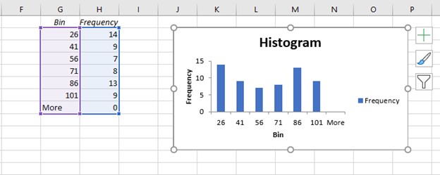
Step 12: To complete the Frequency table move the picture down by click on the edge of the picture and dragging it down.
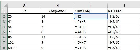
The frequencies are in column H. To complete the frequency table add the following columns: cumulative frequency, relative frequency, and cumulative relative frequency. In cell I1, enter "Cum Freq." Then in cell I2, enter =H2. Next, enter the following formula in cell I3, = I2+H3. Copy the formula down to cell I8 or enter the following formulas in each of the cells:
- In I4, enter =I3+H4;
- In I5, enter =I4+H5;
- In I6, enter =I5+H6;
- In I7, enter =I6+H7; and
- Finally in I8, enter =I7+H8.
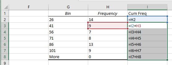
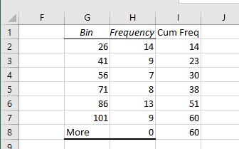
The image above shows the formulas in each cell; you will not see this image in the actual Excel spreadsheet what you will see in the image below (14, 23, 30, 38, 51, 60, and 60).
Step 13: The next column to complete is the relative frequencies. In cell J1, enter Rel Freq. The total of all the frequencies is 60, the number of data values. Therefore, enter the formula into cell J2, =H2/60. Enter the formulas into cells J3 through J8.
- In J3, enter =H3/60;
- In J4, enter =H4/60;
- In J5, enter =H5/60;
- In J6, enter =H6/60;
- In J7, enter =H7/60; and
- Finally in J8, enter =H8/60.
The screenshot below will show all the formulas to enter into the cells J2 through J8. The Excel spreadsheet will not show the formulas in the screenshot below.
The screenshot above shows the formulas. However, only the numbers will show up in the Excel Spreadsheet (The values that appear are as follows: 0.233333, 0.15, 0.116667, 0.133333, 0.216667, 0.15).
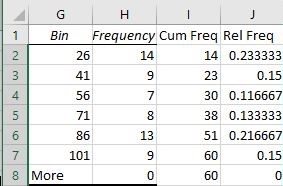
The relative frequencies rounded to four digits are 0.2333, 0.1500, 0.1167, 0.1333, 0.2167, and 0.1500.
Step 14: The final column to complete is the cumulative relative frequencies. In cell K1, enter Cum Rel Freq. The total of all the frequencies is 60. Therefore, enter the formula into the cell K2, = I2/60. Enter the formulas into cells K3 through K8.
- In K3, enter =I3/60;
- In K4, enter =I4/60;
- In K5, enter =I5/60;
- In K6, enter =I6/60;
- In K7, enter =I7/60; and
- In K8, enter =I8/60.
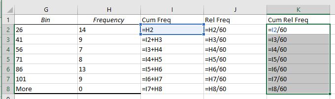
The Excel spreadsheet will not show the formulas as displayed above. It will show the value shown in the screenshot below (0.233333, 0.383333, 0.50, 0.633333, 0.85, and 1).
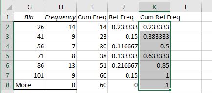
The cumulative relative frequencies rounded to four digits are 0.2333, 0.3833, 0.5000, 0.6333, 0.8500, and 1.0000.
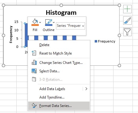
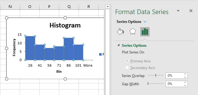
Step 15: To format the histogram, click on the bars and select Format Data Series.
Change the Gap Width to 0%. Then click the X in the upper right-hand corner.
Video on how to create a Frequency Table and Histogram