
2.3: Histograms
- Page ID
- 41766
\( \newcommand{\vecs}[1]{\overset { \scriptstyle \rightharpoonup} {\mathbf{#1}} } \)
\( \newcommand{\vecd}[1]{\overset{-\!-\!\rightharpoonup}{\vphantom{a}\smash {#1}}} \)
\( \newcommand{\dsum}{\displaystyle\sum\limits} \)
\( \newcommand{\dint}{\displaystyle\int\limits} \)
\( \newcommand{\dlim}{\displaystyle\lim\limits} \)
\( \newcommand{\id}{\mathrm{id}}\) \( \newcommand{\Span}{\mathrm{span}}\)
( \newcommand{\kernel}{\mathrm{null}\,}\) \( \newcommand{\range}{\mathrm{range}\,}\)
\( \newcommand{\RealPart}{\mathrm{Re}}\) \( \newcommand{\ImaginaryPart}{\mathrm{Im}}\)
\( \newcommand{\Argument}{\mathrm{Arg}}\) \( \newcommand{\norm}[1]{\| #1 \|}\)
\( \newcommand{\inner}[2]{\langle #1, #2 \rangle}\)
\( \newcommand{\Span}{\mathrm{span}}\)
\( \newcommand{\id}{\mathrm{id}}\)
\( \newcommand{\Span}{\mathrm{span}}\)
\( \newcommand{\kernel}{\mathrm{null}\,}\)
\( \newcommand{\range}{\mathrm{range}\,}\)
\( \newcommand{\RealPart}{\mathrm{Re}}\)
\( \newcommand{\ImaginaryPart}{\mathrm{Im}}\)
\( \newcommand{\Argument}{\mathrm{Arg}}\)
\( \newcommand{\norm}[1]{\| #1 \|}\)
\( \newcommand{\inner}[2]{\langle #1, #2 \rangle}\)
\( \newcommand{\Span}{\mathrm{span}}\) \( \newcommand{\AA}{\unicode[.8,0]{x212B}}\)
\( \newcommand{\vectorA}[1]{\vec{#1}} % arrow\)
\( \newcommand{\vectorAt}[1]{\vec{\text{#1}}} % arrow\)
\( \newcommand{\vectorB}[1]{\overset { \scriptstyle \rightharpoonup} {\mathbf{#1}} } \)
\( \newcommand{\vectorC}[1]{\textbf{#1}} \)
\( \newcommand{\vectorD}[1]{\overrightarrow{#1}} \)
\( \newcommand{\vectorDt}[1]{\overrightarrow{\text{#1}}} \)
\( \newcommand{\vectE}[1]{\overset{-\!-\!\rightharpoonup}{\vphantom{a}\smash{\mathbf {#1}}}} \)
\( \newcommand{\vecs}[1]{\overset { \scriptstyle \rightharpoonup} {\mathbf{#1}} } \)
\(\newcommand{\longvect}{\overrightarrow}\)
\( \newcommand{\vecd}[1]{\overset{-\!-\!\rightharpoonup}{\vphantom{a}\smash {#1}}} \)
\(\newcommand{\avec}{\mathbf a}\) \(\newcommand{\bvec}{\mathbf b}\) \(\newcommand{\cvec}{\mathbf c}\) \(\newcommand{\dvec}{\mathbf d}\) \(\newcommand{\dtil}{\widetilde{\mathbf d}}\) \(\newcommand{\evec}{\mathbf e}\) \(\newcommand{\fvec}{\mathbf f}\) \(\newcommand{\nvec}{\mathbf n}\) \(\newcommand{\pvec}{\mathbf p}\) \(\newcommand{\qvec}{\mathbf q}\) \(\newcommand{\svec}{\mathbf s}\) \(\newcommand{\tvec}{\mathbf t}\) \(\newcommand{\uvec}{\mathbf u}\) \(\newcommand{\vvec}{\mathbf v}\) \(\newcommand{\wvec}{\mathbf w}\) \(\newcommand{\xvec}{\mathbf x}\) \(\newcommand{\yvec}{\mathbf y}\) \(\newcommand{\zvec}{\mathbf z}\) \(\newcommand{\rvec}{\mathbf r}\) \(\newcommand{\mvec}{\mathbf m}\) \(\newcommand{\zerovec}{\mathbf 0}\) \(\newcommand{\onevec}{\mathbf 1}\) \(\newcommand{\real}{\mathbb R}\) \(\newcommand{\twovec}[2]{\left[\begin{array}{r}#1 \\ #2 \end{array}\right]}\) \(\newcommand{\ctwovec}[2]{\left[\begin{array}{c}#1 \\ #2 \end{array}\right]}\) \(\newcommand{\threevec}[3]{\left[\begin{array}{r}#1 \\ #2 \\ #3 \end{array}\right]}\) \(\newcommand{\cthreevec}[3]{\left[\begin{array}{c}#1 \\ #2 \\ #3 \end{array}\right]}\) \(\newcommand{\fourvec}[4]{\left[\begin{array}{r}#1 \\ #2 \\ #3 \\ #4 \end{array}\right]}\) \(\newcommand{\cfourvec}[4]{\left[\begin{array}{c}#1 \\ #2 \\ #3 \\ #4 \end{array}\right]}\) \(\newcommand{\fivevec}[5]{\left[\begin{array}{r}#1 \\ #2 \\ #3 \\ #4 \\ #5 \\ \end{array}\right]}\) \(\newcommand{\cfivevec}[5]{\left[\begin{array}{c}#1 \\ #2 \\ #3 \\ #4 \\ #5 \\ \end{array}\right]}\) \(\newcommand{\mattwo}[4]{\left[\begin{array}{rr}#1 \amp #2 \\ #3 \amp #4 \\ \end{array}\right]}\) \(\newcommand{\laspan}[1]{\text{Span}\{#1\}}\) \(\newcommand{\bcal}{\cal B}\) \(\newcommand{\ccal}{\cal C}\) \(\newcommand{\scal}{\cal S}\) \(\newcommand{\wcal}{\cal W}\) \(\newcommand{\ecal}{\cal E}\) \(\newcommand{\coords}[2]{\left\{#1\right\}_{#2}}\) \(\newcommand{\gray}[1]{\color{gray}{#1}}\) \(\newcommand{\lgray}[1]{\color{lightgray}{#1}}\) \(\newcommand{\rank}{\operatorname{rank}}\) \(\newcommand{\row}{\text{Row}}\) \(\newcommand{\col}{\text{Col}}\) \(\renewcommand{\row}{\text{Row}}\) \(\newcommand{\nul}{\text{Nul}}\) \(\newcommand{\var}{\text{Var}}\) \(\newcommand{\corr}{\text{corr}}\) \(\newcommand{\len}[1]{\left|#1\right|}\) \(\newcommand{\bbar}{\overline{\bvec}}\) \(\newcommand{\bhat}{\widehat{\bvec}}\) \(\newcommand{\bperp}{\bvec^\perp}\) \(\newcommand{\xhat}{\widehat{\xvec}}\) \(\newcommand{\vhat}{\widehat{\vvec}}\) \(\newcommand{\uhat}{\widehat{\uvec}}\) \(\newcommand{\what}{\widehat{\wvec}}\) \(\newcommand{\Sighat}{\widehat{\Sigma}}\) \(\newcommand{\lt}{<}\) \(\newcommand{\gt}{>}\) \(\newcommand{\amp}{&}\) \(\definecolor{fillinmathshade}{gray}{0.9}\)- Distinguish between bar graphs and histograms
- Explore the creation of a grouped frequency distribution and its graphical representation
- Explore how the number of classes affects graphical representations.
Section \(2.3\) Excel File (contains all of the data sets for this section)
Histograms vs. Bar Graphs
Recall that a histogram is a graph of the distribution of a continuous quantitative variable. Continuity is indicated by eliminating the space between the bars. When the bars have gaps, we have a bar graph representing either a qualitative or discrete quantitative variable. Please note that there are statisticians who distinguish between bar graphs (with gaps) and histograms (without gaps) simply based on the type of variables with bar graphs for qualitative variables and histograms for quantitative variables.
Constructing Histograms
Consider how long it takes to respond to a deer or child suddenly running onto the road while driving a car. We continue to travel at the same speed from the time we see the deer to the time we act (to begin braking, to swerve, etc.); the distance traveled during this time is called the reaction distance. We consider the reaction distance of \(642\) students in drivers' education when driving at \(60\) miles per hour. Such a large data set is difficult to understand when presented as a long list of values in a spreadsheet (not provided here). Since the reaction distance is a continuous quantitative variable, we can understand the data better using grouped frequency distributions and histograms.
If we were given that the distances ranged from \(46\) feet to \(167\) feet, how might we consider grouping the data? There is no single correct answer. We might choose to go by tens starting at \(45\) or perhaps starting at \(40;\) we might decide to go by twenties or some other nice number. We recommend constructing several different groupings to see which best represents the data. We show a single example below.
| Interval's Lower Limit | Interval's Upper Limit | Class | Class Frequency |
|---|---|---|---|
| \(39.5\) | \(49.5\) | \((39.5,49.5]\) | \(3\) |
| \(49.5\) | \(59.5\) | \((49.5,59.5]\) | \(10\) |
| \(59.5\) | \(69.5\) | \((59.5,69.5]\) | \(53\) |
| \(69.5\) | \(79.5\) | \((69.5,79.5]\) | \(107\) |
| \(79.5\) | \(89.5\) | \((79.5,89.5]\) | \(147\) |
| \(89.5\) | \(99.5\) | \((89.5,99.5]\) | \(130\) |
| \(99.5\) | \(109.5\) | \((99.5,109.5]\) | \(78\) |
| \(109.5\) | \(119.5\) | \(109.5,119.5]\) | \(59\) |
| \(119.5\) | \(129.5\) | \((119.5,129.5]\) | \(36\) |
| \(129.5\) | \(139.5\) | \((129.5,139.5]\) | \(11\) |
| \(139.5\) | \(149.5\) | \((139.5,149.5]\) | \(6\) |
| \(149.5\) | \(159.5\) | \((149.5,159.5]\) | \(1\) |
| \(159.5\) | \(169.5\) | \((159.5,169.5]\) | \(1\) |
The reaction distances must be broken into mutually exclusive and exhaustive classes, often called class intervals. For our example, the first interval is \((39.5, 49.5],\) the second is \((49.5, 59.5],\) etc. Note \(59.5\) is counted in the second class. The length of a class interval is called the class width and is found by computing the difference between two consecutive lower bounds. The class width is \(49.5-39.5\) \(=10.\)
The number of reaction distances falling into each interval was counted to obtain the class frequencies. There are \(3\) reaction distances in the first interval, \(10\) in the second, etc. We note that class intervals of width \(10\) provide enough detail about the distribution to be revealing without making the graph too "choppy." If this were not the case, we could try a different width.
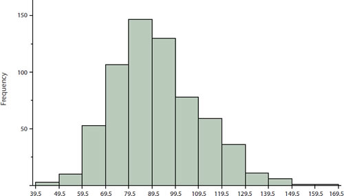
Figure \(\PageIndex{1}\): Histogram of grouped frequency distribution for reaction distances
In the histogram above, the bar heights represent the frequencies for each of our classes; we could also construct histograms based on relative frequencies. Histograms based on relative frequencies show the proportion of observations in each interval rather than the number of observations. We can change a histogram based on frequencies to one based on relative frequencies by dividing each class frequency by the total number of observations and plotting the quotients on the vertical axis.
Our histogram shows that most reaction distances are in the middle of the distribution, with fewer scores in the extremes. We can also see that the distribution is not quite symmetric: the reaction distances extend to the right farther than they do to the left. The histogram is said to be positively skewed.
To explore these ideas further, we will first utilize Desmos. The following exercise reveals some consequences in changing the number of classes used to construct a histogram.
Open the Desmos Activity link.
- Determine what this data represents, find the lower boundary of the first bar of the histogram, determine the class width, and finally describe the shape of this histogram.
- Answer
-
In the far right corner, we can see that the histogram is illustrating times for male swimmers in the \(100\)-meter freestyle. Unfortunately, we do not know when or where these times were collected. By clicking on the points on the \(x\)-axis, we can see that the lower bound of our histogram is at \(47.385.\) Notice this does not mean that someone actually swam the \(100\)-meter freestyle at that exact time, but rather, there was one swimmer who swam the \(100\)-meters between \(47.385\) and \(47.769\) seconds. The class width can be determined by subtracting consecutive values, as shown in the picture. Each class is \(0.385\) seconds long. The main portion of this graph is symmetrical from a practical perspective. Given how far and unconnected the last observation is from the rest of the data, it is difficult to say the tail on the right is longer. It seems more likely that far right observation is uncommon.

- Scroll down to the slider for classes. What happens to the histogram as \(b\) gets smaller or larger?
- Answer
-
Notice that having too many classes is essentially looking at each individual piece of data and having too few classes is rather uninformative. Typically, for data sets with fewer than \(200\) observations, \(7\) to \(10\) bins will provide a good representation of the data. With this particular data, however, it seems that \(14\) classes give us a good view of the data.
We now turn to Excel to familiarize ourselves further with the construction of histograms and with the functionality of Excel.
The data set provided for exercise \(2.3.2\) in the Section \(2.3\) Excel file contains the final grade percentages of \(260\) students.
- Use the \(\text{MAX}\) and \(\text{MIN}\) functions in Excel explained in the provided Excel guides to determine the largest and smallest values in the data set.
- Answer
-
Using the provided Excel file without altering the columns, the commands \(=\text{MAX}(A2:A261)\) and \(=\text{MIN}(A2:A261)\) will return the desired values. We thus find that the lowest final grade was \(35.73\) percent and the highest final grade was \(99.76\) percent.
- Knowing that all of our data falls between \(35.73\) and \(99.76,\) helps ensure that our classes are exhaustive. A natural place to begin constructing a histogram for grade data would be using the typical grading scale for assigning letter grades. As such, the class widths will be \(10\) with an A being assigned for grades in the interval \([90,100]\), B for grades in \([80,90)\), etc. To keep our class widths the same size, continue segmenting the failing grades by \(10\) as well, rather than just having a class constituting all failing grades. At this point, we caution against the use of Excel's built-in histogram function because, as of \(2024,\), it includes the upper bound of a class in the class. This unfortunate design, however, can be overcome in various ways. See the Excel guide to see how and then construct the histogram. Describe the histogram as symmetric, positively skewed, or negatively skewed. Explain.
- Answer
-
Be sure to label the histogram and various axes with pertinent information. We have included class counts on this histogram for the purposes of checking solutions.

The distribution appears to have a longer tail to the left which would lead to use describing the histogram as negatively skewed.

- The previous text exercise indicated that a general rule of thumb for constructing data sets with less than \(200\) observations was to use between \(7\) and \(10\) classes. The last histogram consisted of \(7\) classes and we have over \(200\) observations but just by \(60.\) Construct two histograms, one with \(5\) classes and the second with \(13\) classes. Use \(35\) as the lower bound of the first class, \(100\) as the upper bound for the last class, and the same guidelines as the previous histogram in terms of including or excluding the boundaries of the classes. Compare the three histograms.
- Answer
-


Each histogram appears to be negatively skewed. The least pronounced skew is with the histogram constructed from only five classes. When we have \(5\) or \(7\) classes, each class increases in frequency until we arrive at the class with the most observations and then each class decreases in frequency as we move beyond. In the histogram with \(13\) classes, the frequency counts are more volatile going up and down with greater frequency as we progress through the classes.

