
10.4: The Regression Equation
- Page ID
- 20082

\( \newcommand{\vecs}[1]{\overset { \scriptstyle \rightharpoonup} {\mathbf{#1}} } \)
\( \newcommand{\vecd}[1]{\overset{-\!-\!\rightharpoonup}{\vphantom{a}\smash {#1}}} \)
\( \newcommand{\id}{\mathrm{id}}\) \( \newcommand{\Span}{\mathrm{span}}\)
( \newcommand{\kernel}{\mathrm{null}\,}\) \( \newcommand{\range}{\mathrm{range}\,}\)
\( \newcommand{\RealPart}{\mathrm{Re}}\) \( \newcommand{\ImaginaryPart}{\mathrm{Im}}\)
\( \newcommand{\Argument}{\mathrm{Arg}}\) \( \newcommand{\norm}[1]{\| #1 \|}\)
\( \newcommand{\inner}[2]{\langle #1, #2 \rangle}\)
\( \newcommand{\Span}{\mathrm{span}}\)
\( \newcommand{\id}{\mathrm{id}}\)
\( \newcommand{\Span}{\mathrm{span}}\)
\( \newcommand{\kernel}{\mathrm{null}\,}\)
\( \newcommand{\range}{\mathrm{range}\,}\)
\( \newcommand{\RealPart}{\mathrm{Re}}\)
\( \newcommand{\ImaginaryPart}{\mathrm{Im}}\)
\( \newcommand{\Argument}{\mathrm{Arg}}\)
\( \newcommand{\norm}[1]{\| #1 \|}\)
\( \newcommand{\inner}[2]{\langle #1, #2 \rangle}\)
\( \newcommand{\Span}{\mathrm{span}}\) \( \newcommand{\AA}{\unicode[.8,0]{x212B}}\)
\( \newcommand{\vectorA}[1]{\vec{#1}} % arrow\)
\( \newcommand{\vectorAt}[1]{\vec{\text{#1}}} % arrow\)
\( \newcommand{\vectorB}[1]{\overset { \scriptstyle \rightharpoonup} {\mathbf{#1}} } \)
\( \newcommand{\vectorC}[1]{\textbf{#1}} \)
\( \newcommand{\vectorD}[1]{\overrightarrow{#1}} \)
\( \newcommand{\vectorDt}[1]{\overrightarrow{\text{#1}}} \)
\( \newcommand{\vectE}[1]{\overset{-\!-\!\rightharpoonup}{\vphantom{a}\smash{\mathbf {#1}}}} \)
\( \newcommand{\vecs}[1]{\overset { \scriptstyle \rightharpoonup} {\mathbf{#1}} } \)
\( \newcommand{\vecd}[1]{\overset{-\!-\!\rightharpoonup}{\vphantom{a}\smash {#1}}} \)
\(\newcommand{\avec}{\mathbf a}\) \(\newcommand{\bvec}{\mathbf b}\) \(\newcommand{\cvec}{\mathbf c}\) \(\newcommand{\dvec}{\mathbf d}\) \(\newcommand{\dtil}{\widetilde{\mathbf d}}\) \(\newcommand{\evec}{\mathbf e}\) \(\newcommand{\fvec}{\mathbf f}\) \(\newcommand{\nvec}{\mathbf n}\) \(\newcommand{\pvec}{\mathbf p}\) \(\newcommand{\qvec}{\mathbf q}\) \(\newcommand{\svec}{\mathbf s}\) \(\newcommand{\tvec}{\mathbf t}\) \(\newcommand{\uvec}{\mathbf u}\) \(\newcommand{\vvec}{\mathbf v}\) \(\newcommand{\wvec}{\mathbf w}\) \(\newcommand{\xvec}{\mathbf x}\) \(\newcommand{\yvec}{\mathbf y}\) \(\newcommand{\zvec}{\mathbf z}\) \(\newcommand{\rvec}{\mathbf r}\) \(\newcommand{\mvec}{\mathbf m}\) \(\newcommand{\zerovec}{\mathbf 0}\) \(\newcommand{\onevec}{\mathbf 1}\) \(\newcommand{\real}{\mathbb R}\) \(\newcommand{\twovec}[2]{\left[\begin{array}{r}#1 \\ #2 \end{array}\right]}\) \(\newcommand{\ctwovec}[2]{\left[\begin{array}{c}#1 \\ #2 \end{array}\right]}\) \(\newcommand{\threevec}[3]{\left[\begin{array}{r}#1 \\ #2 \\ #3 \end{array}\right]}\) \(\newcommand{\cthreevec}[3]{\left[\begin{array}{c}#1 \\ #2 \\ #3 \end{array}\right]}\) \(\newcommand{\fourvec}[4]{\left[\begin{array}{r}#1 \\ #2 \\ #3 \\ #4 \end{array}\right]}\) \(\newcommand{\cfourvec}[4]{\left[\begin{array}{c}#1 \\ #2 \\ #3 \\ #4 \end{array}\right]}\) \(\newcommand{\fivevec}[5]{\left[\begin{array}{r}#1 \\ #2 \\ #3 \\ #4 \\ #5 \\ \end{array}\right]}\) \(\newcommand{\cfivevec}[5]{\left[\begin{array}{c}#1 \\ #2 \\ #3 \\ #4 \\ #5 \\ \end{array}\right]}\) \(\newcommand{\mattwo}[4]{\left[\begin{array}{rr}#1 \amp #2 \\ #3 \amp #4 \\ \end{array}\right]}\) \(\newcommand{\laspan}[1]{\text{Span}\{#1\}}\) \(\newcommand{\bcal}{\cal B}\) \(\newcommand{\ccal}{\cal C}\) \(\newcommand{\scal}{\cal S}\) \(\newcommand{\wcal}{\cal W}\) \(\newcommand{\ecal}{\cal E}\) \(\newcommand{\coords}[2]{\left\{#1\right\}_{#2}}\) \(\newcommand{\gray}[1]{\color{gray}{#1}}\) \(\newcommand{\lgray}[1]{\color{lightgray}{#1}}\) \(\newcommand{\rank}{\operatorname{rank}}\) \(\newcommand{\row}{\text{Row}}\) \(\newcommand{\col}{\text{Col}}\) \(\renewcommand{\row}{\text{Row}}\) \(\newcommand{\nul}{\text{Nul}}\) \(\newcommand{\var}{\text{Var}}\) \(\newcommand{\corr}{\text{corr}}\) \(\newcommand{\len}[1]{\left|#1\right|}\) \(\newcommand{\bbar}{\overline{\bvec}}\) \(\newcommand{\bhat}{\widehat{\bvec}}\) \(\newcommand{\bperp}{\bvec^\perp}\) \(\newcommand{\xhat}{\widehat{\xvec}}\) \(\newcommand{\vhat}{\widehat{\vvec}}\) \(\newcommand{\uhat}{\widehat{\uvec}}\) \(\newcommand{\what}{\widehat{\wvec}}\) \(\newcommand{\Sighat}{\widehat{\Sigma}}\) \(\newcommand{\lt}{<}\) \(\newcommand{\gt}{>}\) \(\newcommand{\amp}{&}\) \(\definecolor{fillinmathshade}{gray}{0.9}\)Data rarely fit a straight line exactly. Usually, you must be satisfied with rough predictions. Typically, you have a set of data whose scatter plot appears to "fit" a straight line. This is called a Line of Best Fit or Least-Squares Line.
If you know a person's pinky (smallest) finger length, do you think you could predict that person's height? Collect data from your class (pinky finger length, in inches). The independent variable, \(x\), is pinky finger length and the dependent variable, \(y\), is height. For each set of data, plot the points on graph paper. Make your graph big enough and use a ruler. Then "by eye" draw a line that appears to "fit" the data. For your line, pick two convenient points and use them to find the slope of the line. Find the \(y\)-intercept of the line by extending your line so it crosses the \(y\)-axis. Using the slopes and the \(y\)-intercepts, write your equation of "best fit." Do you think everyone will have the same equation? Why or why not? According to your equation, what is the predicted height for a pinky length of 2.5 inches?
A random sample of 11 statistics students produced the following data, where \(x\) is the third exam score out of 80, and \(y\) is the final exam score out of 200. Can you predict the final exam score of a random student if you know the third exam score?
| \(x\) (third exam score) | \(y\) (final exam score) |
|---|---|
| 65 | 175 |
| 67 | 133 |
| 71 | 185 |
| 71 | 163 |
| 66 | 126 |
| 75 | 198 |
| 67 | 153 |
| 70 | 163 |
| 71 | 159 |
| 69 | 151 |
| 69 | 159 |
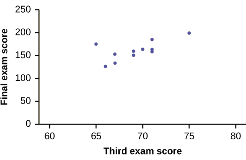
The third exam score, \(x\), is the independent variable and the final exam score, \(y\), is the dependent variable. We will plot a regression line that best "fits" the data. If each of you were to fit a line "by eye," you would draw different lines. We can use what is called a least-squares regression line to obtain the best fit line.
Consider the following diagram. Each point of data is of the the form (\(x, y\)) and each point of the line of best fit using least-squares linear regression has the form (\(x, \hat{y}\)).
The \(\hat{y}\) is read "\(y\) hat" and is the estimated value of \(y\). It is the value of \(y\) obtained using the regression line. It is not generally equal to \(y\) from data.
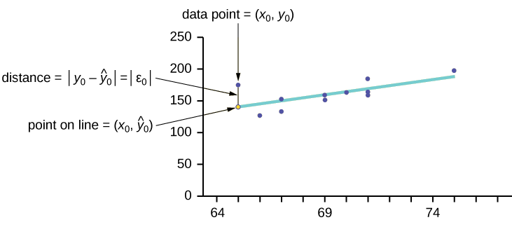
The term \(y_{0} – \hat{y}_{0} = \varepsilon_{0}\) is called the "error" or residual. It is not an error in the sense of a mistake. The absolute value of a residual measures the vertical distance between the actual value of \(y\) and the estimated value of \(y\). In other words, it measures the vertical distance between the actual data point and the predicted point on the line.
If the observed data point lies above the line, the residual is positive, and the line underestimates the actual data value for \(y\). If the observed data point lies below the line, the residual is negative, and the line overestimates that actual data value for \(y\).
In the diagram in Figure, \(y_{0} – \hat{y}_{0} = \varepsilon_{0}\) is the residual for the point shown. Here the point lies above the line and the residual is positive.
\(\varepsilon =\) the Greek letter epsilon
For each data point, you can calculate the residuals or errors, \(y_{i} - \hat{y}_{i} = \varepsilon_{i}\) for \(i = 1, 2, 3, ..., 11\).
Each \(|\varepsilon|\) is a vertical distance.
For the example about the third exam scores and the final exam scores for the 11 statistics students, there are 11 data points. Therefore, there are 11 \(\varepsilon\) values. If you square each \(\varepsilon\) and add, you get
\[(\varepsilon_{1})^{2} + (\varepsilon_{2})^{2} + \dotso + (\varepsilon_{11})^{2} = \sum^{11}_{i = 1} \varepsilon^{2} \label{SSE}\]
Equation\ref{SSE} is called the Sum of Squared Errors (SSE).
Using calculus, you can determine the values of \(a\) and \(b\) that make the SSE a minimum. When you make the SSE a minimum, you have determined the points that are on the line of best fit. It turns out that the line of best fit has the equation:
\[\hat{y} = a + bx\]
where
- \(a = \bar{y} - b\bar{x}\) and
- \(b = \dfrac{\sum(x - \bar{x})(y - \bar{y})}{\sum(x - \bar{x})^{2}}\).
The sample means of the \(x\) values and the \(x\) values are \(\bar{x}\) and \(\bar{y}\), respectively. The best fit line always passes through the point \((\bar{x}, \bar{y})\).
The slope \(b\) can be written as \(b = r\left(\dfrac{s_{y}}{s_{x}}\right)\) where \(s_{y} =\) the standard deviation of the \(y\) values and \(s_{x} =\) the standard deviation of the \(x\) values. \(r\) is the correlation coefficient, which is discussed in the next section.
Of course, that can be calculation intensive, so use technology to do the actual calculation.
Least Square Criteria for Best Fit
The process of fitting the best-fit line is called linear regression. The idea behind finding the best-fit line is based on the assumption that the data are scattered about a straight line. The criteria for the best fit line is that the sum of the squared errors (SSE) is minimized, that is, made as small as possible. Any other line you might choose would have a higher SSE than the best fit line. This best fit line is called the least-squares regression line .
Computer spreadsheets, statistical software, and many calculators can quickly calculate the best-fit line and create the graphs. The calculations tend to be tedious if done by hand. Instructions to use Excel to find the best-fit line and create a scatterplot are given.
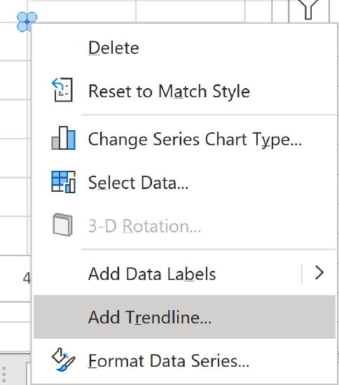
THIRD EXAM vs FINAL EXAM EXAMPLE:
Start by creating a scatter plot in Excel.
Right-click any data point in the scatter plot and choose Add Trendline... from the options.
Then scroll to the bottom of the options and select both Display Equation on chart and Display R-squared value on chart.
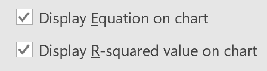
Move the equation and R-squared to a visible portion of the chart. For now, just note where R-squared is. This will be discussed further below.
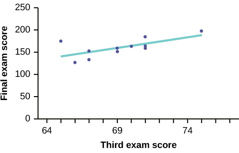
The least squares regression line (best-fit line) for the third-exam/final-exam example has the equation:
\[\hat{y} = -173.51 + 4.83x\]
REMINDER
Remember, it is always important to plot a scatter diagram first. If the scatter plot indicates that there is a linear relationship between the variables, then it is reasonable to use a best fit line to make predictions for \(y\) given \(x\) within the domain of \(x\)-values in the sample data, but not necessarily for x-values outside that domain. You could use the line to predict the final exam score for a student who earned a grade of 73 on the third exam. You should NOT use the line to predict the final exam score for a student who earned a grade of 50 on the third exam, because 50 is not within the domain of the \(x\)-values in the sample data, which are between 65 and 75.
Understanding Slope
The slope of the line, \(b\), describes how changes in the variables are related. It is important to interpret the slope of the line in the context of the situation represented by the data. You should be able to write a sentence interpreting the slope in plain English.
INTERPRETATION OF THE SLOPE: The slope of the best-fit line tells us how the dependent variable (\(y\)) changes for every one unit increase in the independent (\(x\)) variable, on average.
THIRD EXAM vs FINAL EXAM EXAMPLE
Slope: The slope of the line is \(b = 4.83\).
Interpretation: For a one-point increase in the score on the third exam, the final exam score increases by 4.83 points, on average.
Another way to find the equation of the line using Excel is to use Excel formulas. For this method, you do not need to create a scatter plot, which can be beneficial in some circumstances.
- Enter the data, with the \(x\)-values in one column and the \(y\)-values in another column.
- Calculate the slope using the Excel formula \(=\text{SLOPE}(y\text{'s},x\text{'s})\).
- Calculate the \(y\)-intercept using the Excel formula \(=\text{INTERCEPT}(y\text{'s},x\text{'s})\).
- Plug in the values you found to the equation \(y=mx+b\), where \(m\) is the slope and \(b\) is the \(y\)-intercept.
SCUBA divers have maximum dive times they cannot exceed when going to different depths. The data in Table show different depths with the maximum dive times in minutes. Use your calculator to find the least squares regression line and predict the maximum dive time for 110 feet.
| \(X\) (depth in feet) | \(Y\) (maximum dive time) |
|---|---|
| 50 | 80 |
| 60 | 55 |
| 70 | 45 |
| 80 | 35 |
| 90 | 25 |
| 100 | 22 |
- Answer
-
\(\hat{y} = 127.24 – 1.11x\)
At 110 feet, a diver could dive for only five minutes.
The Correlation Coefficient \(r\)
Besides looking at the scatter plot and seeing that a line seems reasonable, how can you tell if the line is a good predictor? Use the correlation coefficient as another indicator (besides the scatterplot) of the strength of the relationship between \(x\) and \(y\). The correlation coefficient, \(r\), developed by Karl Pearson in the early 1900s, is numerical and provides a measure of strength and direction of the linear association between the independent variable \(x\) and the dependent variable \(y\).
The correlation coefficient is calculated as
\[r = \dfrac{n \sum(xy) - \left(\sum x\right)\left(\sum y\right)}{\sqrt{\left[n \sum x^{2} - \left(\sum x\right)^{2}\right] \left[n \sum y^{2} - \left(\sum y\right)^{2}\right]}}\]
where \(n =\) the number of data points.
If you suspect a linear relationship between \(x\) and \(y\), then \(r\) can measure how strong the linear relationship is.
What the VALUE of \(r\) tells us:
- The value of \(r\) is always between –1 and +1: –1 ≤ r ≤ 1.
The size of the correlation \(r\) indicates the strength of the linear relationship between \(x\) and \(y\). Values of \(r\) close to –1 or to +1 indicate a stronger linear relationship between \(x\) and \(y\).
- If \(r = 0\) there is absolutely no linear relationship between \(x\) and \(y\) (no linear correlation).
- If \(r = 1\), there is perfect positive correlation. If \(r = -1\), there is perfect negative correlation. In both these cases, all of the original data points lie on a straight line. Of course,in the real world, this will not generally happen.
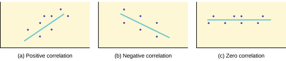
What the SIGN of \(r\) tells us
- A positive value of \(r\) means that when \(x\) increases, \(y\) tends to increase and when \(x\) decreases, \(y\) tends to decrease (positive correlation).
- A negative value of \(r\) means that when \(x\) increases, \(y\) tends to decrease and when \(x\) decreases, \(y\) tends to increase (negative correlation).
The sign of \(r\) is the same as the sign of the slope, \(b\), of the best-fit line.
Strong correlation does not suggest that \(x\) causes \(y\) or \(y\) causes \(x\). We say "correlation does not imply causation."
The formula for \(r\) looks formidable. However, computer spreadsheets, statistical software, and many calculators can quickly calculate \(r\). The correlation coefficient \(r\) can be found by taking the square root of R-squared (as found above), keeping in mind to select the correct sign. Alternatively, \(r\) can be found using the Excel formula \(=\text{CORREL}()\).
The Coefficient of Determination
The variable \(r^{2}\) is called the coefficient of determination and is the square of the correlation coefficient, but is usually stated as a percent, rather than in decimal form. It has an interpretation in the context of the data:
- \(r^{2}\), when expressed as a percent, represents the percent of variation in the dependent (predicted) variable \(y\) that can be explained by variation in the independent (explanatory) variable \(x\) using the regression (best-fit) line.
- \(1 - r^{2}\), when expressed as a percentage, represents the percent of variation in \(y\) that is NOT explained by variation in \(x\) using the regression line. This can be seen as the scattering of the observed data points about the regression line.
\(r^{2}\) is the R-squared that was found using Excel (as shown above). Alternatively, you can square \(r\) after finding it using the Excel formula \(=\text{CORREL}()\).
Consider the third exam/final exam example introduced in the previous section
- The line of best fit is: \(\hat{y} = -173.51 + 4.83x\)
- The correlation coefficient is \(r = 0.6631\)
- The coefficient of determination is \(r^{2} = 0.6631^{2} = 0.4397\)
- Interpretation of \(r^{2}\) in the context of this example:
- Approximately 44% of the variation (0.4397 is approximately 0.44) in the final-exam grades can be explained by the variation in the grades on the third exam, using the best-fit regression line.
- Therefore, approximately 56% of the variation (\(1 - 0.44 = 0.56\)) in the final exam grades can NOT be explained by the variation in the grades on the third exam, using the best-fit regression line. (This is seen as the scattering of the points about the line.)
Summary
A regression line, or a line of best fit, can be drawn on a scatter plot and used to predict outcomes for the \(x\) and \(y\) variables in a given data set or sample data. There are several ways to find a regression line, but usually the least-squares regression line is used because it creates a uniform line. Residuals, also called “errors,” measure the distance from the actual value of \(y\) and the estimated value of \(y\). The Sum of Squared Errors, when set to its minimum, calculates the points on the line of best fit. Regression lines can be used to predict values within the given set of data, but should not be used to make predictions for values outside the set of data.
The correlation coefficient \(r\) measures the strength of the linear association between \(x\) and \(y\). The variable \(r\) has to be between –1 and +1. When \(r\) is positive, the \(x\) and \(y\) will tend to increase and decrease together. When \(r\) is negative, \(x\) will increase and \(y\) will decrease, or the opposite, \(x\) will decrease and \(y\) will increase. The coefficient of determination \(r^{2}\), is equal to the square of the correlation coefficient. When expressed as a percent, \(r^{2}\) represents the percent of variation in the dependent variable \(y\) that can be explained by variation in the independent variable \(x\) using the regression line.
Glossary
- Coefficient of Correlation
- a measure developed by Karl Pearson (early 1900s) that gives the strength of association between the independent variable and the dependent variable; the formula is:
\[r = \dfrac{n \sum xy - \left(\sum x\right) \left(\sum y\right)}{\sqrt{\left[n \sum x^{2} - \left(\sum x\right)^{2}\right] \left[n \sum y^{2} - \left(\sum y\right)^{2}\right]}}\]
where \(n\) is the number of data points. The coefficient cannot be more than 1 or less than –1. The closer the coefficient is to ±1, the stronger the evidence of a significant linear relationship between \(x\) and \(y\).
Contributors and Attributions
Barbara Illowsky and Susan Dean (De Anza College) with many other contributing authors. Content produced by OpenStax College is licensed under a Creative Commons Attribution License 4.0 license. Download for free at http://cnx.org/contents/30189442-699...b91b9de@18.114.