
2.1: Qualitative Data
- Page ID
- 58249

\( \newcommand{\vecs}[1]{\overset { \scriptstyle \rightharpoonup} {\mathbf{#1}} } \)
\( \newcommand{\vecd}[1]{\overset{-\!-\!\rightharpoonup}{\vphantom{a}\smash {#1}}} \)
\( \newcommand{\dsum}{\displaystyle\sum\limits} \)
\( \newcommand{\dint}{\displaystyle\int\limits} \)
\( \newcommand{\dlim}{\displaystyle\lim\limits} \)
\( \newcommand{\id}{\mathrm{id}}\) \( \newcommand{\Span}{\mathrm{span}}\)
( \newcommand{\kernel}{\mathrm{null}\,}\) \( \newcommand{\range}{\mathrm{range}\,}\)
\( \newcommand{\RealPart}{\mathrm{Re}}\) \( \newcommand{\ImaginaryPart}{\mathrm{Im}}\)
\( \newcommand{\Argument}{\mathrm{Arg}}\) \( \newcommand{\norm}[1]{\| #1 \|}\)
\( \newcommand{\inner}[2]{\langle #1, #2 \rangle}\)
\( \newcommand{\Span}{\mathrm{span}}\)
\( \newcommand{\id}{\mathrm{id}}\)
\( \newcommand{\Span}{\mathrm{span}}\)
\( \newcommand{\kernel}{\mathrm{null}\,}\)
\( \newcommand{\range}{\mathrm{range}\,}\)
\( \newcommand{\RealPart}{\mathrm{Re}}\)
\( \newcommand{\ImaginaryPart}{\mathrm{Im}}\)
\( \newcommand{\Argument}{\mathrm{Arg}}\)
\( \newcommand{\norm}[1]{\| #1 \|}\)
\( \newcommand{\inner}[2]{\langle #1, #2 \rangle}\)
\( \newcommand{\Span}{\mathrm{span}}\) \( \newcommand{\AA}{\unicode[.8,0]{x212B}}\)
\( \newcommand{\vectorA}[1]{\vec{#1}} % arrow\)
\( \newcommand{\vectorAt}[1]{\vec{\text{#1}}} % arrow\)
\( \newcommand{\vectorB}[1]{\overset { \scriptstyle \rightharpoonup} {\mathbf{#1}} } \)
\( \newcommand{\vectorC}[1]{\textbf{#1}} \)
\( \newcommand{\vectorD}[1]{\overrightarrow{#1}} \)
\( \newcommand{\vectorDt}[1]{\overrightarrow{\text{#1}}} \)
\( \newcommand{\vectE}[1]{\overset{-\!-\!\rightharpoonup}{\vphantom{a}\smash{\mathbf {#1}}}} \)
\( \newcommand{\vecs}[1]{\overset { \scriptstyle \rightharpoonup} {\mathbf{#1}} } \)
\(\newcommand{\longvect}{\overrightarrow}\)
\( \newcommand{\vecd}[1]{\overset{-\!-\!\rightharpoonup}{\vphantom{a}\smash {#1}}} \)
\(\newcommand{\avec}{\mathbf a}\) \(\newcommand{\bvec}{\mathbf b}\) \(\newcommand{\cvec}{\mathbf c}\) \(\newcommand{\dvec}{\mathbf d}\) \(\newcommand{\dtil}{\widetilde{\mathbf d}}\) \(\newcommand{\evec}{\mathbf e}\) \(\newcommand{\fvec}{\mathbf f}\) \(\newcommand{\nvec}{\mathbf n}\) \(\newcommand{\pvec}{\mathbf p}\) \(\newcommand{\qvec}{\mathbf q}\) \(\newcommand{\svec}{\mathbf s}\) \(\newcommand{\tvec}{\mathbf t}\) \(\newcommand{\uvec}{\mathbf u}\) \(\newcommand{\vvec}{\mathbf v}\) \(\newcommand{\wvec}{\mathbf w}\) \(\newcommand{\xvec}{\mathbf x}\) \(\newcommand{\yvec}{\mathbf y}\) \(\newcommand{\zvec}{\mathbf z}\) \(\newcommand{\rvec}{\mathbf r}\) \(\newcommand{\mvec}{\mathbf m}\) \(\newcommand{\zerovec}{\mathbf 0}\) \(\newcommand{\onevec}{\mathbf 1}\) \(\newcommand{\real}{\mathbb R}\) \(\newcommand{\twovec}[2]{\left[\begin{array}{r}#1 \\ #2 \end{array}\right]}\) \(\newcommand{\ctwovec}[2]{\left[\begin{array}{c}#1 \\ #2 \end{array}\right]}\) \(\newcommand{\threevec}[3]{\left[\begin{array}{r}#1 \\ #2 \\ #3 \end{array}\right]}\) \(\newcommand{\cthreevec}[3]{\left[\begin{array}{c}#1 \\ #2 \\ #3 \end{array}\right]}\) \(\newcommand{\fourvec}[4]{\left[\begin{array}{r}#1 \\ #2 \\ #3 \\ #4 \end{array}\right]}\) \(\newcommand{\cfourvec}[4]{\left[\begin{array}{c}#1 \\ #2 \\ #3 \\ #4 \end{array}\right]}\) \(\newcommand{\fivevec}[5]{\left[\begin{array}{r}#1 \\ #2 \\ #3 \\ #4 \\ #5 \\ \end{array}\right]}\) \(\newcommand{\cfivevec}[5]{\left[\begin{array}{c}#1 \\ #2 \\ #3 \\ #4 \\ #5 \\ \end{array}\right]}\) \(\newcommand{\mattwo}[4]{\left[\begin{array}{rr}#1 \amp #2 \\ #3 \amp #4 \\ \end{array}\right]}\) \(\newcommand{\laspan}[1]{\text{Span}\{#1\}}\) \(\newcommand{\bcal}{\cal B}\) \(\newcommand{\ccal}{\cal C}\) \(\newcommand{\scal}{\cal S}\) \(\newcommand{\wcal}{\cal W}\) \(\newcommand{\ecal}{\cal E}\) \(\newcommand{\coords}[2]{\left\{#1\right\}_{#2}}\) \(\newcommand{\gray}[1]{\color{gray}{#1}}\) \(\newcommand{\lgray}[1]{\color{lightgray}{#1}}\) \(\newcommand{\rank}{\operatorname{rank}}\) \(\newcommand{\row}{\text{Row}}\) \(\newcommand{\col}{\text{Col}}\) \(\renewcommand{\row}{\text{Row}}\) \(\newcommand{\nul}{\text{Nul}}\) \(\newcommand{\var}{\text{Var}}\) \(\newcommand{\corr}{\text{corr}}\) \(\newcommand{\len}[1]{\left|#1\right|}\) \(\newcommand{\bbar}{\overline{\bvec}}\) \(\newcommand{\bhat}{\widehat{\bvec}}\) \(\newcommand{\bperp}{\bvec^\perp}\) \(\newcommand{\xhat}{\widehat{\xvec}}\) \(\newcommand{\vhat}{\widehat{\vvec}}\) \(\newcommand{\uhat}{\widehat{\uvec}}\) \(\newcommand{\what}{\widehat{\wvec}}\) \(\newcommand{\Sighat}{\widehat{\Sigma}}\) \(\newcommand{\lt}{<}\) \(\newcommand{\gt}{>}\) \(\newcommand{\amp}{&}\) \(\definecolor{fillinmathshade}{gray}{0.9}\)- Explore qualitative (categorical) data representing non-numerical categories such as colors, brands, or types.
- Use bar graphs, Pareto charts, and pie graphs to visualize categorical data.
- Highlight frequencies, proportions, and key patterns within the categories for clearer analysis
Remember, qualitative data are words describing an individual's characteristics. Several different graphs can be used to represent qualitative data, including bar graphs, Pareto charts, and pie charts.
Pie charts and bar graphs are the most common ways of displaying qualitative data. A spreadsheet program like Microsoft (MS) Excel can create both graphs. The first step for both graphs is to generate a frequency or relative frequency table. A frequency table summarizes the data and lists the number of occurrences of each data type.
Categorical Frequency Distribution
Suppose you have the following raw data for different car types for students parked in a college parking lot.
Ford, Chevy, Honda, Toyota, Other, Toyota, Nissan, Nissan, Chevy, Toyota, Honda, Chevy, Toyota, Nissan, Ford, Toyota, Other, Nissan, Chevy, Ford, Nissan, Toyota, Nissan, Ford, Chevy, Toyota, Nissan, Honda, Other, Chevy, Chevy, Honda, Toyota, Chevy, Ford, Nissan, Other, Toyota, Chevy, Honda, Chevy, Toyota, Chevy, Chevy, Nissan, Honda, Toyota, Toyota, Nissan, Other
Solution
A list of data is too hard to look at and analyze, so you need to summarize it. First, you need to decide the categories. Second, list the car types in the first column. Third, for the values in the frequency column, we count the number of cars per car type in the list. For example, there are 5 Fords, 12 Chevys, 6 Hondas, 12 Toyotas, 10 Nissans, and 5 Others. Finally, the total of the frequency column should be the number of observations in the data by adding all the frequency values. The total number of data values is denoted as n. In this example, n = 50. Based on the explanation above, the frequency distribution will look like the table below.
| Category | Frequency |
|---|---|
| Ford | 5 |
| Chevy | 12 |
| Honda | 6 |
| Toyota | 12 |
| Nissan | 10 |
| Other | 5 |
| Total | 50 |
A relative frequency is a percentage that is expressed in decimal form. Since raw data values are not as useful in describing data, it is better to create a third column that lists the relative frequency of each category. The relative frequency per category is the frequency divided by the total. For example, the Ford category is computed as follows:
relative frequency \(= \dfrac{5}{50} = 0.10\)
This can be written as a decimal, fraction, or percent. Based on the explanation above, the frequency distribution with a relative frequency column should look like the table below.
| Category | Frequency | Relative Frequency |
|---|---|---|
| Ford | 5 | 0.10 |
| Chevy | 12 | 0.24 |
| Honda | 6 | 0.12 |
| Toyota | 12 | 0.24 |
| Nissan | 10 | 0.20 |
| Other | 5 | 0.10 |
| Total | 50 | 1.00 |
The relative frequency column should add up to 1.00. It might be off a little due to rounding.
We can use the frequency distribution to display the data using different types of graphs. These graphs include the bar graph, the pie graph, and the Pareto chart.
Bar Graphs
Bar graphs consist of the frequencies on the y-axis (vertical axis) and the categories on the x-axis (horizontal axis). For each category, draw a bar with a height equal to each frequency. All bars should have the same width, and the spaces between them should be the same.
Draw a bar graph of the data in Example \(\PageIndex{1}\).
Solution
| Category | Frequency | Relative Frequency |
|---|---|---|
| Ford | 5 | 0.10 |
| Chevy | 12 | 0.24 |
| Honda | 6 | 0.12 |
| Toyota | 12 | 0.24 |
| Nissan | 10 | 0.20 |
| Other | 5 | 0.10 |
| Total | 50 | 1.00 |
To construct a bar graph using frequencies:
- Put the frequency scales on the y-axis and the category on the x-axis.
- Draw a bar above each category with a height equal to its frequency.
- Label the y-axis, x-axis, and the graph using appropriate titles.
For this example, if the steps are done correctly, you should have a graph similar to the one below.
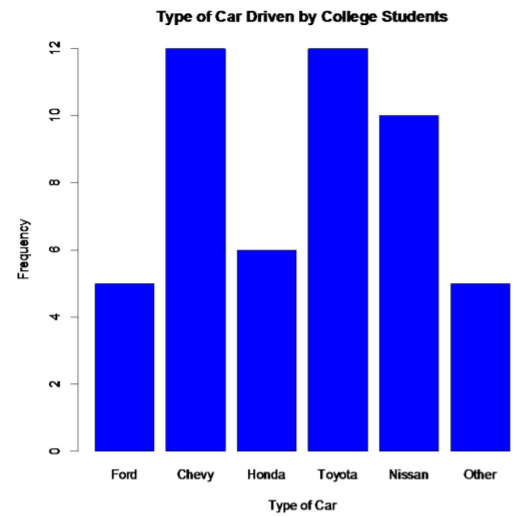.png?revision=1)
Notice from the graph, you can see that Toyota and Chevy are the most popular cars, with Nissan not far behind. Ford seems to be the type of car that is least liked; the cars labeled as others would be liked less than a Ford.
Some key features of a bar graph:
- Equal spacing between bars.
- Bars are the same width.
- There should be labels on each axis and a title for the graph.
- There should be a scaling on the y-axis, and the categories should be listed on the x-axis.
- The bars don’t touch.
You can also draw a bar graph using relative frequency on the y-axis. This is useful when comparing two samples with different sample sizes because it is better to compare by percentages/relative frequencies to see which categories are the most common. The relative frequency graph and the frequency graph should look the same, except for the scaling on the y-axis.
To construct a bar graph using relative frequencies:
- Put the relative frequency scales on the y-axis and the category on the x-axis.
- Draw a bar above each category with a height equal to its frequency.
- Label the y-axis, x-axis, and the graph using appropriate titles.
For this example, if the steps are done correctly, you should have a graph similar to the one below.
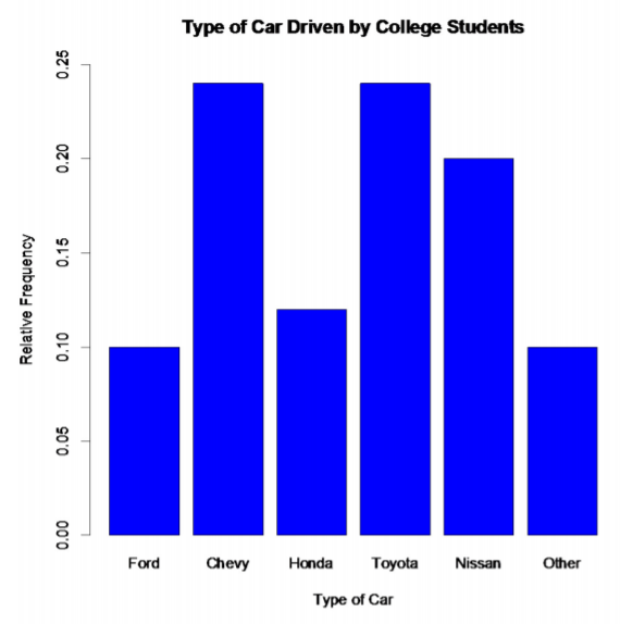.png?revision=1)
Pareto chart
A second type of categorical data graph is a Pareto chart, which is a bar graph with the bars sorted from the highest frequency to the lowest frequency, starting from the left. It is used to represent the vital few items. In this case, it will be the most popular car types. These are Chevy and Toyota. This is especially useful in business applications, where you want to know what services your customers like the most, what processes result in more injuries, which issues employees find more important, and other types of questions like these. Here is the Pareto chart for the data in Example \(\PageIndex{1}\).
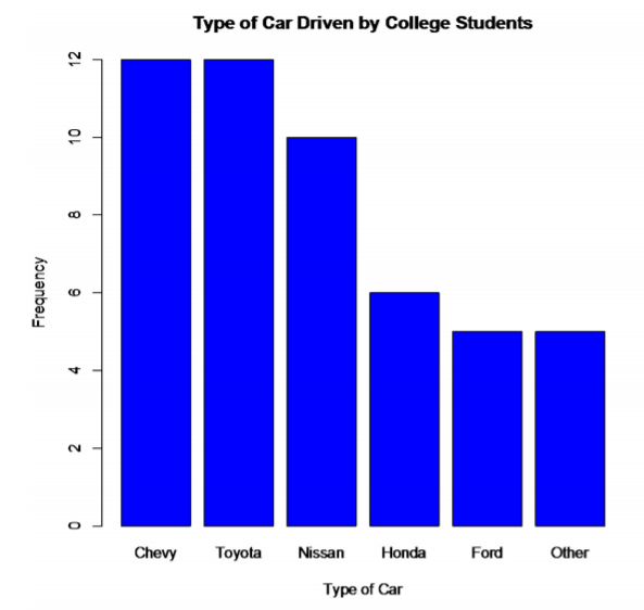.png?revision=1)
Pie Chart
The pie chart is a circle divided into sections according to the percentage of frequencies in each category. The formula for these percentages is P = f / n * 100%. Where P stands for percent, f for the frequency of each class, and n for the sum of all the frequencies. To draw each section, use the percentages (recall that a quarter of the circle equals 25%).
A random extended family has been selected, and their family members are documented and listed according to the age group below.
| Categories | |
|---|---|
| Children | 10 |
| Young Adults | 12 |
| Middle Age | 19 |
| Elderly | 8 |
Table \(\PageIndex{5}\): Age of Family Members
Solution
Guidelines for Creating a Pie Chart
- Compute the relative frequencies by dividing each frequency by the total frequency.
- Multiply each relative frequency by 100 to get the percentages.
- Draw a circle.
- Draw and label each section according to the percentage of each category.
| Categories | Frequency | Relative Frequency (Rounded to Two Decimal Places) | Percent |
|---|---|---|---|
| Children | 10 | 10/49 ≈ 0.20 | 0.20 \(\cdot\) 100 = 20% |
| Young Adults | 12 | 12/49 ≈ 0.24 | 0.24 \(\cdot\) 100 = 24% |
| Middle Age | 19 | 19/49 ≈ 0.39 | 0.39 \(\cdot\) 100 = 39% |
| Elderly | 8 | 8/49 ≈ 0.16 | 0.16 \(\cdot\) 100 = 16% |
Table \(\PageIndex{6}\): Age of Family Members With Relative Frequencies and Percents

We have a pie chart with four sections. The children section is represented by 20%. The young adults section is represented by 25%. The middle age section is represented by 39%. Finally, the elderly section is represented by 16%. The size of the slices is based on the percentages.
Draw a pie chart of the data in Example \(\PageIndex{1}\).
First, you need the relative frequencies.
| Category | Frequency | Relative Frequency |
|---|---|---|
| Ford | 5 | 0.10 |
| Chevy | 12 | 0.24 |
| Honda | 6 | 0.12 |
| Toyota | 12 | 0.24 |
| Nissan | 10 | 0.20 |
| Other | 5 | 0.10 |
| Total | 50 | 1.00 |
Second, multiply each relative frequency by 360° to obtain the angle measure for each category.
| Category | Relative Frequency | Angle (in degrees (°)) |
|---|---|---|
| Ford | 0.10 | 36.0 |
| Chevy | 0.24 | 86.4 |
| Honda | 0.12 | 43.2 |
| Toyota | 0.24 | 86.4 |
| Nissan | 0.20 | 72.0 |
| Other | 0.10 | 36.0 |
| Total | 1.00 | 360.0 |
Now draw the pie graph using a compass, protractor, and straight edge. Technology is preferred. If you use technology, there is no need for the relative frequencies or the angles.
The pie graph for this example should be like the one below.
.png?revision=1)
As you can see from the graph, Toyota and Chevy are the most popular car types, while the cars labeled other are liked the least. Based on the car types that are known, Ford is the least common one in the sample.
Authors
"2.1: Qualitative Data" by Toros Berberyan, Tracy Nguyen, and Alfie Swan is licensed under CC BY-SA 4.0
Attributions
"2.1: Qualitative Data" by Kathryn Kozak is licensed CC BY-SA 4.0
Exercises
- The table below shows the percentage of Arizona workers aged 16 and older who use carpool, drive alone, take public transportation, or other means of transportation.
| Transportation type | Percentage |
|---|---|
| Carpool | 11.6% |
| Private Vehicle (Alone) | 75.8% |
| Public Transportation | 2.0% |
| Other | 10.6% |
- Create a bar graph with the information provided above.
- Create a pie chart with the information provided above.
- What transportation type is the most common for Arizona workers?
- Which known transportation type is used by the fewest Arizona workers?
Scan the QR code or click on it to open the MyOpenMath version of the above question with step-by-step guidance.
MyOpenMath is a free online learning platform designed to support math instruction through automated homework, quizzes, and assessments. You must register for MyOpenMath and sign in to view the question.

- The number of deaths in the United States due to carbon monoxide (CO) poisoning from generators from the years 1999 to 2011 is provided below.
| Region | Number of Deaths from CO from Generators |
|---|---|
| Urban Core | 401 |
| Sub-Urban | 97 |
| Large Rural | 86 |
| Small Rural/Isolated | 111 |
- Create a bar graph with the information provided above.
- Find the relative frequency and percentage for each row of the table. Round relative frequency to two decimal places and percentage to the nearest whole number.
- Use the information from the table above and part b to create a pie chart.
- What region has the most deaths due to CO from generators?
- What region has the least deaths due to CO from generators?
Scan the QR code or click on it to open the MyOpenMath version of the above question with step-by-step guidance.
MyOpenMath is a free online learning platform designed to support math instruction through automated homework, quizzes, and assessments. You must register for MyOpenMath and sign in to view the question.

- In Connecticut, households use gas, fuel oil, or electricity as a heating source. The table below shows the percentage of households that use one of these as their principal heating source ("Electricity usage," 2013), ("Fuel oil usage," 2013), ("Gas usage," 2013).
| Heating Source | Percentage |
|---|---|
| Electricity | 15.3% |
| Fuel Oil | 46.3% |
| Gas | 35.6% |
| Other | 2.9% |
- Create a bar graph with the information provided above.
- Create a pie chart with the information provided above.
- Which one is the most common heat source in Connecticut?
- Which known heating source is the least commonly used in Connecticut?
Scan the QR code or click on it to open the MyOpenMath version of the above question with step-by-step guidance.
MyOpenMath is a free online learning platform designed to support math instruction through automated homework, quizzes, and assessments. You must register for MyOpenMath and sign in to view the question.

- Eyeglassomatic manufactures eyeglasses for different retailers. They test to see how many defective lenses they made from January 1 to March 31. The data below gives the defective type and the number of defects.
| Defect type | Number of Defects |
| Flaked | 1992 |
| Wrong axis | 1838 |
| Chamfer wrong | 1596 |
| Right shape - big | 1105 |
| Lost in lab | 976 |
| Scratch | 5865 |
| Right shaped - small | 4613 |
| Spots/bubble - intern | 976 |
| Crazing, cracks | 1546 |
| Wrong shape | 1485 |
| Spots and bubbles | 1371 |
| Wrong height | 1130 |
| Wrong PD | 1398 |
- Create a Pareto chart with the information provided above.
- Describe what Pareto chart tells you about what possibly causes the most defects.
Scan the QR code or click on it to open the MyOpenMath version of the above question with step-by-step guidance.
MyOpenMath is a free online learning platform designed to support math instruction through automated homework, quizzes, and assessments. You must register for MyOpenMath and sign in to view the question.

- A recent survey conducted at a local university revealed students' preferred study locations on campus. Here are the results, highlighting the percentage of students who favor each area for studying.
| Study Area | Popularity (%) |
| Library | 45% |
| Cafeteria | 15% |
| Outdoor Quad | 20% |
| Dorm Lounge | 10% |
| Computer Lab | 25% |
| STEM Center | 18% |
| Coffee Shop | 12% |
- Create a Pareto chart with the information provided above.
- Describe what the Pareto chart tells us about the most popular study area.
Scan the QR code or click on it to open the MyOpenMath version of the above question with step-by-step guidance.
MyOpenMath is a free online learning platform designed to support math instruction through automated homework, quizzes, and assessments. You must register for MyOpenMath and sign in to view the question.

- Answers
-
If you are an instructor and want the solutions to all the exercise questions for each section, please email Toros Berberyan.