Statistics LibreTexts

3.3.1: Bivariate Data and Scatterplots Review

  • Page ID
    28705
  • \( \newcommand{\vecs}[1]{\overset { \scriptstyle \rightharpoonup} {\mathbf{#1}} } \) \( \newcommand{\vecd}[1]{\overset{-\!-\!\rightharpoonup}{\vphantom{a}\smash {#1}}} \)\(\newcommand{\id}{\mathrm{id}}\) \( \newcommand{\Span}{\mathrm{span}}\) \( \newcommand{\kernel}{\mathrm{null}\,}\) \( \newcommand{\range}{\mathrm{range}\,}\) \( \newcommand{\RealPart}{\mathrm{Re}}\) \( \newcommand{\ImaginaryPart}{\mathrm{Im}}\) \( \newcommand{\Argument}{\mathrm{Arg}}\) \( \newcommand{\norm}[1]{\| #1 \|}\) \( \newcommand{\inner}[2]{\langle #1, #2 \rangle}\) \( \newcommand{\Span}{\mathrm{span}}\) \(\newcommand{\id}{\mathrm{id}}\) \( \newcommand{\Span}{\mathrm{span}}\) \( \newcommand{\kernel}{\mathrm{null}\,}\) \( \newcommand{\range}{\mathrm{range}\,}\) \( \newcommand{\RealPart}{\mathrm{Re}}\) \( \newcommand{\ImaginaryPart}{\mathrm{Im}}\) \( \newcommand{\Argument}{\mathrm{Arg}}\) \( \newcommand{\norm}[1]{\| #1 \|}\) \( \newcommand{\inner}[2]{\langle #1, #2 \rangle}\) \( \newcommand{\Span}{\mathrm{span}}\)\(\newcommand{\AA}{\unicode[.8,0]{x212B}}\)

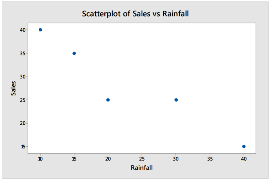
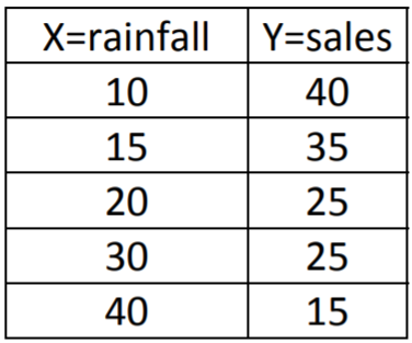
    In Chapter 3, we defined bivariate data as data that have two different numeric variables. In an algebra class, these are also known as ordered pairs. We will let X represent the independent (or explanatory) variable and Y represent the dependent (or response) variable in this definition. Here is an example of five total pairs in which X represents the annual rainfall in inches in a city and Y represents annual sales of sunglasses per 1000 population.  

    The best way to graph bivariate data is by using a Scatterplot in which X, the independent variable is the vertical axis and Y, the dependent variable is the horizontal axis.

    Example: Rainfall and sunglasses sales

    Here is an example and scatterplot of five total pairs where X represents the annual rainfall in inches in a city and Y represents annual sales of sunglasses per 1000 population.  

    clipboard_e30bace9e65d2447f597bcf134c87fb26.png

    Solution

    In the scatterplot for this data, it appears that cities with more rainfall have lower sales. It also appears that this relationship is linear, a pattern which can then be exemplified in a statistical model.

    clipboard_e7e1dd4c89b9f39a2cccb52f8a3d50f44.png


    3.3.1: Bivariate Data and Scatterplots Review is shared under a CC BY-SA license and was authored, remixed, and/or curated by LibreTexts.

    • Was this article helpful?