Statistics LibreTexts

3.4: Box Plots (Box and Whisker Plot)

  • Page ID
    20841
  • \( \newcommand{\vecs}[1]{\overset { \scriptstyle \rightharpoonup} {\mathbf{#1}} } \) \( \newcommand{\vecd}[1]{\overset{-\!-\!\rightharpoonup}{\vphantom{a}\smash {#1}}} \)\(\newcommand{\id}{\mathrm{id}}\) \( \newcommand{\Span}{\mathrm{span}}\) \( \newcommand{\kernel}{\mathrm{null}\,}\) \( \newcommand{\range}{\mathrm{range}\,}\) \( \newcommand{\RealPart}{\mathrm{Re}}\) \( \newcommand{\ImaginaryPart}{\mathrm{Im}}\) \( \newcommand{\Argument}{\mathrm{Arg}}\) \( \newcommand{\norm}[1]{\| #1 \|}\) \( \newcommand{\inner}[2]{\langle #1, #2 \rangle}\) \( \newcommand{\Span}{\mathrm{span}}\) \(\newcommand{\id}{\mathrm{id}}\) \( \newcommand{\Span}{\mathrm{span}}\) \( \newcommand{\kernel}{\mathrm{null}\,}\) \( \newcommand{\range}{\mathrm{range}\,}\) \( \newcommand{\RealPart}{\mathrm{Re}}\) \( \newcommand{\ImaginaryPart}{\mathrm{Im}}\) \( \newcommand{\Argument}{\mathrm{Arg}}\) \( \newcommand{\norm}[1]{\| #1 \|}\) \( \newcommand{\inner}[2]{\langle #1, #2 \rangle}\) \( \newcommand{\Span}{\mathrm{span}}\)\(\newcommand{\AA}{\unicode[.8,0]{x212B}}\)

    The box plot was created to represent the 3 quartiles (Q1, median and Q3) along with the minimum and maximum values of the data. These values are also called the Five Point Summary of the data. Let's start with a box plot of data with no outliers.

    Steps for making a box plot (no outliers)

    1. Draw the box between Q1 and Q3
    2. Accurately plot the median
    3. Draw whiskers to minimum and maximum values

    clipboard_ea10e92a3bfd93ddce244cb28fc1da0e9.png

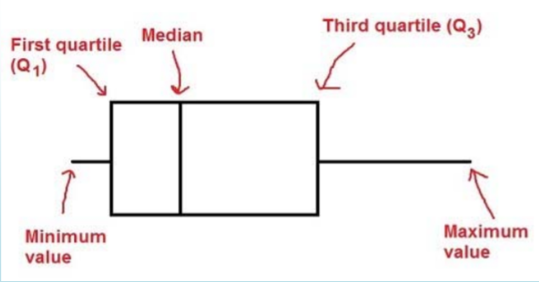
    Each section of the box plot represents 25% of the data. Box plots can be drawn horizontally or vertically.

    Example: Students browsing the web

    Let’s again  return to the example of daily minutes spent on the internet by 30 students. Find the five point summary, create a box plot and interpret the graph.

    clipboard_e6c5634e23b4b099e88cbc76871cafb16.png

    Solution

    Five point Summary:

    Minimum = 67    

    Q1=87        

    Median = 101.5      

    Q3=108      

    Maximum = 125

    Here are box plots representing these data values horizontally and vertically.

    clipboard_e8729ed32df12f54ec28b6b2c98328700.png

    clipboard_ef87631d7978ad7da7e9a770386941eac.png

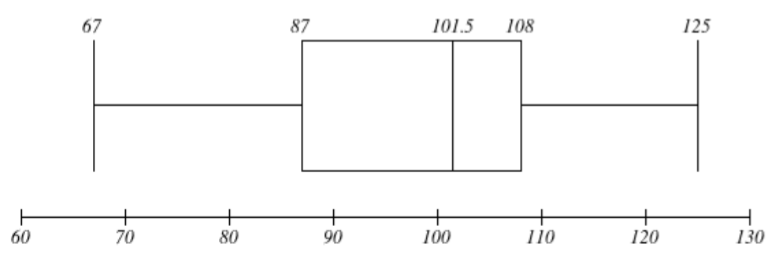
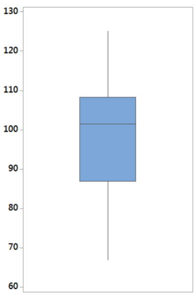
    You can chose either method to make a box plot.

    The center as represented by the median is 101.5 minutes.

    The spread as measured by the range  is 58 minutes.  

    The spread as measured by the IQR is 21 minutes (the middle 50% of the data).

    The data values are negatively skewed from the median.


    This page titled 3.4: Box Plots (Box and Whisker Plot) is shared under a CC BY-SA 4.0 license and was authored, remixed, and/or curated by Maurice A. Geraghty via source content that was edited to the style and standards of the LibreTexts platform; a detailed edit history is available upon request.