
Lab 11: More Regression
- Page ID
- 9055
\( \newcommand{\vecs}[1]{\overset { \scriptstyle \rightharpoonup} {\mathbf{#1}} } \)
\( \newcommand{\vecd}[1]{\overset{-\!-\!\rightharpoonup}{\vphantom{a}\smash {#1}}} \)
\( \newcommand{\id}{\mathrm{id}}\) \( \newcommand{\Span}{\mathrm{span}}\)
( \newcommand{\kernel}{\mathrm{null}\,}\) \( \newcommand{\range}{\mathrm{range}\,}\)
\( \newcommand{\RealPart}{\mathrm{Re}}\) \( \newcommand{\ImaginaryPart}{\mathrm{Im}}\)
\( \newcommand{\Argument}{\mathrm{Arg}}\) \( \newcommand{\norm}[1]{\| #1 \|}\)
\( \newcommand{\inner}[2]{\langle #1, #2 \rangle}\)
\( \newcommand{\Span}{\mathrm{span}}\)
\( \newcommand{\id}{\mathrm{id}}\)
\( \newcommand{\Span}{\mathrm{span}}\)
\( \newcommand{\kernel}{\mathrm{null}\,}\)
\( \newcommand{\range}{\mathrm{range}\,}\)
\( \newcommand{\RealPart}{\mathrm{Re}}\)
\( \newcommand{\ImaginaryPart}{\mathrm{Im}}\)
\( \newcommand{\Argument}{\mathrm{Arg}}\)
\( \newcommand{\norm}[1]{\| #1 \|}\)
\( \newcommand{\inner}[2]{\langle #1, #2 \rangle}\)
\( \newcommand{\Span}{\mathrm{span}}\) \( \newcommand{\AA}{\unicode[.8,0]{x212B}}\)
\( \newcommand{\vectorA}[1]{\vec{#1}} % arrow\)
\( \newcommand{\vectorAt}[1]{\vec{\text{#1}}} % arrow\)
\( \newcommand{\vectorB}[1]{\overset { \scriptstyle \rightharpoonup} {\mathbf{#1}} } \)
\( \newcommand{\vectorC}[1]{\textbf{#1}} \)
\( \newcommand{\vectorD}[1]{\overrightarrow{#1}} \)
\( \newcommand{\vectorDt}[1]{\overrightarrow{\text{#1}}} \)
\( \newcommand{\vectE}[1]{\overset{-\!-\!\rightharpoonup}{\vphantom{a}\smash{\mathbf {#1}}}} \)
\( \newcommand{\vecs}[1]{\overset { \scriptstyle \rightharpoonup} {\mathbf{#1}} } \)
\( \newcommand{\vecd}[1]{\overset{-\!-\!\rightharpoonup}{\vphantom{a}\smash {#1}}} \)
\(\newcommand{\avec}{\mathbf a}\) \(\newcommand{\bvec}{\mathbf b}\) \(\newcommand{\cvec}{\mathbf c}\) \(\newcommand{\dvec}{\mathbf d}\) \(\newcommand{\dtil}{\widetilde{\mathbf d}}\) \(\newcommand{\evec}{\mathbf e}\) \(\newcommand{\fvec}{\mathbf f}\) \(\newcommand{\nvec}{\mathbf n}\) \(\newcommand{\pvec}{\mathbf p}\) \(\newcommand{\qvec}{\mathbf q}\) \(\newcommand{\svec}{\mathbf s}\) \(\newcommand{\tvec}{\mathbf t}\) \(\newcommand{\uvec}{\mathbf u}\) \(\newcommand{\vvec}{\mathbf v}\) \(\newcommand{\wvec}{\mathbf w}\) \(\newcommand{\xvec}{\mathbf x}\) \(\newcommand{\yvec}{\mathbf y}\) \(\newcommand{\zvec}{\mathbf z}\) \(\newcommand{\rvec}{\mathbf r}\) \(\newcommand{\mvec}{\mathbf m}\) \(\newcommand{\zerovec}{\mathbf 0}\) \(\newcommand{\onevec}{\mathbf 1}\) \(\newcommand{\real}{\mathbb R}\) \(\newcommand{\twovec}[2]{\left[\begin{array}{r}#1 \\ #2 \end{array}\right]}\) \(\newcommand{\ctwovec}[2]{\left[\begin{array}{c}#1 \\ #2 \end{array}\right]}\) \(\newcommand{\threevec}[3]{\left[\begin{array}{r}#1 \\ #2 \\ #3 \end{array}\right]}\) \(\newcommand{\cthreevec}[3]{\left[\begin{array}{c}#1 \\ #2 \\ #3 \end{array}\right]}\) \(\newcommand{\fourvec}[4]{\left[\begin{array}{r}#1 \\ #2 \\ #3 \\ #4 \end{array}\right]}\) \(\newcommand{\cfourvec}[4]{\left[\begin{array}{c}#1 \\ #2 \\ #3 \\ #4 \end{array}\right]}\) \(\newcommand{\fivevec}[5]{\left[\begin{array}{r}#1 \\ #2 \\ #3 \\ #4 \\ #5 \\ \end{array}\right]}\) \(\newcommand{\cfivevec}[5]{\left[\begin{array}{c}#1 \\ #2 \\ #3 \\ #4 \\ #5 \\ \end{array}\right]}\) \(\newcommand{\mattwo}[4]{\left[\begin{array}{rr}#1 \amp #2 \\ #3 \amp #4 \\ \end{array}\right]}\) \(\newcommand{\laspan}[1]{\text{Span}\{#1\}}\) \(\newcommand{\bcal}{\cal B}\) \(\newcommand{\ccal}{\cal C}\) \(\newcommand{\scal}{\cal S}\) \(\newcommand{\wcal}{\cal W}\) \(\newcommand{\ecal}{\cal E}\) \(\newcommand{\coords}[2]{\left\{#1\right\}_{#2}}\) \(\newcommand{\gray}[1]{\color{gray}{#1}}\) \(\newcommand{\lgray}[1]{\color{lightgray}{#1}}\) \(\newcommand{\rank}{\operatorname{rank}}\) \(\newcommand{\row}{\text{Row}}\) \(\newcommand{\col}{\text{Col}}\) \(\renewcommand{\row}{\text{Row}}\) \(\newcommand{\nul}{\text{Nul}}\) \(\newcommand{\var}{\text{Var}}\) \(\newcommand{\corr}{\text{corr}}\) \(\newcommand{\len}[1]{\left|#1\right|}\) \(\newcommand{\bbar}{\overline{\bvec}}\) \(\newcommand{\bhat}{\widehat{\bvec}}\) \(\newcommand{\bperp}{\bvec^\perp}\) \(\newcommand{\xhat}{\widehat{\xvec}}\) \(\newcommand{\vhat}{\widehat{\vvec}}\) \(\newcommand{\uhat}{\widehat{\uvec}}\) \(\newcommand{\what}{\widehat{\wvec}}\) \(\newcommand{\Sighat}{\widehat{\Sigma}}\) \(\newcommand{\lt}{<}\) \(\newcommand{\gt}{>}\) \(\newcommand{\amp}{&}\) \(\definecolor{fillinmathshade}{gray}{0.9}\)Objectives:
- Understand how to interpret the correlation coefficient and determine when it indicates a significant linear relationship.
- Understand the difference between causation and association.
Introduction:
In the last lab we saw how to use R to construct least squares regression lines in order to fit linear models to data for the purpose of predicting the value of the response variable from values of the predictor variable. But before such a model is used in practice to make predictions, we should first determine whether or not the model (which is estimated from sample data) can reasonably be extended to the general population. In this lab, we further explore how to interpret correlation coefficients and how to determine when their values indicate that the linear relationship between two variables is significant.
Activities:
Getting Organized: If you are already organized, and remember the basic protocol from previous labs, you can skip this section.
Navigate to your class folder structure. Within your "Labs" folder make a subfolder called "Lab11". Next, download the lab notebook .Rmd file for this lab from Blackboard and save it in your "Lab11" folder. You will be working with the Cars.csv, TVlife.csv, and KYDerby.csv data sets on this lab. You should download the data files into your "Lab11" folder from Blackboard.
Within RStudio, navigate to your "Lab11" folder via the file browser in the lower right pane and then click "More > Set as working directory". Get set to write your observations and R commands in an R Markdown file by opening the "lab11_notebook.Rmd" file in RStudio. Remember to add your name as the author in line 3 of the document. For this lab, enter all of your commands into code chunks in the lab notebook. You can still experiment with code in an R script, if you want. To set up an R Script in RStudio, in the upper left corner click “File > New File > R script”. A new tab should open up in the upper left pane of RStudio.
Correlation Coefficient: A correlation coefficient for two variables will always be between -1 and +1, and it only equals one of those values when the variables are perfectly correlated, which is evident when observations form a perfectly straight line in a scatterplot. The sign of the correlation coefficient reflects the direction of the association (e.g., positive values of \(r\) correspond to a positive linear association). When the form of the association is linear, the magnitude of the correlation coefficient indicates the strength of the association, with values closer to -1 or +1, signifying a stronger linear association.
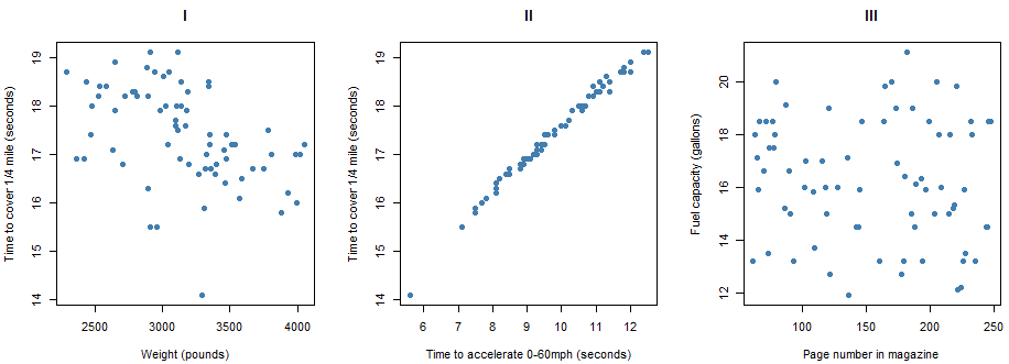
The nine scatterplots below pertain to models of cars described in Consumer Reports’ New Car Buying Guide. The eight variables represented here are the following:
- City MPG (in miles per gallon) rating
- Highway MPG (in miles per gallon) rating
- Weight (in pounds)
- Percentage of weight in the front half of the car
- Time to accelerate (in seconds) from 0 to 60 miles per hour
- Time to cover 1/4 mile (in seconds)
- Fuel capacity (in gallons)
- Page number of the magazine on which the car was described
Pause for Reflection #1:
Evaluate the direction and strength of the association between the variables in each scatterplot above. Do this by arranging the scatterplots for those that reveal the most strongly negative association between the variables, to those that reveal virtually no association, to those that reveal the most strongly positive association. Arrange them by number using the format of the following table.
Furthermore, match the following correlation coefficients to each scatterplot:
a. 0.888
b. 0.51
c. -0.89
d. -0.157
e. -0.45
f. 0.222
g. 0.994
h. -0.094
i. -0.69
_____________________________________________________
Pause for Reflection #2:
Comment on the results of the previous reflection. Specifically, reflect on why the strength and direction of the relationship between specific variables makes sense given the context. For example, scatterplot II looks at the relationship between the time to accelerate from 0 to 60 mph and the time to cover 1/4 mile. This scatterplot exhibits the strongest positive relationship. Why would the two variables considered here have the strongest positive relationship amongst all variables considered?
_____________________________________________________
Significant Correlation: The slope, or steepness, of the points in a scatterplot is unrelated to the value of the correlation coefficient. If the points fall on a perfectly straight line with a positive slope, then the correlation coefficient equals 1.0 whether that slope is very steep or not steep at all. In other words, correlation can be +1 for points lying on a line with slope \(m=0.1\) or slope \(m=10\). What matters for the magnitude of the correlation is how closely the points concentrate around a line, not the steepness of a line.
For example, look at scatterplots VI and IX above. The linear trend in each scatterplot is positive with a similar slope. However, the points in VI are more tightly clustered along the line while the points in IX are more spread out. So we would say that the association between the variables in VI (city and highway mpg rating) is stronger than the association between the variables in IX (city mpg rating and time to cover 1/4 mile). Thus, we could more confidently conclude that there appears to be a linear relationship between city mpg and highway mpg, i.e., make an inference about the population of cars based on the sample of cars we have data for.
This begs the question, when does a sample correlation coefficient provide sufficient evidence of a linear relationship between two variables? In other words, we are essentially asking when is a sample correlation coefficient significantly different from 0 (close enough to -1 or +1) in order to conclude a relationship in the population based on sample data)? This is equivalent to testing whether or not the slope of the least squares regression line is significantly different from 0. Let's demonstrate how to do this for the correlation coefficient between city mpg and highway mpg for the cars data.
cars = read.csv("Cars.csv")
lin.reg = lm(cars$HighwayMPG ~ cars$CityMPG)     # first, construct linear model
summary(lin.reg)                                 # second, display a summary of the info stored in the linear model

##
## Call:
## lm(formula = cars$HighwayMPG ~ cars$CityMPG
##
## Residuals:
##     Min         1Q    Median        3Q       Max
## -3.6782    -0.9211    0.0181    0.9574    3.4433
##
## Coefficients:
##              Estimate Std. Error t value Pr(>|t|)
## (Intercept)   9.19659    1.22854   7.486  1.5e-10 ***
## cars$CityMPG  0.93926    0.05781  16.247  < 2e-16 ***
## ---
## Signif. codes:  0 ‘***’ 0.001 ‘**’ 0.01 ‘*’ 0.05 ‘.’ 0.1 ‘ ’ 1
##
## Residual standard error: 1.421 on 71 degrees of freedom
## Multiple R-squared:  0.788,    Adjusted R-squared:  0.785
## F-statistic:   264 on 1 and 71 DF,  p-value: < 2.2e-16
There is quite a bit of information displayed when calling the summary() function on the stored results of the linear model function lm(). But the relevant information used for testing the significance of the linear relationship is the \(P\)-value associated to the test of whether the slope of the least squares regression line, i.e., the coefficient on the \(x\) variable (city mpg in this case), is significantly different from 0, which is highlighted in yellow. As we can see, the \(P\)-value is very small in this case (less than 2\(\times10^{-16}\)), which indicates that the slope is significantly different from 0 and thus so is the correlation coefficient.
Pause for Reflection #3:
Determine if the correlation coefficients between the pairs of variables in the following scatterplots from above for the cars data are significant.
- scatterplot IX
- scatterplot VIII
_____________________________________________________
Pause for Reflection #4:
Explain why it is equivalent to test whether the slope of the least squares line is significantly different from 0 in order to determine if the corresponding correlation coefficient is significantly different from 0.
_____________________________________________________
Correlation vs. Causation: We have to be very careful when interpreting correlation coefficients, especially when we find that they are significant. One of the major errors made in interpreting significant correlation between two variables is to conclude a cause-and-effect relationship between the variables.
For example, the data set TVlife.csv provides information on the life expectancy and number of televisions per thousand people in a sample of 22 countries, as reported by The World Almanac and Book of Facts. Suppose we are interested in predicting life expectancy in a country from the number of TVs.
Pause for Reflection #5:
Using the data in TVlife.csv, create a scatterplot of life expectancy vs. number of TVs.
Additionally, estimate the correlation coefficient between life expectancy and number of TVs. Is it significant?
Because the association between the variables is so strong, you might conclude that simply sending televisions to the countries with lower life expectancies would cause their inhabitants to live longer. Comment on this argument.
_____________________________________________________
This example illustrates the very important distinction between association and causation. Two variables might be strongly associated without having a cause-and-effect relationship between them. Often with observational studies, both variables are related to a third (confounding) variable.
Pause for Reflection #6:
In the case of life expectancy and television sets, suggest a confounding variable that is associated both with a country’s life expectancy and with the prevalence of televisions in that country.
_____________________________________________________
Non-linear Relationships: Another common mistake when interpreting correlation coefficients is to conclude that the relationship is linear. The correlation coefficient measures the degree of linear association between two quantitative variables. But even when two variables display a nonlinear relationship, the correlation between them still might be quite close to \(\pm\) 1. To demonstrate this consider the KYDerby.csv data set.
The Kentucky Derby is the most famous horse race in the world, held annually on the first Saturday in May at Churchill Downs race track in Louisville, Kentucky. This race has been called "The Most Exciting Two Minutes in Sports" because that’s about how long it takes for a horse to run its 1.25-mile track. The file KYDerby.csv contains the winning time (in seconds) for every year since 1896, when the track length was changed to 1.25 mile, along with the track condition (fast, good, or slow) on the day of the race.
Pause for Reflection #7:
Create a scatterplot of winning time (\(y\)) vs. year (\(x\)). Comment on the shape of the relationship between the variables.
Additionally, calculate the correlation coefficient and determine if it is significant.
_____________________________________________________
With these data, the relationship is clearly curved and not linear, and yet the correlation is still close to -1. Do not assume from a significant correlation coefficient that the relationship between the variables must be linear. Always look at a scatterplot, in conjunction with the correlation coefficient, to assess the form (linear or not) of the association.