
7.2.1: Can Samples Predict Populations?
- Page ID
- 17351

To understand whether samples can be used to describe population's, let start with a silly experiment Imagine that you had a gumball machine. We twist the dial with our right hand, and see how many green gumballs come out. We put the gumballs back in, then twist the dial with our left hand and count how many green gumballs come out. In sum, in each experiment we counted the green balls for the left and right hand. What we really want to know is if there is a difference between them. So, we can calculate the difference score (which is just subtracting one score from the other).
\[ Difference = X_L - X_R \nonumber \]
To show that the difference score is the of green gumballs from the left hand minus the number of green gumballs from the right hand. The difference should be zero, but sampling error produces some differences. The bars in Figure \(\PageIndex{1}\) shows the differences (note that it is not frequency chart) in the number of green gumballs ( \( Difference = X_L - X_R \)). Missing bars mean that there were an equal number of green gumballs chosen by the left and right hands (difference score is 0). A positive value means that more green gumballs were chosen by the left than right hand. A negative value means that more green gumballs were chosen by the right than left hand. Note that if we decided (and we get to decide) to calculate the difference in reverse (right hand - left hand), the signs of the differences scores would flip around.
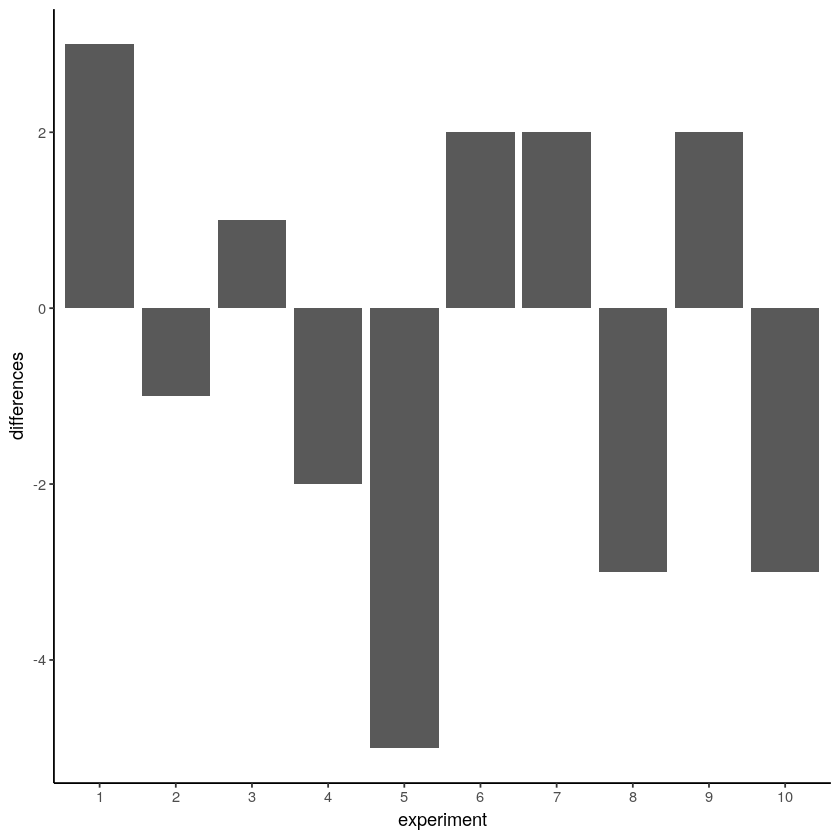
Figure \(\PageIndex{1}\)- Difference in Number of Green Gumballs from 10 Draws from Left and 10 Draws from Right Hand (CC-BY-SA Matthew J. C. Crump from Answering Questions with Data- Introductory Statistics for Psychology Students)
We are starting to see the differences that chance can produce. The difference scores are mostly between -2 to +2, meaning that there are usually not more than 2 more green gumballs when the left hand was chosen, and usually not few than 2 green gumballs, either. We could get an even better impression by running this pretend experiment 100 times instead of only 10 times. How about we do that (Figure \(\PageIndex{2}\)).
Ooph, we just ran so many simulated experiments that the x-axis is unreadable, but it goes from 1 to 100. Each bar represents the difference of number of green balls chosen randomly by the left or right hand. There are man kinds of differences that chance alone can produce!

Beginning to notice anything? Look at the y-axis, this shows the size of the difference. Yes, there are lots of bars of different sizes, this shows us that many kinds of differences do occur by chance. However, the y-axis is also restricted. It does not go from -10 to +10. Big differences (greater than 5 or -5) don’t happen very often.
Now that we have a method for simulating differences due to chance, let’s run 10,000 simulated experiments. But, instead of plotting the differences in a bar graph for each experiment, how about we look at the histogram of frequency of each difference score. This will give us a clearer picture about which differences happen most often, and which ones do not. This will be another window into chance. The chance window of differences.
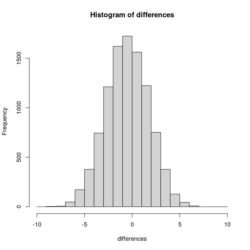
The most frequency difference in Figure \(\PageIndex{3}\) is 0, which is what we expect by chance, that neither hand has a special power to attract green gumballs. Although there can be differences as large as 10 green gumballs between each hand, larger differences occur less often by chance.
Exercise \(\PageIndex{1}\)
What does this histogram remind you of?
- Answer
-
Yep, a normal curve!
What else can this histogram tell us about chance? It can show that chance produces some differences more often than others. First, chance usually produces 0 differences, that’s the biggest bar in the middle. Second, chance can produce larger differences, but as the differences get larger (positive or negative), they occur less frequently. The shape of this histogram is your chance window, it tells you what chance can do, it tells you what chance usually does, and what it usually does not do.
OK, we have seen that chance can produce differences here. But, we still don’t have a good idea about what chance usually does and doesn’t do. For example, if we could find the window of opportunity here, we would be able find out that chance usually does not produce differences of a certain large size. If we knew what the size was, then if we ran experiment and our difference was bigger than what chance can do, we could be confident that chance did not produce our difference.
You can use this chance window to help you make inferences. If you ran yourself in the gumball experiment and found that your left hand chose 2 more green gumballs than red gumballs, would you conclude that you left hand was special, and caused you to choose more green gumballs? Hopefully not. You could look at the chance window and see that differences of size +2 do happen fairly often by chance alone. You should not be surprised if you got a +2 difference. However, what if your left hand chose 5 more green gumballs than red gumballs. Well, chance doesn’t do this very often, you might think something is up with your left hand. If you got a whopping 9 more green gumballs than red gumballs, you might really start to wonder. This is the kind of thing that could happen (it’s possible), but is very rare if the sample is randomly chosen. When you get things that almost never happen by chance, you can be more confident that the difference reflects a causal force that is not chance.
Bringing it Together
Okay, so what have we covered so far in this chapter.
First, populations are different from samples.
Second, that samples might be able to be used to predict population characteristics (parameters).
Finally, that even when the sample is from the population, it is not exactly like the population; the sample's mean and standard deviation are not going to be exactly the same at the population mean and standard deviation.
So, how can we tell when your sample is similar enough to the population that you can use the sample to predict the population? That's inferential statistics!