
2.8: Graphing Quantitative Date- Line Graphs
- Page ID
- 17305

Although line graphs are great at showing how data changes through time, we will mostly use line graphs to show frequency distributions; line graphs of frequency distributions are sometimes called frequency polygons, but that just reminds me of high school geometry. For example, the frequency table in Table 2.2.2 showed the frequency of final exam scores, a quantitative variable, while Figure \(\PageIndex{1}\) shows the same information but as a graph:
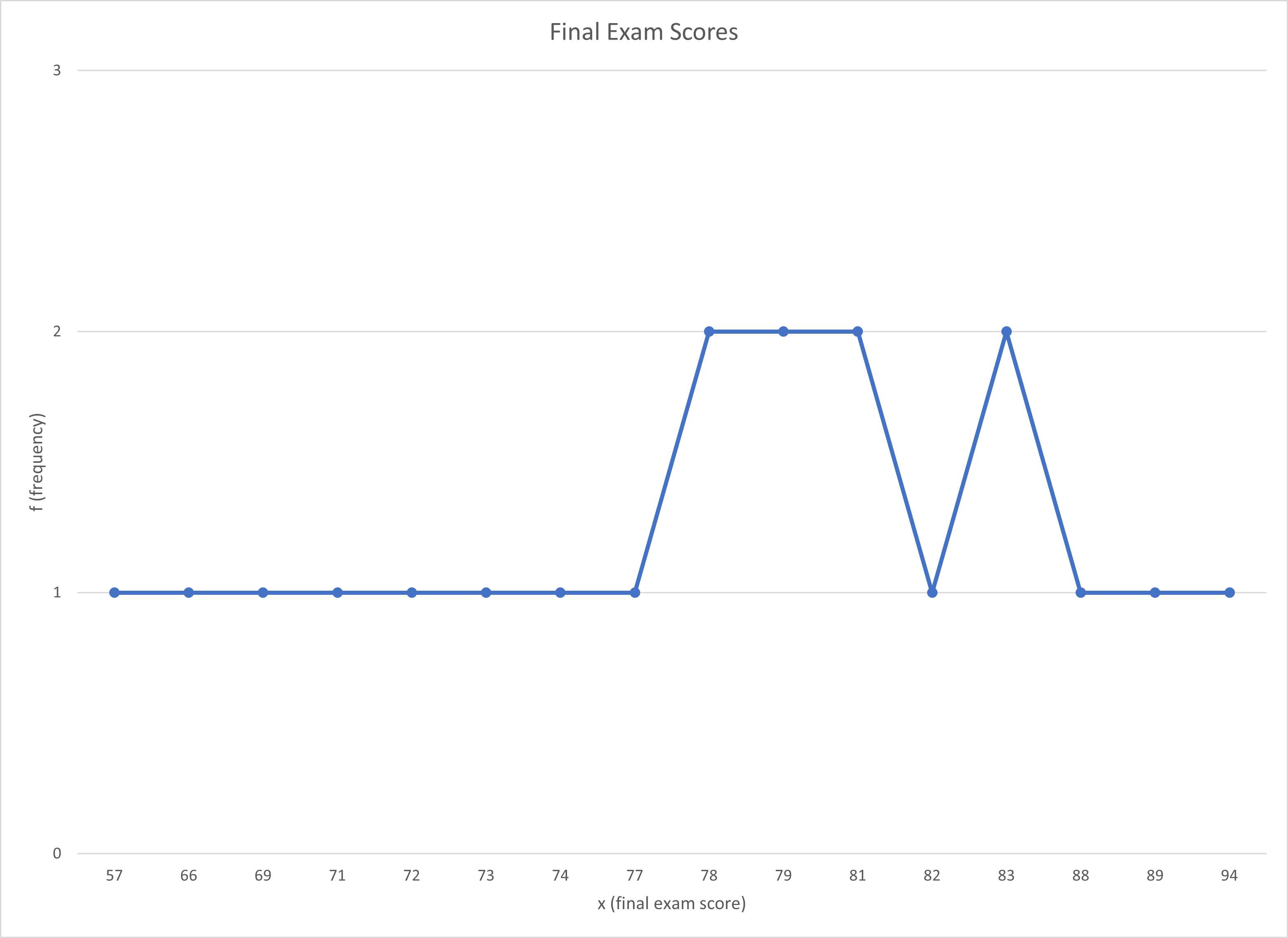
Let’s unpack Figure \(\PageIndex{1}\), as well. First, the x-axis has the same information as the “x” column in Figure 2.1, each score that was earned on the final exam. The x-axis is always the one on the bottom going from left to right. Because we are talking about a numerical variable (ratio scale of measurement; quantitative variable), the information on the x-axis is each score. In a line graph, you did not create your own categories; for example, you would not create categories based on letter grades. The scores should be from lowest to highest. Second, the y-axis shows the same information as the “f” column in Figure 2.2.2, the number of students who earned that score. The y-axis is always going up and down. This chart was also created with a common commercial spreadsheet software (Excel), and there are again fancier types of line graph. And again, the fancier a chart looks, the more difficult it is to easily and quickly understand what the chart is showing.
Interpreting Line Graphs
I added a question to your interpretations.
Note
Can you see which question was added? Why do you think it was added for line charts?
- What kind of graph is Figure \(\PageIndex{1}\)?
- This is a line graph. Line graphs are used to display quantitative data (or changes through time)
- What does the x-axis measure in Figure \(\PageIndex{1}\)?
- The x-axis on line graphs show each score (or each time period). The x-axis on line graphs shows each time period. In a line graph showing changes through time, the x-axis will always be some marker of time.
- What does the y-axis measure in Figure \(\PageIndex{1}\)?
- The y-axis is the axis that goes up and down. For most charts discussed in this textbook, the y-axis will be frequencies. However, the y-axis in Figure \(\PageIndex{2}\) shows the average percentages earned out of all points possible in the class each semester.
- [New question!] Is Figure \(\PageIndex{1}\) skewed? If so positively or negatively? If not, is the graph tall/narrow, medium/normal, or wide/flat?
- Because the tail is so long on th left and there seems to be a pile of scores towards the right, I would say that this line graph is negatively skewed. This seems backwards to me, so I looked back at Figure 2.xxx (the picture of the skewed charts). Because it is skewed, it can’t have kurtosis.
- What do you notice from Figure \(\PageIndex{1}\)? What pops out to you?
- Two things that pop out to me. First, there is a bump of more frequent scores between 78 to 83 points. This suggests that most students in this unknown class earned a C+ or a B- on the Final Exam. The second thing I notice is that the left tail is pretty long. This means there are also quite a few students who earned low scores on the Final Exam.
- What does Figure \(\PageIndex{1}\) make you wonder about?
- This chart makes me wonder if the professor ended up “curving” the exam since the highest score was 94 points, and that score was earned by only one student. The next highest score was 89 points, again with only one student earning that score on the Final Exam. If I haven’t said this before, THIS IS NOT MY CLASS.
- What is a catchy headline for Figure \(\PageIndex{1}\)?
- 85% of the Class Passed! [17 out of 20 students earned 70 points or higher]
- How could you summarize the info in Figure \(\PageIndex{1}\) into one sentence?
- Almost everyone in the class passed the Final Exam, but only one student earned more than 90 points.
- Who might want to know the information in Figure \(\PageIndex{1}\)?
- I would guess that students who are going to take this class from this professor might be interested. College administrators might also want to know so that they can see that most students are passing their classes.
Line Graphs Through Time
But for thoroughness, let’s also look at a line graph that shows data through time. Figure \(\PageIndex{2}\) shows the percentage of points earn out of all points in Dr. MO's behavioral statistics courses in seven consecutive semesters (starting in Fall 2013, and ending in Fall 2016 when she started teaching a modified version of the course).
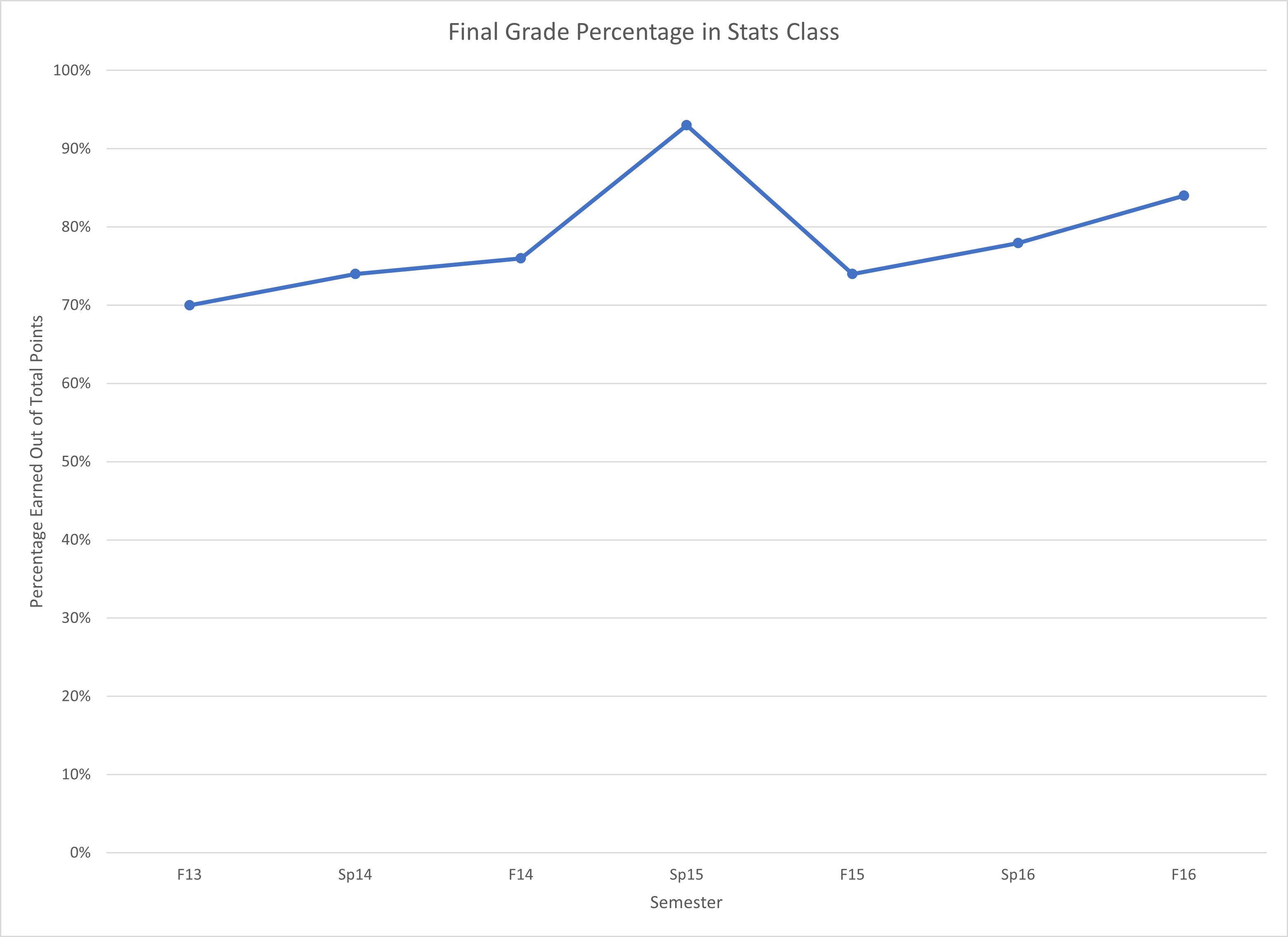
Unpacking Figure \(\PageIndex{2}\), what do you see? First, let’s compare Figure \(\PageIndex{2}\) to Figure \(\PageIndex{1}\). In Figure \(\PageIndex{1}\), the x-axis was each score, while in Figure \(\PageIndex{2}\) the x-axis is the time period. Similarly, in Figure \(\PageIndex{1}\), the y-axis in the frequency, the number of students who earned that score. In Figure \(\PageIndex{2}\), the y-axis is the percentage earned. Frequency distributions are really important for statistical analyses, but they aren’t the only type of chart that you’ll come across.
Interpreting Line Graphs
- What kind of graph is Figure \(\PageIndex{2}\)?
- This is a line graph. Line graphs are used to display quantitative data (or changes through time)
- What does the x-axis measure in Figure \(\PageIndex{2}\)?
- The x-axis on line graphs shows each time period. In a line graph showing changes through time, the x-axis will always be some marker of time.
- What does the y-axis measure in Figure \(\PageIndex{2}\)?
- The y-axis is the axis that goes up and down. For most charts discussed in this textbook, the y-axis will be frequencies. However, the y-axis in Figure \(\PageIndex{2}\) shows the average percentages earned out of all points possible in the class each semester.
- Is Figure \(\PageIndex{2}\) skewed? If so positively or negatively? If not, is the graph tall/narrow, medium/normal, or wide/flat?
- This question doesn't really make sense when the x-axis isn't scores (quantitative data points). In line graphs through time, we are looking for trends not kurtosis or skew.
- What do you notice from Figure \(\PageIndex{2}\)? What pops out to you?
-
- Spring 2015 was a great year for students!
- What does Figure \(\PageIndex{2}\) make you wonder about?
- What happened in Spring 2015?! And why didn't it keep happening?
- What is a catchy headline for Figure \(\PageIndex{2}\)?
- Average is Passing in Dr. MO's Behavioral Statistics Class
- How could you summarize the info in Figure \(\PageIndex{2}\) into one sentence?
- The average percentages were all passing, with Spring 2015 being a particularly high average score.
- Who might want to know the information in Figure \(\PageIndex{2}\)?
- I would guess that students who are going to take this class from this professor might be interested. College administrators might also want to know so that they can see that most students are passing this professor's class.
Another kind of graph that is used to show quantitative variables is a histogram, discussed next!
Contributors and Attributions
This page was extensively adapted by Michelle Oja (Taft College) from work by Matthew J. C. Crump (Brooklyn College of CUNY)