
11.1.1: Observing and Interpreting Variability
- Page ID
- 18081

Why is variability so important?
We have seen time and again that scores, be they individual data or group means, will differ naturally. Sometimes this is due to random chance, and other times it is due to actual differences. Our job as scientists, researchers, and data analysts is to determine if the observed differences are systematic and meaningful (via a hypothesis test) and, if so, what is causing those differences. Through this, it becomes clear that, although we are usually interested in the mean or average score, it is the variability in the scores that is key.
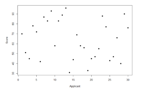
Take a look at Figure \(\PageIndex{1}\), which shows scores for many people on a test of skill used as part of a job application. The \(x\)-axis has each individual person, in no particular order, and the \(y\)-axis contains the score each person received on the test. As we can see, the job applicants differed quite a bit in their performance, and understanding why that is the case would be extremely useful information. However, there’s no interpretable pattern in the data, especially because we only have information on the test, not on any other variable (remember that the x-axis here only shows individual people and is not ordered or interpretable).
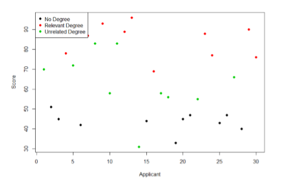
Our goal is to explain this variability that we are seeing in the dataset. Let’s assume that as part of the job application procedure we also collected data on the highest degree each applicant earned. With knowledge of what the job requires, we could sort our applicants into three groups: those applicants who have a college degree related to the job, those applicants who have a college degree that is not related to the job, and those applicants who did not earn a college degree. This is a common way that job applicants are sorted, and we can use a new kind of analysis to test if these groups are actually different. The new analysis is called ANOVA, standing for ANalysis Of VAriance. Figure \(\PageIndex{2}\) presents the same job applicant scores, but now they are color coded by group membership (i.e. which group they belong in). Now that we can differentiate between applicants this way, a pattern starts to emerge: those applicants with a relevant degree (coded red) tend to be near the top, those applicants with no college degree (coded black) tend to be near the bottom, and the applicants with an unrelated degree (coded green) tend to fall into the middle. However, even within these groups, there is still some variability, as shown in Figure \(\PageIndex{2}\).
This pattern is even easier to see when the applicants are sorted and organized into their respective groups, as shown in Figure \(\PageIndex{3}\).
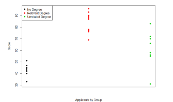
Now that we have our data visualized into an easily interpretable format, we can clearly see that our applicants’ scores differ largely along group lines. Those applicants who do not have a college degree received the lowest scores, those who had a degree relevant to the job received the highest scores, and those who did have a degree but one that is not related to the job tended to fall somewhere in the middle. Thus, we have systematic variance between our groups.
We can also clearly see that within each group, our applicants’ scores differed from one another. Those applicants without a degree tended to score very similarly, since the scores are clustered close together. Our group of applicants with relevant degrees varied a little but more than that, and our group of applicants with unrelated degrees varied quite a bit. It may be that there are other factors that cause the observed score differences within each group, or they could just be due to random chance. Because we do not have any other explanatory data in our dataset, the variability we observe within our groups is considered random error, with any deviations between a person and that person’s group mean caused only by chance. Thus, we have unsystematic (random) variance within our groups.
An ANOVA is a great way to be able to compare the differences (variance) between the groups, while taking into account the differences (variances) within each group: ANalyis Of VAriance.
The process and analyses used in ANOVA will take these two sources of variance (systematic variance between groups and random error within groups, or how much groups differ from each other and how much people differ within each group) and compare them to one another to determine if the groups have any explanatory value in our outcome variable. By doing this, we will test for statistically significant differences between the group means, just like we did for \(t\)-tests. We will go step by step to break down the math to see how ANOVA actually works.
Before we get into the calculations themselves, we must first lay out some important terminology and notation.
Variables & Notation
IV Levels
In ANOVA, we are working with two variables, a grouping or explanatory variable and a continuous outcome variable. The grouping variable is our predictor (it predicts or explains the values in the outcome variable) or, in experimental terms, our independent variable, and it made up of \(K\) groups, with \(K\) being any whole number 2 or greater. That is, ANOVA requires two or more groups to work, and it is usually conducted with three or more. In ANOVA, we refer to groups as “levels”, so the number of levels is just the number of groups, which again is \(K\). In the previous example, our grouping variable was education, which had three levels, so \(K\) = 3. When we report any descriptive value (e.g. mean, sample size, standard deviation) for a specific group or IV level, we will use a subscript to denote which group it refers to. For example, if we have three groups and want to report the standard deviation \(s\) for each group, we would report them as \(s_1\), \(s_2\), and \(s_3\).
To be more informative, it can be easier to use letters representing the group level names as subscripts instead of numbers. For example, if we have a high, medium, and low group, we could represent their means as: \(\overline{X}_{H}\), \(\overline{X}_{M}\), and \(\overline{X}_{L}\). This makes interpretation easier, as well, because you don't have to keep going back to see if the subscript of "1" was for the high group or if "1" represented the low group.
DV
Our second variable is our outcome variable. This is the variable on which people differ, and we are trying to explain or account for those differences based on group membership. In the example above, our outcome was the score each person earned on the test. Our outcome variable will still use \(X\) for scores as before. When describing the outcome variable using means, we will use subscripts to refer to specific group means. So if we have \(k\) = 3 groups, our means will be \(\overline{X_{1}}\), \(\overline{X_{2}}\), and \(\overline{X_{3}}\). We will also have a single mean representing the average of all participants across all groups. This is known as the grand mean, and we use the symbol \(\overline{X_{G}}\), sometimes call the mean of the total (\(\overline{X_{T}}\)). These different means – the individual group means and the overall grand mean – will be how we calculate our sums of squares.
Samples
Finally, we now have to differentiate between several different sample sizes. Our data will now have sample sizes for each group, and we will often denote these with a lower case “\(n\)” and a subscript, just like with our other descriptive statistics: \(n_1\), \(n_2\), and \(n_3\). We also have the overall sample size in our dataset, and we will denote this with a capital \(N\). The total sample size is just the group sample sizes added together. You don't have to get too caught up with lower case and upper case issues, as long as you use the subscripts to accurately identify which group you are talking about. If you see an upper case N with a subscript (\(N_{L}\)), you can be pretty confident that it's talking about the sample size of the Low group, even though it should probably be a lower case \(n\) for the group. To make things clear, you can also include a subscript for the total sample size (\(N_{T}\)) instead of relying only on the capitalization to identify the groups.
Now that we've covered that, let's learn a little bit more about how we will use these different kinds of variability in the ANOVA.
Contributors and Attributions
Foster et al. (University of Missouri-St. Louis, Rice University, & University of Houston, Downtown Campus)