
14.9: Final Considerations
- Page ID
- 22156

Correlations, although simple to calculate, and be very complex, and there are many additional issues we should consider. We will look at two of the most common issues that affect our correlations, as well as discuss reporting methods you may encounter.
Range Restriction
The strength of a correlation depends on how much variability is in each of the variables. This is evident in the formula for Pearson’s \(r\), which uses both covariance (based on the sum of products, which comes from deviation scores) and the standard deviation of both variables (which are based on the sums of squares, which also come from deviation scores). Thus, if we reduce the amount of variability in one or both variables, our correlation will go down (less variability = weaker correlation). Range restriction is one case when the full variability of a variable is missed.
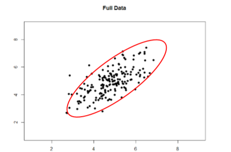
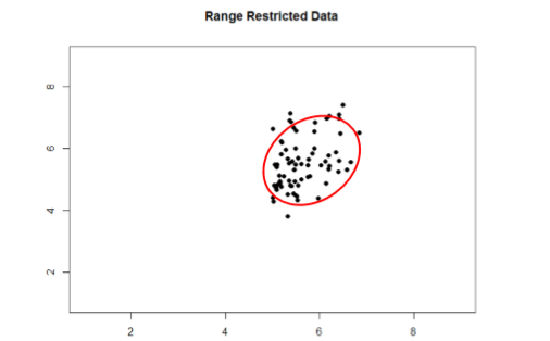
Take a look at Figures \(\PageIndex{1}\) and \(\PageIndex{2}\) below. The first shows a strong relation (\(r\) = 0.67) between two variables. An oval is overlain on top of it to make the relation even more distinct. The second figure shows the same data, but the bottom half of the \(X\) variable (all scores below 5) have been removed, which causes our relation (again represented by a red oval) to become much weaker (\(r\) = 0.38). Thus range restriction has truncated (made smaller) our observed correlation.
Sometimes range restriction happens by design. For example, we rarely hire people who do poorly on job applications, so we would not have the lower range of those predictor variables. Dr. MO's students researchers have asked for the ages of participants but offer a "30 years old or older" category or "under 18 years old" category. This restricts what the range of ages looks like because we have individual data points for everyone who is 18 to 29 years old, but then a clump of data points for those younger or older than that. Other times, we inadvertently cause range restriction by not properly sampling our population. Although there are ways to correct for range restriction, they are complicated and require much information that may not be known, so it is best to be very careful during the data collection process to avoid it.
Outliers
Another issue that can cause the observed size of our correlation to be inappropriately large or small is the presence of outliers. An outlier is a data point that falls far away from the rest of the observations in the dataset. Sometimes outliers are the result of incorrect data entry, poor or intentionally misleading responses, or simple random chance. Other times, however, they represent real people with meaningful values on our variables. The distinction between meaningful and accidental outliers is a difficult one that is based on the expert judgment of the researcher. Sometimes, we will remove the outlier (if we think it is an accident) or we may decide to keep it (if we find the scores to still be meaningful even though they are different). In one of her research studies, Dr. MO asked participants to read a brief story online (the IV was in the story), then click to the next page to answer questions on the story (DV). If participants clicked through the story in milliseconds, then Dr. MO removed their scores on the dependent variable from further analysis because they didn't actually experience the IV without actually reading the story.
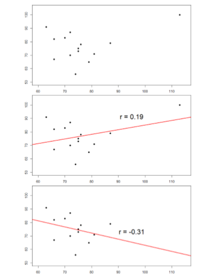
The plots below in Figure \(\PageIndex{3}\) show the effects that an outlier can have on data. In the first, we have our raw dataset. You can see in the upper right corner that there is an outlier observation that is very far from the rest of our observations on both the \(X\) and \(Y\) variables. In the middle, we see the correlation computed when we include the outlier, along with a straight line representing the relation; here, it is a positive relation. In the third image, we see the correlation after removing the outlier, along with a line showing the direction once again. Not only did the correlation get stronger, it completely changed direction!
In general, there are three effects that an outlier can have on a correlation: it can change the magnitude (make it stronger or weaker), it can change the significance (make a non-significant correlation significant or vice versa), and/or it can change the direction (make a positive relation negative or vice versa). Outliers are a big issue in small datasets where a single observation can have a strong weight compared to the rest. However, as our samples sizes get very large (into the hundreds), the effects of outliers diminishes because they are outweighed by the rest of the data. Nevertheless, no matter how large a dataset you have, it is always a good idea to screen for outliers, both statistically (using analyses that we do not cover here) and/or visually (using scatterplots).
Correlation Matrices
Many research studies look at the relation between more than two quantitative variables. In such situations, we could simply list all of our correlations, but that would take up a lot of space and make it difficult to quickly find the relation we are looking for. Instead, we create correlation matrices so that we can quickly and simply display our results. A matrix is like a grid that contains our values. There is one row and one column for each of our variables, and the intersections of the rows and columns for different variables contain the correlation for those two variables.
We can create a correlation matrix to quickly display the correlations between job satisfaction, well-being, burnout, and job performance. each. Such a matrix is shown below in Table \(\PageIndex{1}\).
| Satisfaction | Well-Being | Burnout | Performance | |
|---|---|---|---|---|
| Satisfaction | 1.00 | |||
| Well-Being | 0.41 | 1.00 | ||
| Burnout | -0.54 | -0.87 | 1.00 | |
| Performance | 0.08 | 0.21 | -0.33 | 1.00 |
Notice that there are values of 1.00 where each row and column of the same variable intersect. This is because a variable correlates perfectly with itself, so the value is always exactly 1.00. Also notice that the upper cells are left blank and only the cells below the diagonal of 1s are filled in. This is because correlation matrices are symmetrical: they have the same values above the diagonal as below it. Filling in both sides would provide redundant information and make it a bit harder to read the matrix, so we leave the upper triangle blank.
Correlation matrices are a very condensed way of presenting many results quickly, so they appear in almost all research studies that correkate several quantitative variables. Many matrices also include columns that show the variable means and standard deviations, as well as asterisks showing whether or not each correlation is statistically significant.
Summary
The principles of correlations underlie many other advanced analyses. In the next chapter, we will learn about regression, which is a formal way of running and analyzing a correlation that can be extended to more than two variables. Regression is a very powerful technique that serves as the basis for even our most advanced statistical models, so what we have learned in this chapter will open the door to an entire world of possibilities in data analysis.