
2.14: Describing Data using Distributions and Graphs Exercises
- Page ID
- 22020

At the end of most of the chapters will be a couple questions that go over some basic information in that chapter. However, most chapters will have whole sections to practice on, and those practice scenarios are much more helpful than the few problems at the end of the chapter. In this chapter, the real practice is when we interpreted what each graph was telling us. The problems at the end of the chapter are more like a review than actually helping you know what you know.
Either way, enjoy! And good luck! Here are some basic questions about graphs.
Name some ways to graph quantitative variables and some ways to graph qualitative variables.
- Answer
-
Qualitative variables are displayed using pie charts and bar charts. Quantitative variables are displayed as box plots, histograms, etc.
Pretend you are constructing a histogram for describing the distribution of salaries for individuals who are 40 years or older, but are not yet retired.
- What is on the Y-axis? Explain.
- What is on the X-axis? Explain.
- What would be the probable shape of the salary distribution? Explain why.
You do not need to draw the histogram, only describe it below.
- Answer
-
- The Y-axis would have the frequency because this is always the case in histograms.
- The X-axis has income, because this is out quantitative variable of interest.
- Because most income data are positively skewed, this histogram would likely be skewed positively too.
Which of the box plots on the graph has a large positive skew? Which has a large negative skew?
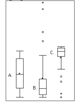
- Answer
-
Chart B has the positive skew because the outliers (dots and asterisks) are on the upper (higher) end; chart C has the negative skew because the outliers are on the lower end.
Explain the differences between bar charts and histograms. When would each be used?
- Answer
-
In bar charts, the bars do not touch; in histograms, the bars do touch. Bar charts are appropriate for qualitative variables, whereas histograms are better for quantitative variables.