
2.E: Describing Data using Distributions and Graphs (Exercises)
- Page ID
- 14462

\( \newcommand{\vecs}[1]{\overset { \scriptstyle \rightharpoonup} {\mathbf{#1}} } \) \( \newcommand{\vecd}[1]{\overset{-\!-\!\rightharpoonup}{\vphantom{a}\smash {#1}}} \)\(\newcommand{\id}{\mathrm{id}}\) \( \newcommand{\Span}{\mathrm{span}}\) \( \newcommand{\kernel}{\mathrm{null}\,}\) \( \newcommand{\range}{\mathrm{range}\,}\) \( \newcommand{\RealPart}{\mathrm{Re}}\) \( \newcommand{\ImaginaryPart}{\mathrm{Im}}\) \( \newcommand{\Argument}{\mathrm{Arg}}\) \( \newcommand{\norm}[1]{\| #1 \|}\) \( \newcommand{\inner}[2]{\langle #1, #2 \rangle}\) \( \newcommand{\Span}{\mathrm{span}}\) \(\newcommand{\id}{\mathrm{id}}\) \( \newcommand{\Span}{\mathrm{span}}\) \( \newcommand{\kernel}{\mathrm{null}\,}\) \( \newcommand{\range}{\mathrm{range}\,}\) \( \newcommand{\RealPart}{\mathrm{Re}}\) \( \newcommand{\ImaginaryPart}{\mathrm{Im}}\) \( \newcommand{\Argument}{\mathrm{Arg}}\) \( \newcommand{\norm}[1]{\| #1 \|}\) \( \newcommand{\inner}[2]{\langle #1, #2 \rangle}\) \( \newcommand{\Span}{\mathrm{span}}\)\(\newcommand{\AA}{\unicode[.8,0]{x212B}}\)
- Name some ways to graph quantitative variables and some ways to graph qualitative variables.
- Answer:
-
Qualitative variables are displayed using pie charts and bar charts. Quantitative variables are displayed as box plots, histograms, etc.
- Given the following data, construct a pie chart and a bar chart. Which do you think is the more appropriate or useful way to display the data?
| Favorite Movie Genre | Frequency |
|---|---|
| Comedy | 14 |
| Horror | 9 |
| Romance | 8 |
| Action | 12 |
- Pretend you are constructing a histogram for describing the distribution of salaries for individuals who are 40 years or older, but are not yet retired.
- What is on the Y-axis? Explain.
- What is on the X-axis? Explain.
- What would be the probable shape of the salary distribution? Explain why.
- Answer:
-
[You do not need to draw the histogram, only describe it below]
- The Y-axis would have the frequency or proportion because this is always the case in histograms
- The X-axis has income, because this is out quantitative variable of interest
- Because most income data are positively skewed, this histogram would likely be skewed positively too
- A graph appears below showing the number of adults and children who prefer each type of soda. There were 130 adults and kids surveyed. Discuss some ways in which the graph below could be improved.

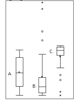
- Which of the box plots on the graph has a large positive skew? Which has a large negative skew?
- Answer:
-
Chart B has the positive skew because the outliers (dots and asterisks) are on the upper (higher) end; chart C has the negative skew because the outliers are on the lower end.
- Create a histogram of the following data representing how many shows children said they watch each day:
| Number of TV Shows | Frequency |
|---|---|
| 0 | 2 |
| 1 | 18 |
| 2 | 36 |
| 3 | 7 |
| 4 | 3 |
- Explain the differences between bar charts and histograms. When would each be used?
- Answer:
-
In bar charts, the bars do not touch; in histograms, the bars do touch. Bar charts are appropriate for qualitative variables, whereas histograms are better for quantitative variables.
- Draw a histogram of a distribution that is
- Negatively skewed
- Symmetrical
- Positively skewed
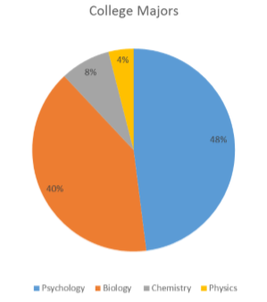
- Based on the pie chart below, which was made from a sample of 300 students, construct a frequency table of college majors.
- Answer:
-
Use the following dataset for the computations below:
Major Frequency Psychology 144 Biology 120 Chemistry 24 Physics 12
- Create a histogram of the following data. Label the tails and body and determine if it is skewed (and direction, if so) or symmetrical.
| Hours worked per week | Proportion |
|---|---|
| 0 -10 | 4 |
| 10 -20 | 8 |
| 20 - 30 | 11 |
| 30 - 40 | 51 |
| 40 - 50 | 12 |
| 50 - 60 | 9 |
| 60+ | 5 |