
Ch 2.2 Histogram
- Page ID
- 15881
2.2 Histogram
Histogram can be used to show distribution of medium to large quantitative data. Data are summarized into frequency classes.
- consists of contiguous (adjoining) bars. A Typical histogram should have about 5 to 15 bars or classes. Each bar represents one class of data.
- The horizontal axis is labeled with what the data represents in each class.
- The vertical axis is labeled either frequency or relative frequency.
- Histogram can show shape of distribution of the data, the center, and the spread of the data, but data cannot be recovered.
- Histogram can also show outliers that has a frequency of 1 or 2 but with large gap from the rest of data.
Ex1. The histogram below shows distribution of weights of players in a football team.

a) How many players are on the team?
sum of frequencies: 2 + 10 + 9 + 7 + 4 + 2 = 34
b) How many players weight 240 lb. or more?
sum of the last three frequencies: 7 + 4 + 2 = 13
c) Can we tell the actual weights of the players from the histogram?
no because we only have frequency for each class.
d) Are there any outliers?
No outliers.
Graph histogram from data
Method 1: Use Statdisk (statdisk.org) Histogram
- Input or copy and paste (ctrl-V) data to Sample Editor in a column.
- Select Data/Histogram.
- Select column where data is located.
- Enter Histogram Title, x and y-axis label.
-Use Statdisk default classes (Auto-fit) or select “user-defined”, enter “class-width” and “class start”. “Class start” must be lower or equal to the minimum value in the data.
- Select frequency or relative frequency.
- Click plot. screen shot to save the histogram.
- Find the class range by hovering over each bar.
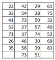
Ex1. Sketch a histogram for the following commute time. Use class width of 10 and lowest value of 20.

Method 2: Use Statdisk, Explore data.
- Enter data to one column,
- Select data, select Explore data-descriptive statistics.
- Select column, click evaluate.
- Summary statistics will be on the left and three graphs: Histogram (using auto-fit classes), boxplot and Normal quantile plot will be on the right.
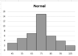
Ex2. Sketch a Histogram of number of customers in a sample of stores.
12, 34, 45, 67, 43, 55, 57, 89, 77, 72, 56, 37, 45, 49, 51
a) Use default class of statdisk. Copy Histogram below. Describe shape of distribution.
The shape of the dis tribution is symmetrical normal, bell shape.
b) Regraph histogram with classwidth of 12 and lowest class limit 10.
 use statdisk/data/select column 1/ click User-defined,
enter class width = 12
class start = 10
B) Other graphs for quantitative data:
Frequency polygon/relative frequency polygon – Use for large datasets from frequency distribution. Use a line to show frequency distribution instead of bars. Line starts and ends at the horizontal axis.

Multiple frequency polygons can be graphed on the same graph for comparing two or more datasets.
C) Shape of distribution and skewness
Histogram and frequency polygon can be used to show shape of distribution and skewness of data values.
Normal distribution means data are in a symmetrical bell shape.
Skewed to the right – most data are in the low values.
Skewed to the left – most data are in the high values.
Uniform – data are evenly distributed.


D) Time Series Graph:
Show trend of data collected over times. Data are not summarized. Time series graph shows increasing and decreasing data values over time.
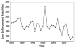
Data are represented by points connected with lines.
Graph time-series graph by Excel
- Input data with time in one column and data in another column.
- Select the data values, insert chart, line graph.
- Select the x-axis label, right click, select data, select
- Edit horizontal axis label by selecting the year column. Select Ok and Ok.
- Input Chart Title, x and y-axis label and marker