
3.2.1: Graphing Bivariate Data with Scatterplots
- Page ID
- 28701
A scatterplot is a useful graph for looking for relationships between two numeric variables. This relationship is called correlation. When performing correlation analysis, ask these questions:
- What is the direction of the correlation?
- What is the strength of the correlation?
- What is the shape of the correlation?
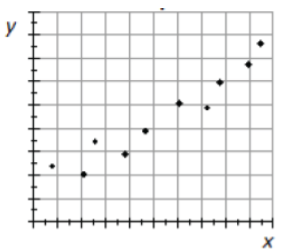
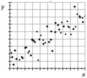
Example: Cucumber yield and rainfall
This scatterplot represents randomly collected data on growing season precipitation and cucumber yield. It is reasonable to suggest that the amount of water received on a field during the growing season will influence the yield of cucumbers growing on it.32
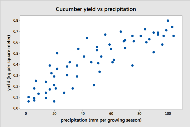
Solution
Direction: Correlation is positive, yield increases as precipitation increases.
Strength: There is a moderate to strong correlation.
Shape: Mostly linear, but there may be a slight downward curve in yield as precipitation increases.
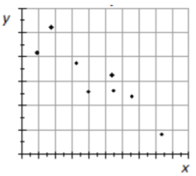
Example: GPA and missing class
A group of students at Georgia College conducted a survey asking random students various questions about their academic profile. One part of their study was to see if there is any correlation between various students’ GPA and classes missed.33
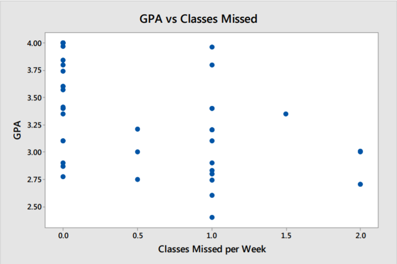
Solution
Direction: Correlation, if any, is negative. GPA trends lower for students who miss more classes.
Strength: There is a very weak correlation present.
Shape: Hard to tell, but a linear fit is not unreasonable.
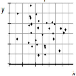
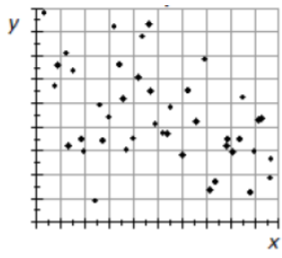
Example: Commute times and temperature
A mathematics instructor commutes by car from his home in San Francisco to De Anza College in Cupertino, California. For 100 randomly selected days during the year, the instructor recorded the commute time and the temperature in Cupertino at time of arrival.
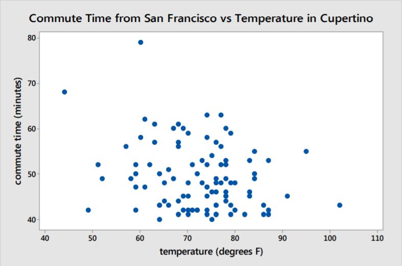
Solution
Direction: There is no obvious direction present.
Strength: There is no apparent correlation between commute time and temperature.
Shape: Since there is no apparent correlation, looking for a shape is meaningless.
Other: There are two outliers representing very long commute times.
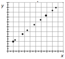
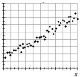
Example: Age of sugar maple trees
Is it possible to estimate the age of trees by measuring the diameters of the trunks? Data was reconstructed by a comprehensive study by the US Department of Agriculture. The researchers collected data for old growth sugar maple trees in northern US forests.34
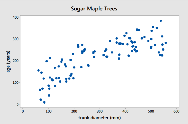
Solution
Direction: There is a positive correlation present. Age increases as trunk size increases.
Strength: The correlation is strong.
Shape: The shape of the graph is curved downward meaning the correlation is not linear.
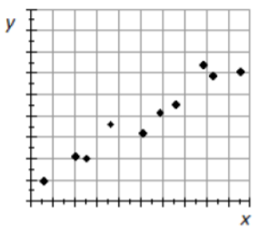
Example: Gun ownership and gun suicides
This scatterplot represents gun ownership and gun suicides for 73 different countries. The data is adjusted to rates per population for comparison purposes.35
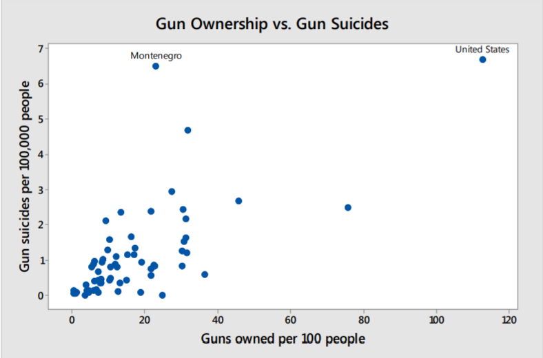
Solution
Direction: There is a positive correlation present. More gun ownership means more gun suicides.
Strength: The correlation is moderate for most data.
Shape: The shape of the graph is linear for most of the data.
Other: There are a few outliers in which gun ownership is much higher. There is also an outlier with an extremely high suicide rate.
This final example demonstrates that outliers can make it difficult to read graphs. For example, The United States has the highest gun ownership rates and the highest suicide by gun rates among these countries, making the United States stand far away from the bulk of the data in the scatterplot. Montenegro had the second highest suicide by gun rate, but with a much lower gun ownership rate.