
1.3.5.2: Dot Plots
- Page ID
- 28662
A dot plot represents each value of a data set as a dot on a simple numeric scale. Multiple values are stacked to create a shape for the data. If the data set is large, each dot can represent multiple values of the data.
Example: Weights of apples
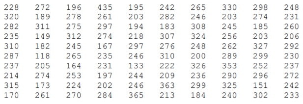
A Chilean agricultural researcher collected a sample of 100 Royal Gala apples.20 The weight of each apple (reported in grams) is shown in the table below:

Here is the data organized into a dot plot, in which each dot represents one apple. The scaling of the horizontal axis rounds each apple’s weight to the nearest 10 grams.
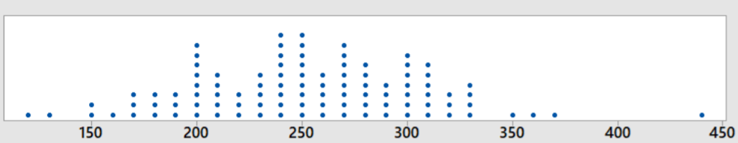
The center of the data is about 250, meaning that a typical apple would weight about 250 grams. The range of weights is between 110 and 440 grams, although the 440 gram apple is an outlier, an unusually large apple. The next highest weight is only 370 grams. Not counting the outlier, the data is symmetric and clustered towards the center.
Dot plots can also be used to compare multiple populations.
Example: Dot plots can also be used to compare multiple populations
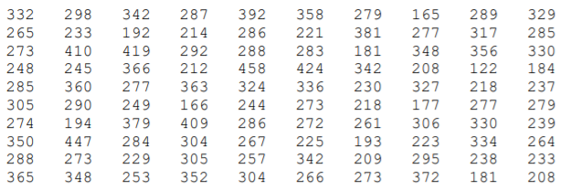
The Chilean agricultural researcher collected a sample of 100 navel oranges21 and recorded the weight of each orange in grams.

We can now add the weights of the oranges to the dot plot of the apple weights made in the prior example. The first chart keeps apples and oranges in separate graphs while the second chart combines data with a different marker for apples and orange. This second chart is called a stacked dot plot.
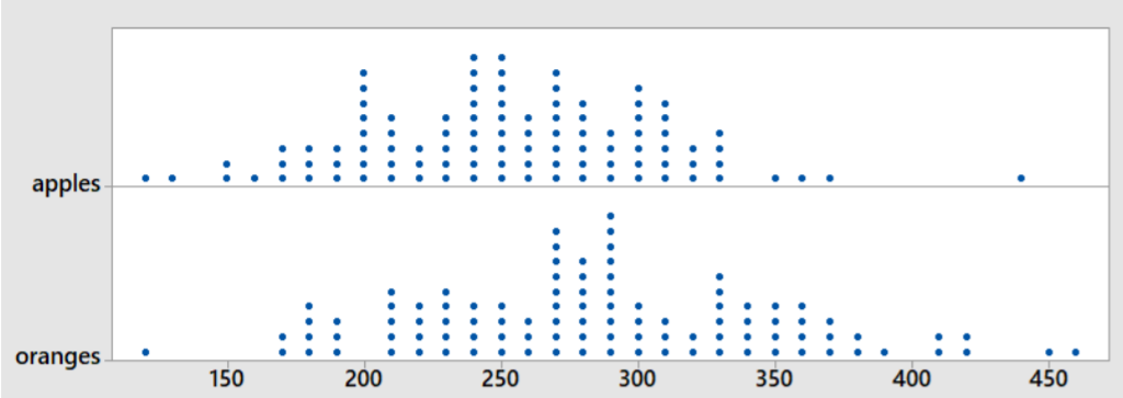
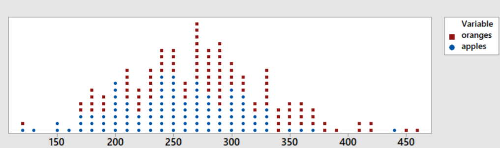
From the graphs, we can see that the typical orange weighs about 30 grams more than the typical apple. The spread of weights for apples and oranges is about the same. The shapes of both graphs are symmetric and clustered towards the center. There is a high outlier for apples at 440 grams and a low outlier for oranges at 120 grams.