
1.3.4: Graphs of Categorical Data
- Page ID
- 28659
When describing categorical data with graphs, we want to be able to visualize the difference in proportions or percentages within each group. These values are also known as relative frequencies.
Definition: Relative Frequency
n = sample size ‐ The number of observations in your sample size.
Frequency ‐ the number of times a particular value is observed.
Relative frequency ‐ The proportion or percentage of times a particular value is observed.
Relative Frequency = Frequency / n
Example: One categorical variable ‐ marital status
A sample of 500 adults (aged 18 and over) from Santa Clara County, California was taken from the year 2000 United States Census.14 The results are displayed in the table:
| Marital Status | Frequency | Relative Frequency |
|---|---|---|
| Married | 270 | 270/500 = 0.540 or 54.0% |
| Widowed | 22 | 22/500 = 0.044 or 4.4% |
| Divorced ‐ not remarried | 42 | 42/500 = 0.084 or 8.4% |
| Separated | 10 | 10/500 = 0.020 or 2.0% |
| Single ‐ never married | 156 | 156/500 = 0.312 or 31.2% |
| Total | 500 | 500/500 = 1.000 or 100.0% |
Solution
Analysis ‐ over half of the sampled adults were reported as married. The smallest group was separate which represented only 2% of the sample.
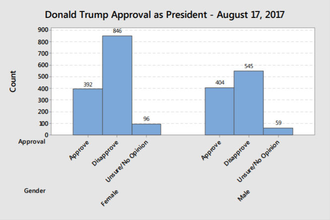
Example: Comparing two categorical variables ‐ presidential approval and gender
Reuters/Ipsos conducts a daily tracking poll of American adults to assess support of the president of the United States. Here are the results of a tracking poll ending August 17, 2017, which includes data from the five days on which Donald Trump made several highly controversial statements regarding violence following a gathering of neo‐Nazis and white supremacists in Charlottesville, Virginia. The question is "Overall, do you approve or disapprove of the way Donald Trump is handling his job as president?"15
| Female Frequency | Male Frequency | Female Relative Frequency | Male Relative Frequency | |
|---|---|---|---|---|
| Approve | 392 | 404 | 0.295 or 29.5% | 0.400 or 40.0% |
| Disapprove | 846 | 545 | 0.634 or 63.4% | 0.541 or 54.1% |
| Unsure/No Opinion | 96 | 59 | 0.079 or 7.9% | 0.059 or 5.9% |
| Total | 1334 | 1008 | 1.000 or 100% | 1.000 or 100% |
Solution
Analysis – Both men and women disapproved of the way Donald Trump was handling his job as president on the date of the poll. Women had a higher disapproval rate than men. In political science, this is called a gender gap.
Bar Graphs
One way to represent categorical data is on a bar graph, where the height of the bar can represent the frequency or relative frequency of each choice.
The graphs below represent the marital status information from the one categorical example. The vertical axis on the first graph shows frequencies for each group, while the second graph shows the relative frequencies (shown here as percentages).
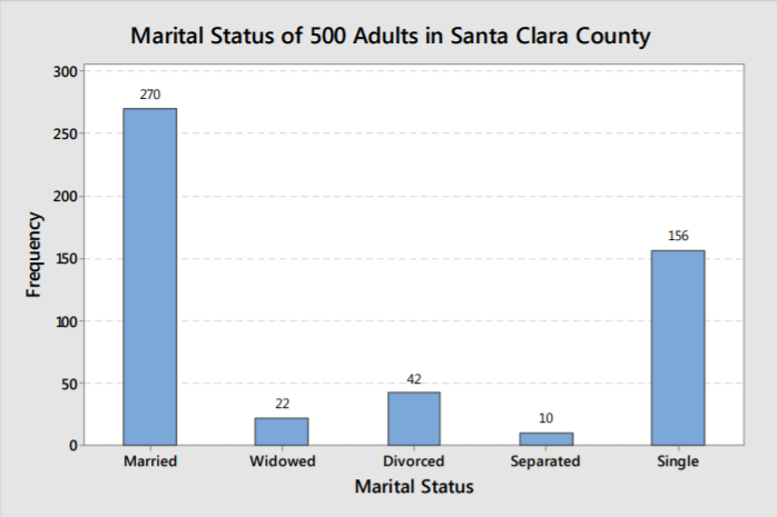
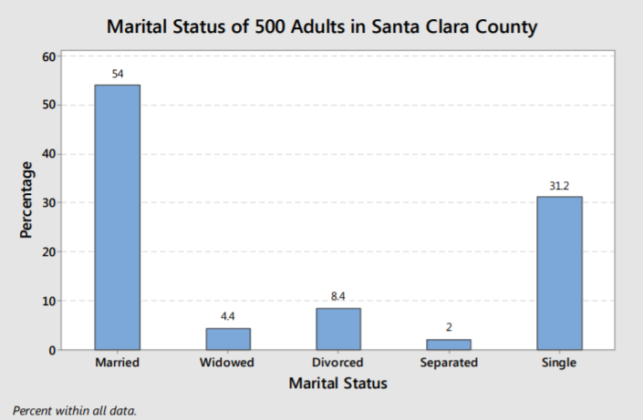
There is no difference in the shape of each graph as the percentage or frequency in each group is directly proportional to the area of each bar.
In either case, we can make the same analysis, that married and single are the most frequently occurring marital statuses.
A clustered bar graph can be used to compare categorical variables, such as the presidential approval poll cross‐ tabulated by gender. You can see in this graph that women have a much stronger disapproval of Trump than men do. In this graph, the vertical axis is frequency, but you could also make the vertical axis relative frequency or percentage.
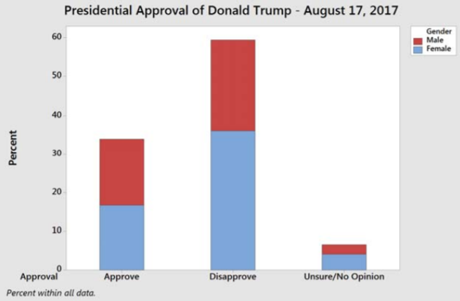
Another way of representing the same data is a stacked bar graph, shown here with percentage (relative frequency) as the vertical axis. It is harder to see the difference between men and women, but the total approval/disapproval percentages are easier to read.
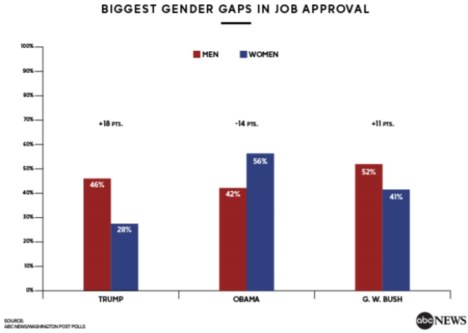
Example: Historic gender gaps
Here is another clustered bar graph reported by ABC News, August 21, showing that Trump had a larger gender gap than the two prior presidents, Barack Obama and George W. Bush.16
In conclusion, bar graphs are an excellent way to display, analyze and compare categorical data. However, care must be taken to not create misleading graphs.
Example: Misreported Affordable Care Act enrollment
Here is an example of a bar graph reported on the Fox News Channel that distorted the truth about people signing up for the Affordable Care Act (ACA) in 2014, as reported by mediamatters.org17
On March 27 health insurance enrollment through the ACA's exchanges surpassed 6 million, exceeding the revised estimate of enrollees for the program's first year before the March 31 open enrollment deadline. Enrollment appears on track to hit the Congressional Budget Office's initial estimate of 7 million sign‐ups, and taking Medicaid enrollees into account, the ACA will have reportedly extended health care coverage to at least 9.5 million previously uninsured individuals.
Fox celebrated the final day of open enrollment by attempting to somehow twist the recent enrollment surge into bad news for the law.
America's Newsroom aired an extremely skewed bar chart which made it appear that the 6 million enrollees comprised roughly one‐third of the 7 million enrollee goal:
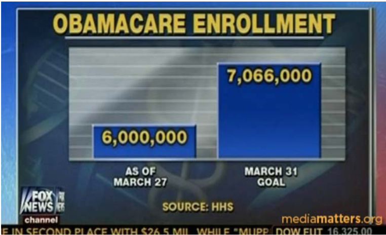
At first look, the graph seemingly shows that the ACA enrollment was well below the projected goal. The graph is misleading for three reasons:
- The vertical axis doesn’t start at zero enrollees, greatly overstating the difference between the two numbers.
- The graph of the “6,000,000” enrolled failed to include new enrollees in Medicaid, which was part of the “March 31 Goal.”
- The reported enrollment was 4 days before the deadline. Like students doing their homework, many people waited until the last day to enroll.
The actual enrollment numbers far exceeded the goal, the exact opposite of this poorly constructed bar graph.
Pie Charts
Another way to represent categorical data is a pie chart, in which each slice of the pie represents the relative frequency or percentage of data in each category.
The pie chart shown here represents the marital status of 500 adults in Santa Clara County taken from the 200 census, the same data that was represented by a bar graph in a previous example.
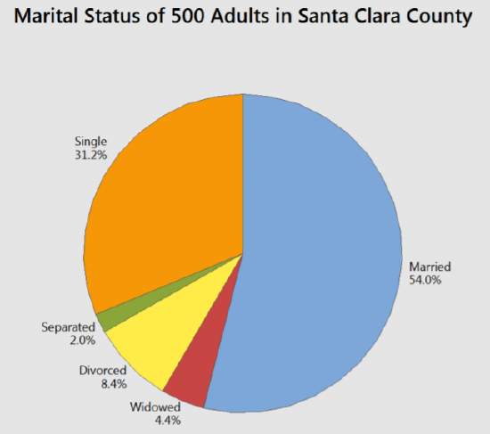
The analysis again shows that most people are married, followed by single.
A multiple pie chart can be used to compare the effect of one categorical variable on another.
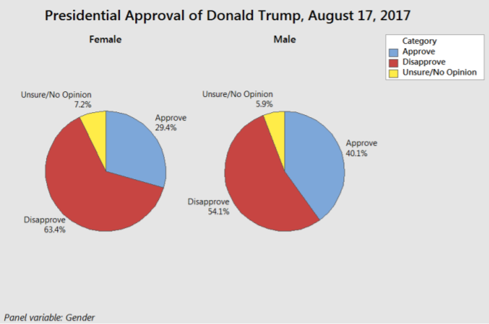
In the presidential approval poll example, a higher percentage of female adults disapprove of Donald Trump's performance as U.S. President compared to male adults. This is comparable to stacked or clustered bar graphs shown in the prior example.