
3.3: Ranking
- Page ID
- 5173

Along with the center and the variability, another useful numerical measure is the ranking of a number. A percentile is a measure of ranking. It represents a location measurement of a data value to the rest of the values. Many standardized tests give the results as a percentile. Doctors also use percentiles to track a child’s growth.
The kth percentile is the data value that has k% of the data at or below that value.
Example \(\PageIndex{1}\) interpreting percentile
- What does a score of the 90th percentile mean?
- What does a score of the 70th percentile mean?
Solution
- This means that 90% of the scores were at or below this score. (A person did the same as or better than 90% of the test takers.)
- This means that 70% of the scores were at or below this score.
Example \(\PageIndex{2}\) percentile versus score
If the test was out of 100 points and you scored at the 80th percentile, what was your score on the test?
Solution
You don’t know! All you know is that you scored the same as or better than 80% of the people who took the test. If all the scores were really low, you could have still failed the test. On the other hand, if many of the scores were high you could have gotten a 95% or so.
There are special percentiles called quartiles. Quartiles are numbers that divide the data into fourths. One fourth (or a quarter) of the data falls between consecutive quartiles.
Definition \(\PageIndex{1}\)
To find the quartiles:
- Sort the data in increasing order.
- Find the median, this divides the data list into 2 halves.
- Find the median of the data below the median. This value is Q1.
- Find the median of the data above the median. This value is Q3.
Ignore the median in both calculations for Q1 and Q3
If you record the quartiles together with the maximum and minimum you have five numbers. This is known as the five-number summary. The five-number summary consists of the minimum, the first quartile (Q1), the median, the third quartile (Q3), and the maximum (in that order).
The interquartile range, IQR, is the difference between the first and third quartiles, Q1 and Q3. Half of the data (50%) falls in the interquartile range. If the IQR is “large” the data is spread out and if the IQR is “small” the data is closer together.
Definition \(\PageIndex{2}\)
Interquartile Range (IQR)
IQR = Q3 - Q1
Determining probable outliers from IQR: fences
A value that is less than Q1-\(1.5*\)IQR (this value is often referred to as a low fence) is considered an outlier.
Similarly, a value that is more than Q3\(+1.5*\)IQR (the high fence) is considered an outlier.
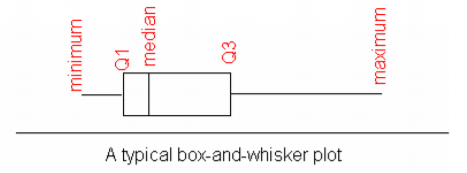
A box plot (or box-and-whisker plot) is a graphical display of the five-number summary. It can be drawn vertically or horizontally. The basic format is a box from Q1 to Q3, a vertical line across the box for the median and horizontal lines as whiskers extending out each end to the minimum and maximum. The minimum and maximum can be represented with dots. Don’t forget to label the tick marks on the number line and give the graph a title.
An alternate form of a Box-and-Whiskers Plot, known as a modified box plot, only extends the left line to the smallest value greater than the low fence, and extends the left line to the largest value less than the high fence, and displays markers (dots, circles or asterisks) for each outlier.
If the data are symmetrical, then the box plot will be visibly symmetrical. If the data distribution has a left skew or a right skew, the line on that side of the box plot will be visibly long. If the plot is symmetrical, and the four quartiles are all about the same length, then the data are likely a near uniform distribution. If a box plot is symmetrical, and both outside lines are noticeably longer than the Q1 to median and median to Q3 distance, the distribution is then probably bell-shaped.
.png?revision=1)
Example \(\PageIndex{3}\) five-number summary for an even number of data points
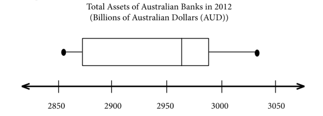
The total assets in billions of Australian dollars (AUD) of Australian banks for the year 2012 are given in Example \(\PageIndex{1}\) ("Reserve bank of," 2013). Find the five-number summary and the interquartile range (IQR), and draw a box-and-whiskers plot.
| 2855 | 2862 | 2861 | 2884 | 3014 | 2965 |
| 2971 | 3002 | 3032 | 2950 | 2967 | 2964 |
Solution
Variable: \(x =\) total assets of Australian banks
First sort the data.
| 2855 | 2861 | 2862 | 2884 | 2950 | 2964 | 2965 | 2967 | 2971 | 3002 | 3014 | 3032 |
The minimum is 2855 billion AUD and the maximum is 3032 billion AUD.
There are 12 data points so the median is the average of the 6th and 7th numbers.
.png?revision=1)
Table \(\PageIndex{3}\): Sorted Data for Total Assets with Median
To find QI, find the median of the first half of the list.
.png?revision=1)
Table \(\PageIndex{4}\): Finding QI
To find Q3, find the median of the second half of the list.
.png?revision=1)
Table \(\PageIndex{5}\): Finding Q3
The five-number summary is (all numbers in billion AUD)
Minimum: 2855
Q1: 2873
Median: 2964.5
Q3: 2986.5
Maximum: 3032
To find the interquartile range, IQR, find Q3-Q1
IQR = 2986.5 - 2873 = 113.5 billion AUD
This tells you the middle 50% of assets were within 113.5 billion AUD of each other.
You can use the five-number summary to draw the box-and-whiskers plot.
.png?revision=1)
The distribution is skewed right because the right tail is longer.
Example \(\PageIndex{4}\) five-number summary for an odd number of data points
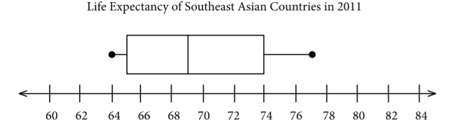
The life expectancy for a person living in one of 11 countries in the region of South East Asia in 2012 is given below ("Life expectancy in," 2013). Find the five-number summary for the data and the IQR, then draw a box-and-whiskers plot.
| 70 | 67 | 69 | 65 | 69 | 77 |
| 65 | 68 | 75 | 74 | 64 |
Solution
Variable: \(x =\) life expectancy of a person.
Sort the data first.
| 64 | 65 | 65 | 67 | 68 | 69 | 69 | 70 | 74 | 75 | 77 |
The minimum is 64 years and the maximum is 77 years.
There are 11 data points so the median is the 6th number in the list.
.png?revision=1)
Table \(\PageIndex{8}\): Finding the Median of Life Expectancies
Finding the Q1 and Q3 you need to find the median of the numbers below the median and above the median. The median is not included in either calculation.
.png?revision=1)
Table \(\PageIndex{9}\): Finding Q1
.png?revision=1)
Table \(\PageIndex{10}\): Finding Q3
Q1=65 years and Q3=74 years
The five-number summary is (in years)
Minimum: 64
Q1: 65
Median: 69
Q3: 74
Maximum: 77
To find the interquartile range (IQR)
IQR=Q3-Q1=74-65=9 years
The middle 50% of life expectancies are within 9 years.
.png?revision=1)
This distribution looks somewhat skewed right, since the whisker is longer on the right. However, it could be considered almost symmetric too since the box looks somewhat symmetric.
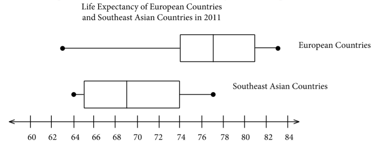
You can draw 2 box plots side by side (or one above the other) to compare 2 samples. Since you want to compare the two data sets, make sure the box plots are on the same axes. As an example, suppose you look at the box-and-whiskers plot for life expectancy for European countries and Southeast Asian countries.
.png?revision=1)
Looking at the box-and-whiskers plot, you will notice that the three quartiles for life expectancy are all higher for the European countries, yet the minimum life expectancy for the European countries is less than that for the Southeast Asian countries. The life expectancy for the European countries appears to be skewed left, while the life expectancies for the Southeast Asian countries appear to be more symmetric. There are of course more qualities that can be compared between the two graphs.
To find the five-number summary using R, the command is:
variable<-c(type in data with commas)
summary(variable)
This command will give you the five number summary and the mean.
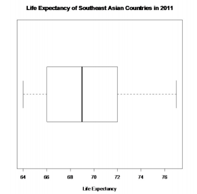
For Example \(\PageIndex{4}\), the commands would be
expectancy<-c(70, 67, 69, 65, 69, 77, 65, 68, 75, 74, 64)
summary(expectancy)
The output would be:
\(\begin{array}{cccccc}{\text { Min.}} & {\text{ Ist Qu.}} & {\text{Median}} & {\text{Mean}} & {\text{3rd Qu.}} & {\text{Max.}} \\ {64.00} & {66.00} & {69.00} & {69.36} & {72.00} & {77.00} \end{array}\)
To draw the box plot the command is boxplot(variable, main="title you want", xlab="label you want", horizontal = TRUE). The horizontal = TRUE orients the box plot to be horizontal. If you leave that part off, the box plot will be vertical by default.
For Example \(\PageIndex{4}\), the command is
boxplot(expectancy, main="Life Expectancy of Southeast Asian Countries in 2011",horizontal=TRUE, xlab="Life Expectancy")
You should get the box plot in Graph 3.3.4.
.png?revision=1)
This is known as a modified box plot. Instead of plotting the maximum and minimum, the box plot has as a lower line Q1-1.5*IQR , and as an upper line, Q3+1.5*IQR. Any values below the lower line or above the upper line are considered outliers. Outliers are plotted as dots on the modified box plot. This data set does not have any outliers.
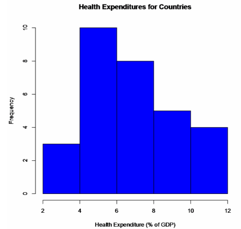
Example \(\PageIndex{5}\) putting it all together
A random sample was collected on the health expenditures (as a % of GDP) of countries around the world. The data is in Example \(\PageIndex{11}\). Using graphical and numerical descriptive statistics, analyze the data and use it to predict the health expenditures of all countries in the world.
| 3.35 | 5.94 | 10.64 | 5.24 | 3.79 | 5.65 | 7.66 | 7.38 | 5.87 | 11.15 |
| 5.96 | 4.78 | 7.75 | 2.72 | 9.50 | 7.69 | 10.05 | 11.96 | 8.18 | 6.74 |
| 5.89 | 6.20 | 5.98 | 8.83 | 6.78 | 6.66 | 9.45 | 5.41 | 5.16 | 8.55 |
Solution
First, it might be useful to look at a visualization of the data, so create a histogram.
.png?revision=1)
From the graph, the data appears to be somewhat skewed right. So there are some countries that spend more on health based on a percentage of GDP than other countries, but the majority of countries appear to spend around 4 to 8% of their GDP on health.
Numerical descriptions might also be useful. Using technology, the mean is 7.03%, the standard deviation is 2.27%, and the five-number summary is minimum = 2.72%, Q1 = 5.71%, median = 6.70%, Q3 = 8.46%, and maximum = 11.96%. To visualize the five-number summary, create a box plot.
.png?revision=1)
So it appears that countries spend on average about 7% of their GPD on health. The spread is somewhat low, since the standard deviation is fairly small, which means that the data is fairly consistent. The five-number summary confirms that the data is slightly skewed right. The box plot shows that there are no outliers. So from all of this information, one could say that countries spend a small percentage of their GDP on health and that most countries spend around the same amount. There doesn’t appear to be any country that spends much more than other countries or much less than other countries.
Homework
Exercise \(\PageIndex{1}\)
- Suppose you take a standardized test and you are in the 10th percentile. What does this percentile mean? Can you say that you failed the test? Explain.
- Suppose your child takes a standardized test in mathematics and scores in the 96th percentile. What does this percentile mean? Can you say your child passed the test? Explain.
- Suppose your child is in the 83rd percentile in height and 24th percentile in weight. Describe what this tells you about your child’s stature.
- Suppose your work evaluates the employees and places them on a percentile ranking. If your evaluation is in the 65th percentile, do you think you are working hard enough? Explain.
- Cholesterol levels were collected from patients two days after they had a heart attack (Ryan, Joiner & Ryan, Jr, 1985) and are in Example \(\PageIndex{12}\). Find the five-number summary and interquartile range (IQR), and draw a box-and-whiskers plot.
270 236 210 142 280 272 160 220 226 242 186 266 206 318 294 282 234 224 276 282 360 310 280 278 288 288 244 236 Table \(\PageIndex{12}\): Cholesterol Levels - The lengths (in kilometers) of rivers on the South Island of New Zealand that flow to the Pacific Ocean are listed in Example \(\PageIndex{13}\) (Lee, 1994). Find the five-number summary and interquartile range (IQR), and draw a box-and-whiskers plot.
River Length (km) River Length (km) Clarence 209 Clutha 322 Conway 48 Taieri 288 Waiau 169 Shag 72 Hurunui 169 Kakanui 64 Waipara 64 Waitaki 209 Ashley 97 Waihao 64 Waimakariri 161 Pareora 56 Selwyn 95 Rangitata 121 Rakaia 145 Ophi 80 Ashburton 90 Table \(\PageIndex{13}\): Lengths of Rivers (km) Flowing to Pacific Ocean - The lengths (in kilometers) of rivers on the South Island of New Zealand that flow to the Tasman Sea are listed in Example \(\PageIndex{14}\) (Lee, 1994). Find the five-number summary and interquartile range (IQR), and draw a box-and-whiskers plot.
River Length (km) River Length (km) Hollyford 76 Waimea 48 Cascade 64 Motueka 108 Arawhata 68 Takaka 72 Haast 64 Aorere 72 Karangarua 37 Heaphy 35 Cook 32 Karamea 80 Waiho 32 Mokihinui 56 Whataroa 51 Buller 177 Wanganui 56 Grey 121 Waitaha 40 Taramakau 80 Hokitika 64 Arahura 56 Table \(\PageIndex{14}\): Lengths of Rivers (km) Flowing to Tasman Sea - Eyeglassmatic manufactures eyeglasses for their retailers. They test to see how many defective lenses they made the time period of January 1 to March 31. Example \(\PageIndex{15}\) gives the defect and the number of defects. Find the five-number summary and interquartile range (IQR), and draw a box-and-whiskers plot.
Defect type Number of defects Scratch 5865 Right shaped - small 4613 Flaked 1992 Wrong axis 1838 Chamfer wrong 1596 Crazing, cracks 1546 Wrong shape 1485 Wrong PD 1398 Spots and bubbles 1371 Wrong height 1130 Right shape - big 1105 Lost in lab 976 Spots/bubble - intern 976 Table \(\PageIndex{15}\): Number of Defective Lenses - A study was conducted to see the effect of exercise on pulse rate. Male subjects were taken who do not smoke, but do drink. Their pulse rates were measured ("Pulse rates before," 2013). Then they ran in place for one minute and then measured their pulse rate again. Graph 3.3.7 is of box-and-whiskers plots that were created of the before and after pulse rates. Discuss any conclusions you can make from the graphs.
.png?revision=1)
Graph 3.3.7: Box-and-Whiskers Plot of Pulse Rates for Males - A study was conducted to see the effect of exercise on pulse rate. Female subjects were taken who do not smoke, but do drink. Their pulse rates were measured ("Pulse rates before," 2013). Then they ran in place for one minute, and after measured their pulse rate again. Graph 3.3.8 is of box-and-whiskers plots that were created of the before and after pulse rates. Discuss any conclusions you can make from the graphs.
.png?revision=1)
Graph 3.3.8: Box-and-Whiskers Plot of Pulse Rates for Females - To determine if Reiki is an effective method for treating pain, a pilot study was carried out where a certified second-degree Reiki therapist provided treatment on volunteers. Pain was measured using a visual analogue scale (VAS) immediately before and after the Reiki treatment (Olson & Hanson, 1997). Graph 3.3.9 is of box-and-whiskers plots that were created of the before and after VAS ratings. Discuss any conclusions you can make from the graphs.
.png?revision=1)
Graph 3.3.9: Box-and-Whiskers Plot of Pain Using Reiki - The number of deaths attributed to UV radiation in African countries and Middle Eastern countries in the year 2002 were collected by the World Health Organization ("UV radiation: Burden," 2013). Graph 3.3.10 is of box-and-whiskers plots that were created of the deaths in African countries and deaths in Middle Eastern countries. Discuss any conclusions you can make from the graphs.
.png?revision=1)
Graph 3.3.10: Box-and-Whiskers Plot of UV Radiation Deaths in Different Regions
- Answer
-
Note: Q1, Q3, and IQR may differ slightly due to how technology finds them.
1. See solutions
3. See solutions
5. min = 142, Q1 = 225, med = 268, Q3 = 282, max = 360, IQR = 57, see solutions
7. min = 32 km, Q1 = 46 km, med = 64 km, Q3 = 77 km, max = 177 km, IQR = 31 km, see solutions
9. See solutions
11. See solutions
Data Sources:
Annual maximums of daily rainfall in Sydney. (2013, September 25). Retrieved from http://www.statsci.org/data/oz/sydrain.html
Lee, A. (1994). Data analysis: An introduction based on r. Auckland. Retrieved from http://www.statsci.org/data/oz/nzrivers.html
Life expectancy in southeast Asia. (2013, September 23). Retrieved from http://apps.who.int/gho/data/node.main.688
Olson, K., & Hanson, J. (1997). Using reiki to manage pain: a preliminary report. Cancer Prev Control, 1(2), 108-13. Retrieved from http://www.ncbi.nlm.nih.gov/pubmed/9765732
Pulse rates before and after exercise. (2013, September 25). Retrieved from http://www.statsci.org/data/oz/ms212.html
Reserve bank of Australia. (2013, September 23). Retrieved from http://data.gov.au/dataset/banks-assets
Ryan, B. F., Joiner, B. L., & Ryan, Jr, T. A. (1985). Cholesterol levels after heart attack. Retrieved from http://www.statsci.org/data/general/cholest.html
Time between nerve pulses. (2013, September 25). Retrieved from http://www.statsci.org/data/general/nerve.html
Time of passages of play in rugby. (2013, September 25). Retrieved from http://www.statsci.org/data/oz/rugby.html
U.S. tornado climatology. (17, May 2013). Retrieved from www.ncdc.noaa.gov/oa/climate/...tornadoes.html
UV radiation: Burden of disease by country. (2013, September 4). Retrieved from http://apps.who.int/gho/data/node.main.165?lang=en