
2.2: Quantitative Data
- Page ID
- 5165

The graph for quantitative data looks similar to a bar graph, except there are some major differences. First, in a bar graph the categories can be put in any order on the horizontal axis. There is no set order for these data values. You can’t say how the data is distributed based on the shape, since the shape can change just by putting the categories in different orders. With quantitative data, the data are in specific orders, since you are dealing with numbers. With quantitative data, you can talk about a distribution, since the shape only changes a little bit depending on how many categories you set up. This is called a frequency distribution.
This leads to the second difference from bar graphs. In a bar graph, the categories that you made in the frequency table were determined by you. In quantitative data, the categories are numerical categories, and the numbers are determined by how many categories (or what are called classes) you choose. If two people have the same number of categories, then they will have the same frequency distribution. Whereas in qualitative data, there can be many different categories depending on the point of view of the author.
The third difference is that the categories touch with quantitative data, and there will be no gaps in the graph. The reason that bar graphs have gaps is to show that the categories do not continue on, like they do in quantitative data. Since the graph for quantitative data is different from qualitative data, it is given a new name. The name of the graph is a histogram. To create a histogram, you must first create the frequency distribution. The idea of a frequency distribution is to take the interval that the data spans and divide it up into equal subintervals called classes.
Summary of the Steps Involved in Making a Frequency Distribution
- Find the range = largest value – smallest value
- Pick the number of classes to use. Usually the number of classes is between five and twenty. Five classes are used if there are a small number of data points and twenty classes if there are a large number of data points (over 1000 data points). (Note: categories will now be called classes from now on.)
- Class width = \(\dfrac{\text { range }}{\# \text { classes }}\) Always round up to the next integer (even if the answer is already a whole number go to the next integer). If you don’t do this, your last class will not contain your largest data value, and you would have to add another class just for it. If you round up, then your largest data value will fall in the last class, and there are no issues.
- Create the classes. Each class has limits that determine which values fall in each class. To find the class limits, set the smallest value as the lower class limit for the first class. Then add the class width to the lower class limit to get the next lower class limit. Repeat until you get all the classes. The upper class limit for a class is one less than the lower limit for the next class.
- In order for the classes to actually touch, then one class needs to start where the previous one ends. This is known as the class boundary. To find the class boundaries, subtract 0.5 from the lower class limit and add 0.5 to the upper class limit.
- Sometimes it is useful to find the class midpoint. The process is
Midpoint \(=\dfrac{\text { lower limit +upper limit }}{2}\) - To figure out the number of data points that fall in each class, go through each data value and see which class boundaries it is between. Utilizing tally marks may be helpful in counting the data values. The frequency for a class is the number of data values that fall in the class.
Note
The above description is for data values that are whole numbers. If you data value has decimal places, then your class width should be rounded up to the nearest value with the same number of decimal places as the original data. In addition, your class boundaries should have one more decimal place than the original data. As an example, if your data have one decimal place, then the class width would have one decimal place, and the class boundaries are formed by adding and subtracting 0.05 from each class limit.
Example \(\PageIndex{1}\) creating a frequency table
Example \(\PageIndex{1}\) contains the amount of rent paid every month for 24 students from a statistics course. Make a relative frequency distribution using 7 classes.
| 1500 | 1350 | 350 | 1200 | 850 | 900 |
| 1500 | 1150 | 1500 | 900 | 1400 | 1100 |
| 1250 | 600 | 610 | 960 | 890 | 1325 |
| 900 | 800 | 2550 | 495 | 1200 | 690 |
Solution
- Find the range:
largest value - smallest value \(= 2550-350=2200\) - Pick the number of classes:
The directions to say to use 7 classes. - Find the class width:
width \(=\dfrac{\text { range }}{7}=\dfrac{2200}{7} \approx 314.286\)
Round up to 315
\(\color{text}{Always round up to the next integer even if the width is already an integer.}\) - Find the class limits:
Start at the smallest value. This is the lower class limit for the first class. Add the width to get the lower limit of the next class. Keep adding the width to get all the lower limits.
\(350+315=665,665+315=980,980+315=1295 \rightleftharpoons\),
The upper limit is one less than the next lower limit: so for the first class the upper class limit would be \(665-1=664\).
When you have all 7 classes, make sure the last number, in this case the 2550, is at least as large as the largest value in the data. If not, you made a mistake somewhere. - Find the class boundaries:
Subtract 0.5 from the lower class limit to get the class boundaries. Add 0.5 to the upper class limit for the last class's boundary.
\(350-0.5=349.5, \quad 665-0.5=664.5,\quad 980-0.5=979.5, \quad 1295-0.5=1294.5 \rightleftharpoons\)
Every value in the data should fall into exactly one of the classes. No data values should fall right on the boundary of two classes. - Find the class midpoints:
midpoint \(=\dfrac{\text { lower limit }+\text { upper limit }}{2}\)
\(\dfrac{350+664}{2}=507, \dfrac{665+979}{2}=822, \rightleftharpoons\) - Tally and find the frequency of the data:
Go through the data and put a tally mark in the appropriate class for each piece of data by looking to see which class boundaries the data value is between. Fill in the frequency by changing each of the tallies into a number.
| Class Limits | Class Boundaries | Class Midpoint | Tally | Frequency |
|---|---|---|---|---|
| 350-664 | 349.5-664.5 | 507 | |||| | 4 |
| 665-979 | 664.5-979.5 | 822 | \(\cancel{||||}\) ||| | 8 |
| 980-1294 | 979.5-1294.5 | 1137 | \(\cancel{||||}\) | 5 |
| 1295-1609 | 1294.5-1609.5 | 1452 | \(\cancel{||||}\) | | 6 |
| 1610-1924 | 1609.5-1924.5 | 1767 | 0 | |
| 1925-2239 | 1924.5-2239.5 | 2082 | 0 | |
| 2240-2554 | 2239.5-2554.5 | 2397 | | | 1 |
Make sure the total of the frequencies is the same as the number of data points.
R command for a frequency distribution:
To create a frequency distribution:
summary(variable) – so you can find out the minimum and maximum.
breaks = seq(min, number above max, by = class width)
breaks – so you can see the breaks that R made.
variable.cut=cut(variable, breaks, right=FALSE) – this will cut up the data into the classes.
variable.freq=table(variable.cut) – this will create the frequency table.
variable.freq – this will display the frequency table.
For the data in Example \(\PageIndex{1}\), the R command would be:
rent<-c(1500, 1350, 350, 1200, 850, 900, 1500, 1150, 1500, 900, 1400, 1100, 1250, 600, 610, 960, 890, 1325, 900, 800, 2550, 495, 1200, 690) summary(rent)
Output:
\(\begin{array}{cccccc}{\text{Min} }&{1\text{st Qu.}}& {\text{Median}} & {\text{Mean}} & {3\text{rd Qu.}} & {\text{Max}} \\ {350} & {837.5} & {1030 .0} & {1082.0} & {1331.0} & {2550 .0} \end{array}\)
breaks=seq(350, 3000, by = 315)
breaks
Output:
[1] 350 665 980 1295 1610 1925 2240 2555 2870
These are your lower limits of the frequency distribution. You can now write your own table.
rent.cut=cut(rent, breaks, right=FALSE)
rent.freq=table(rent.cut)
Output:
rent.cut
\(\begin{array}{cccccccc}{[350,665)} & {[665,980)} & {[980,1.3 e+03)} & {[1.3e+03, 1.61e+03)} & {[1.61e+03, 1.92e+03)} & {[1.92e+03, 2.24e+03)} & {[2.24e+03, 2.56e+03)} & {[2.56e+03, 2.87e+03)} \\ {4} & {8} & {5} & {6}& {0} & {0} & {1} & {0}\end{array}\)
It is difficult to determine the basic shape of the distribution by looking at the frequency distribution. It would be easier to look at a graph. The graph of a frequency distribution for quantitative data is called a frequency histogram or just histogram for short.
Definition \(\PageIndex{1}\): Histogram
A Histogram is a graph of the frequencies on the vertical axis and the class boundaries on the horizontal axis. Rectangles where the height is the frequency and the width is the class width are drawn for each class.
Example \(\PageIndex{2}\: Drawing a Histogram
Draw a histogram for the distribution from Example \(\PageIndex{1}\).
Solution
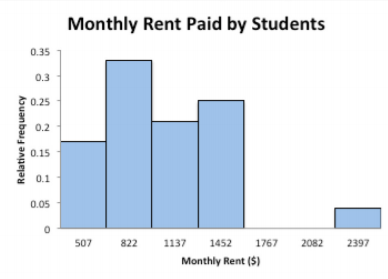
The class boundaries are plotted on the horizontal axis and the frequencies are plotted on the vertical axis. You can plot the midpoints of the classes instead of the class boundaries. Graph 2.2.1 was created using the midpoints because it was easier to do with the software that created the graph. On R, the command is
hist(variable, col="type in what color you want", breaks, main="type the title you want", xlab="type the label you want for the horizontal axis",
ylim=c(0, number above maximum frequency) – produces histogram with specified color and using the breaks you made for the frequency distribution.
For this example, the command in R would be (assuming you created a frequency distribution in R as described previously):
hist(rent, col="blue", breaks, right=FALSE, main="Monthly Rent Paid by Students", ylim=c(0,8) xlab="Monthly Rent ($)")
.png?revision=1)
If no frequency distribution was created before the histogram, then the command would be:
hist(variable, col="type in what color you want", number of classes, main="type the title you want", xlab="type the label you want for the horizontal axis") – produces histogram with specified color and number of classes (though the number of classes is an estimate and R will create the number of classes near this value).
For this example, the R command without a frequency distribution created first would be:
hist(rent, col="blue", 7, main="Monthly Rent Paid by Students", xlab="Monthly Rent ($)")
Notice the graph has the axes labeled, the tick marks are labeled on each axis, and there is a title.
Reviewing the graph you can see that most of the students pay around $750 per month for rent, with about $1500 being the other common value. You can see from the graph, that most students pay between $600 and $1600 per month for rent. Of course, these values are just estimates from the graph. There is a large gap between the $1500 class and the highest data value. This seems to say that one student is paying a great deal more than everyone else. This value could be considered an outlier. An outlier is a data value that is far from the rest of the values. It may be an unusual value or a mistake. It is a data value that should be investigated. In this case, the student lives in a very expensive part of town, thus the value is not a mistake, and is just very unusual. There are other aspects that can be discussed, but first some other concepts need to be introduced.
Frequencies are helpful, but understanding the relative size each class is to the total is also useful. To find this you can divide the frequency by the total to create a relative frequency. If you have the relative frequencies for all of the classes, then you have a relative frequency distribution.
Definition \(\PageIndex{2}\)
Relative Frequency Distribution
A variation on a frequency distribution is a relative frequency distribution. Instead of giving the frequencies for each class, the relative frequencies are calculated.
Relative frequency \(=\dfrac{\text { frequency }}{\# \text { of data points }}\)
This gives you percentages of data that fall in each class.
Example \(\PageIndex{3}\) creating a relative frequency table
Find the relative frequency for the grade data.
Solution
From Example \(\PageIndex{1}\), the frequency distribution is reproduced in Example \(\PageIndex{2}\).
| Class Limits | Class Boundaries | Class Midpoint | Frequency |
|---|---|---|---|
| 350-664 | 349.5-664.5 | 507 | 4 |
| 665-979 | 664.5-979.5 | 822 | 8 |
| 980-1294 | 979.5-1294.5 | 1127 | 5 |
| 1295-1609 | 1294.5-1609.5 | 1452 | 6 |
| 1610-1924 | 1609.5-1924.5 | 1767 | 0 |
| 1925-2239 | 1924.5-2239.5 | 2082 | 0 |
| 2240-2554 | 2239.5-2554.5 | 2397 | 1 |
Divide each frequency by the number of data points.
\(\dfrac{4}{24}=0.17, \dfrac{8}{24}=0.33, \dfrac{5}{24}=0.21, \rightleftharpoons\)
| Class Limits | Class Boundaries | Class Midpoint | Frequency | Relative Frequency |
|---|---|---|---|---|
| 350-664 | 349.5-664.5 | 507 | 4 | 0.17 |
| 665-979 | 664.5-979.5 | 822 | 8 | 0.33 |
| 980-1294 | 979.5-1294.5 | 1127 | 5 | 0.21 |
| 1295-1609 | 1294.5-1609.5 | 1452 | 6 | 0.25 |
| 1610-1924 | 1609.5-1924.5 | 1767 | 0 | 0 |
| 1925-2239 | 1924.5-2239.5 | 2082 | 0 | 0 |
| 2240-2554 | 2239.5-2554.5 | 2397 | 1 | 0.04 |
| Total | 24 | 1 |
The relative frequencies should add up to 1 or 100%. (This might be off a little due to rounding errors.)
The graph of the relative frequency is known as a relative frequency histogram. It looks identical to the frequency histogram, but the vertical axis is relative frequency instead of just frequencies.
Example \(\PageIndex{4}\) drawing a relative frequency histogram
Draw a relative frequency histogram for the grade distribution from Example \(\PageIndex{1}\).
Solution
The class boundaries are plotted on the horizontal axis and the relative frequencies are plotted on the vertical axis. (This is not easy to do in R, so use another technology to graph a relative frequency histogram.)
.png?revision=1)
Notice the shape is the same as the frequency distribution.
Another useful piece of information is how many data points fall below a particular class boundary. As an example, a teacher may want to know how many students received below an 80%, a doctor may want to know how many adults have cholesterol below 160, or a manager may want to know how many stores gross less than $2000 per day. This is known as a cumulative frequency. If you want to know what percent of the data falls below a certain class boundary, then this would be a cumulative relative frequency. For cumulative frequencies you are finding how many data values fall below the upper class limit.
To create a cumulative frequency distribution, count the number of data points that are below the upper class boundary, starting with the first class and working up to the top class. The last upper class boundary should have all of the data points below it. Also include the number of data points below the lowest class boundary, which is zero.
Example \(\PageIndex{5}\) creating a cumulative frequency distribution
Create a cumulative frequency distribution for the data in Example \(\PageIndex{1}\).
Solution
The frequency distribution for the data is in Example \(\PageIndex{2}\).
| Class Limits | Class Boundaries | Class Midpoint | Frequency |
|---|---|---|---|
| 350-664 | 349.5-664.5 | 507 | 4 |
| 665-979 | 664.5-979.5 | 822 | 8 |
| 980-1294 | 979.5-1294.5 | 1127 | 5 |
| 1295-1609 | 1294.5-1609.5 | 1452 | 6 |
| 1610-1924 | 1609.5-1924.5 | 1767 | 0 |
| 1925-2239 | 1924.5-2239.5 | 2082 | 0 |
| 2240-2554 | 2239.5-2554.5 | 2397 | 1 |
Now ask yourself how many data points fall below each class boundary. Below 349.5, there are 0 data points. Below 664.5 there are 4 data points, below 979.5, there are 4 + 8 = 12 data points, below 1294.5 there are 4 + 8 + 5 = 17 data points, and continue this process until you reach the upper class boundary. This is summarized in Example \(\PageIndex{4}\).
To produce cumulative frequencies in R, you need to have performed the commands for the frequency distribution. Once you have complete that, then use variable.cumfreq=cumsum(variable.freq) – creates the cumulative frequencies for the variable
cumfreq0=c(0,variable.cumfreq) – creates a cumulative frequency table for the variable.
cumfreq0 – displays the cumulative frequency table.
For this example the command would be:
rent.cumfreq=cumsum(rent.freq)
cumfreq0=c(0,rent.cumfreq)
cumfreq0
Output:
\(\begin{array}{ccccccccc}{}&{[350,665)} & {[665,980)} & {[980,1.3e+03)}& {[1.3e+03, 1.61e+03)}&{[1.61e+03, 1.92e+03)}&{[1.92e+03,2.24e+03)}&{[2.24e+03, 2.56e+03)}&{[2.56e+03, 2.87e+03)} \\ {0}&{4} & {12}&{17}&{23}&{23}&{23}&{24}&{24}\end{array}\)
Now type this into a table. See Example \(\PageIndex{4}\).
| Class Limits | Class Boundaries | Class Midpoint | Frequency | Cumulative Frequency |
|---|---|---|---|---|
| 350-664 | 349.5-664.5 | 507 | 4 | 4 |
| 665-979 | 664.5-979.5 | 822 | 8 | 12 |
| 980-1294 | 979.5-1294.5 | 1127 | 5 | 17 |
| 1295-1609 | 1294.5-1609.5 | 1452 | 6 | 23 |
| 1610-1924 | 1609.5-1924.5 | 1767 | 0 | 23 |
| 1925-2239 | 1924.5-2239.5 | 2082 | 0 | 23 |
| 2240-2554 | 2239.5-2554.5 | 2397 | 1 | 24 |
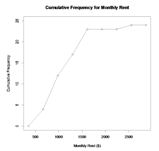
Again, it is hard to look at the data the way it is. A graph would be useful. The graph for cumulative frequency is called an ogive (o-jive). To create an ogive, first create a scale on both the horizontal and vertical axes that will fit the data. Then plot the points of the class upper class boundary versus the cumulative frequency. Make sure you include the point with the lowest class boundary and the 0 cumulative frequency. Then just connect the dots.
Example \(\PageIndex{6}\) drawing an ogive
Draw an ogive for the data in Example \(\PageIndex{1}\).
Solution
In R, the commands would be:
plot(breaks,cumfreq0, main="title you want to use", xlab="label you want to use", ylab="label you want to use", ylim=c(0, number above maximum cumulative frequency) – plots the ogive
lines(breaks,cumfreq0) – connects the dots on the ogive
For this example, the commands would be:
Plot(breaks,cumfreq0, main=”Cumulative Frequency for Monthly Rent”, xlab=”Monthly Rent ($)”, ylab=”Cumulative Frequency”, ylim=c(0,25))
lines(breaks,cumfreq0)
.png?revision=1)
The usefulness of a ogive is to allow the reader to find out how many students pay less than a certain value, and also what amount of monthly rent is paid by a certain number of students. As an example, suppose you want to know how many students pay less than $1500 a month in rent, then you can go up from the $1500 until you hit the graph and then you go over to the cumulative frequency axes to see what value corresponds to this value. It appears that around 20 students pay less than $1500. (See Graph 2.2.4.)
.png?revision=1)
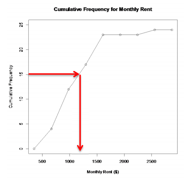
Also, if you want to know the amount that 15 students pay less than, then you start at 15 on the vertical axis and then go over to the graph and down to the horizontal axis where the line intersects the graph. You can see that 15 students pay less than about $1200 a month. (See Graph 2.2.5.)
.png?revision=1)
If you graph the cumulative relative frequency then you can find out what percentage is below a certain number instead of just the number of people below a certain value.
Shapes of the distribution:
When you look at a distribution, look at the basic shape. There are some basic shapes that are seen in histograms. Realize though that some distributions have no shape. The common shapes are symmetric, skewed, and uniform. Another interest is how many peaks a graph may have. This is known as modal.
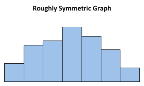
Symmetric means that you can fold the graph in half down the middle and the two sides will line up. You can think of the two sides as being mirror images of each other. Skewed means one “tail” of the graph is longer than the other. The graph is skewed in the direction of the longer tail (backwards from what you would expect). A uniform graph has all the bars the same height.
Modal refers to the number of peaks. Unimodal has one peak and bimodal has two peaks. Usually if a graph has more than two peaks, the modal information is not longer of interest.
Other important features to consider are gaps between bars, a repetitive pattern, how spread out is the data, and where the center of the graph is.
Examples of Graphs:
This graph is roughly symmetric and unimodal:
.png?revision=1)
This graph is symmetric and bimodal:
.png?revision=1)
This graph is skewed to the right:
.png?revision=1)
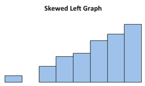
This graph is skewed to the left and has a gap:
.png?revision=1)
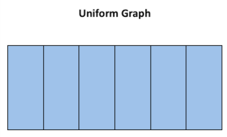
This graph is uniform since all the bars are the same height:
.png?revision=1)
Example \(\PageIndex{7}\) creating a frequency distribution, histogram, and ogive
The following data represents the percent change in tuition levels at public, fouryear colleges (inflation adjusted) from 2008 to 2013 (Weissmann, 2013). Create a frequency distribution, histogram, and ogive for the data.
| 19.5% | 40.8% | 57.0% | 15.1% | 17.4% | 5.2% | 13.0% |
| 15.6% | 51.5% | 15.6% | 14.5% | 22.4% | 19.5% | 31.3% |
| 21.7% | 27.0% | 13.1% | 26.8% | 24.3% | 38.0% | 21.1% |
| 9.3% | 46.7% | 14.5% | 78.4% | 67.3% | 21.1% | 22.4% |
| 5.3% | 17.3% | 17.5% | 36.6% | 72.0% | 63.2% | 15.1% |
| 2.2% | 17.5% | 36.7% | 2.8% | 16.2% | 20.5% | 17.8% |
| 30.1% | 63.6% | 17.8% | 23.2% | 25.3% | 21.4% | 28.5% |
| 9.4% | ||||||
Solution
- Find the range:
largest value - smallest value = \(78.4\)% \(-2.2\)% \(=76.2\)% - Pick the number of classes:
Since there are 50 data points, then around 6 to 8 classes should be used. Let's use 8. - Find the class width:
width \(=\dfrac{\text { range }}{8}=\dfrac{76.2 \%}{8} \approx 9.525 \%\)
Since the data has one decimal place, then the class width should round to one decimal place. Make sure you round up.
width \(=9.6\)% - Find the class limits:
\(2.2 \%+9.6 \%=11.8 \%, 11.8 \%+9.6 \%=21.4 \%, 21.4 \%+9.6 \%=31.0 \%, \leftrightharpoons\) - Find the class boundaries:
Since the data has one decimal place, the class boundaries should have two decimal places, so subtract 0.05 from the lower class limit to get the class boundaries. Add 0.05 to the upper class limit for the last class’s boundary.
\(2.2-0.05=2.15 \%, 11.8-0.05=11.75 \%, 21.4-0.05=21.35 \% \leftrightharpoons\)
Every value in the data should fall into exactly one of the classes. No data values should fall right on the boundary of two classes. - Find the class midpoints:
midpoint \(=\dfrac{\text { lower limt }+\text { upper limit }}{2}\)
\(\dfrac{2.2+11.7}{2}=6.95 \%, \dfrac{11.8+21.3}{2}=16.55 \%, \leftrightharpoons\) - Tally and find the frequency of the data:
| Class Limits | Class Boundaries | Class Midpoint | Tally | Frequency | Relative Frequency | Cumulative Frequency |
|---|---|---|---|---|---|---|
| 2.2-11.7 | 2.15-11.75 | 6.95 | \(\cancel{||||} |\) | 6 | 0.12 | 6 |
| 11.8-21.3 | 11.75-21.35 | 16.55 | \(\cancel{||||} \cancel{||||} \cancel{||||} \cancel{||||}\) | 20 | 0.40 | 26 |
| 21.4-30.9 | 21.35-30.95 | 26.15 | \(\cancel{||||} \cancel{||||} |\) | 11 | 0.22 | 37 |
| 31.0-45.0 | 30.95-40.55 | 35.75 | \( |||| \) | 4 | 0.08 | 41 |
| 40.6-50.1 | 40.55-50.15 | 45.35 | \( || \) | 2 | 0.04 | 43 |
| 50.2-59.7 | 50.15-59.75 | 54.95 | \( || \) | 2 | 0.04 | 45 |
| 59.8-69.3 | 59.75-69.35 | 64.55 | \( ||| \) | 3 | 0.06 | 48 |
| 69.4-78.9 | 69.35-78.95 | 74.15 | \( || \) | 2 | 0.04 | 50 |
Make sure the total of the frequencies is the same as the number of data points.
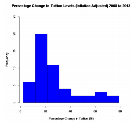.png?revision=1)
This graph is skewed right, with no gaps. This says that most percent increases in tuition were around 16.55%, with very few states having a percent increase greater than 45.35%.
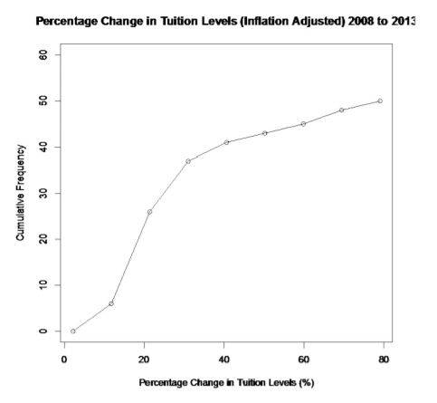.png?revision=1)
Looking at the ogive, you can see that 30 states had a percent change in tuition levels of about 25% or less.
There are occasions where the class limits in the frequency distribution are predetermined. Example \(\PageIndex{8}\) demonstrates this situation.
Example \(\PageIndex{8}\) creating a frequency distribution and histogram
The following are the percentage grades of 25 students from a statistics course. Make a frequency distribution and histogram.
| 62 | 87 | 81 | 69 | 87 | 62 | 45 | 95 | 76 | 76 |
| 62 | 71 | 65 | 67 | 72 | 80 | 40 | 77 | 87 | 58 |
| 84 | 73 | 93 | 64 | 89 |
Solution
Since this data is percent grades, it makes more sense to make the classes in multiples of 10, since grades are usually 90 to 100%, 80 to 90%, and so forth. It is easier to not use the class boundaries, but instead use the class limits and think of the upper class limit being up to but not including the next classes lower limit. As an example the class 80 – 90 means a grade of 80% up to but not including a 90%. A student with an 89.9% would be in the 80-90 class.
| Class Limit | Class Midpoint | Tally | Freqeuncy |
|---|---|---|---|
| 40-50 | 45 | \( || \) | 2 |
| 50-60 | 55 | \( | \) | 1 |
| 60-70 | 65 | \( \cancel{||||} || \) | 7 |
| 70-80 | 75 | \( \cancel{||||} | \) | 6 |
| 80-90 | 85 | \( \cancel{||||} || \) | 7 |
| 90-100 | 95 | \( || \) | 2 |
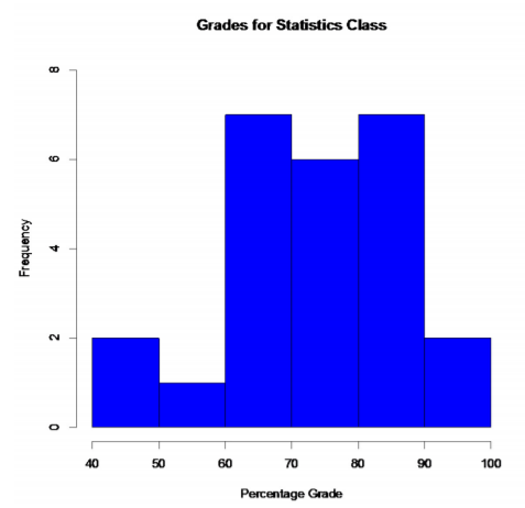.png?revision=1)
It appears that most of the students had between 60 to 90%. This graph looks somewhat symmetric and also bimodal. The same number of students earned between 60 to 70% and 80 to 90%.
There are other types of graphs for quantitative data. They will be explored in the next section.
Homework
Exercise \(\PageIndex{1}\)
- The median incomes of males in each state of the United States, including the District of Columbia and Puerto Rico, are given in Example \(\PageIndex{9}\) ("Median income of," 2013). Create a frequency distribution, relative frequency distribution, and cumulative frequency distribution using 7 classes.
$42,951 $52,379 $42,544 $37,488 $49,281 $50,987 $60,705 $50,411 $66,760 $40,951 $43,902 $45,494 $41,528 $50,746 $45,183 $43,624 $43,993 $41,612 $46,313 $43,944 $56,708 $60,264 $50,053 $50,580 $40,202 $43,146 $41,635 $42,182 $41,803 $53,033 $60,568 $41,037 $50,388 $41,950 $44,660 $46,176 $41,420 $45,976 $47,956 $22,529 $48,842 $41,464 $40,285 $41,309 $43,160 $47,573 $44,057 $52,805 $53,046 $42,125 $46,214 $51,630 Table \(\PageIndex{9}\): Data of Median Income for Males - The median incomes of females in each state of the United States, including the District of Columbia and Puerto Rico, are given in Example \(\PageIndex{10}\) ("Median income of," 2013). Create a frequency distribution, relative frequency distribution, and cumulative frequency distribution using 7 classes.
$31,862 $40,550 $36,048 $30,752 $41,817 $40,236 $47,476 $40,500 $60,332 $33,823 $35,438 $37,242 $31,238 $39,150 $34,023 $33,745 $33,269 $32,684 $31,844 $34,599 $48,748 $46,185 $36,931 $40,416 $29,548 $33,865 $31,067 $33,424 $35,484 $41,021 $47,155 $32,316 $42,113 $33,459 $32,462 $35,746 $31,274 $36,027 $37,089 $22,117 $41,412 $31,330 $31,329 $33,184 $35,301 $32,843 $38,177 $40,969 $40,993 $29,688 $35,890 $34,381 Table \(\PageIndex{10}\): Data of Median Income for Females - The density of people per square kilometer for African countries is in Example \(\PageIndex{11}\) ("Density of people," 2013). Create a frequency distribution, relative frequency distribution, and cumulative frequency distribution using 8 classes.
15 16 81 3 62 367 42 123 8 9 337 12 29 70 39 83 26 51 79 6 157 105 42 45 72 72 37 4 36 134 12 3 630 563 72 29 3 13 176 341 415 187 65 194 75 16 41 18 69 49 103 65 143 2 18 31 Table \(\PageIndex{11}\): Data of Density of People per Square Kilometer - The Affordable Care Act created a market place for individuals to purchase health care plans. In 2014, the premiums for a 27 year old for the bronze level health insurance are given in Example \(\PageIndex{12}\) ("Health insurance marketplace," 2013). Create a frequency distribution, relative frequency distribution, and cumulative frequency distribution using 5 classes.
$114 $119 $121 $125 $132 $139 $139 $141 $143 $145 $151 $153 $156 $159 $162 $163 $165 $166 $170 $170 $176 $177 $181 $185 $185 $186 $186 $189 $190 $192 $196 $203 $204 $219 $254 $286 Table \(\PageIndex{12}\): Data of Health Insurance Premiums - Create a histogram and relative frequency histogram for the data in Example \(\PageIndex{9}\). Describe the shape and any findings you can from the graph.
- Create a histogram and relative frequency histogram for the data in Example \(\PageIndex{10}\). Describe the shape and any findings you can from the graph.
- Create a histogram and relative frequency histogram for the data in Example \(\PageIndex{11}\). Describe the shape and any findings you can from the graph.
- Create a histogram and relative frequency histogram for the data in Example \(\PageIndex{12}\). Describe the shape and any findings you can from the graph.
- Create an ogive for the data in Example \(\PageIndex{9}\). Describe any findings you can from the graph.
- Create an ogive for the data in Example \(\PageIndex{10}\). Describe any findings you can from the graph.
- Create an ogive for the data in Example \(\PageIndex{11}\). Describe any findings you can from the graph.
- Create an ogive for the data in Example \(\PageIndex{12}\). Describe any findings you can from the graph.
- Students in a statistics class took their first test. The following are the scores they earned. Create a frequency distribution and histogram for the data using class limits that make sense for grade data. Describe the shape of the distribution.
80 79 89 74 73 67 79 93 70 70 76 88 83 73 81 79 80 85 79 80 79 58 93 94 74 Table \(\PageIndex{13}\): Data of Test 1 Grades - Students in a statistics class took their first test. The following are the scores they earned. Create a frequency distribution and histogram for the data using class limits that make sense for grade data. Describe the shape of the distribution. Compare to the graph in question 13.
Table \(\PageIndex{14}\): Data of Test 1 Grades 67 67 76 47 85 70 87 76 80 72 84 98 84 64 65 82 81 81 88 74 87 83
- Answer
-
See solutions