
8.3: Statistical Modeling- An Example
- Page ID
- 8749

Let’s look at an example of fitting a model to data, using the data from NHANES. In particular, we will try to build a model of the height of children in the NHANES sample. First let’s load the data and plot them (see Figure 8.1).
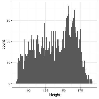
Remember that we want to describe the data as simply as possible while still capturing their important features. What is the simplest model we can imagine that might still capture the essence of the data? How about the most common value in the dataset (which we call the mode)?
This redescribes the entire set of 1691 children in terms of a single number. If we wanted to predict the height of any new children, then our guess would be the same number: 166.5 centimeters.
\(\ \hat{height_i}=166.5 \)
We put the hat symbol over the name of the variable to show that this is our predicted value. The error for this individual would then be the difference between the predicted value ( \(\ \hat{height_i}\) )and their actual height ( \(\ {height_i}\) ):
\(\ error_i =height_i - \hat{height_i}\)
How good of a model is this? In general we define the goodness of a model in terms of the error, which represents the difference between model and the data; all things being equal, the model that produces lower error is the better model.
What we find is that the average individual has a fairly large error of -28.8 centimeters. We would like to have a model where the average error is zero, and it turns out that if we use the arithmetic mean (commonly known as the average) as our model then this will be the case.
The mean (often denoted by a bar over the variable, such as ) is the sum of all of the values, divided by the number of values. Mathematically, we express this as:
\(\ \bar{X}=\frac{\sum_{i=1}^n x_i}{n}\)
We can prove mathematically that the sum of errors from the mean (and thus the average error) is zero (see the proof at the end of the chapter if you are interested). Given that the average error is zero, this seems like a better model.
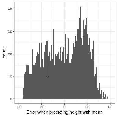
Even though the average of errors from the mean is zero, we can see from the histogram in Figure 8.2 that each individual still has some degree of error; some are positive and some are negative, and those cancel each other out. For this reason, we generally summarize errors in terms of some kind of measure that counts both positive and negative errors as bad. We could use the absolute value of each error value, but it’s more common to use the squared errors, for reasons that we will see later in the course.
There are several common ways to summarize the squared error that you will encounter at various points in this book, so it’s important to understand how they relate to one another. First, we could simply add them up; this is referred to as the sum of squared errors. The reason we don’t usually use this is that its magnitude depends on the number of data points, so it can be difficult to interpret unless we are looking at the same number of observations. Second, we could take the mean of the squared error values, which is referred to as the mean squared error (MSE). However, because we squared the values before averaging, they are not on the same scale as the original data; they are in centimeters2. For this reason, it’s also common to take the square root of the MSE, which we refer to as the root mean squared error (RMSE), so that the error is measured in the same units as the original values (in this example, centimeters).
The mean has a pretty substantial amount of error – any individual data point will be about 27 cm from the mean on average – but it’s still much better than the mode, which has an average error of about 39 cm.
8.2.1 Improving our model
Can we imagine a better model? Remember that these data are from all children in the NHANES sample, who vary from 2 to 17 years of age. Given this wide age range, we might expect that our model of height should also include age. Let’s plot the data for height against age, to see if this relationship really exists.
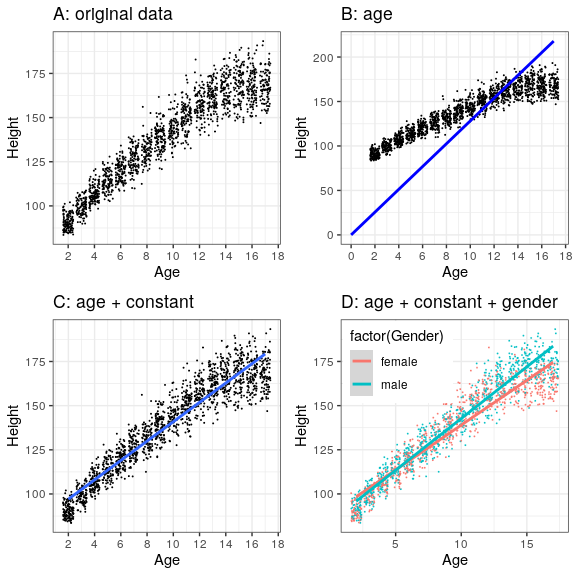
The black points in Panel A of Figure 8.3 show individuals in the dataset, and there seems to be a strong relationship between height and age, as we would expect. Thus, we might build a model that relates height to age:
\(\ \hat{height_i}=\beta * age_i\)
where β \beta is a parameter that we multiply by age to get the smallest error.
You may remember from algebra that a line is define as follows:
y = slope ∗ x + intercept
If age is the X variable, then that means that our prediction of height from age will be a line with a slope of β and an intercept of zero - to see this, let’s plot the best fitting line in blue on top of the data (Panel B in Figure 8.3). Something is clearly wrong with this model, as the line doesn’t seem to follow the data very well. In fact, the RMSE for this model (39.16) is actually higher than the model that only includes the mean! The problem comes from the fact that our model only includes age, which means that the predicted value of height from the model must take on a value of zero when age is zero. Even though the data do not include any children with an age of zero, the line is mathematically required to have a y-value of zero when x is zero, which explains why the line is pulled down below the younger datapoints. We can fix this by including a constant value in our model, which basically represents the estimated value of height when age is equal to zero; even though an age of zero is not plausible in this dataset, this is a mathematical trick that will allow the model to account for the overall magnitude of the data. The model is:
\(\ \hat{height_i}=constant + \beta * age_i\)
where constant is a constant value added to the prediction for each individual; we also call the intercept, since it maps onto the intercept in the equation for a line. We will learn later how it is that we actually compute these values for a particular dataset; for now, we will use the lm() function in R to compute the values of the constant and β that give us the smallest error for these particular data. Panel C in Figure 8.3 shows this model applied to the NHANES data, where we see that the line matches the data much better than the one without a constant.
Our error is much smaller using this model – only 8.36 centimeters on average. Can you think of other variables that might also be related to height? What about gender? In Panel D of Figure 8.3 we plot the data with lines fitted separately for males and females. From the plot, it seems that there is a difference between males and females, but it is relatively small and only emerges after the age of puberty. Let’s estimate this model and see how the errors look. In Figure 8.4 we plot the root mean squared error values across the different models. From this we see that the model got a little bit better going from mode to mean, much better going from mean to mean+age, and only very slighly better by including gender as well.
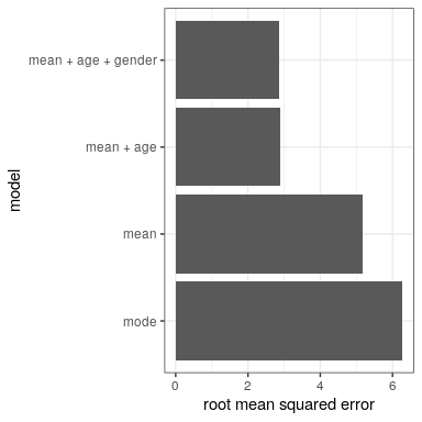 Figure 8.4: Mean squared error plotted for each of the models tested above.