7.6: Creating a More Complex Plot
- Page ID
- 8744

\( \newcommand{\vecs}[1]{\overset { \scriptstyle \rightharpoonup} {\mathbf{#1}} } \) \( \newcommand{\vecd}[1]{\overset{-\!-\!\rightharpoonup}{\vphantom{a}\smash {#1}}} \)\(\newcommand{\id}{\mathrm{id}}\) \( \newcommand{\Span}{\mathrm{span}}\) \( \newcommand{\kernel}{\mathrm{null}\,}\) \( \newcommand{\range}{\mathrm{range}\,}\) \( \newcommand{\RealPart}{\mathrm{Re}}\) \( \newcommand{\ImaginaryPart}{\mathrm{Im}}\) \( \newcommand{\Argument}{\mathrm{Arg}}\) \( \newcommand{\norm}[1]{\| #1 \|}\) \( \newcommand{\inner}[2]{\langle #1, #2 \rangle}\) \( \newcommand{\Span}{\mathrm{span}}\) \(\newcommand{\id}{\mathrm{id}}\) \( \newcommand{\Span}{\mathrm{span}}\) \( \newcommand{\kernel}{\mathrm{null}\,}\) \( \newcommand{\range}{\mathrm{range}\,}\) \( \newcommand{\RealPart}{\mathrm{Re}}\) \( \newcommand{\ImaginaryPart}{\mathrm{Im}}\) \( \newcommand{\Argument}{\mathrm{Arg}}\) \( \newcommand{\norm}[1]{\| #1 \|}\) \( \newcommand{\inner}[2]{\langle #1, #2 \rangle}\) \( \newcommand{\Span}{\mathrm{span}}\)\(\newcommand{\AA}{\unicode[.8,0]{x212B}}\)
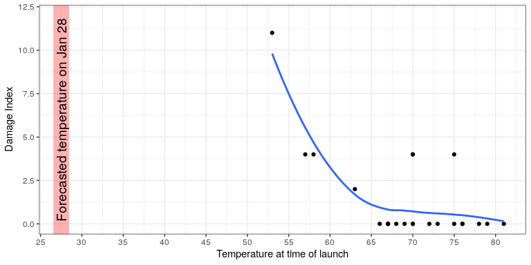
In this section we will recreate Figure 6.2 from Chapter @ref{data-visualization}. Here is the code to generate the figure; we will go through each of its sections below.
oringDf <- read.table("data/orings.csv", sep = ",",
                      header = TRUE)

oringDf %>%
  ggplot(aes(x = Temperature, y = DamageIndex)) +
  geom_point() +
  geom_smooth(method = "loess",
              se = FALSE, span = 1) +
  ylim(0, 12) +
  geom_vline(xintercept = 27.5, size =8,
             alpha = 0.3, color = "red") +
  labs(
    y = "Damage Index",
    x = "Temperature at time of launch"
  ) +
  scale_x_continuous(breaks = seq.int(25, 85, 5)) +
  annotate(
    "text",
    angle=90,
    x = 27.5,
    y = 6,
    label = "Forecasted temperature on Jan 28",
    size = 5
  )