Statistics LibreTexts

6.1: Anatomy of a Plot

  • Page ID
    8734
  • \( \newcommand{\vecs}[1]{\overset { \scriptstyle \rightharpoonup} {\mathbf{#1}} } \) \( \newcommand{\vecd}[1]{\overset{-\!-\!\rightharpoonup}{\vphantom{a}\smash {#1}}} \)\(\newcommand{\id}{\mathrm{id}}\) \( \newcommand{\Span}{\mathrm{span}}\) \( \newcommand{\kernel}{\mathrm{null}\,}\) \( \newcommand{\range}{\mathrm{range}\,}\) \( \newcommand{\RealPart}{\mathrm{Re}}\) \( \newcommand{\ImaginaryPart}{\mathrm{Im}}\) \( \newcommand{\Argument}{\mathrm{Arg}}\) \( \newcommand{\norm}[1]{\| #1 \|}\) \( \newcommand{\inner}[2]{\langle #1, #2 \rangle}\) \( \newcommand{\Span}{\mathrm{span}}\) \(\newcommand{\id}{\mathrm{id}}\) \( \newcommand{\Span}{\mathrm{span}}\) \( \newcommand{\kernel}{\mathrm{null}\,}\) \( \newcommand{\range}{\mathrm{range}\,}\) \( \newcommand{\RealPart}{\mathrm{Re}}\) \( \newcommand{\ImaginaryPart}{\mathrm{Im}}\) \( \newcommand{\Argument}{\mathrm{Arg}}\) \( \newcommand{\norm}[1]{\| #1 \|}\) \( \newcommand{\inner}[2]{\langle #1, #2 \rangle}\) \( \newcommand{\Span}{\mathrm{span}}\)\(\newcommand{\AA}{\unicode[.8,0]{x212B}}\)

    The goal of plotting data is to present a summary of a dataset in a two-dimensional (or occasionally three-dimensional) presentation. We refer to the dimensions as axes – the horizontal axis is called the X-axis and the vertical axis is called the Y-axis. We can arrange the data along the axes in a way that highlights the data values. These values may be either continuous or categorical.

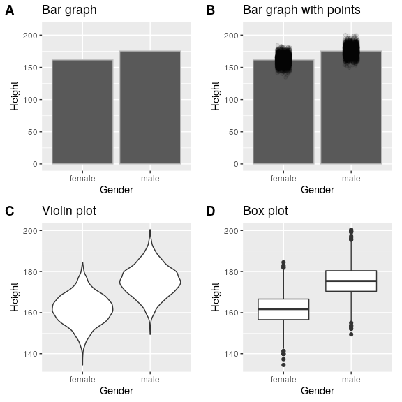
    There are many different types of plots that we can use, which have different advantages and disadvantages. Let’s say that we are interested in characterizing the difference in height between men and women in the NHANES dataset. Figure 6.3 shows four different ways to plot these data.

    1. The bar graph in panel A shows the difference in means, but doesn’t show us how much spread there is in the data around these means – and as we will see later, knowing this is essential to determine whether we think the difference between the groups is large enough to be important.
    2. The second plot shows the bars with all of the data points overlaid - this makes it a bit clearer that the distributions of height for men and women are overlapping, but it’s still hard to see due to the large number of data points.

    In general we prefer using a plotting technique that provides a clearer view of the distribution of the data points.

    1. In panel C, we see one example of a violin plot, which plots the distribution of data in each condition (after smoothing it out a bit).
    2. Another option is the box plot shown in panel D, which shows the median (central line), a measure of variability (the width of the box, which is based on a measure called the interquartile range), and any outliers (noted by the points at the ends of the lines). These are both effective ways to show data that provide a good feel for the distribution of the data.
    Four different ways of plotting the difference in height between men and women in the NHANES dataset.  Panel A plots the means of the two groups, which gives no way to assess the relative overlap of the two distributions.  Panel B shows the same bars, but also overlays the data points, jittering them so that we can see their overall distribution.  Panel C shows a violin plot, which shows the distribution of the datasets for each group.  Panel D shows a box plot, which highlights the spread of the distribution along with any outliers (which are shown as individual points).
    Figure 6.3: Four different ways of plotting the difference in height between men and women in the NHANES dataset. Panel A plots the means of the two groups, which gives no way to assess the relative overlap of the two distributions. Panel B shows the same bars, but also overlays the data points, jittering them so that we can see their overall distribution. Panel C shows a violin plot, which shows the distribution of the datasets for each group. Panel D shows a box plot, which highlights the spread of the distribution along with any outliers (which are shown as individual points).

    This page titled 6.1: Anatomy of a Plot is shared under a not declared license and was authored, remixed, and/or curated by Russell A. Poldrack via source content that was edited to the style and standards of the LibreTexts platform; a detailed edit history is available upon request.