
15.2.2: Chapter 3 Homework
- Page ID
- 28305

\( \newcommand{\vecs}[1]{\overset { \scriptstyle \rightharpoonup} {\mathbf{#1}} } \) \( \newcommand{\vecd}[1]{\overset{-\!-\!\rightharpoonup}{\vphantom{a}\smash {#1}}} \)\(\newcommand{\id}{\mathrm{id}}\) \( \newcommand{\Span}{\mathrm{span}}\) \( \newcommand{\kernel}{\mathrm{null}\,}\) \( \newcommand{\range}{\mathrm{range}\,}\) \( \newcommand{\RealPart}{\mathrm{Re}}\) \( \newcommand{\ImaginaryPart}{\mathrm{Im}}\) \( \newcommand{\Argument}{\mathrm{Arg}}\) \( \newcommand{\norm}[1]{\| #1 \|}\) \( \newcommand{\inner}[2]{\langle #1, #2 \rangle}\) \( \newcommand{\Span}{\mathrm{span}}\) \(\newcommand{\id}{\mathrm{id}}\) \( \newcommand{\Span}{\mathrm{span}}\) \( \newcommand{\kernel}{\mathrm{null}\,}\) \( \newcommand{\range}{\mathrm{range}\,}\) \( \newcommand{\RealPart}{\mathrm{Re}}\) \( \newcommand{\ImaginaryPart}{\mathrm{Im}}\) \( \newcommand{\Argument}{\mathrm{Arg}}\) \( \newcommand{\norm}[1]{\| #1 \|}\) \( \newcommand{\inner}[2]{\langle #1, #2 \rangle}\) \( \newcommand{\Span}{\mathrm{span}}\)\(\newcommand{\AA}{\unicode[.8,0]{x212B}}\)
- A poll was taken of 150 students at De Anza College. Students were asked how many hours they work outside of college. The students were interviewed in the morning between 8 AM and 11 AM on a Thursday. The sample mean for these 150 students was 9.2 hours.
- What is the Population?
- What is the Sample?
- Does the 9.2 hours represent a statistic or parameter? Explain.
- Is the sample mean of 9.2 a reasonable estimate of the mean number of hours worked for all students at De Anza? Explain any possible bias.
- The box plots represent the results of three exams for 40 students in a Math course.
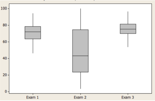
- Which exam has the highest median?
- Which exam has the highest standard deviation?
- For Exam 2, how does the median compare to the mean?
- In your own words, compare the exams.
- Examine the following average daily commute time (minutes) for residents of two cities.
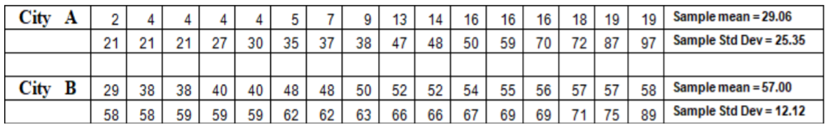
- Compute and interpret the z‐score for a 75‐minute commute for City A.
- Compute and interpret the z‐score for a 75‐minute commute for City B.
- For which group would a 75 ‐minute commute be more unusual? Explain.
- The February 10, 2017 Nielsen ratings of 20 TV programs shown on commercial television, all starting between 8 PM and 10 PM, are given below:

- Obtain the sample mean and median. Do you believe that the data is symmetric, right‐skewed or left skewed?
- Determine the sample variance and standard deviation.
- Assuming the data are bell shaped, between which two numbers would you expect to find 68% of the data?
- The following data represents recovery time for 16 patients (arranged in a table to help you out).
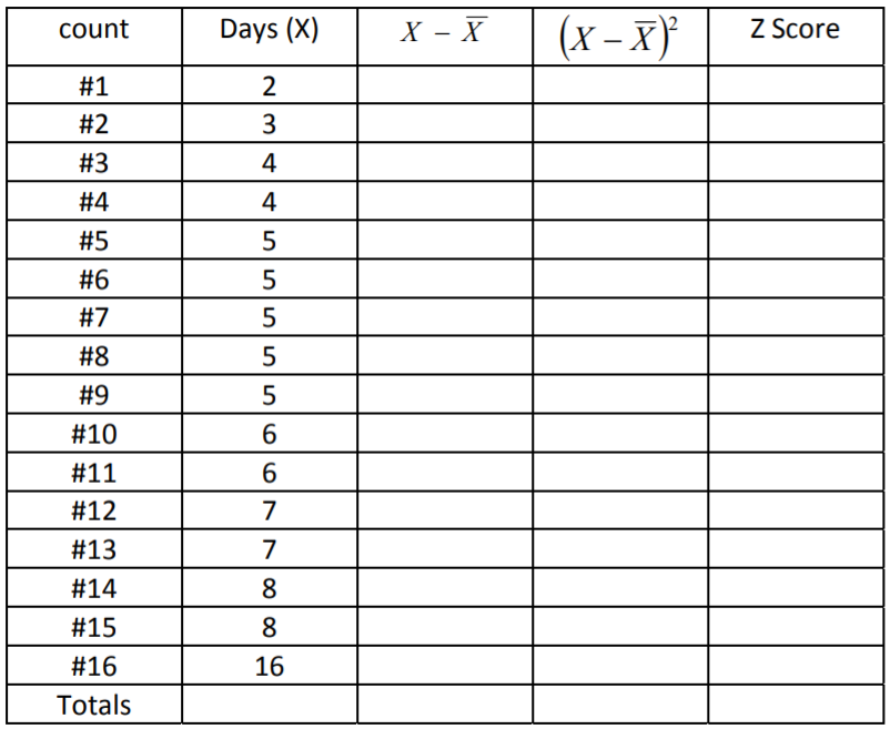
- Calculate the sample mean and median
- Use the table to calculate the variance and standard deviation.
- Use the range of the data to see if the standard deviation makes sense. (Range should be between 3 and 6 standard deviations).
- Using the empirical rule between which two numbers should you expect to see 68% of the data? 95% of the data? 99.7% of the data?
- Calculate the Z‐score for observation. Do you think any of these data are outliers?
- The following data represents the heights (in feet) of 20 almond trees in an orchard.
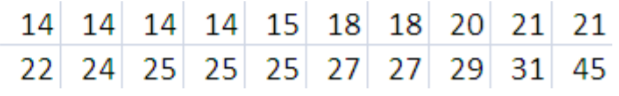
- Construct a box plot of the data.
- Do you think the tree with the height of 45 feet is an outlier? Use the box plot method to justify your answer.
- The following average daily commute time (in minutes) for residents of 2 cities are shown in the table.
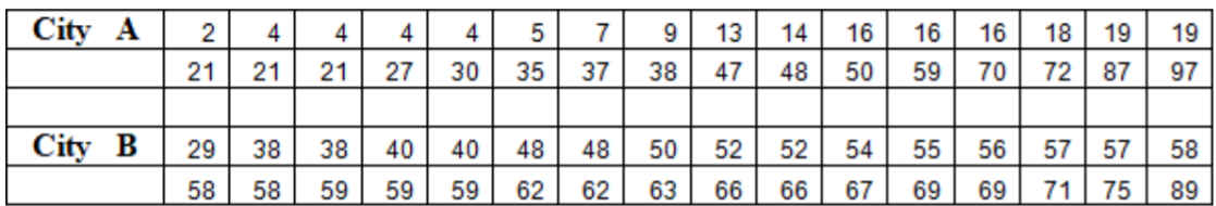
- Find the quartiles and interquartile range for each group.
- Calculate the 80th percentile for each group.
- Construct side‐by‐side box plots, and compare the two groups
- Rank the following correlation coefficients from weakest to strongest.
.343, ‐.318, .214, ‐.765, 0, .998, ‐.932, .445
- If you were trying to think of factors that affect health care costs:
- Choose a variable you believe would be positively correlated with health care costs.
- Choose a variable you believe would be negatively correlated with health care costs.
- Choose a variable you believe would be uncorrelated with health care costs.