
3.1: Degrees, hours and kilometers- measurement data
- Page ID
- 3554

It is extremely important that temperature and distance change smoothly and continuously. This means, that if we have two different measures of the temperature, we can always imagine an intermediate value. Any two temperature or distance measurements form an interval including an infinite amount of other possible values. Thus, our first data type is called measurement, or interval. Measurement data is similar to the ideal endless ruler where every tick mark corresponds to a real number.
However, measurement data do not always change smoothly and continuously from negative infinity to positive infinity. For example, temperature corresponds to a ray and not a line since it is limited with an absolute zero (\(0^\circ\)K), and the agreement is that below it no temperature is possible. But the rest of the temperature points along its range are still comparable with real numbers.
It is even more interesting to measure angles. Angles change continuously, but after 359\(^\circ\) goes 0\(^\circ\)! Instead of a line, there is a segment with only positive values. This is why exists a special circular statistics that deals with angles.
Sometimes, collecting measurement data requires expensive or rare equipment and complex protocols. For example, to estimate the colors of flowers as a continuous variable, you would (as minimum) have to use spectrophotometer to measure the wavelength of the reflected light (a numerical representation of visible color).
Now let us consider another example. Say, we are counting the customers in a shop. If on one day there were 947 people, and 832 on another, we can easily imagine values in between. It is also evident that on the first day there were more customers. However, the analogy breaks when we consider two consecutive numbers (like 832 and 831) because, since people are not counted in fractions, there is no intermediate. Therefore, these data correspond better to natural then to real numbers. These numbers are ordered, but not always allow intermediates and are always non-negative. They belong to a different type of measurement data—not continuous, but discreteI\(^{[1]}\).
Related with definition of measurement data is the idea of parametricity. With that approach, inferential statistical methods are divided into parametric and nonparametric. Parametric methods are working well if:
- Data type is continuous measurement.
- Sample size is large enough (usually no less then 30 individual observations).
- Data distribution is normal or close to it. This data is often called “normal”, and this feature—“normality”.
Should at least one of the above assumptions to be violated, the data usually requires nonparametric methods. An important advantage of nonparametric tests is their ability to deal with data without prior assumptions about the distribution. On the other hand, parametric methods are more powerful: the chance of find an existing pattern is higher because nonparametric algorithms tend to “mask” differences by combining individual observations into groups. In addition, nonparametric methods for two and more samples often suffer from sensitivity to the inequality of sample distributions.
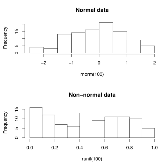
Let us create normal and non-normal data artificially:
Code \(\PageIndex{1}\) (R):
(First command creates 10 random numbers which come from normal distribution. Second creates numbers from uniform distribution\(^{[2]}\) Whereas first set of numbers are concentrated around zero, like in darts game, second set are more or less equally spaced.)
But how to tell normal from non-normal? Most simple is the visual way, with appropriate plots (Figure \(\PageIndex{1}\)):
Code \(\PageIndex{2}\) (R):
(Do you see the difference? Histograms are good to check normality but there are better plots—see next chapter for more advanced methods.)
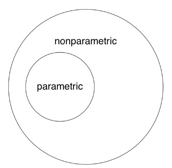
Note again that nonparametric methods are applicable to both “nonparametric” and “parametric” data whereas the opposite is not true (Figure \(\PageIndex{2}\)).
By the way, this last figure (Euler diagram) was created with R by typing the following commands:
Code \(\PageIndex{3}\) (R):
(We used plotrix package which has the draw.circle() command defined. As you see, one may use R even for these exotic purposes. However, diagrams are better to draw in specialized applications like Inkscape.)
Measurement data are usually presented in R as numerical vectors. Often, one vector corresponds with one sample. Imagine that we have data on heights (in cm) of the seven employees in a small firm. Here is how we create a simple vector:
Code \(\PageIndex{3}\) (R):
As you learned from the previous chapter, x is the name of the R object, <- is an assignment operator, and c() is a function to create vector. Every R object has a structure:
Code \(\PageIndex{4}\) (R):
Function str() shows that x is a num, numerical vector. Here is the way to check if an object is a vector:
Code \(\PageIndex{5}\) (R):
There are many is.something()-like functions in R, for example:
Code \(\PageIndex{6}\) (R):
There are also multiple as.something()-like conversion functions.
To sort heights from smallest to biggest, use:
Code \(\PageIndex{7}\) (R):
To reverse results, use:
Code \(\PageIndex{8}\) (R):
Measurement data is somehow similar to the common ruler, and R package vegan has a ruler-like linestack() plot useful for plotting linear vectors:
One of simple but useful plots is the linestack() timeline plot from vegan package (Figure \(\PageIndex{3}\)):
Code \(\PageIndex{1}\) (R):
In the open repository, file compositae.txt contains results of flowering heads measurements for many species of aster family (Compositae). In particular, we measured the overall diameter of heads (variable HEAD.D) and counted number of rays (“petals”, variable RAYS, see Figure \(\PageIndex{4}\)). Please explore part of this data graphically, with scatterplot(s) and find out if three species (yellow chamomile, Anthemis tinctoria; garden cosmos, Cosmos bipinnatus; and false chamomile, Tripleurospermum inodorum) are different by combination of diameter of heads and number of rays.

References
1. Discrete measurement data are in fact more handy to computers: as you might know, processors are based on 0/1 logic and do not readily understand non-integral, floating numbers.
2. For unfamiliar words, please refer to the glossary in the end of book.