1.5: Numerical Descriptions of Data, II: Measures of Spread
- Page ID
- 8884
Range
The simplest – and least useful – measure of the spread of some data is literally how much space on the \(x\)-axis the histogram takes up. To define this, first a bit of convenient notation:
DEFINITION 1.5.1. Suppose \(x_1, \dots, x_n\) is some quantitative dataset. We shall write \(x_{min}\) for the smallest and \(x_{max}\) for the largest values in the dataset.
With this, we can define our first measure of spread
DEFINITION 1.5.2. Suppose \(x_1, \dots, x_n\) is some quantitative dataset. The range of this data is the number \(x_{max}-x_{min}\).
EXAMPLE 1.5.3. Using again the statistics test scores data from Example 1.3.1, we can read off from the stem-and-leaf plot that \(x_{min}=25\) and \(x_{max}=100\), so the range is \(75(=100-25)\).
EXAMPLE 1.5.4. Working now with the made-up data in Example 1.4.2, which was put into increasing order in Example 1.4.9, we can see that \(x_{min}=-3.1415\) and \(x_{max}=17\), so the range is \(20.1415(=17-(-3.1415))\).
The thing to notice here is that since the idea of outliers is that they are outside of the normal behavior of the dataset, if there are any outliers they will definitely be what value gets called \(x_{min}\) or \(x_{max}\) (or both). So the range is supremely sensitive to outliers: if there are any outliers, the range will be determined exactly by them, and not by what the typical data is doing.
Quartiles and the \(IQR\)
Let’s try to find a substitute for the range which is not so sensitive to outliers. We want to see how far apart not the maximum and minimum of the whole dataset are, but instead how far apart are the typical larger values in the dataset and the typical smaller values. How can we measure these typical larger and smaller? One way is to define these in terms of the typical – central – value of the upper half of the data and the typical value of the lower half of the data. Here is the definition we shall use for that concept:
DEFINITION 1.5.5. Imagine that we have put the values of a dataset \(\{x_1, \dots, x_n\}\) of \(n\) numbers in increasing (or at least non-decreasing) order, so that \(x_1\le x_2\le \dots \le x_n\). If \(n\) is odd, call the lower half data all the values \(\{x_1, \dots, x_{(n-1)/2}\}\) and the upper half data all the values \(\{x_{(n+3)/2}, \dots, x_n\}\); if \(n\) is even, the lower half data will be the values \(\{x_1, \dots, x_{n/2}\}\) and the upper half data all the values \(\{x_{(n/2)+1}, \dots, x_n\}\).
Then the first quartile, written \(Q_1\), is the median of the lower half data, and the third quartile, written \(Q_3\), is the median of the upper half data.
Note that the first quartile is halfway through the lower half of the data. In other words, it is a value such that one quarter of the data is smaller. Similarly, the third quartile is halfway through the upper half of the data, so it is a value such that three quarters of the data is small. Hence the names “first” and “third quartiles.”
We can build a outlier-insensitive measure of spread out of the quartiles.
DEFINITION 1.5.6. Given a quantitative dataset, its inter-quartile range or \(IQR\) is defined by \(IQR=Q_3-Q_1\).
EXAMPLE 1.5.7. Yet again working with the statistics test scores data from Example 1.3.1, we can count off the lower and upper half datasets from the stem-and-leaf plot, being respectively \[\rm{Lower}=\{25, 25, 40, 58, 68, 69, 69, 70, 70, 71, 73, 73, 73, 74, 76\}\] and \[\ \ \ \ \ \rm{Upper} = \{77, 78, 80, 83, 83, 86, 87, 88, 90, 90, 90, 92, 93, 95, 100\}\ .\] It follows that, for these data, \(Q_1=70\) and \(Q_3=88\), so \(IQR=18(=88-70)\).
EXAMPLE 1.5.8. Working again with the made-up data in Example 1.4.2, which was put into increasing order in Example 1.4.9, we can see that the lower half data is \(\{-3.1415, .75\}\), the upper half is \(\{2, 17\}\), \(Q_1=-1.19575(=\frac{-3.1415+.75}{2})\), \(Q_3=9.5(=\frac{2+17}{2})\), and \(IQR=10.69575(=9.5-(-1.19575))\).
Variance and Standard Deviation
We’ve seen a crude measure of spread, like the crude measure “mode” of central tendency. We’ve also seen a better measure of spread, the \(IQR\), which is insensitive to outliers like the median (and built out of medians). It seems that, to fill out the parallel triple of measures, there should be a measure of spread which is similar to the mean. Let’s try to build one.
Suppose the data is sample data. Then how far a particular data value \(x_i\) is from the sample mean \(\overline{x}\) is just \(x_i-\overline{x}\). So the mean displacement from the mean, the mean of \(x_i-\overline{x}\), should be a good measure of variability, shouldn’t it?
Unfortunately, it turns out that the mean of \(x_i-\overline{x}\) is always 0. This is because when \(x_i>\overline{x}\), \(x_i-\overline{x}\) is positive, while when \(x_i<\overline{x}\), \(x_i-\overline{x}\) is negative, and it turns out that the positives always exactly cancel the negatives (see if you can prove this algebraically, it’s not hard).
We therefore need to make the numbers \(x_i-\overline{x}\) positive before taking their mean. One way to do this is to square them all. Then we take something which is almost the mean of these squared numbers to get another measure of spread or variability:
DEFINITION 1.5.9. Given sample data \(x_1, \dots, x_n\) from a sample of size \(n\), the sample variance is defined as \[S_x^2 = \frac{\sum \left(x_i-\overline{x}\right)^2}{n-1} .\] Out of this, we then define the sample standard deviation \[S_x = \sqrt{S_x^2} = \sqrt{\frac{\sum \left(x_i-\overline{x}\right)^2}{n-1}} .\]
Why do we take the square root in that sample standard deviation? The answer is that the measure we build should have the property that if all the numbers are made twice as big, then the measure of spread should also be twice as big. Or, for example, if we first started working with data measured in feet and then at some point decided to work in inches, the numbers would all be 12 times as big, and it would make sense if the measure of spread were also 12 times as big.
The variance does not have this property: if the data are all doubled, the variance increases by a factor of 4. Or if the data are all multiplied by 12, the variance is multiplied by a factor of 144.
If we take the square root of the variance, though, we get back to the nice property of doubling data doubles the measure of spread, etc. For this reason, while we have defined the variance on its own and some calculators, computers, and on-line tools will tell the variance whenever you ask them to computer 1-variable statistics, we will in this class only consider the variance a stepping stone on the way to the real measure of spread of data, the standard deviation.
One last thing we should define in this section. For technical reasons that we shall not go into now, the definition of standard deviation is slightly different if we are working with population data and not sample data:
DEFINITION 1.5.10. Given data \(x_1, \dots, x_n\) from an entire population of size \(n\), the population variance is defined as \[\ \sigma X^2 = \frac{\sum \left(x_i-\mu X\right)^2}{n} .\] Out of this, we then define the population standard deviation \[\ \sigma X = \sqrt{\sigma X^2} = \sqrt{\frac{\sum \left(x_i-\mu X\right)^2}{n}} .\]
[This letter \(\ \sigma\) is the lower-case Greek letter sigma, whose upper case \(\ \Sigma\) you’ve seen elsewhere.]
Now for some examples. Notice that to calculate these values, we shall always use an electronic tool like a calculator or a spreadsheet that has a built-in variance and standard deviation program – experience shows that it is nearly impossible to get all the calculations entered correctly into a non-statistical calculator, so we shall not even try.
EXAMPLE 1.5.11. For the statistics test scores data from Example 1.3.1, entering them into a spreadsheet and using VAR.S and STDEV.S for the sample variance and standard deviation and VAR.P and STDEV.P for population variance and population standard deviation, we get \[\begin{aligned} S_x^2 &= 331.98\\ S_x &= 18.22\\ \sigma X^2 &= 330.92\\ \sigma X &= 17.91\end{aligned}\]
EXAMPLE 1.5.12. Similarly, for the data in Example 1.4.2, we find in the same way that \[\begin{aligned} S_x^2 &= 60.60\\ S_x &= 7.78\\ \sigma X^2 &= 48.48\\ \sigma X &= 6.96\end{aligned}\]
Strengths and Weaknesses of These Measures of Spread
We have already said that the range is extremely sensitive to outliers.
The \(IQR\), however, is built up out of medians, used in different ways, so the \(IQR\) is insensitive to outliers.
The variance, both sample and population, is built using a process quite like a mean, and in fact also has the mean itself in the defining formula. Since the standard deviation in both cases is simply the square root of the variance, it follows that the sample and population variances and standard deviations are all sensitive to outliers.
This differing sensitivity and insensitivity to outliers is the main difference between the different measures of spread that we have discussed in this section.
One other weakness, in a certain sense, of the \(IQR\) is that there are several different definitions in use of the quartiles, based upon whether the median value is included or not when dividing up the data. These are called, for example, QUARTILE.INC and QUARTILE.EXC on some spreadsheets. It can then be confusing which one to use.
A Formal Definition of Outliers – the \(1.5\,IQR\) Rule
So far, we have said that outliers are simply data that are atypical. We need a precise definition that can be carefully checked. What we will use is a formula (well, actually two formulæ) that describe that idea of an outlier being far away from the rest of data.
Actually, since outliers should be far away either in being significantly bigger than the rest of the data or in being significantly smaller, we should take a value on the upper side of the rest of the data, and another on the lower side, as the starting points for this far away. We can’t pick the \(x_{max}\) and \(x_{min}\) as those starting points, since they will be the outliers themselves, as we have noticed. So we will use our earlier idea of a value which is typical for the larger part of the data, the quartile \(Q_3\), and \(Q_1\) for the corresponding lower part of the data.
Now we need to decide how far is far enough away from those quartiles to count as an outlier. If the data already has a lot of variation, then a new data value would have to be quite far in order for us to be sure that it is not out there just because of the variation already in the data. So our measure of far enough should be in terms of a measure of spread of the data.
Looking at the last section, we see that only the \(IQR\) is a measure of spread which is insensitive to outliers – and we definitely don’t want to use a measure which is sensitive to the outliers, one which would have been affected by the very outliers we are trying to define.
All this goes together in the following
DEFINITION 1.5.13. [The \(1.5\,IQR\) Rule for Outliers] Starting with a quantitative dataset whose first and third quartiles are \(Q_1\) and \(Q_3\) and whose inter-quartile range is \(IQR\), a data value \(x\) is [officially, from now on] called an outlier if \(x<Q_1-1.5\,IQR\) or \(x>Q_3+1.5\,IQR\).
Notice this means that \(x\) is not an outlier if it satisfies \(Q_1-1.5\,IQR\le x\le Q_3+1.5\,IQR\).
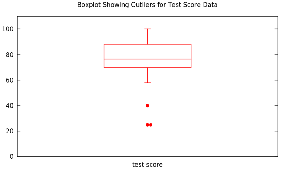
EXAMPLE 1.5.14. Let’s see if there were any outliers in the test score dataset from Example 1.3.1. We found the quartiles and IQR in Example 1.5.7, so from the \(1.5\,IQR\) Rule, a data value \(x\) will be an outlier if \[x<Q_1-1.5\,IQR=70-1.5\cdot18=43\] or if \[x>Q_3+1.5\,IQR=88+1.5\cdot18=115\ .\] Looking at the stemplot in Table 1.3.1, we conclude that the data values \(25\), \(25\), and \(40\) are the outliers in this dataset.
EXAMPLE 1.5.15. Applying the same method to the data in Example 1.4.2, using the quartiles and IQR from Example 1.5.8, the condition for an outlier \(x\) is \[x<Q_1-1.5\,IQR=-1.19575-1.5\cdot10.69575=-17.239375\] or \[x>Q_3+1.5\,IQR=9.5+1.5\cdot10.69575=25.543625\ .\] Since none of the data values satisfy either of these conditions, there are no outliers in this dataset.
The Five-Number Summary and Boxplots
We have seen that numerical summaries of quantitative data can be very useful for quickly understanding (some things about) the data. It is therefore convenient for a nice package of several of these
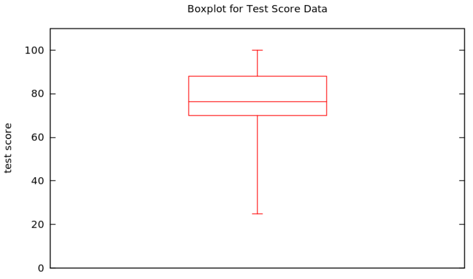
DEFINITION 1.5.16. Given a quantitative dataset \(\{x_1, \dots, x_n\}\), the five-number summary5 of this data is the set of values \[\left\{x_{min},\ \ Q_1,\ \ \mathrm{median},\ \ Q_3,\ \ x_{max}\right\}\]
EXAMPLE 1.5.17. Why not write down the five-number summary for the same test score data we saw in Example 1.3.1? We’ve already done most of the work, such as calcu- lating the min and max in Example 1.5.3, the quartiles in Example 1.5.7, and the median in Example 1.4.10, so the five-number summary is \[\begin{aligned} x_{min}&=25\\ Q_1&=70\\ \mathrm{median}&=76.5\\ Q_3&=88\\ x_{max}&=100\end{aligned}\]
EXAMPLE 1.5.18. And, for completeness, the five number summary for the made-up data in Example 1.4.2 is \[\begin{aligned} x_{min}&=-3.1415\\ Q_1&=-1.9575\\ \mathrm{median}&=1\\ Q_3&=9.5\\ x_{max}&=17\end{aligned}\] where we got the min and max from Example 1.5.4, the median from Example 1.4.9, and the quartiles from Example 1.5.8.
As we have seen already several times, it is nice to have a both a numeric and a graphical/visual version of everything. The graphical equivalent of the five-number summary is
DEFINITION 1.5.19. Given some quantitative data, a boxplot [sometimes box-and-whisker plot] is a graphical depiction of the five-number summary, as follows:
- an axis is drawn, labelled with the variable of the study
- tick marks and numbers are put on the axis, enough to allow the following visual features to be located numerically
- a rectangle (the box) is drawn parallel to the axis, stretching from values \(Q_1\) to \(Q_3\) on the axis
- an addition line is drawn, parallel to the sides of the box at locations \(x_{min}\) and \(x_{max}\), at the axis coordinate of the median of the data
- lines are drawn parallel to the axis from the middle of sides of the box at the locations \(x_{min}\) and \(x_{max}\) out to the axis coordinates \(x_{min}\) and \(x_{max}\), where these whiskers terminate in “T”s.
EXAMPLE 1.5.20. A boxplot for the test score data we started using in Example 1.3.1 is easy to make after we found the corresponding five-number summary in Example 1.5.17:
Sometimes it is nice to make a version of the boxplot which is less sensitive to outliers. Since the endpoints of the whiskers are the only parts of the boxplot which are sensitive in this way, they are all we have to change:
DEFINITION 1.5.21. Given some quantitative data, a boxplot showing outliers [sometimes box-and-whisker plot showing outliers] is minor modification of the regular boxplot, as follows
- the whiskers only extend as far as the largest and smallest non-outlier data values
- dots are put along the lines of the whiskers at the axis coordinates of any outliers in the dataset
EXAMPLE 1.5.22. A boxplot showing outliers for the test score data we started using in Example 1.3.1 is only a small modification of the one we just made in Example 1.5.20