
7: Analysis of Bivariate Quantitative Data
- Page ID
- 5324

For the past three chapters you have been learning about making inferences for univariate data. For each research question that could be asked, only one random variable was needed for the answer. That random variable could be either categorical or quantitative. In some cases, the same random variable could be sampled and compared for two different populations, but that still makes it univariate data. In this chapter, we will explore bivariate quantitative data. This means that for each unit in our sample, two quantitative variables will be determined. The purpose of collecting two quantitative variables is to determine if there is a relationship between them.
The last time the analysis of two quantitative variables was discussed was in Chapter 4 when you learned to make a scatter plot and find the correlation. At the time, it was emphasized that even if a correlation exists, that fact alone is insufficient to prove causation. There are a variety of possible explanations that could be provided for an observed correlation. These were listed in Chapter 4 and provided again here.
- Changing the x variable will cause a change in the y variable
- Changing the y variable will cause a change in the x variable
- A feedback loop may exist in which a change in the x variable leads to a change in the y variable which leads to another change in the x variable, etc.
- The changes in both variables are determined by a third variable
- The changes in both variables are coincidental.
- The correlation is the result of outliers, without which there would not be significant correlation.
- The correlation is the result of confounding variables.
Causation is easier to prove with a manipulative experiment than an observational experiment. In a manipulative experiment, the researcher will randomly assign subjects to different groups, thereby diminishing any possible effect from confounding variables. In observational experiments, confounding variables cannot be distributed equitably throughout the population being studied. Manipulative experiments cannot always be done because of ethical reasons. For example, the earth is currently undergoing an observational experiment in which the explanatory variable is the amount of fossil fuels being converted to carbon dioxide and the response variable is the mean global temperature. It would have been considered unethical if a scientist had proposed in the 1800s that we should burn as many fossil fuels as possible to see how it affects the global temperature. Likewise, experiments that would force someone to smoke, text while driving, or do other hazardous actions would not be considered ethical and so correlations must be sought using observational experiments.
There are several reasons why it is appropriate to collect and analyze bivariate data. One such reason is that the dependent or response variable is of greater interest but the independent or explanatory variable is easier to measure. Therefore, if there is a strong relationship between the explanatory and response variable, that relationship can be used to calculate the response variable using data from the explanatory variable. For example, a physician would really like to know the degree to which a patient’s coronary arteries are blocked, but blood pressure is easier data to obtain. Therefore, since there is a strong relationship between blood pressure and the degree to which arteries are blocked, then blood pressure can be used as a predictive tool.
Another reason for collecting and analyzing bivariate data is to establish norms for a population. As an example, infants are both weighed and measured at birth and there should be a correlation between their weight and length (height?). A baby that is substantially underweight compared to babies of the same length would raise concerns for the doctor.
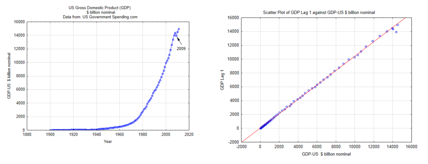
In order to use the methods described in this chapter, the data must be independent, quantitative, continuous, and have a bivariate normal distribution. The use of discrete quantitative data exceeds the scope of this chapter. Independence means that the magnitude of one data value does not affect the magnitude of another data value. This is often violated when time series data are used. For example, annual GDP (gross domestic product) data should not be used as one of the random variables for bivariate data analysis because the size of the economy in one year has a tremendous influence on the size of it the next year. This is shown in the two graphs below. The graph on the left is a time series graph of the actual GDP for the US. The graph on the right is a scatter plot that uses the GDP for the US as the x variable and the GDP for the US one year later (lag 1) for the y value. The fact that these points are in such a straight line indicates that the data are not independent. Consequently, this data should not be used in the type of the analyses that will be discussed in this chapter.
A bivariate normal distribution is one in which y values are normally distributed for each x value and x values are normally distributed for each y value. If this could be graphed in three dimensions, the surface would look like a mountain with a rounded peak.
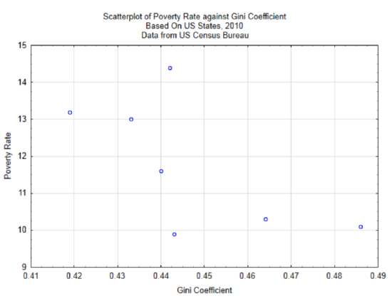
We will now return to the example in chapter 4 in which the relationship between the wealth gap, as measured by the Gini Coefficient, and poverty were explored. Life can be more difficult for those in poverty and certainly the influence they can have in the country is far more limited than those who are affluent. Since people in poverty must channel their energies into survival, they have less time and energy to put towards things that would benefit humanity as a whole. Therefore, it is in the interest of all people to find a way to reduce poverty and thereby increase the number of people who can help the world improve.
There are a lot of possible variables that could contribute to poverty. A partial list is shown below. Not all of these are quantitative variables and some can be difficult to measure, but they can still have an impact on poverty levels
- Education
- Parent’s income level
- Community’s income level
- Job availability
- Mental Health
- Knowledge
- Motivation and determination
- Physically disabilities or illness
- Wealth gap
- Race/ethnicity/immigration status/gender
- Percent of population that is employed
In Chapter 4, only the relationship between wealth gap and poverty level was explored. Data was gathered from seven states to determine if there is a correlation between these two variables. The scatter plot is reproduced below. The correlation is -0.65.
As a reminder, correlation is a number between -1 and 1. The population correlation is represented with the Greek letter \(\rho\), while the sample correlation coefficient is represented with the letter \(r\). A correlation of 0 indicates no correlation, whereas a correlation of 1 or -1 indicates a perfect correlation. The question is whether the underlying population has a significant linear relationship. The evidence for this comes from the sample. The hypotheses that are typically tested are:
\(H_0: \rho = 0\)
\(H_1: \rho \ne 0\)
This is a two-tailed test for a non-directional alternative hypothesis. A significant result indicates only that the correlation is not 0, it does not indicate the direction of the correlation.
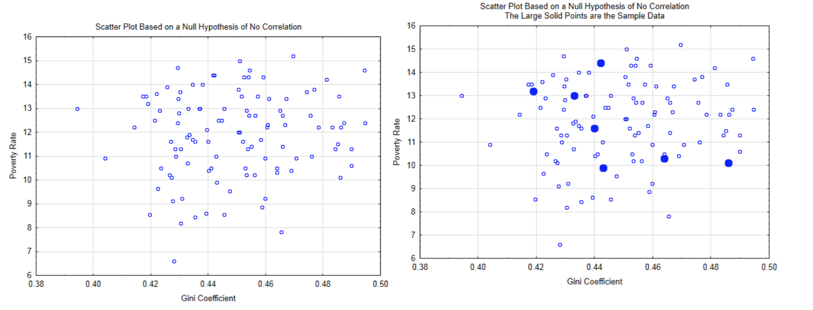
The logic behind this hypothesis test is based on the assumption the null hypothesis is true which means there is no correlation in the population. An example is shown in the scatter plot on the left. From this distribution, the probability of getting the sample data (shown in solid circles in the graph at the right), or more extreme data (forming a straighter line), is calculated.
The test used to determine if the correlation is significant is a t test. The formula is:
\[t = \dfrac{r\sqrt{n - 2}}{\sqrt{1 - r^2}}.\]
There are n - 2 degrees of freedom.
This can be demonstrated with the example of Gini coefficients and poverty rates as provided in Chapter 4 and using a level of significance of 0.05. The correlation is -0.650. The sample size is 7, so there are 5 degrees of freedom. After substituting into the test statistic, \(t = \dfrac{-0.650 \sqrt{7 - 2}}{\sqrt{1 - (-0.650)^2}}\), the value of the test statistic is -1.91. Based on the t-table with 5 degrees of freedom, the two-sided p-value is greater than 0.10 (actual 0.1140). Consequently, there is not a significant correlation between Gini coefficient and poverty rates.
Another explanatory variable that can be investigated for its correlation with poverty rates is the employment-population ratio (percent). This is the percent of the population that is employed at least one hour in the month
.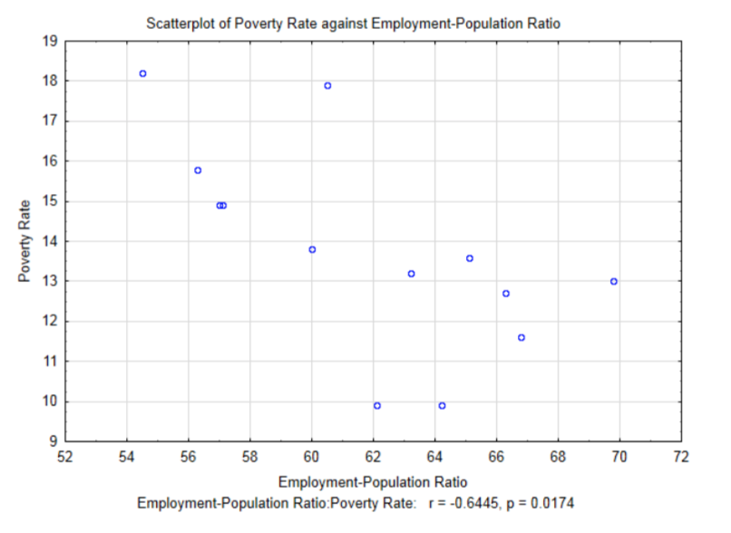
The correlation for this data is -0.6445, \(t\) = -2.80 and \(p\) = 0.0174. Notice at the 0.05 level of significance, this correlation is significant. Before exploring the meaning of a significant correlation, compare the results of the correlation between Gini Coefficient and poverty rate which was -0.650 and the results of the correlation between Employment-Population Ratio and poverty rates which is -0.6445. The former correlation was not significant while the later was significant even though it is less than the former. This is a good example of why the knowledge of a correlation coefficient is not sufficient information to determine if the correlation is significant. The other factor that influences the determination of significance is the sample size. The Employment-Population Ratio/poverty rates data was determined from a larger sample size (13 compared with 7). Sample size plays an important role in determining if the alternative is supported. With very large samples, very small sample correlations can be shown to be significant. The question is whether significant corresponds with important.
The effect of sample size on possible correlations is shown in the four distributions below. These distributions were created by starting with a population that had a correlation of \(\rho = 0.000\).10,000 samples of size 5,15,35, and 300 were drawn from this population, with replacement.
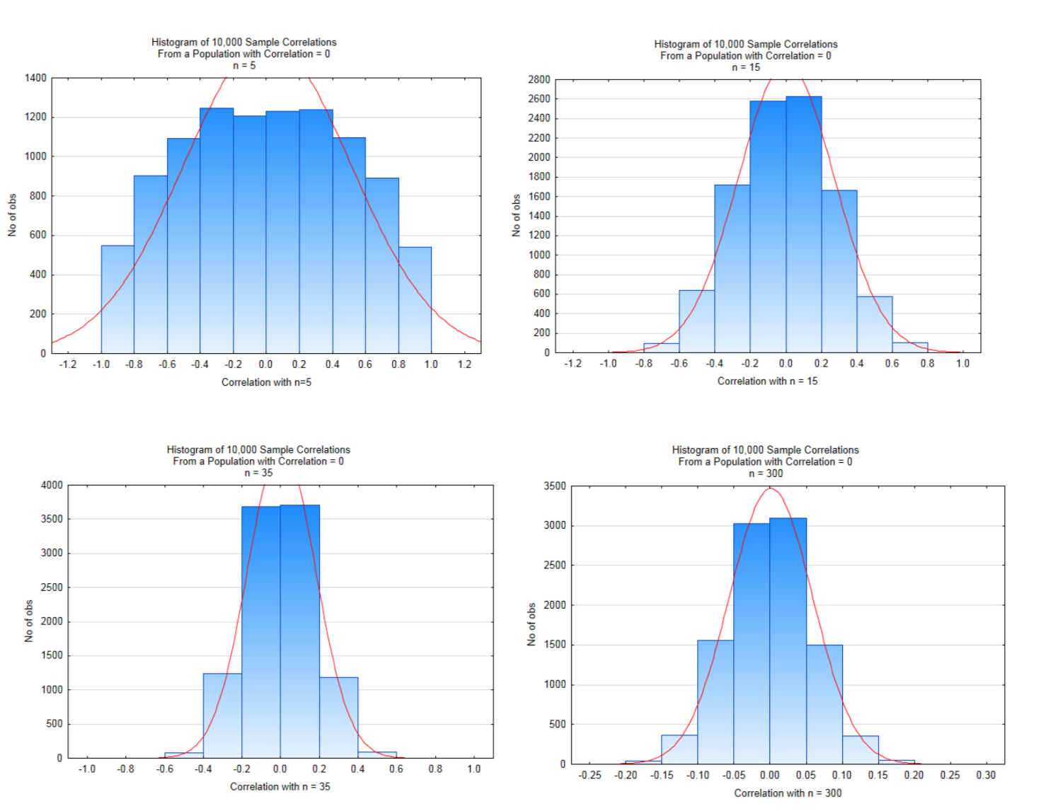
Look carefully at the x-axis scales and the heights of the bars. Values near the middle of the graphs are likely values while values on the far left and right of the graph are unlikely values which, when testing a hypothesis, would possibly lead to a significant conclusion. With small sample sizes, the magnitude of the correlation must be very large to conclude there is significant correlation. As the sample size increases, the magnitude of the correlation can be much smaller to conclude there is significant correlation. The critical values for each of these are shown in the table below and are based on a two-tailed test with a level of significance of 5%.
| n | 5 | 15 | 35 | 300 |
|---|---|---|---|---|
| t | 2.776 | 2.145 | 2.032 | 1.968 |
| |r| | 0.848 | 0.511 | 0.334 | 0.113 |
In the histogram in the bottom right in which the sample size was 300, a correlation that exceeds 0.113 would lead to a conclusion of significant correlation, yet there is the question of whether a correlation that small is very meaningful, even if it is significant. It might be meaningful or it might not. The researcher must determine that for each situation.
Returning to the analysis of Gini coefficients and poverty rates, since there was not a significant correlation between these two variables, then there is no point in trying to use Gini Coefficients to estimate poverty rates or focusing on changes to the wealth gap as a way of improving the poverty rate. There might be other reasons for wanting to change the wealth gap, but its impact on poverty rates does not appear to be one of the reasons. On the other hand, because there is a significant correlation between Employment-Population Ratio and poverty rates, then it is reasonable to use the relationship between them as a model for estimating poverty rates for specific Employment-Population Ratios. If this relationship can be determined to be causal, then it justifies improving the employment-population ratio to help reduce poverty rates. In other words, people need jobs to get out of poverty.
Since the Pearson Product Moment Correlation Coefficient measures the strength of the linear relationship between the two variables, then it is reasonable to find the equation of the line that best fits the data. This line is called the least squares regression line or the line of best fit. A regression line has been added to the graph for Employment-Population Ratio and Poverty Rates. Notice that there is a negative slope to the line. This corresponds to the sign of the correlation coefficient.
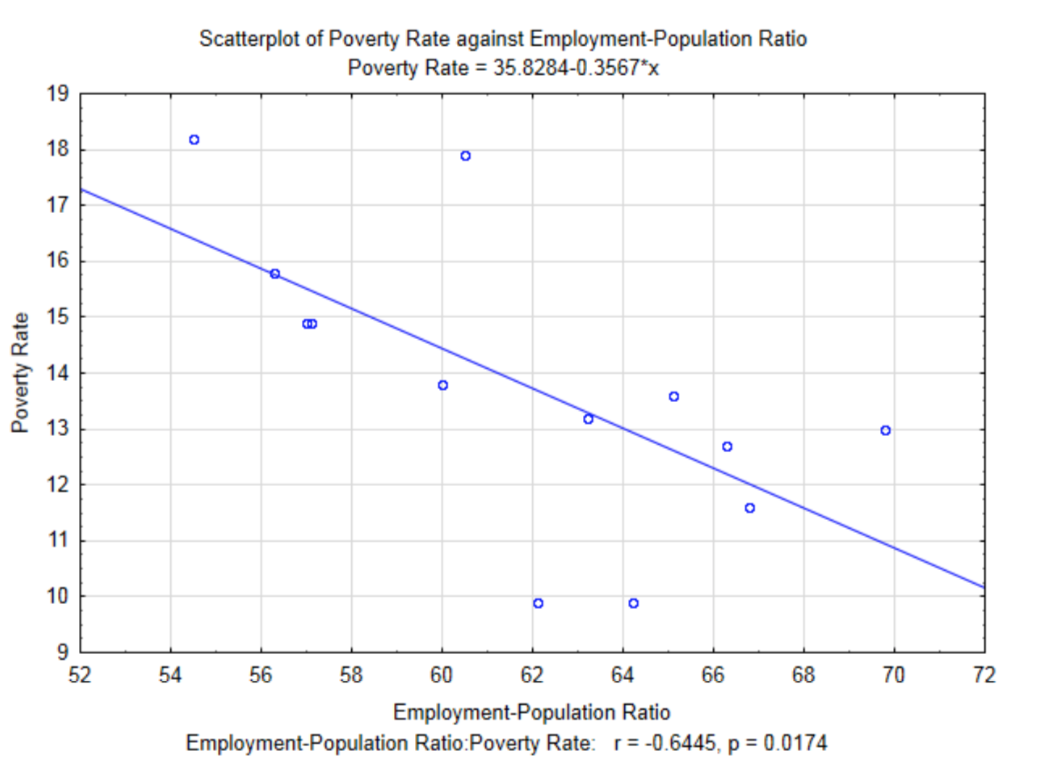
The equation of the line, as it appears in the subtitle of the graph is \(y = 35.8284 – 0.3567x\), where \(x\) is the Employment-Population Ratio and \(y\) is the poverty rate. As an algebra student, you were taught that a linear equation can be written in the form of \(y = mx + b\). In statistics, linear regression equations are written in the form \(y = b + mx\) except that they traditionally are shown as \(y' = a + bx\) where \(y'\) represents the y value predicted by the line, \(a\) represents the \(y\) intercept and \(b\) represents the slope.
To calculate the values of \(a\) and \(b\), 5 other values are needed first. These are the correlation (r), the mean and standard deviation for \(x\) (\(\bar{x}\) and \(s_x\)) and the mean and standard deviation for \(y\) (\(\bar{y}\) and \(s_y\)). First find \(b\) using the formula: \(b = r(\dfrac{s_y}{s_x})\). Next, substitute \(\bar{y}\), \(\bar{x}\), and \(b\) into the basic linear equation \(\bar{y} = a + b\bar{x}\) and solve for \(a\).
For this example, \(r = -0.6445\), \(bar{x} = 61.76\), \(s_x = 4.67\), \(bar{y} = 13.80\), and \(s_y = 2.58\).
\(b = r(\dfrac{s_y}{s_x})\)
\(b = -0.6445(\dfrac{2.58}{4.67}) = -0.3561\)
\(\bar{y} = a + b\bar{x}\)
\(1380 = a + -0.3561(61.76)\)
\(a = 35.79\)
Therefore, the final regression equation is \(y' = 35.79 - 0.3561x\). The difference between this equation and the one in the graph is the result of rounding errors used for these calculations.
The regression equation allows us to estimate the y value, but does not provide an indication of the accuracy of the estimate. In other words, what is the effect of the relationship between \(x\) and \(y\) on the \(y\) value?
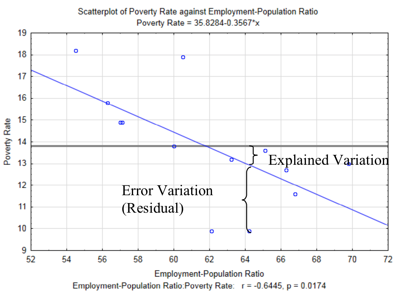
To determine the influence of the relationship between \(x\) and \(y\) begins with the idea that there is variation between the \(y\) value and the mean of all the \(y\) values (\(bar{y}\)). This is something that you have seen with univariate quantitative data. There are two reasons why the \(y\) values are not equivalent to the mean. These are called explained variation and error variation. Explained variation is the variation that is a consequence of the relationship \(y\) has with \(x\). In other words, \(y\) does not equal the mean of all the \(y\) values because the relationship shown by the regression line influences it. The error variation is the variation between an actual point and the \(y\) value predicted by the regression line that is a consequence of all the other factors that impact the response random variable. This vertical distance between each actual data point and the predicted \(y\) value (\(y'\)) is called the residual. The explained variation and error variation is shown in the graph below. The horizontal line at 13.8 is the mean of all the \(y\) values.
The total variation is given by the sum of the squared distance each value is from the average \(y\) value. This is shown as \(\sum_{i = 1}^{n} (y_i - \bar{y})^2\).
The explained variation is given by the sum of the squared distances the \(y\) value predicted by the regression equation (\(y'\)) is from the average \(y\) value, \(\bar{y}\). This is shown as
\[\sum_{i = 1}^{n} (y_i' - \bar{y})^2.\]
The error variation is given by the sum of the squared distances the actual \(y\) data value is from the predicted \(y\) value (\(y'\)). This is shown as \(\sum_{i = 1}^{n} (y_i - y_i ')^2\).
The relationship between these can be shown with a word equation and an algebraic equation.
Total Variation = Explained Variation + Error Variation
\[\sum_{i = 1}^{n} (y_{i} - \bar{y})^{2} = \sum_{i = 1}^{n} (y_{i}' - \bar{y})^{2} + \sum_{i = 1}^{n} (y_{i} - y_{i} ')^2\]
The primary reason for this discussion is to lead us to an understanding of the mathematical (though not necessarily causal) influence of the \(x\) variable on the \(y\) variable. Since this influence is the explained variation, then we can find the ratio of the explained variation to the total variation. We define this ratio as the coefficient of determination. The ratio is represented by \(r^2\).
\(r^2 = \dfrac{\sum_{i = 1}^{n} (y_i' - \bar{y})^2}{\sum_{i = 1}^{n} (y_i - \bar{y})^2}\)
The coefficient of determination is the square of the correlation coefficient. What it represents is the proportion of the variance of one variable that results from the mathematical influence of the variance of the other variable. The coefficient of determination will always be a value between 0 and 1, that is \(0 \le r^2 \le 1\). While \(r^2\) is presented in this way, it is often spoken of in terms of percent, which results by multiplying the \(r^2\) value by 100.
In the scatter plot of poverty rate against employment-population ratio, the correlation is \(r = - 0.6445\), so \(r^2 = 0.4153\). Therefore, we conclude that 41.53% of the influence on the variance in poverty rate is from the variance in the employment-population ratio. The remaining influence that is considered error variation comes from some of the other items in the list of possible variables that could affect poverty.
There is no definitive scale for determining desirable levels for \(r^2\). While values close to 1 show a strong mathematical relationship and values close to 0 show a weak relationship, the researcher must contemplate the actual meaning of the \(r^2\) value in the context of their research.
Technology
Calculating correlation and regression equations by hand can be very tedious and subject to rounding errors. Consequently, technology is routinely employed to in regression analysis. The data that was used when comparing the Gini Coefficients to poverty rates will be used here.
| Gini Coefficient | Poverty Rate |
|---|---|
| 0.486 | 10.1 |
| 0.443 | 9.9 |
| 0.44 | 11.6 |
| 0.433 | 13 |
| 0.419 | 13.2 |
| 0.442 | 14.4 |
| 0.464 | 10.3 |
ti 84 Calculator
To enter the data, use Stat – Edit – Enter to get to the lists that were used in Chapter 4. Clear lists one and two by moving the cursor up to L1, pushing the clear button and then moving the cursor down. Do the same for L2.
Enter the Gini Coefficients into L1, the Poverty Rate into L2. They must remain paired in the same way they are in the table.
To determine the value of t, the p-value, the r and r2 values and the numeric values in the regression equation, use Stat – Tests – E: LinRegTTest. Enter the Xlist as L1 and the Ylist as L2. The alternate hypothesis is shown as \(\beta\) & \(\rho\): \(\ne\) 0. Put cursor over Calculate and press enter.
The output is:
LinRegTTest
\(y = a + bx\)
\(\beta \ne 0\) and \(\rho \ne 0\)
t = -1.912582657
p = 0.1140079665
df = 5
b = -52.72871602
\(s = 1.479381344\) (standard error)
\(r^2 = 0.4224975727\)
\(r = -0.6499981406\)
Microsoft’s Excel contains an add-in that must be installed in order to complete the regression analysis. In more recent versions of Excel (2010), this addin can be installed by
- Select the file tab
- Select Options
- On the left side, select Add-Ins
- At the bottom, next to where it says Excel Add-ins, click on Go Check the first box, which says Analysis ToolPak then click ok. You may need your Excel disk at this point.
To do the actual Analysis:
- Select the data tab
- Select the data analysis option (near the top right side of the screen)
- Select Regression
- Fill in the spaces for the y and x data ranges.
- Click ok.
A new worksheet will be created that contains a summary output. Some of the numbers are shown in gray to help you know which numbers to look for. Notice how they correspond to the output from the TI 84 and the calculations done earlier in this chapter.
