
7.1: Correlation
- Page ID
- 2911

In many studies, we measure more than one variable for each individual. For example, we measure precipitation and plant growth, or number of young with nesting habitat, or soil erosion and volume of water. We collect pairs of data and instead of examining each variable separately (univariate data), we want to find ways to describe bivariate data, in which two variables are measured on each subject in our sample. Given such data, we begin by determining if there is a relationship between these two variables. As the values of one variable change, do we see corresponding changes in the other variable?
We can describe the relationship between these two variables graphically and numerically. We begin by considering the concept of correlation.
Correlation is defined as the statistical association between two variables.
A correlation exists between two variables when one of them is related to the other in some way. A scatterplot is the best place to start. A scatterplot (or scatter diagram) is a graph of the paired (x, y) sample data with a horizontal x-axis and a vertical y-axis. Each individual (x, y) pair is plotted as a single point.
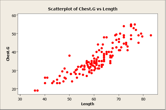
Figure \(\PageIndex{1}\) . Scatterplot of chest girth versus length.
In this example, we plot bear chest girth (y) against bear length (x). When examining a scatterplot, we should study the overall pattern of the plotted points. In this example, we see that the value for chest girth does tend to increase as the value of length increases. We can see an upward slope and a straight-line pattern in the plotted data points.
A scatterplot can identify several different types of relationships between two variables.
- A relationship has no correlation when the points on a scatterplot do not show any pattern.
- A relationship is non-linear when the points on a scatterplot follow a pattern but not a straight line.
- A relationship is linear when the points on a scatterplot follow a somewhat straight line pattern. This is the relationship that we will examine.
Linear relationships can be either positive or negative. Positive relationships have points that incline upwards to the right. As x values increase, y values increase. As x values decrease, y values decrease. For example, when studying plants, height typically increases as diameter increases.
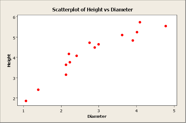
Figure \(\PageIndex{2}\) . Scatterplot of height versus diameter.
Negative relationships have points that decline downward to the right. As x values increase, yvalues decrease. As x values decrease, y values increase. For example, as wind speed increases, wind chill temperature decreases.
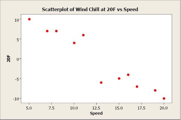
Figure \(\PageIndex{3}\) . Scatterplot of temperature versus wind speed.
Non-linear relationships have an apparent pattern, just not linear. For example, as age increases height increases up to a point then levels off after reaching a maximum height.
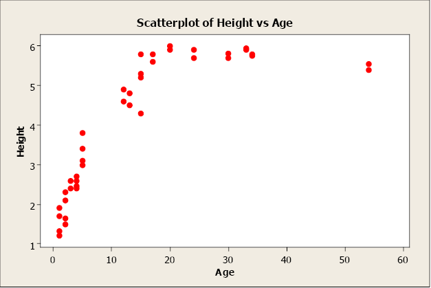
Figure \(\PageIndex{4}\) . Scatterplot of height versus age.
When two variables have no relationship, there is no straight-line relationship or non-linear relationship. When one variable changes, it does not influence the other variable.
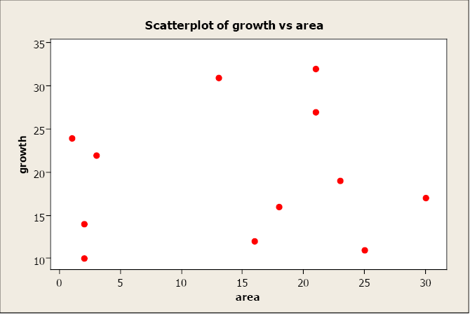
Figure \(\PageIndex{5}\) . Scatterplot of growth versus area.
Linear Correlation Coefficient
Because visual examinations are largely subjective, we need a more precise and objective measure to define the correlation between the two variables. To quantify the strength and direction of the relationship between two variables, we use the linear correlation coefficient:
\[r = \dfrac {\sum \dfrac {(x_i-\bar x)}{s_x} \dfrac {(y_i - \bar y)}{s_y}}{n-1}\]
where \(\bar x\) and \(s_x\) are the sample mean and sample standard deviation of the x’s, and \(\bar y\) and \(s_y\) are the mean and standard deviation of the y’s. The sample size is n.
An alternate computation of the correlation coefficient is:
\[r = \dfrac {S_{xy}}{\sqrt {S_{xx}S_{yy}}}\]
where
\[S_{xx} = \sum x^2 - \dfrac {(\sum x)^2}{n}\]
\[S_{xy} = \sum xy - \dfrac {(\sum x)(\sum y )}{n}\]
\[S_{yy} = \sum y^2 - \dfrac {(\sum x)^2}{n}\]
The linear correlation coefficient is also referred to as Pearson’s product moment correlation coefficient in honor of Karl Pearson, who originally developed it. This statistic numerically describes how strong the straight-line or linear relationship is between the two variables and the direction, positive or negative.
The properties of “r”:
- It is always between -1 and +1.
- It is a unitless measure so “r” would be the same value whether you measured the two variables in pounds and inches or in grams and centimeters.
- Positive values of “r” are associated with positive relationships.
- Negative values of “r” are associated with negative relationships.
Examples of Positive Correlation
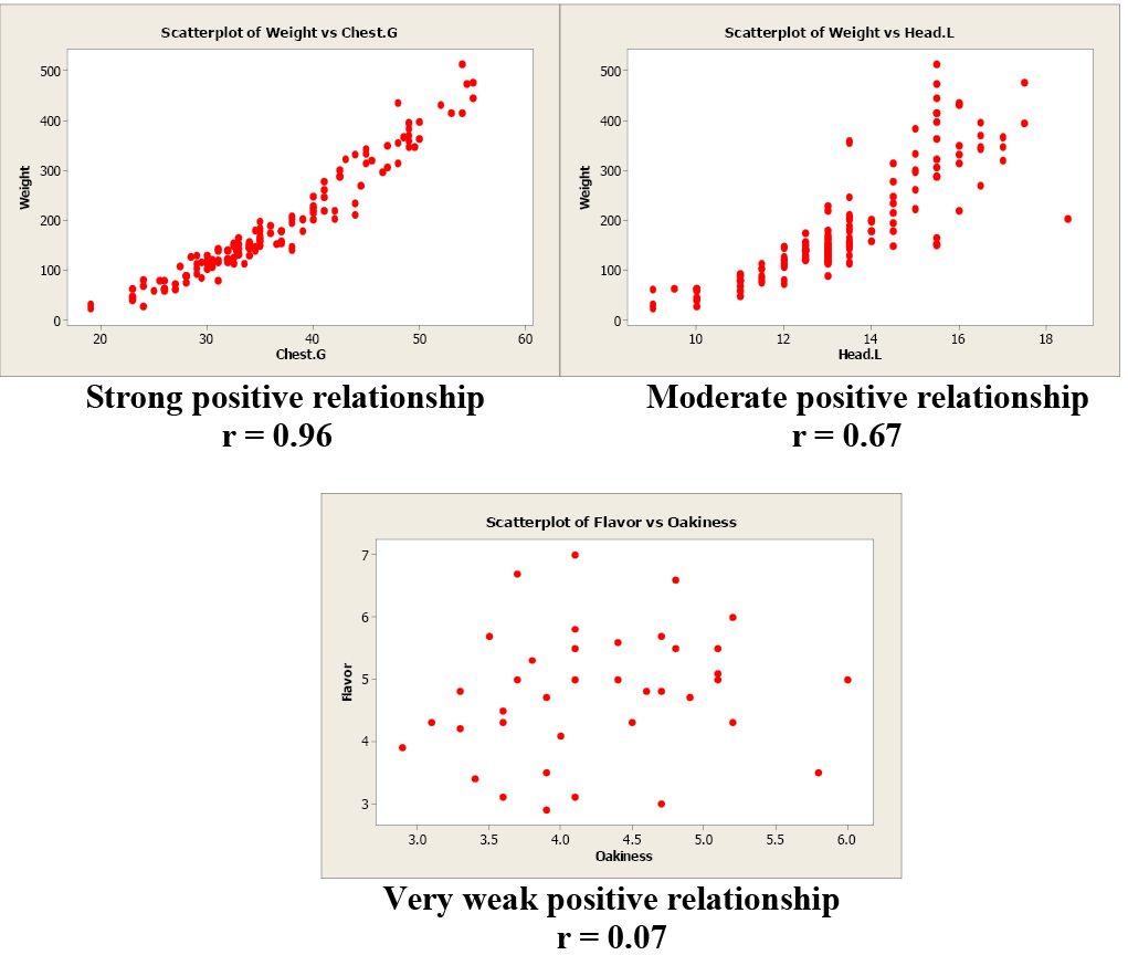
Figure \(\PageIndex{6}\) . Examples of positive correlation.
Examples of Negative Correlation
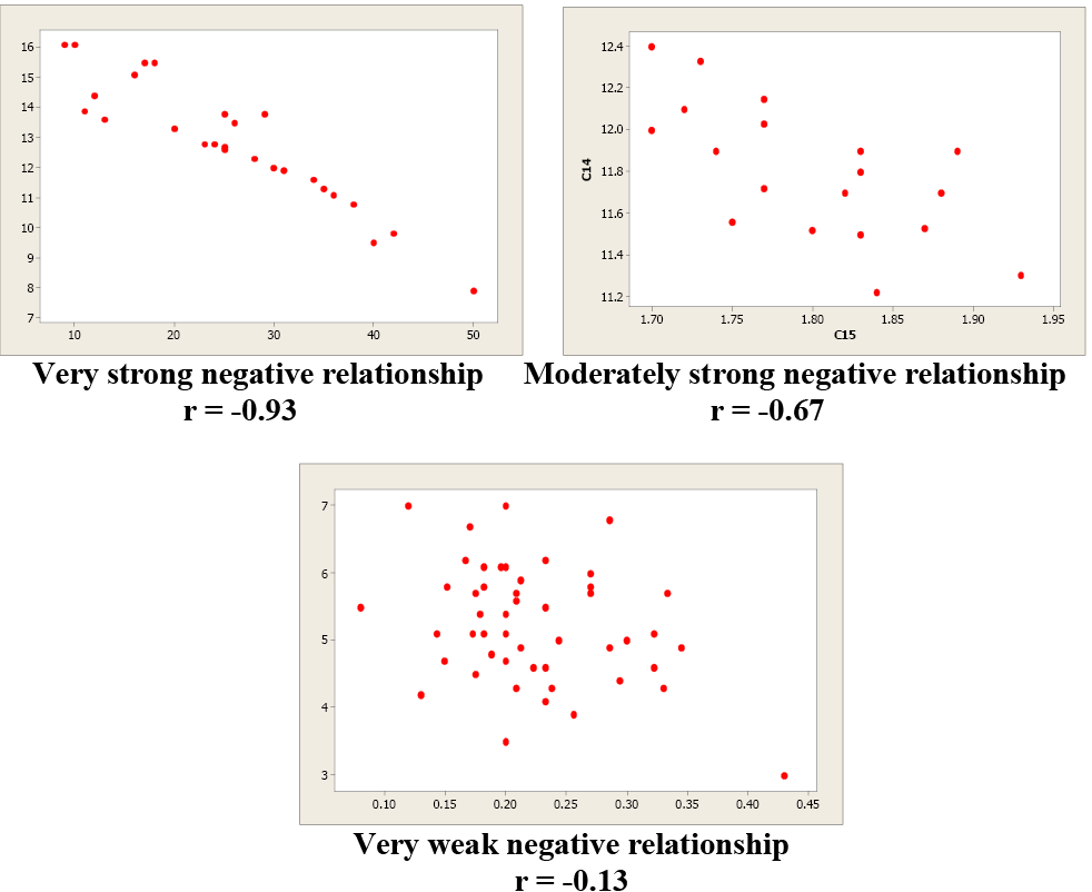
Figure \(\PageIndex{7}\) . Examples of negative correlation.
Correlation is not causation!!! Just because two variables are correlated does not mean that one variable causes another variable to change.
Examine these next two scatterplots. Both of these data sets have an r = 0.01, but they are very different. Plot 1 shows little linear relationship between x and y variables. Plot 2 shows a strong non-linear relationship. Pearson’s linear correlation coefficient only measures the strength and direction of a linear relationship. Ignoring the scatterplot could result in a serious mistake when describing the relationship between two variables.
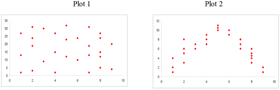
Figure \(\PageIndex{8}\) . Comparison of scatterplots.
When you investigate the relationship between two variables, always begin with a scatterplot. This graph allows you to look for patterns (both linear and non-linear). The next step is to quantitatively describe the strength and direction of the linear relationship using “r”. Once you have established that a linear relationship exists, you can take the next step in model building.