
13.9: Checking the Normality of a Sample
- Page ID
- 8267

All of the tests that we have discussed so far in this chapter have assumed that the data are normally distributed. This assumption is often quite reasonable, because the central limit theorem (Section 10.3.3) does tend to ensure that many real world quantities are normally distributed: any time that you suspect that your variable is actually an average of lots of different things, there’s a pretty good chance that it will be normally distributed; or at least close enough to normal that you can get away with using t-tests. However, life doesn’t come with guarantees; and besides, there are lots of ways in which you can end up with variables that are highly non-normal. For example, any time you think that your variable is actually the minimum of lots of different things, there’s a very good chance it will end up quite skewed. In psychology, response time (RT) data is a good example of this. If you suppose that there are lots of things that could trigger a response from a human participant, then the actual response will occur the first time one of these trigger events occurs.198 This means that RT data are systematically non-normal. Okay, so if normality is assumed by all the tests, and is mostly but not always satisfied (at least approximately) by real world data, how can we check the normality of a sample? In this section I discuss two methods: QQ plots, and the Shapiro-Wilk test.
plots
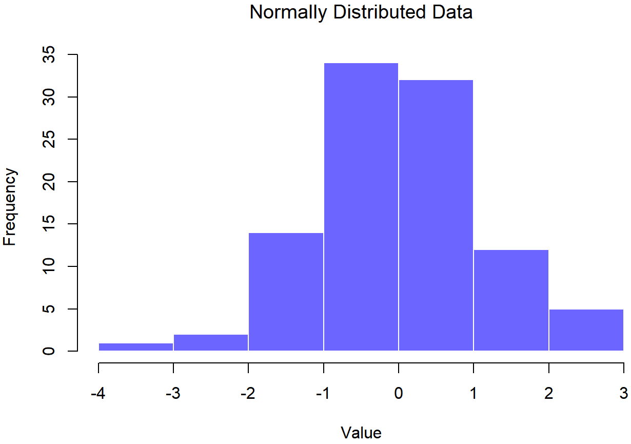
normal.data, a normally distributed sample with 100 observations.## Normally Distributed Data
## skew= -0.02936155
## kurtosis= -0.06035938
##
## Shapiro-Wilk normality test
##
## data: data
## W = 0.99108, p-value = 0.7515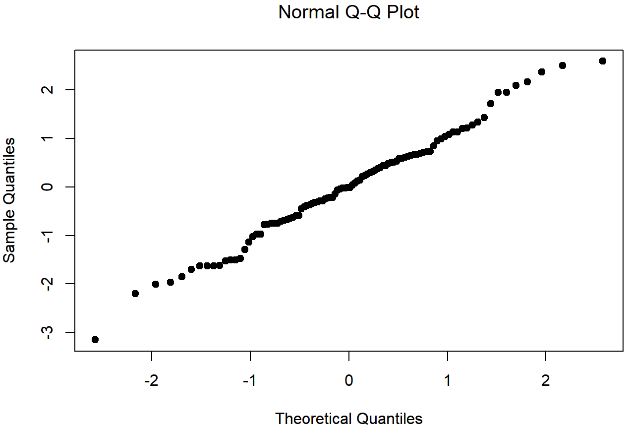
normal.data, a normally distributed sample with 100 observations.The Shapiro-Wilk statistic associated with the data in Figures 13.14 and 13.15 is W=.99, indicating that no significant departures from normality were detected (p=.73). As you can see, these data form a pretty straight line; which is no surprise given that we sampled them from a normal distribution! In contrast, have a look at the two data sets shown in Figures 13.16, 13.17, 13.18, 13.19. Figures 13.16 and 13.17 show the histogram and a QQ plot for a data set that is highly skewed: the QQ plot curves upwards. Figures 13.18 and 13.19 show the same plots for a heavy tailed (i.e., high kurtosis) data set: in this case, the QQ plot flattens in the middle and curves sharply at either end.
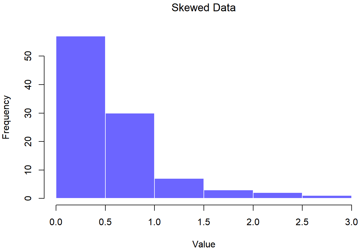
skewed.data set## Skewed Data
## skew= 1.889475
## kurtosis= 4.4396
##
## Shapiro-Wilk normality test
##
## data: data
## W = 0.81758, p-value = 8.908e-10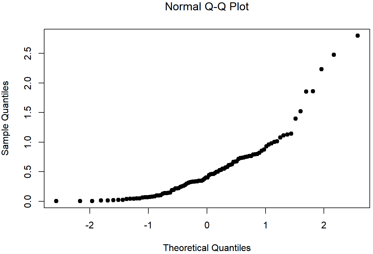
skewed.data setThe skewness of the data in Figures 13.16 and 13.17 is 1.94, and is reflected in a QQ plot that curves upwards. As a consequence, the Shapiro-Wilk statistic is W=.80, reflecting a significant departure from normality (p<.001).
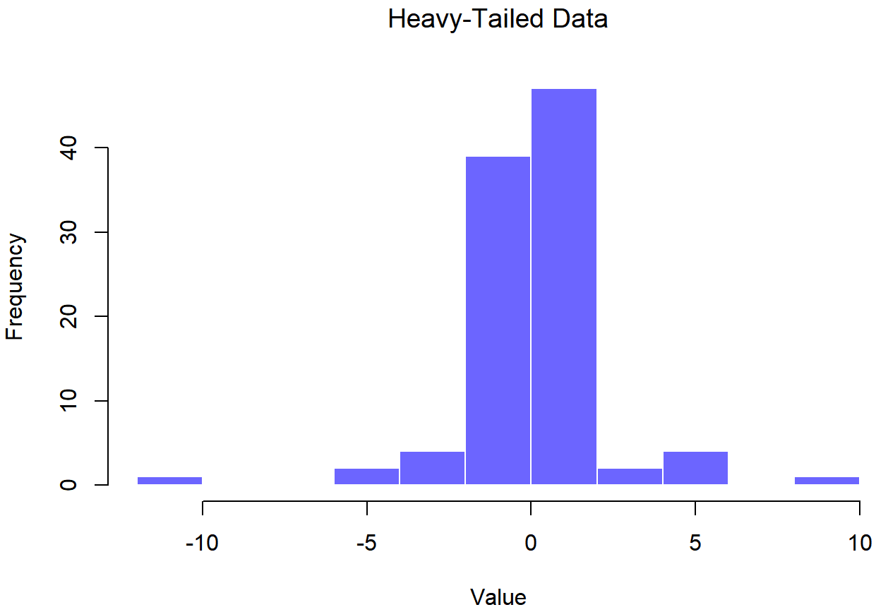
## Heavy-Tailed Data
## skew= -0.05308273
## kurtosis= 7.508765
##
##  Shapiro-Wilk normality test
##
## data:  data
## W = 0.83892, p-value = 4.718e-09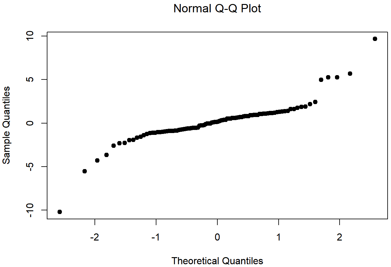
Figures 13.18 and 13.19 shows the same plots for a heavy tailed data set, again consisting of 100 observations. In this case, the heavy tails in the data produce a high kurtosis (2.80), and cause the QQ plot to flatten in the middle, and curve away sharply on either side. The resulting Shapiro-Wilk statistic is W=.93, again reflecting significant non-normality (p<.001).
One way to check whether a sample violates the normality assumption is to draw a “quantile-quantile” plot (QQ plot). This allows you to visually check whether you’re seeing any systematic violations. In a QQ plot, each observation is plotted as a single dot. The x co-ordinate is the theoretical quantile that the observation should fall in, if the data were normally distributed (with mean and variance estimated from the sample) and on the y co-ordinate is the actual quantile of the data within the sample. If the data are normal, the dots should form a straight line. For instance, lets see what happens if we generate data by sampling from a normal distribution, and then drawing a QQ plot using the R function qqnorm(). The qqnorm() function has a few arguments, but the only one we really need to care about here is y, a vector specifying the data whose normality we’re interested in checking. Here’s the R commands:
normal.data <- rnorm( n = 100 )  # generate N = 100 normally distributed numbers
hist( x = normal.data )          # draw a histogram of these numbers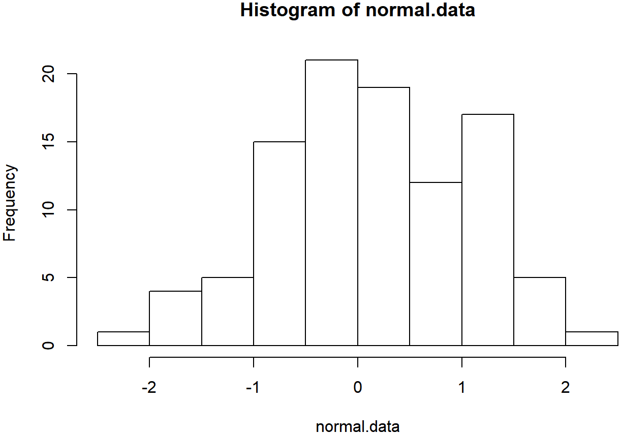
qqnorm( y = normal.data ) # draw the QQ plot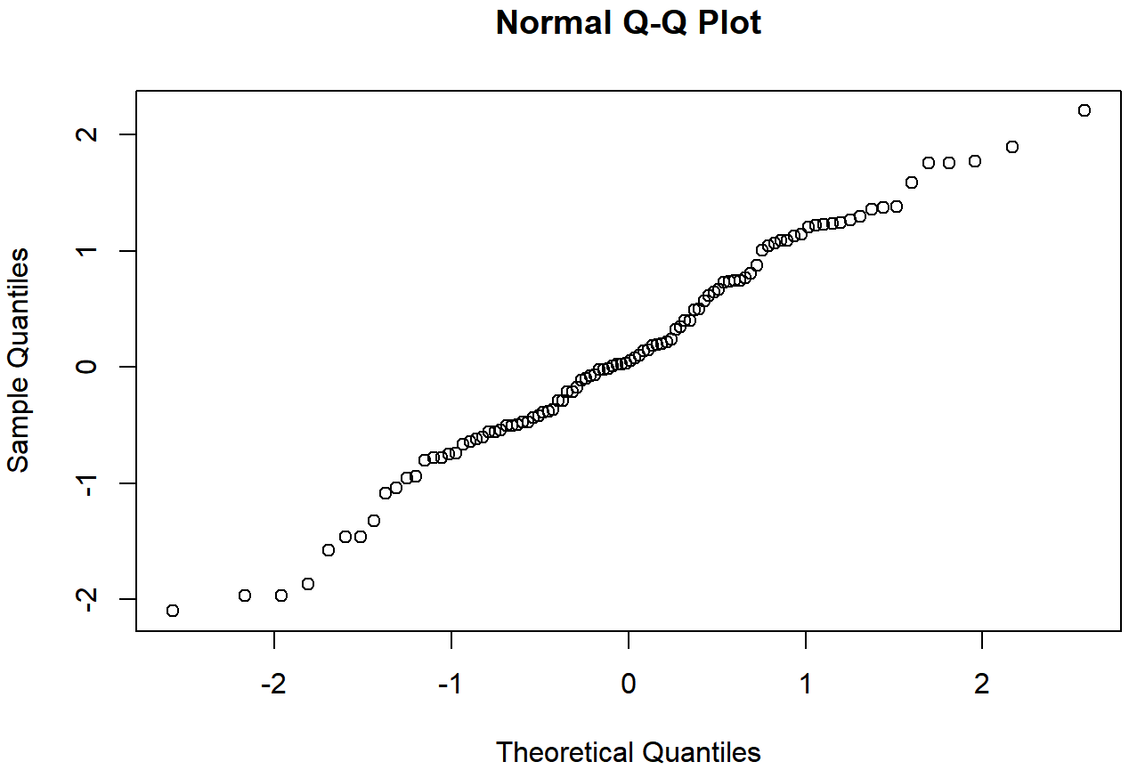
Shapiro-Wilk tests
Although QQ plots provide a nice way to informally check the normality of your data, sometimes you’ll want to do something a bit more formal. And when that moment comes, the Shapiro-Wilk test (Shapiro and Wilk 1965) is probably what you’re looking for.199 As you’d expect, the null hypothesis being tested is that a set of N observations is normally distributed. The test statistic that it calculates is conventionally denoted as W, and it’s calculated as follows. First, we sort the observations in order of increasing size, and let X1 be the smallest value in the sample, X2 be the second smallest and so on. Then the value of W is given by
\(W=\dfrac{\left(\sum_{i=1}^{N} a_{i} X_{i}\right)^{2}}{\sum_{i=1}^{N}\left(X_{i}-\bar{X}\right)^{2}}\)
where \(\ \bar{X}\) is the mean of the observations, and the ai values are … mumble, mumble … something complicated that is a bit beyond the scope of an introductory text.
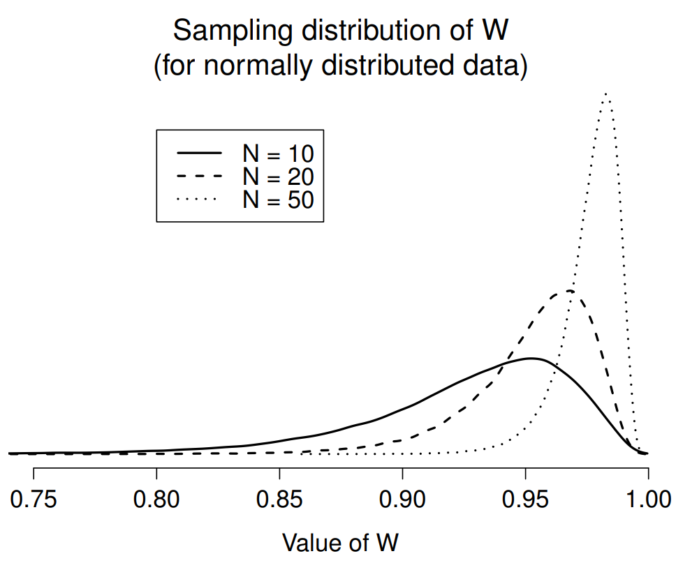
Because it’s a little hard to explain the maths behind the W statistic, a better idea is to give a broad brush description of how it behaves. Unlike most of the test statistics that we’ll encounter in this book, it’s actually small values of W that indicated departure from normality. The W statistic has a maximum value of 1, which arises when the data look “perfectly normal”. The smaller the value of W, the less normal the data are. However, the sampling distribution for W – which is not one of the standard ones that I discussed in Chapter 9 and is in fact a complete pain in the arse to work with – does depend on the sample size N. To give you a feel for what these sampling distributions look like, I’ve plotted three of them in Figure 13.20. Notice that, as the sample size starts to get large, the sampling distribution becomes very tightly clumped up near W=1, and as a consequence, for larger samples W doesn’t have to be very much smaller than 1 in order for the test to be significant.
To run the test in R, we use the shapiro.test() function. It has only a single argument x, which is a numeric vector containing the data whose normality needs to be tested. For example, when we apply this function to our normal.data, we get the following:
shapiro.test( x = normal.data )##
## Shapiro-Wilk normality test
##
## data: normal.data
## W = 0.98654, p-value = 0.4076So, not surprisingly, we have no evidence that these data depart from normality. When reporting the results for a Shapiro-Wilk test, you should (as usual) make sure to include the test statistic W and the p value, though given that the sampling distribution depends so heavily on N it would probably be a politeness to include N as well.