
6.6: Scatterplots
- Page ID
- 3977

Scatterplots are a simple but effective tool for visualising data. We’ve already seen scatterplots in this chapter, when using the plot() function to draw the Fibonacci variable as a collection of dots (Section 6.2. However, for the purposes of this section I have a slightly different notion in mind. Instead of just plotting one variable, what I want to do with my scatterplot is display the relationship between two variables, like we saw with the figures in the section on correlation (Section 5.7. It’s this latter application that we usually have in mind when we use the term “scatterplot”. In this kind of plot, each observation corresponds to one dot: the horizontal location of the dot plots the value of the observation on one variable, and the vertical location displays its value on the other variable. In many situations you don’t really have a clear opinions about what the causal relationship is (e.g., does A cause B, or does B cause A, or does some other variable C control both A and B). If that’s the case, it doesn’t really matter which variable you plot on the x-axis and which one you plot on the y-axis. However, in many situations you do have a pretty strong idea which variable you think is most likely to be causal, or at least you have some suspicions in that direction. If so, then it’s conventional to plot the cause variable on the x-axis, and the effect variable on the y-axis. With that in mind, let’s look at how to draw scatterplots in R, using the same parenthood data set (i.e. parenthood.Rdata) that I used when introducing the idea of correlations.
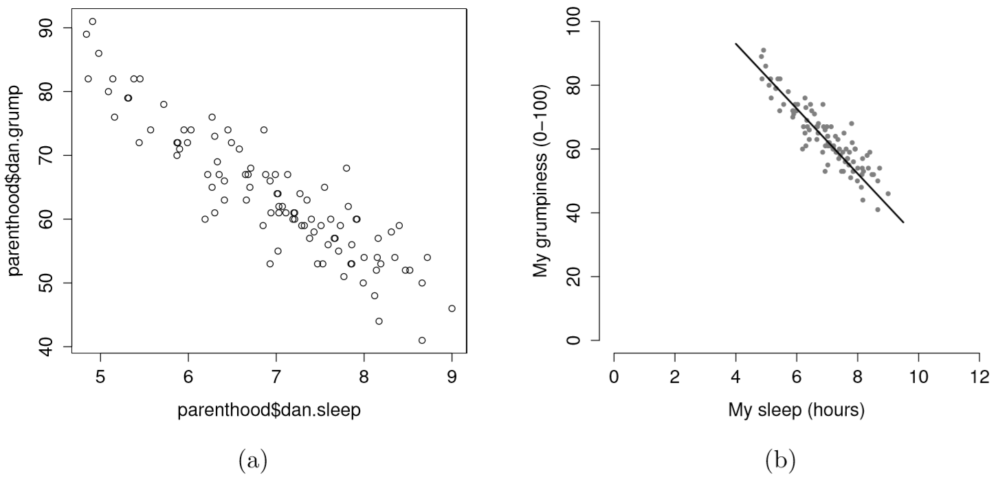
Suppose my goal is to draw a scatterplot displaying the relationship between the amount of sleep that I get (dan.sleep) and how grumpy I am the next day (dan.grump). As you might expect given our earlier use of plot() to display the Fibonacci data, the function that we use is the plot() function, but because it’s a generic function all the hard work is still being done by the plot.default() function. In any case, there are two different ways in which we can get the plot that we’re after. The first way is to specify the name of the variable to be plotted on the x axis and the variable to be plotted on the y axis. When we do it this way, the command looks like this:
plot( x = parenthood$dan.sleep,   # data on the x-axis
      y = parenthood$dan.grump    # data on the y-axis
) 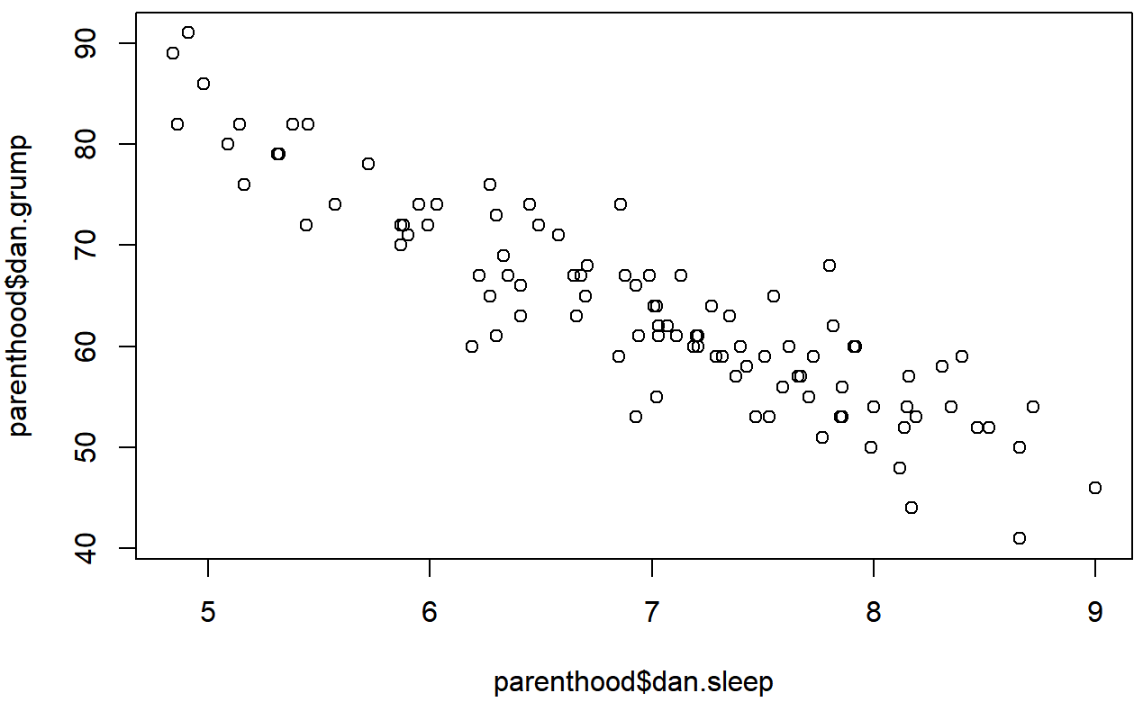
The second way do to it is to use a “formula and data frame” format, but I’m going to avoid using it.99 For now, let’s just stick with the x and y version. If we do this, the result is the very basic scatterplot shown in Figure 6.19. This serves fairly well, but there’s a few customisations that we probably want to make in order to have this work properly. As usual, we want to add some labels, but there’s a few other things we might want to do as well. Firstly, it’s sometimes useful to rescale the plots. In Figure 6.19 R has selected the scales so that the data fall neatly in the middle. But, in this case, we happen to know that the grumpiness measure falls on a scale from 0 to 100, and the hours slept falls on a natural scale between 0 hours and about 12 or so hours (the longest I can sleep in real life). So the command I might use to draw this is:
plot( x = parenthood$dan.sleep,         # data on the x-axis
       y = parenthood$dan.grump,         # data on the y-axis
       xlab = "My sleep (hours)",        # x-axis label
       ylab = "My grumpiness (0-100)",   # y-axis label
       xlim = c(0,12),                   # scale the x-axis
       ylim = c(0,100),                  # scale the y-axis
       pch = 20,                         # change the plot type
       col = "gray50",                   # dim the dots slightly
       frame.plot = FALSE                # don't draw a box
 )
This command produces the scatterplot in Figure ??, or at least very nearly. What it doesn’t do is draw the line through the middle of the points. Sometimes it can be very useful to do this, and I can do so using lines(), which is a low level plotting function. Better yet, the arguments that I need to specify are pretty much the exact same ones that I use when calling the plot() function. That is, suppose that I want to draw a line that goes from the point (4,93) to the point (9.5,37). Then the x locations can be specified by the vector c(4,9.5) and the y locations correspond to the vector c(93,37). In other words, I use this command:
plot( x = parenthood$dan.sleep,         # data on the x-axis
       y = parenthood$dan.grump,         # data on the y-axis
       xlab = "My sleep (hours)",        # x-axis label
       ylab = "My grumpiness (0-100)",   # y-axis label
       xlim = c(0,12),                   # scale the x-axis
       ylim = c(0,100),                  # scale the y-axis
       pch = 20,                         # change the plot type
       col = "gray50",                   # dim the dots slightly
       frame.plot = FALSE                # don't draw a box
 )
 lines( x = c(4,9.5),   # the horizontal locations
        y = c(93,37),   # the vertical locations
        lwd = 2         # line width
 )
And when I do so, R plots the line over the top of the plot that I drew using the previous command. In most realistic data analysis situations you absolutely don’t want to just guess where the line through the points goes, since there’s about a billion different ways in which you can get R to do a better job. However, it does at least illustrate the basic idea.
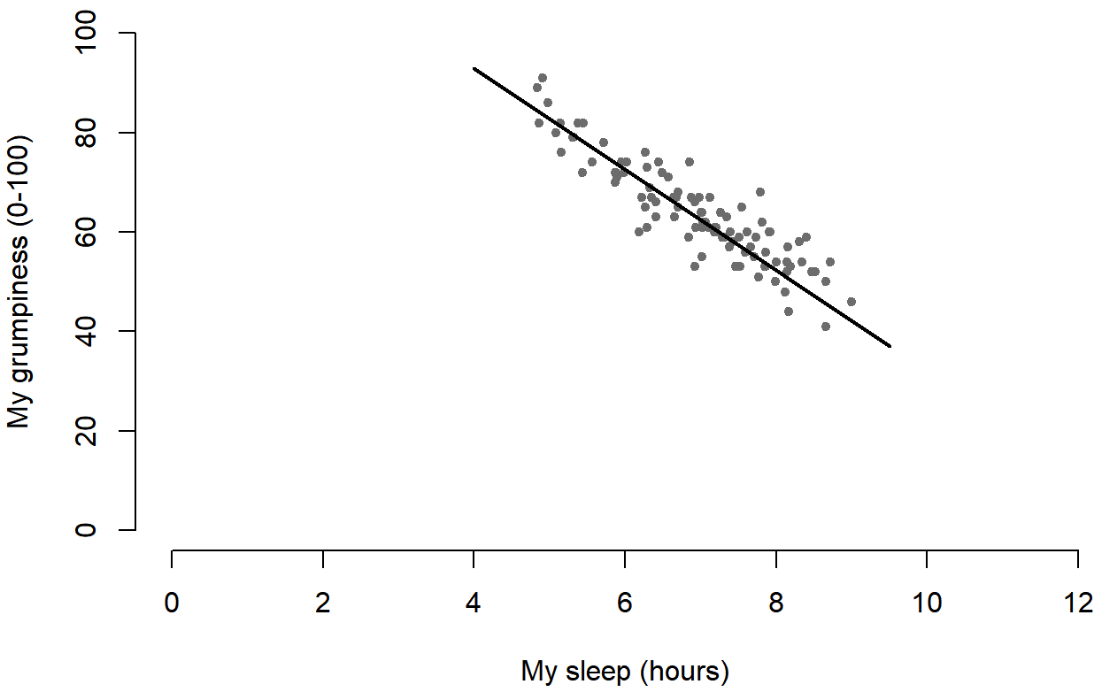
One possibility, if you do want to get R to draw nice clean lines through the data for you, is to use the scatterplot() function in the car package. Before we can use scatterplot() we need to load the package:
> library( car )Having done so, we can now use the function. The command we need is this one:
> scatterplot( dan.grump ~ dan.sleep,
+              data = parenthood,
+              smooth = FALSE
+ )
## Loading required package: carData
scatterplot() function in the car package.The first two arguments should be familiar: the first input is a formula dan.grump ~ dan.sleep telling R what variables to plot,100 and the second specifies a data frame. The third argument smooth I’ve set to FALSE to stop the scatterplot() function from drawing a fancy “smoothed” trendline (since it’s a bit confusing to beginners). The scatterplot itself is shown in Figure 6.20. As you can see, it’s not only drawn the scatterplot, but its also drawn boxplots for each of the two variables, as well as a simple line of best fit showing the relationship between the two variables.
More elaborate options
Often you find yourself wanting to look at the relationships between several variables at once. One useful tool for doing so is to produce a scatterplot matrix, analogous to the correlation matrix.
> cor( x = parenthood ) # calculate correlation matrix
             dan.sleep  baby.sleep   dan.grump         day
dan.sleep   1.00000000  0.62794934 -0.90338404 -0.09840768
baby.sleep  0.62794934  1.00000000 -0.56596373 -0.01043394
dan.grump  -0.90338404 -0.56596373  1.00000000  0.07647926
day        -0.09840768 -0.01043394  0.07647926  1.00000000
We can get a the corresponding scatterplot matrix by using the pairs() function:101
pairs( x = parenthood ) # draw corresponding scatterplot matrix 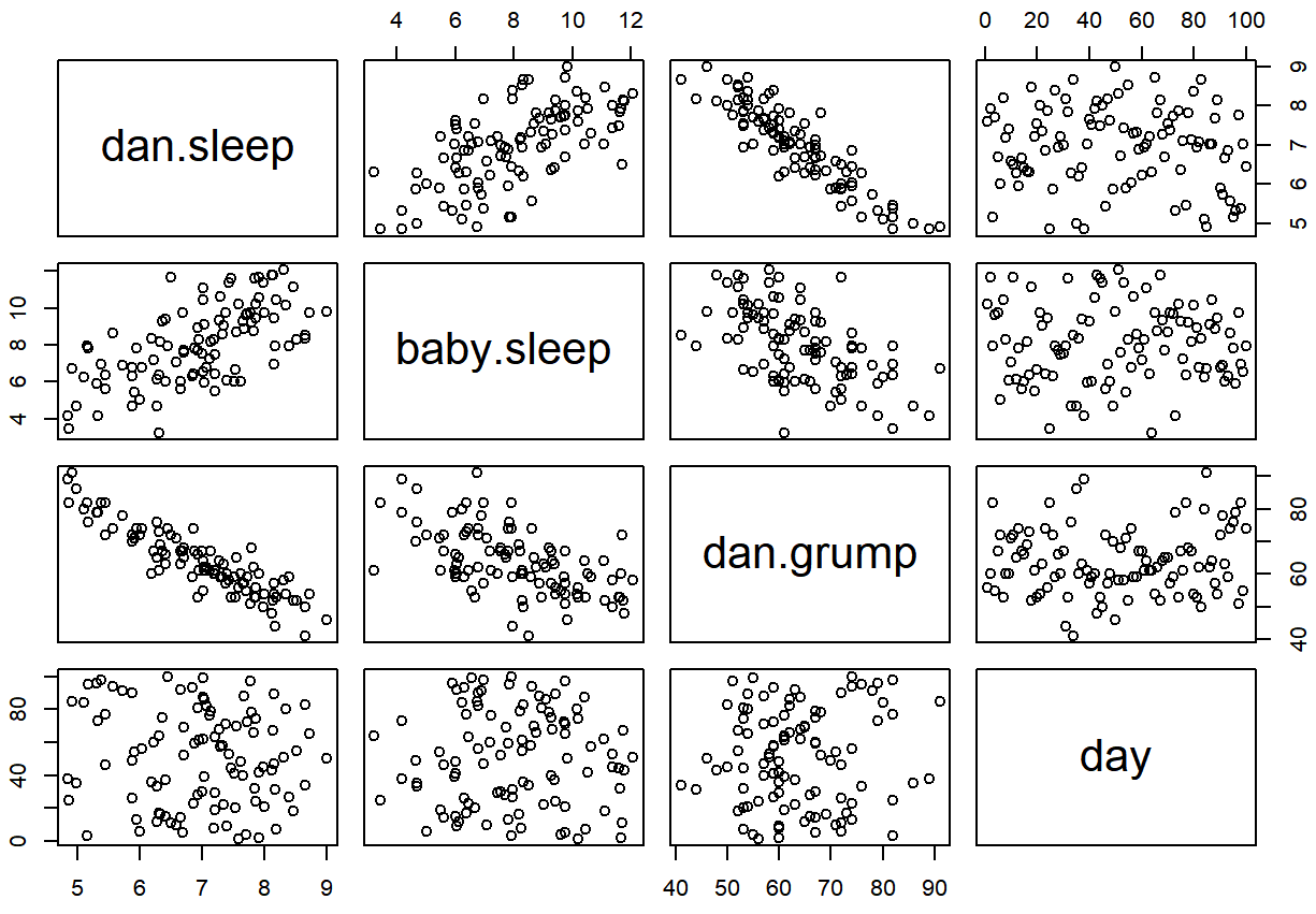
The output of the pairs() command is shown in Figure ??. An alternative way of calling the pairs() function, which can be useful in some situations, is to specify the variables to include using a one-sided formula. For instance, this
> pairs( formula = ~ dan.sleep + baby.sleep + dan.grump,
+        data = parenthood
+ )
would produce a 3×3 scatterplot matrix that only compare dan.sleep, dan.grump and baby.sleep. Obviously, the first version is much easier, but there are cases where you really only want to look at a few of the variables, so it’s nice to use the formula interface.