
6.2: An Introduction to Plotting
- Page ID
- 3973

Before I discuss any specialised graphics, let’s start by drawing a few very simple graphs just to get a feel for what it’s like to draw pictures using R. To that end, let’s create a small vector Fibonacci that contains a few numbers we’d like R to draw for us. Then, we’ll ask R to plot() those numbers:
> Fibonacci <- c( 1,1,2,3,5,8,13 )
> plot( Fibonacci )
The result is Figure 6.2.

As you can see, what R has done is plot the values stored in the Fibonacci variable on the vertical axis (y-axis) and the corresponding index on the horizontal axis (x-axis). In other words, since the 4th element of the vector has a value of 3, we get a dot plotted at the location (4,3). That’s pretty straightforward, and the image in Figure 6.2 is probably pretty close to what you would have had in mind when I suggested that we plot the Fibonacci data. However, there’s quite a lot of customisation options available to you, so we should probably spend a bit of time looking at some of those options. So, be warned: this ends up being a fairly long section, because there’s so many possibilities open to you. Don’t let it overwhelm you though… while all of the options discussed here are handy to know about, you can get by just fine only knowing a few of them. The only reason I’ve included all this stuff right at the beginning is that it ends up making the rest of the chapter a lot more readable!
tedious digression
Before we go into any discussion of customising plots, we need a little more background. The important thing to note when using the plot() function, is that it’s another example of a generic function (Section 4.11, much like print() and summary(), and so its behaviour changes depending on what kind of input you give it. However, the plot() function is somewhat fancier than the other two, and its behaviour depends on two arguments, x (the first input, which is required) and y (which is optional). This makes it (a) extremely powerful once you get the hang of it, and (b) hilariously unpredictable, when you’re not sure what you’re doing. As much as possible, I’ll try to make clear what type of inputs produce what kinds of outputs. For now, however, it’s enough to note that I’m only doing very basic plotting, and as a consequence all of the work is being done by the plot.default() function.
What kinds of customisations might we be interested in? If you look at the help documentation for the default plotting method (i.e., type ?plot.default or help("plot.default")) you’ll see a very long list of arguments that you can specify to customise your plot. I’ll talk about several of them in a moment, but first I want to point out something that might seem quite wacky. When you look at all the different options that the help file talks about, you’ll notice that some of the options that it refers to are “proper” arguments to the plot.default() function, but it also goes on to mention a bunch of things that look like they’re supposed to be arguments, but they’re not listed in the “Usage” section of the file, and the documentation calls them graphical parameters instead. Even so, it’s usually possible to treat them as if they were arguments of the plotting function. Very odd. In order to stop my readers trying to find a brick and look up my home address, I’d better explain what’s going on; or at least give the basic gist behind it.
What exactly is a graphical parameter? Basically, the idea is that there are some characteristics of a plot which are pretty universal: for instance, regardless of what kind of graph you’re drawing, you probably need to specify what colour to use for the plot, right? So you’d expect there to be something like a col argument to every single graphics function in R? Well, sort of. In order to avoid having hundreds of arguments for every single function, what R does is refer to a bunch of these “graphical parameters” which are pretty general purpose. Graphical parameters can be changed directly by using the low-level par() function, which I discuss briefly in Section ?? though not in a lot of detail. If you look at the help files for graphical parameters (i.e., type ?par) you’ll see that there’s lots of them. Fortunately, (a) the default settings are generally pretty good so you can ignore the majority of the parameters, and (b) as you’ll see as we go through this chapter, you very rarely need to use par() directly, because you can “pretend” that graphical parameters are just additional arguments to your high-level function (e.g. plot.default()). In short… yes, R does have these wacky “graphical parameters” which can be quite confusing. But in most basic uses of the plotting functions, you can act as if they were just undocumented additional arguments to your function.
Customising the title and the axis labels
One of the first things that you’ll find yourself wanting to do when customising your plot is to label it better. You might want to specify more appropriate axis labels, add a title or add a subtitle. The arguments that you need to specify to make this happen are:
main. A character string containing the title.sub. A character string containing the subtitle.xlab. A character string containing the x-axis label.ylab. A character string containing the y-axis label.
These aren’t graphical parameters, they’re arguments to the high-level function. However, because the high-level functions all rely on the same low-level function to do the drawing90 the names of these arguments are identical for pretty much every high-level function I’ve come across. Let’s have a look at what happens when we make use of all these arguments. Here’s the command…
> plot( x = Fibonacci,
+       main = "You specify title using the 'main' argument",
+       sub = "The subtitle appears here! (Use the 'sub' argument for this)",
+       xlab = "The x-axis label is 'xlab'",
+       ylab = "The y-axis label is 'ylab'"
+ )
The picture that this draws is shown in Figure 6.3.

It’s more or less as you’d expect. The plot itself is identical to the one we drew in Figure 6.2, except for the fact that we’ve changed the axis labels, and added a title and a subtitle. Even so, there’s a couple of interesting features worth calling your attention to. Firstly, notice that the subtitle is drawn below the plot, which I personally find annoying; as a consequence I almost never use subtitles. You may have a different opinion, of course, but the important thing is that you remember where the subtitle actually goes. Secondly, notice that R has decided to use boldface text and a larger font size for the title. This is one of my most hated default settings in R graphics, since I feel that it draws too much attention to the title. Generally, while I do want my reader to look at the title, I find that the R defaults are a bit overpowering, so I often like to change the settings. To that end, there are a bunch of graphical parameters that you can use to customise the font style:
- Font styles:
font.main,font.sub,font.lab,font.axis. These four parameters control the font style used for the plot title (font.main), the subtitle (font.sub), the axis labels (font.lab: note that you can’t specify separate styles for the x-axis and y-axis without using low level commands), and the numbers next to the tick marks on the axis (font.axis). Somewhat irritatingly, these arguments are numbers instead of meaningful names: a value of 1 corresponds to plain text, 2 means boldface, 3 means italic and 4 means bold italic. - Font colours:
col.main,col.sub,col.lab,col.axis. These parameters do pretty much what the name says: each one specifies a colour in which to type each of the different bits of text. Conveniently, R has a very large number of named colours (typecolours()to see a list of over 650 colour names that R knows), so you can use the English language name of the colour to select it.91 Thus, the parameter value here string like"red","gray25"or"springgreen4"(yes, R really does recognise four different shades of “spring green”). - Font size:
cex.main,cex.sub,cex.lab,cex.axis. Font size is handled in a slightly curious way in R. The “cex” part here is short for “character expansion”, and it’s essentially a magnification value. By default, all of these are set to a value of 1, except for the font title:cex.mainhas a default magnification of 1.2, which is why the title font is 20% bigger than the others. - Font family:
family. This argument specifies a font family to use: the simplest way to use it is to set it to"sans","serif", or"mono", corresponding to a san serif font, a serif font, or a monospaced font. If you want to, you can give the name of a specific font, but keep in mind that different operating systems use different fonts, so it’s probably safest to keep it simple. Better yet, unless you have some deep objections to the R defaults, just ignore this parameter entirely. That’s what I usually do.
To give you a sense of how you can use these parameters to customise your titles, the following command can be used to draw Figure 6.4:
> plot( x = Fibonacci,                           # the data to plot
+       main = "The first 7 Fibonacci numbers",  # the title
+       xlab = "Position in the sequence",       # x-axis label
+       ylab = "The Fibonacci number",           # y-axis label
+       font.main = 1,                           # plain text for title
+       cex.main = 1,                            # normal size for title
+       font.axis = 2,                           # bold text for numbering
+       col.lab = "gray50"                       # grey colour for labels
+ )
Although this command is quite long, it’s not complicated: all it does is override a bunch of the default parameter values. The only difficult aspect to this is that you have to remember what each of these parameters is called, and what all the different values are. And in practice I never remember: I have to look up the help documentation every time, or else look it up in this book.
Changing the plot type
Adding and customising the titles associated with the plot is one way in which you can play around with what your picture looks like. Another thing that you’ll want to do is customise the appearance of the actual plot! To start with, let’s look at the single most important options that the plot() function (or, recalling that we’re dealing with a generic function, in this case the plot.default() function, since that’s the one doing all the work) provides for you to use, which is the type argument. The type argument specifies the visual style of the plot. The possible values for this are:
type = "p". Draw the points only.type = "l". Draw a line through the points.type = "o". Draw the line over the top of the points.type = "b". Draw both points and lines, but don’t overplot.type = "h". Draw “histogram-like” vertical bars.type = "s". Draw a staircase, going horizontally then vertically.type = "S". Draw a Staircase, going vertically then horizontally.type = "c". Draw only the connecting lines from the “b” version.type = "n". Draw nothing. (Apparently this is useful sometimes?)
The simplest way to illustrate what each of these really looks like is just to draw them. To that end, Figure 6.5 shows the same Fibonacci data, drawn using six different types of plot. As you can see, by altering the type argument you can get a qualitatively different appearance to your plot. In other words, as far as R is concerned, the only difference between a scatterplot (like the ones we drew in Section 5.7 and a line plot is that you draw a scatterplot by setting type = "p" and you draw a line plot by setting type = "l". However, that doesn’t imply that you should think of them as begin equivalent to each other. As you can see by looking at Figure 6.5, a line plot implies that there is some notion of continuity from one point to the next, whereas a scatterplot does not.

type of the plot.Changing other features of the plot

In Section ?? we talked about a group of graphical parameters that are related to the formatting of titles, axis labels etc. The second group of parameters I want to discuss are those related to the formatting of the plot itself:
- Colour of the plot:
col. As we saw with the previous colour-related parameters, the simplest way to specify this parameter is using a character string: e.g.,col = "blue". It’s a pretty straightforward parameter to specify: the only real subtlety is that every high-level function tends to draw a different “thing” as it’s output, and so this parameter gets interpreted a little differently by different functions. However, for theplot.default()function it’s pretty simple: thecolargument refers to the colour of the points and/or lines that get drawn! - Character used to plot points:
pch. The plot character parameter is a number, usually between 1 and 25. What it does is tell R what symbol to use to draw the points that it plots. The simplest way to illustrate what the different values do is with a picture. Figure 6.6 a shows the first 25 plotting characters. The default plotting character is a hollow circle (i.e.,pch = 1). - Plot size:
cex. This parameter describes a character expansion factor (i.e., magnification) for the plotted characters. By defaultcex=1, but if you want bigger symbols in your graph you should specify a larger value. - Line type:
lty. The line type parameter describes the kind of line that R draws. It has seven values which you can specify using a number between0and7, or using a meaningful character string:"blank","solid","dashed","dotted","dotdash","longdash", or"twodash". Note that the “blank” version (value 0) just means that R doesn’t draw the lines at all. The other six versions are shown in Figure 6.6 b. - Line width:
lwd. The last graphical parameter in this category that I want to mention is the line width parameter, which is just a number specifying the width of the line. The default value is 1. Not surprisingly, larger values produce thicker lines and smaller values produce thinner lines. Try playing around with different values oflwdto see what happens.
To illustrate what you can do by altering these parameters, let’s try the following command:
> plot( x = Fibonacci,   # the data set
+       type = "b",      # plot both points and lines
+       col = "blue",    # change the plot colour to blue
+       pch = 19,        # plotting character is a solid circle
+       cex = 5,         # plot it at 5x the usual size
+       lty = 2,         # change line type to dashed
+       lwd = 4          # change line width to 4x the usual
+ )
The output is shown in Figure 6.7.
plot( x = Fibonacci,
         type = "b",
         col = "blue",
         pch = 19,
         cex=5,
         lty=2,
         lwd=4)
Changing the appearance of the axes
There are several other possibilities worth discussing. Ignoring graphical parameters for the moment, there’s a few other arguments to the plot.default() function that you might want to use. As before, many of these are standard arguments that are used by a lot of high level graphics functions:
- Changing the axis scales:
xlim,ylim. Generally R does a pretty good job of figuring out where to set the edges of the plot. However, you can override its choices by setting thexlimandylimarguments. For instance, if I decide I want the vertical scale of the plot to run from 0 to 100, then I’d setylim = c(0, 100). - Suppress labelling:
ann. This is a logical-valued argument that you can use if you don’t want R to include any text for a title, subtitle or axis label. To do so, setann = FALSE. This will stop R from including any text that would normally appear in those places. Note that this will override any of your manual titles. For example, if you try to add a title using themainargument, but you also specifyann = FALSE, no title will appear. - Suppress axis drawing:
axes. Again, this is a logical valued argument. Suppose you don’t want R to draw any axes at all. To suppress the axes, all you have to do is addaxes = FALSE. This will remove the axes and the numbering, but not the axis labels (i.e. thexlabandylabtext). Note that you can get finer grain control over this by specifying thexaxtandyaxtgraphical parameters instead (see below). - Include a framing box:
frame.plot. Suppose you’ve removed the axes by settingaxes = FALSE, but you still want to have a simple box drawn around the plot; that is, you only wanted to get rid of the numbering and the tick marks, but you want to keep the box. To do that, you setframe.plot = TRUE.
Note that this list isn’t exhaustive. There are a few other arguments to the plot.default function that you can play with if you want to, but those are the ones you are probably most likely to want to use. As always, however, if these aren’t enough options for you, there’s also a number of other graphical parameters that you might want to play with as well. That’s the focus of the next section. In the meantime, here’s a command that makes use of all these different options:
> plot( x = Fibonacci,       # the data
+       xlim = c(0, 15),     # expand the x-scale
+       ylim = c(0, 15),     # expand the y-scale
+       ann = FALSE,         # delete all annotations
+       axes = FALSE,        # delete the axes
+       frame.plot = TRUE    # but include a framing box
+ )
The output is shown in Figure 6.8, and it’s pretty much exactly as you’d expect. The axis scales on both the horizontal and vertical dimensions have been expanded, the axes have been suppressed as have the annotations, but I’ve kept a box around the plot.
plot( x = Fibonacci,
          xlim = c(0, 15),
          ylim = c(0, 15),
              ann = FALSE,
          axes = FALSE,
            frame.plot = TRUE)
Before moving on, I should point out that there are several graphical parameters relating to the axes, the box, and the general appearance of the plot which allow finer grain control over the appearance of the axes and the annotations.
- Suppressing the axes individually:
xaxt,yaxt. These graphical parameters are basically just fancier versions of theaxesargument we discussed earlier. If you want to stop R from drawing the vertical axis but you’d like it to keep the horizontal axis, setyaxt = "n". I trust that you can figure out how to keep the vertical axis and suppress the horizontal one! - Box type:
bty. In the same way thatxaxt,yaxtare just fancy versions ofaxes, the box type parameter is really just a fancier version of theframe.plotargument, allowing you to specify exactly which out of the four borders you want to keep. The way we specify this parameter is a bit stupid, in my opinion: the possible values are"o"(the default),"l","7","c","u", or"]", each of which will draw only those edges that the corresponding character suggests. That is, the letter"c"has a top, a bottom and a left, but is blank on the right hand side, whereas"7"has a top and a right, but is blank on the left and the bottom. Alternatively a value of"n"means that no box will be drawn. - Orientation of the axis labels
las. I presume that the name of this parameter is an acronym of label style or something along those lines; but what it actually does is govern the orientation of the text used to label the individual tick marks (i.e., the numbering, not thexlabandylabaxis labels). There are four possible values forlas: A value of 0 means that the labels of both axes are printed parallel to the axis itself (the default). A value of 1 means that the text is always horizontal. A value of 2 means that the labelling text is printed at right angles to the axis. Finally, a value of 3 means that the text is always vertical.
Again, these aren’t the only possibilities. There are a few other graphical parameters that I haven’t mentioned that you could use to customise the appearance of the axes,92 but that’s probably enough (or more than enough) for now. To give a sense of how you could use these parameters, let’s try the following command:
> plot( x = Fibonacci,   # the data
+       xaxt = "n",      # don't draw the x-axis
+       bty = "]",       # keep bottom, right and top of box only
+       las = 1          # rotate the text
+ )
The output is shown in Figure 6.9. As you can see, this isn’t a very useful plot at all. However, it does illustrate the graphical parameters we’re talking about, so I suppose it serves its purpose.
plot( x = Fibonacci,
         xaxt = "n",
         bty = "]",
         las = 1 )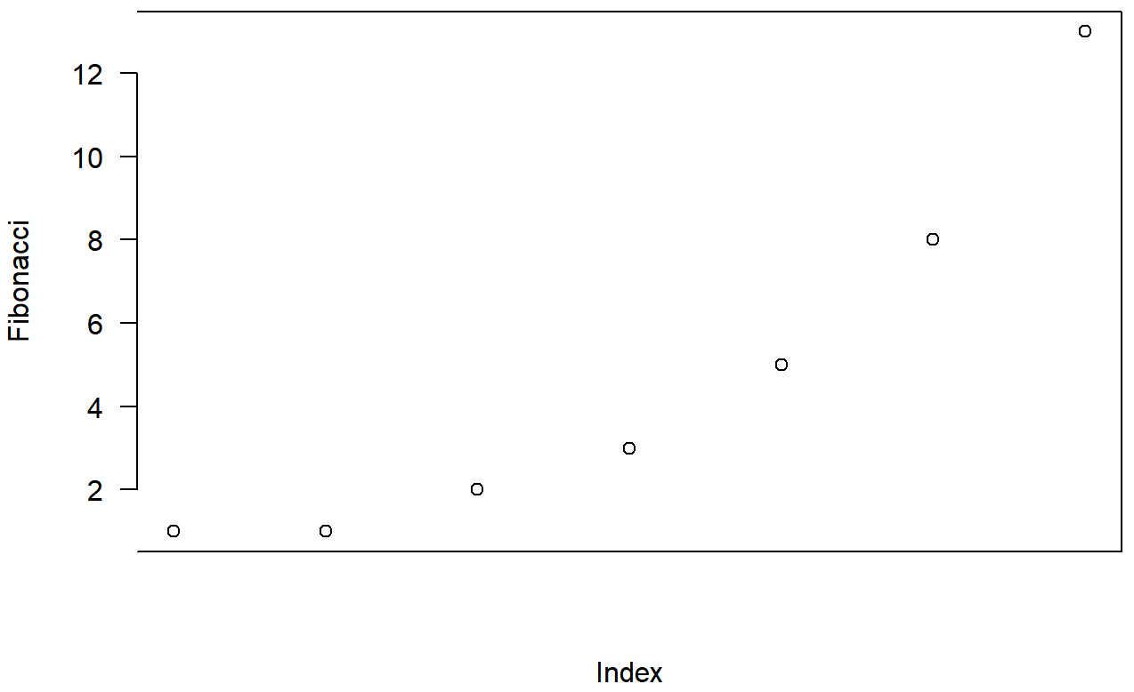
Don’t panic
At this point, a lot of readers will be probably be thinking something along the lines of, “if there’s this much detail just for drawing a simple plot, how horrible is it going to get when we start looking at more complicated things?” Perhaps, contrary to my earlier pleas for mercy, you’ve found a brick to hurl and are right now leafing through an Adelaide phone book trying to find my address. Well, fear not! And please, put the brick down. In a lot of ways, we’ve gone through the hardest part: we’ve already covered vast majority of the plot customisations that you might want to do. As you’ll see, each of the other high level plotting commands we’ll talk about will only have a smallish number of additional options. Better yet, even though I’ve told you about a billion different ways of tweaking your plot, you don’t usually need them. So in practice, now that you’ve read over it once to get the gist, the majority of the content of this section is stuff you can safely forget: just remember to come back to this section later on when you want to tweak your plot.