
5.1: Measures of Central Tendency
- Page ID
- 3965

Drawing pictures of the data, as I did in Figure 5.1 is an excellent way to convey the “gist” of what the data is trying to tell you, it’s often extremely useful to try to condense the data into a few simple “summary” statistics. In most situations, the first thing that you’ll want to calculate is a measure of central tendency. That is, you’d like to know something about the “average” or “middle” of your data lies. The two most commonly used measures are the mean, median and mode; occasionally people will also report a trimmed mean. I’ll explain each of these in turn, and then discuss when each of them is useful.
mean
The mean of a set of observations is just a normal, old-fashioned average: add all of the values up, and then divide by the total number of values. The first five AFL margins were 56, 31, 56, 8 and 32, so the mean of these observations is just:
\[
\dfrac{56+31+56+8+32}{5}=\dfrac{183}{5}=36.60
\nonumber\]
Of course, this definition of the mean isn’t news to anyone: averages (i.e., means) are used so often in everyday life that this is pretty familiar stuff. However, since the concept of a mean is something that everyone already understands, I’ll use this as an excuse to start introducing some of the mathematical notation that statisticians use to describe this calculation, and talk about how the calculations would be done in R.
The first piece of notation to introduce is N, which we’ll use to refer to the number of observations that we’re averaging (in this case N=5). Next, we need to attach a label to the observations themselves. It’s traditional to use X for this, and to use subscripts to indicate which observation we’re actually talking about. That is, we’ll use X1 to refer to the first observation, X2 to refer to the second observation, and so on, all the way up to XN for the last one. Or, to say the same thing in a slightly more abstract way, we use Xi to refer to the i-th observation. Just to make sure we’re clear on the notation, the following table lists the 5 observations in the afl.margins variable, along with the mathematical symbol used to refer to it, and the actual value that the observation corresponds to:
| The Observation | Its Symbol | The Observed Value |
|---|---|---|
| winning margin, game 1 | X1 | 56 points |
| winning margin, game 2 | X2 | 31 points |
| winning margin, game 3 | X3 | 56 points |
| winning margin, game 4 | X4 | 8 points |
| winning margin, game 5 | X5 | 32 points |
Okay, now let’s try to write a formula for the mean. By tradition, we use x̄ as the notation for the mean. So the calculation for the mean could be expressed using the following formula:
\[
\bar{X}=\dfrac{X_{1}+X_{2}+\ldots+X_{N-1}+X_{N}}{N}
\nonumber\]
This formula is entirely correct, but it’s terribly long, so we make use of the summation symbol ∑ to shorten it.65 If I want to add up the first five observations, I could write out the sum the long way, X1+X2+X3+X4+X5 or I could use the summation symbol to shorten it to this:
\[
\sum_{i=1}^{5} X_{i}
\nonumber\]
Taken literally, this could be read as “the sum, taken over all i values from 1 to 5, of the value Xi”. But basically, what it means is “add up the first five observations”. In any case, we can use this notation to write out the formula for the mean, which looks like this:
\[
\bar{X}=\dfrac{1}{N} \sum_{i=1}^{N} X_{i}
\nonumber\]
In all honesty, I can’t imagine that all this mathematical notation helps clarify the concept of the mean at all. In fact, it’s really just a fancy way of writing out the same thing I said in words: add all the values up, and then divide by the total number of items. However, that’s not really the reason I went into all that detail. My goal was to try to make sure that everyone reading this book is clear on the notation that we’ll be using throughout the book: \(\bar{X}\) for the mean, ∑ for the idea of summation, Xi for the ith observation, and N for the total number of observations. We’re going to be re-using these symbols a fair bit, so it’s important that you understand them well enough to be able to “read” the equations, and to be able to see that it’s just saying “add up lots of things and then divide by another thing”.
Calculating the mean in R
Okay that’s the maths, how do we get the magic computing box to do the work for us? If you really wanted to, you could do this calculation directly in R. For the first 5 AFL scores, do this just by typing it in as if R were a calculator…
(56 + 31 + 56 + 8 + 32) / 5## [1] 36.6… in which case R outputs the answer 36.6, just as if it were a calculator. However, that’s not the only way to do the calculations, and when the number of observations starts to become large, it’s easily the most tedious. Besides, in almost every real world scenario, you’ve already got the actual numbers stored in a variable of some kind, just like we have with the afl.margins variable. Under those circumstances, what you want is a function that will just add up all the values stored in a numeric vector. That’s what the sum() function does. If we want to add up all 176 winning margins in the data set, we can do so using the following command:66
sum( afl.margins )## [1] 6213If we only want the sum of the first five observations, then we can use square brackets to pull out only the first five elements of the vector. So the command would now be:
sum( afl.margins[1:5] )## [1] 183To calculate the mean, we now tell R to divide the output of this summation by five, so the command that we need to type now becomes the following:
sum( afl.margins[1:5] ) / 5## [1] 36.6Although it’s pretty easy to calculate the mean using the sum() function, we can do it in an even easier way, since R also provides us with the mean() function. To calculate the mean for all 176 games, we would use the following command:
mean( x = afl.margins )
## [1] 35.30114However, since x is the first argument to the function, I could have omitted the argument name. In any case, just to show you that there’s nothing funny going on, here’s what we would do to calculate the mean for the first five observations:
mean( afl.margins[1:5] )
## [1] 36.6As you can see, this gives exactly the same answers as the previous calculations.
median
The second measure of central tendency that people use a lot is the median, and it’s even easier to describe than the mean. The median of a set of observations is just the middle value. As before let’s imagine we were interested only in the first 5 AFL winning margins: 56, 31, 56, 8 and 32. To figure out the median, we sort these numbers into ascending order:
8,31,32,56,56
From inspection, it’s obvious that the median value of these 5 observations is 32, since that’s the middle one in the sorted list (I’ve put it in bold to make it even more obvious). Easy stuff. But what should we do if we were interested in the first 6 games rather than the first 5? Since the sixth game in the season had a winning margin of 14 points, our sorted list is now
8,14,31,32,56,56
and there are two middle numbers, 31 and 32. The median is defined as the average of those two numbers, which is of course 31.5. As before, it’s very tedious to do this by hand when you’ve got lots of numbers. To illustrate this, here’s what happens when you use R to sort all 176 winning margins. First, I’ll use the sort() function (discussed in Chapter 7) to display the winning margins in increasing numerical order:
sort( x = afl.margins )
##   [1]   0   0   1   1   1   1   2   2   3   3   3   3   3   3   3   3   4
##  [18]   4   5   6   7   7   8   8   8   8   8   9   9   9   9   9   9  10
##  [35]  10  10  10  10  11  11  11  12  12  12  13  14  14  15  16  16  16
##  [52]  16  18  19  19  19  19  19  20  20  20  21  21  22  22  22  23  23
##  [69]  23  24  24  25  25  26  26  26  26  27  27  28  28  29  29  29  29
##  [86]  29  29  30  31  32  32  33  35  35  35  35  36  36  36  36  36  36
## [103]  37  38  38  38  38  38  39  39  40  41  42  43  43  44  44  44  44
## [120]  44  47  47  47  48  48  48  49  49  50  50  50  50  52  52  53  53
## [137]  54  54  55  55  55  56  56  56  57  60  61  61  63  64  65  65  66
## [154]  67  68  70  71  71  72  73  75  75  76  81  82  82  83  84  89  94
## [171]  95  98 101 104 108 116
The middle values are 30 and 31, so the median winning margin for 2010 was 30.5 points. In real life, of course, no-one actually calculates the median by sorting the data and then looking for the middle value. In real life, we use the median command:
median( x = afl.margins )
## [1] 30.5which outputs the median value of 30.5.
Mean or median? What’s the difference?
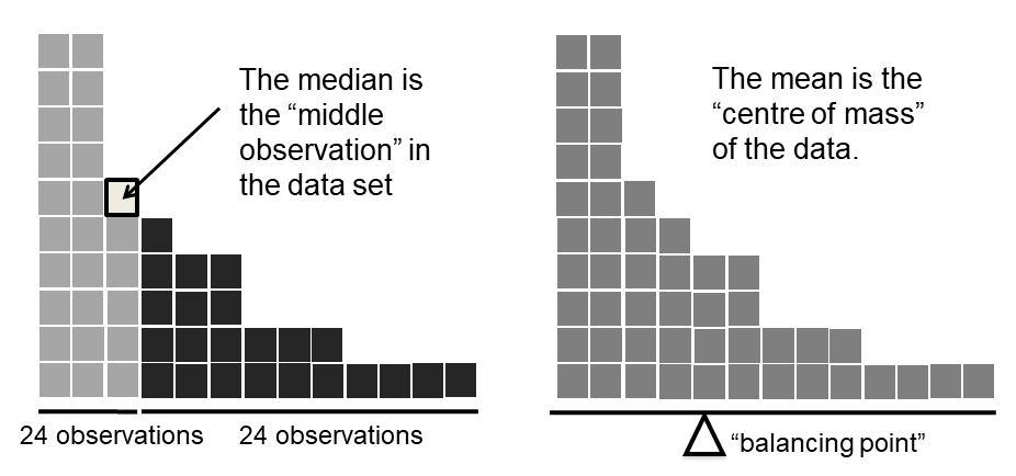
Knowing how to calculate means and medians is only a part of the story. You also need to understand what each one is saying about the data, and what that implies for when you should use each one. This is illustrated in Figure 5.2 the mean is kind of like the “centre of gravity” of the data set, whereas the median is the “middle value” in the data. What this implies, as far as which one you should use, depends a little on what type of data you’ve got and what you’re trying to achieve. As a rough guide:
- If your data are nominal scale, you probably shouldn’t be using either the mean or the median. Both the mean and the median rely on the idea that the numbers assigned to values are meaningful. If the numbering scheme is arbitrary, then it’s probably best to use the mode (Section 5.1.7) instead.
- If your data are ordinal scale, you’re more likely to want to use the median than the mean. The median only makes use of the order information in your data (i.e., which numbers are bigger), but doesn’t depend on the precise numbers involved. That’s exactly the situation that applies when your data are ordinal scale. The mean, on the other hand, makes use of the precise numeric values assigned to the observations, so it’s not really appropriate for ordinal data.
- For interval and ratio scale data, either one is generally acceptable. Which one you pick depends a bit on what you’re trying to achieve. The mean has the advantage that it uses all the information in the data (which is useful when you don’t have a lot of data), but it’s very sensitive to extreme values, as we’ll see in Section 5.1.6.
Let’s expand on that last part a little. One consequence is that there’s systematic differences between the mean and the median when the histogram is asymmetric (skewed; see Section 5.3). This is illustrated in Figure 5.2 notice that the median (right hand side) is located closer to the “body” of the histogram, whereas the mean (left hand side) gets dragged towards the “tail” (where the extreme values are). To give a concrete example, suppose Bob (income $50,000), Kate (income $60,000) and Jane (income $65,000) are sitting at a table: the average income at the table is $58,333 and the median income is $60,000. Then Bill sits down with them (income $100,000,000). The average income has now jumped to $25,043,750 but the median rises only to $62,500. If you’re interested in looking at the overall income at the table, the mean might be the right answer; but if you’re interested in what counts as a typical income at the table, the median would be a better choice here.
real life example
To try to get a sense of why you need to pay attention to the differences between the mean and the median, let’s consider a real life example. Since I tend to mock journalists for their poor scientific and statistical knowledge, I should give credit where credit is due. This is from an excellent article on the ABC news website67 24 September, 2010:
Senior Commonwealth Bank executives have travelled the world in the past couple of weeks with a presentation showing how Australian house prices, and the key price to income ratios, compare favourably with similar countries. “Housing affordability has actually been going sideways for the last five to six years,” said Craig James, the chief economist of the bank’s trading arm, CommSec.
This probably comes as a huge surprise to anyone with a mortgage, or who wants a mortgage, or pays rent, or isn’t completely oblivious to what’s been going on in the Australian housing market over the last several years. Back to the article:
CBA has waged its war against what it believes are housing doomsayers with graphs, numbers and international comparisons. In its presentation, the bank rejects arguments that Australia’s housing is relatively expensive compared to incomes. It says Australia’s house price to household income ratio of 5.6 in the major cities, and 4.3 nationwide, is comparable to many other developed nations. It says San Francisco and New York have ratios of 7, Auckland’s is 6.7, and Vancouver comes in at 9.3.
More excellent news! Except, the article goes on to make the observation that…
Many analysts say that has led the bank to use misleading figures and comparisons. If you go to page four of CBA’s presentation and read the source information at the bottom of the graph and table, you would notice there is an additional source on the international comparison – Demographia. However, if the Commonwealth Bank had also used Demographia’s analysis of Australia’s house price to income ratio, it would have come up with a figure closer to 9 rather than 5.6 or 4.3
That’s, um, a rather serious discrepancy. One group of people say 9, another says 4-5. Should we just split the difference, and say the truth lies somewhere in between? Absolutely not: this is a situation where there is a right answer and a wrong answer. Demographia are correct, and the Commonwealth Bank is incorrect. As the article points out
[An] obvious problem with the Commonwealth Bank’s domestic price to income figures is they compare average incomes with median house prices (unlike the Demographia figures that compare median incomes to median prices). The median is the mid-point, effectively cutting out the highs and lows, and that means the average is generally higher when it comes to incomes and asset prices, because it includes the earnings of Australia’s wealthiest people. To put it another way: the Commonwealth Bank’s figures count Ralph Norris’ multi-million dollar pay packet on the income side, but not his (no doubt) very expensive house in the property price figures, thus understating the house price to income ratio for middle-income Australians.
Couldn’t have put it better myself. The way that Demographia calculated the ratio is the right thing to do. The way that the Bank did it is incorrect. As for why an extremely quantitatively sophisticated organisation such as a major bank made such an elementary mistake, well… I can’t say for sure, since I have no special insight into their thinking, but the article itself does happen to mention the following facts, which may or may not be relevant:
[As] Australia’s largest home lender, the Commonwealth Bank has one of the biggest vested interests in house prices rising. It effectively owns a massive swathe of Australian housing as security for its home loans as well as many small business loans.
My, my.
Trimmed mean
One of the fundamental rules of applied statistics is that the data are messy. Real life is never simple, and so the data sets that you obtain are never as straightforward as the statistical theory says.68 This can have awkward consequences. To illustrate, consider this rather strange looking data set:
−100,2,3,4,5,6,7,8,9,10
If you were to observe this in a real life data set, you’d probably suspect that something funny was going on with the −100 value. It’s probably an outlier, a value that doesn’t really belong with the others. You might consider removing it from the data set entirely, and in this particular case I’d probably agree with that course of action. In real life, however, you don’t always get such cut-and-dried examples. For instance, you might get this instead:
−15,2,3,4,5,6,7,8,9,12
The −15 looks a bit suspicious, but not anywhere near as much as that −100 did. In this case, it’s a little trickier. It might be a legitimate observation, it might not.
When faced with a situation where some of the most extreme-valued observations might not be quite trustworthy, the mean is not necessarily a good measure of central tendency. It is highly sensitive to one or two extreme values, and is thus not considered to be a robust measure. One remedy that we’ve seen is to use the median. A more general solution is to use a “trimmed mean”. To calculate a trimmed mean, what you do is “discard” the most extreme examples on both ends (i.e., the largest and the smallest), and then take the mean of everything else. The goal is to preserve the best characteristics of the mean and the median: just like a median, you aren’t highly influenced by extreme outliers, but like the mean, you “use” more than one of the observations. Generally, we describe a trimmed mean in terms of the percentage of observation on either side that are discarded. So, for instance, a 10% trimmed mean discards the largest 10% of the observations and the smallest 10% of the observations, and then takes the mean of the remaining 80% of the observations. Not surprisingly, the 0% trimmed mean is just the regular mean, and the 50% trimmed mean is the median. In that sense, trimmed means provide a whole family of central tendency measures that span the range from the mean to the median.
For our toy example above, we have 10 observations, and so a 10% trimmed mean is calculated by ignoring the largest value (i.e., 12) and the smallest value (i.e., -15) and taking the mean of the remaining values. First, let’s enter the data
dataset <- c( -15,2,3,4,5,6,7,8,9,12 )Next, let’s calculate means and medians:
mean( x = dataset )
## [1] 4.1median( x = dataset )
## [1] 5.5That’s a fairly substantial difference, but I’m tempted to think that the mean is being influenced a bit too much by the extreme values at either end of the data set, especially the −15 one. So let’s just try trimming the mean a bit. If I take a 10% trimmed mean, we’ll drop the extreme values on either side, and take the mean of the rest:
mean( x = dataset, trim = .1)
## [1] 5.5which in this case gives exactly the same answer as the median. Note that, to get a 10% trimmed mean you write trim = .1, not trim = 10. In any case, let’s finish up by calculating the 5% trimmed mean for the afl.margins data,
mean( x = afl.margins, trim = .05)
## [1] 33.75Mode
The mode of a sample is very simple: it is the value that occurs most frequently. To illustrate the mode using the AFL data, let’s examine a different aspect to the data set. Who has played in the most finals? The afl.finalists variable is a factor that contains the name of every team that played in any AFL final from 1987-2010, so let’s have a look at it. To do this we will use the head() command. head() is useful when you’re working with a data.frame with a lot of rows since you can use it to tell you how many rows to return. There have been a lot of finals in this period so printing afl.finalists using print(afl.finalists) will just fill us the screen. The command below tells R we just want the first 25 rows of the data.frame.
head(afl.finalists, 25)## [1] Hawthorn Melbourne Carlton Melbourne Hawthorn
## [6] Carlton Melbourne Carlton Hawthorn Melbourne
## [11] Melbourne Hawthorn Melbourne Essendon Hawthorn
## [16] Geelong Geelong Hawthorn Collingwood Melbourne
## [21] Collingwood West Coast Collingwood Essendon Collingwood
## 17 Levels: Adelaide Brisbane Carlton Collingwood Essendon ... Western BulldogsThere are actually 400 entries (aren’t you glad we didn’t print them all?). We could read through all 400, and count the number of occasions on which each team name appears in our list of finalists, thereby producing a frequency table. However, that would be mindless and boring: exactly the sort of task that computers are great at. So let’s use the table() function (discussed in more detail in Section 7.1) to do this task for us:
table( afl.finalists )## afl.finalists
## Adelaide Brisbane Carlton Collingwood
## 26 25 26 28
## Essendon Fitzroy Fremantle Geelong
## 32 0 6 39
## Hawthorn Melbourne North Melbourne Port Adelaide
## 27 28 28 17
## Richmond St Kilda Sydney West Coast
## 6 24 26 38
## Western Bulldogs
## 24Now that we have our frequency table, we can just look at it and see that, over the 24 years for which we have data, Geelong has played in more finals than any other team. Thus, the mode of the finalists data is "Geelong". The core packages in R don’t have a function for calculating the mode69. However, I’ve included a function in the lsr package that does this. The function is called modeOf(), and here’s how you use it:
modeOf( x = afl.finalists )## [1] "Geelong"There’s also a function called maxFreq() that tells you what the modal frequency is. If we apply this function to our finalists data, we obtain the following:
maxFreq( x = afl.finalists )## [1] 39Taken together, we observe that Geelong (39 finals) played in more finals than any other team during the 1987-2010 period.
One last point to make with respect to the mode. While it’s generally true that the mode is most often calculated when you have nominal scale data (because means and medians are useless for those sorts of variables), there are some situations in which you really do want to know the mode of an ordinal, interval or ratio scale variable. For instance, let’s go back to thinking about our afl.margins variable. This variable is clearly ratio scale (if it’s not clear to you, it may help to re-read Section 2.2), and so in most situations the mean or the median is the measure of central tendency that you want. But consider this scenario… a friend of yours is offering a bet. They pick a football game at random, and (without knowing who is playing) you have to guess the exact margin. If you guess correctly, you win $50. If you don’t, you lose $1. There are no consolation prizes for “almost” getting the right answer. You have to guess exactly the right margin70 For this bet, the mean and the median are completely useless to you. It is the mode that you should bet on. So, we calculate this modal value
modeOf( x = afl.margins )## [1] 3
maxFreq( x = afl.margins )## [1] 8So the 2010 data suggest you should bet on a 3 point margin, and since this was observed in 8 of the 176 game (4.5% of games) the odds are firmly in your favour.