
4.5: The normal distribution
- Page ID
- 7909

While the binomial distribution is conceptually the simplest distribution to understand, it’s not the most important one. That particular honour goes to the normal distribution, which is also referred to as “the bell curve” or a “Gaussian distribution”.
A normal distribution is described using two parameters, the mean of the distribution \(\mu\) and the standard deviation of the distribution \(\sigma\). The notation that we sometimes use to say that a variable \(X\) is normally distributed is as follows: \[X \sim \mbox{Normal}(\mu,\sigma)\] Of course, that’s just notation. It doesn’t tell us anything interesting about the normal distribution itself. The mathematical formula for the normal distribution is:
The formula is important enough that everyone who learns statistics should at least look at it, but since this is an introductory text I don’t want to focus on it to much. Instead, we look at how R can be used to work with normal distributions. The R functions for the normal distribution are dnorm(), pnorm(), qnorm() and rnorm(). However, they behave in pretty much exactly the same way as the corresponding functions for the binomial distribution, so there’s not a lot that you need to know. The only thing that I should point out is that the argument names for the parameters are mean and sd. In pretty much every other respect, there’s nothing else to add.
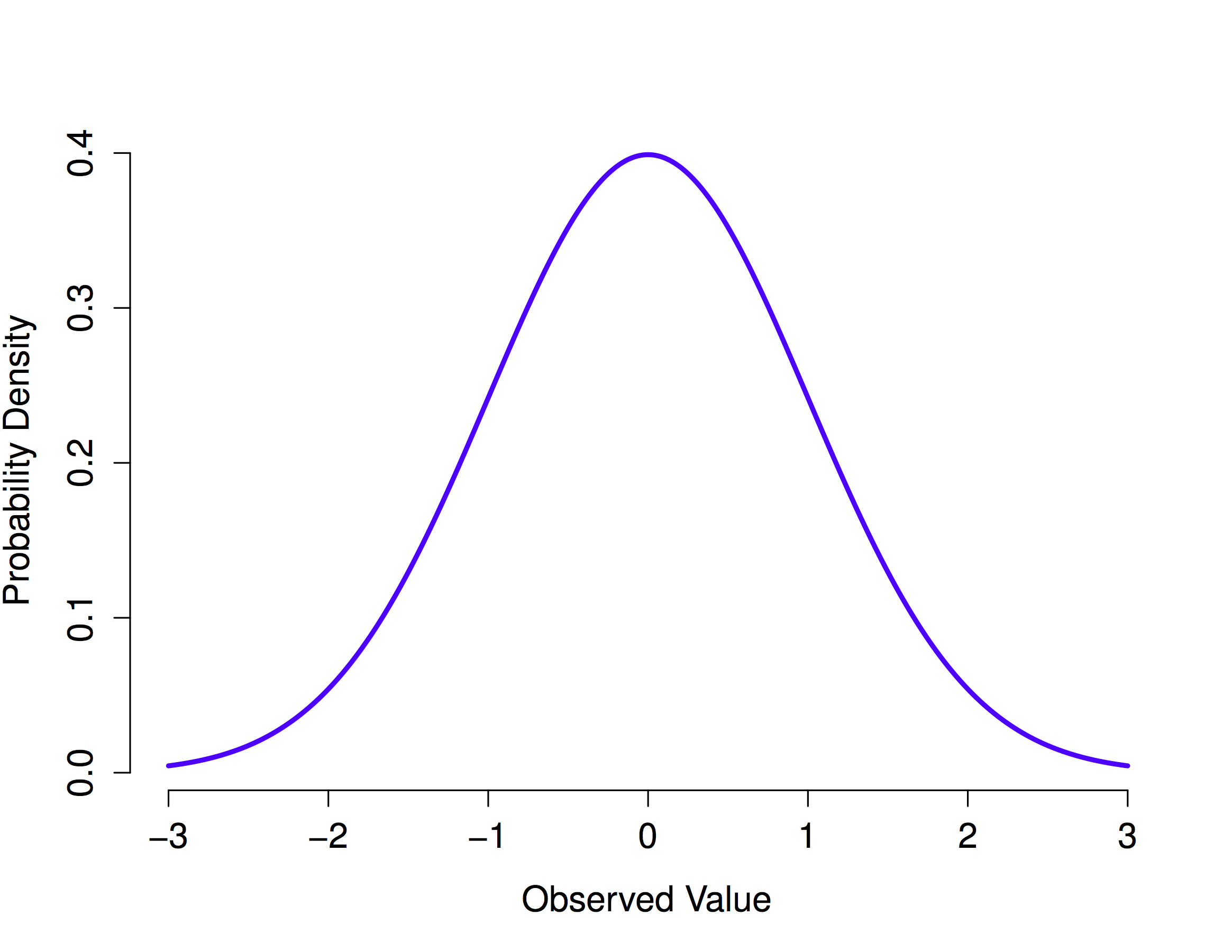
Instead of focusing on the maths, let’s try to get a sense for what it means for a variable to be normally distributed. To that end, have a look at Figure \(\PageIndex{1}\), which plots a normal distribution with mean \(\mu = 0\) and standard deviation \(\sigma = 1\). You can see where the name “bell curve” comes from: it looks a bit like a bell. Notice that, unlike the plots that I drew to illustrate the binomial distribution, the picture of the normal distribution in Figure \(\PageIndex{1}\) shows a smooth curve instead of “histogram-like” bars. This isn’t an arbitrary choice: the normal distribution is continuous, whereas the binomial is discrete. For instance, in the die rolling example from the last section, it was possible to get 3 skulls or 4 skulls, but impossible to get 3.9 skulls.
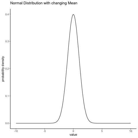
With this in mind, let’s see if we can’t get an intuition for how the normal distribution works. Firstly, let’s have a look at what happens when we play around with the parameters of the distribution. One parameter we can change is the mean. This will shift the distribution to the right or left. The animation below shows a normal distribution with mean = 0, moving up and down from mean = 0 to mean = 5. Note, when you change the mean the whole shape of the distribution does not change, it just shifts from left to right. In the animation the normal distribution bounces up and down a little, but that’s just a quirk of the animation (plus it looks fund that way).
In contrast, if we increase the standard deviation while keeping the mean constant, the peak of the distribution stays in the same place, but the distribution gets wider. The next animation shows what happens when you start with a small standard deviation (sd=0.5), and move to larger and larger standard deviation (up to sd =5). As you can see, the distribution spreads out and becomes wider as the standard deviation increases.
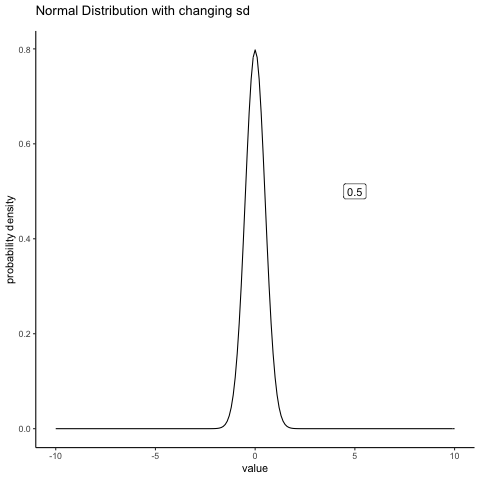
Notice, though, that when we widen the distribution, the height of the peak shrinks. This has to happen: in the same way that the heights of the bars that we used to draw a discrete binomial distribution have to sum to 1, the total area under the curve for the normal distribution must equal 1. Before moving on, I want to point out one important characteristic of the normal distribution. Irrespective of what the actual mean and standard deviation are, 68.3% of the area falls within 1 standard deviation of the mean. Similarly, 95.4% of the distribution falls within 2 standard deviations of the mean, and 99.7% of the distribution is within 3 standard deviations.
Probability density
There’s something I’ve been trying to hide throughout my discussion of the normal distribution, something that some introductory textbooks omit completely. They might be right to do so: this “thing” that I’m hiding is weird and counterintuitive even by the admittedly distorted standards that apply in statistics. Fortunately, it’s not something that you need to understand at a deep level in order to do basic statistics: rather, it’s something that starts to become important later on when you move beyond the basics. So, if it doesn’t make complete sense, don’t worry: try to make sure that you follow the gist of it.
Throughout my discussion of the normal distribution, there’s been one or two things that don’t quite make sense. Perhaps you noticed that the \(y\)-axis in these figures is labelled “Probability Density” rather than density. Maybe you noticed that I used \(p(X)\) instead of \(P(X)\) when giving the formula for the normal distribution. Maybe you’re wondering why R uses the “d” prefix for functions like dnorm(). And maybe, just maybe, you’ve been playing around with the dnorm() function, and you accidentally typed in a command like this:
And if you’ve done the last part, you’re probably very confused. I’ve asked R to calculate the probability that x = 1, for a normally distributed variable with mean = 1 and standard deviation sd = 0.1; and it tells me that the probability is 3.99. But, as we discussed earlier, probabilities can’t be larger than 1. So either I’ve made a mistake, or that’s not a probability.
As it turns out, the second answer is correct. What we’ve calculated here isn’t actually a probability: it’s something else. To understand what that something is, you have to spend a little time thinking about what it really means to say that \(X\) is a continuous variable. Let’s say we’re talking about the temperature outside. The thermometer tells me it’s 23 degrees, but I know that’s not really true. It’s not exactly 23 degrees. Maybe it’s 23.1 degrees, I think to myself. But I know that that’s not really true either, because it might actually be 23.09 degrees. But, I know that… well, you get the idea. The tricky thing with genuinely continuous quantities is that you never really know exactly what they are.
Now think about what this implies when we talk about probabilities. Suppose that tomorrow’s maximum temperature is sampled from a normal distribution with mean 23 and standard deviation 1. What’s the probability that the temperature will be exactly 23 degrees? The answer is “zero”, or possibly, “a number so close to zero that it might as well be zero”. Why is this?
It’s like trying to throw a dart at an infinitely small dart board: no matter how good your aim, you’ll never hit it. In real life you’ll never get a value of exactly 23. It’ll always be something like 23.1 or 22.99998 or something. In other words, it’s completely meaningless to talk about the probability that the temperature is exactly 23 degrees. However, in everyday language, if I told you that it was 23 degrees outside and it turned out to be 22.9998 degrees, you probably wouldn’t call me a liar. Because in everyday language, “23 degrees” usually means something like “somewhere between 22.5 and 23.5 degrees”. And while it doesn’t feel very meaningful to ask about the probability that the temperature is exactly 23 degrees, it does seem sensible to ask about the probability that the temperature lies between 22.5 and 23.5, or between 20 and 30, or any other range of temperatures.
The point of this discussion is to make clear that, when we’re talking about continuous distributions, it’s not meaningful to talk about the probability of a specific value. However, what we can talk about is the probability that the value lies within a particular range of values. To find out the probability associated with a particular range, what you need to do is calculate the “area under the curve”.
Okay, so that explains part of the story. I’ve explained a little bit about how continuous probability distributions should be interpreted (i.e., area under the curve is the key thing), but I haven’t actually explained what the dnorm() function actually calculates. Equivalently, what does the formula for \(p(x)\) that I described earlier actually mean? Obviously, \(p(x)\) doesn’t describe a probability, but what is it? The name for this quantity \(p(x)\) is a probability density, and in terms of the plots we’ve been drawing, it corresponds to the height of the curve. The densities themselves aren’t meaningful in and of themselves: but they’re “rigged” to ensure that the area under the curve is always interpretable as genuine probabilities. To be honest, that’s about as much as you really need to know for now.