
5.2: The data came from a distribution
- Page ID
- 7913

In the last chapter we discussed samples and distributions, and the idea that you can take samples from distributions. So, from now on when you see a bunch of numbers, you should wonder, “where did these numbers come from?”. What caused some kinds of numbers to happen more than other kinds of numbers. The answer to this question requires us to again veer off into the abstract world of distributions. A distribution a place where numbers can come from. The distribution sets the constraints. It determines what numbers are likely to occur, and what numbers are not likely to occur. Distributions are abstract ideas. But, they can be made concrete, and we can draw them with pictures that you have seen already, called histograms.
The next bit might seem slightly repetitive from the previous chapter. We again look at sampling numbers from a uniform distribution. We show that individual samples can look quite different from each other. Much of the beginning part of this chapter will already be familiar to you, but we take the concepts in a slightly different direction. The direction is how to make inferences about the role of chance in your experiment.
Uniform distribution
A uniform distribution is completely flat, it looks like this:
library(ggplot2)
suppressPackageStartupMessages(library(dplyr))
df<-data.frame(a=1:10,b=seq(.1,1,.1))
df$a<-as.factor(df$a)
ggplot(df,aes(x=a,y=b))+
  geom_point(color="white")+
  geom_hline(yintercept=.1)+
  theme_classic()+
  ylab("Probability")+
  xlab("Number")+
  ggtitle("Uniform distribution for numbers 1 to 10")

OK, so that doesn’t look like much. What is going on here? The y-axis is labelled probability, and it goes from 0 to 1. The x-axis is labelled Number, and it goes from one to 10. There is a horizontal line drawn straight through. This line tells you the probability of each number from 1 to 10. Notice the line is flat. This means all of the numbers have the same probability of occurring. More specifically, there are 10 numbers from 1 to 10 (1,2,3,4,5,6,7,8,9,10), and they all have an equal chance of occurring. 1/10 = .1, which is the probability indicated by the horizontal line.
“So what?”. Imagine that this uniform distribution is a number generating machine. It spits out numbers, but it spits out each number with the probability indicated by the line. If this distribution was going to start spitting out numbers, it would spit out 10% 1s, 10% 2s, 10% 3s, and so on, up to 10% 10s. Wanna see what that would look like? Let’s make it spit out 100 numbers
We used the uniform distribution to generate these numbers. Officially, we call this sampling from a distribution. Sampling is what you do at a grocery store when there is free food. You can keep taking more. However, if you take all of the samples, then what you have is called the population. We’ll talk more about samples and populations as we go along.
Because we used the uniform distribution to create numbers, we already know where our numbers came from. However, we can still pretend for the moment that someone showed up at your door, showed you these numbers, and then you wondered where they came from. Can you tell just by looking at these numbers that they came from a uniform distribution? What would need to look at? Perhaps you would want to know if all of the numbers occur with roughly equal frequency, after all they should have right? That is, if each number had the same chance of occurring, we should see that each number occurs roughly the same number of times.
We already know what a histogram is, so we can put our numbers into a histogram and see what the counts look like. If all of the numbers occur with equal frequency, then each number should occur 10 times, because we sampled a total of 100 numbers. The histogram looks like this:
a<-matrix(round(runif(100,1,10)),ncol=10)
hist(a)

Uh oh, as you can see, not all of the number occurred 10 times each. All of the bars are not the same height. This shows that randomly sampling numbers from this distribution does not guarantee that our numbers will be exactly like the distribution they came from. We can call this sampling error, or sampling variability.
Not all samples are the same, they are usually quite different
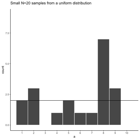
Let’s take a look at sampling error more closely. We will sample 20 numbers from the uniform. Here we should expect that each number between 1 and 10 occurs two times each. Let’s take 20 sample and make a histogram. And then, let’s do that 10 times. So we will be looking at 10 histograms, each showing us what the 10 different samples of twenty numbers looks like:
library(ggplot2)
a<-round(runif(20*10,1,10))
df<-data.frame(a,sample=rep(1:10,each=20))
ggplot(df,aes(x=a))+
  geom_histogram(bins=10, color="white")+
  facet_wrap(~sample)+
  theme_classic()+
  scale_x_continuous(breaks=seq(1,10,1))

You might notice right away that none of the histograms are the same. Even though we are randomly taking 20 numbers from the very same uniform distribution, each sample of 20 numbers comes out different. This is sampling variability, or sampling error.
Here is movie version. You are watching a new histogram for each sample of 20 observations. The horizontal line shows the shape of the uniform distribution. It crosses the y-axis at 2, because we expect that each number (from 1 to 10) should occur about 2 times each in a sample of 20. However, as you can see, this does not happen. Instead, each sample bounces around quite a bit, due to random chance.
Looking at the above histograms shows us that figuring out where our numbers came from can be difficult. In the real world, our measurements are samples. We usually only have the luxury of getting one sample of measurements, rather than repeating our own measurements 10 times or more. If you look at the histograms, you will see that some of them look like they could have come from the uniform distribution: most of the bars are near two, and they all fall kind of on a flat line. But, if you happen to look at a different sample, you might see something that is very bumpy, with some numbers happening way more than others. This could suggest to you that those numbers did not come from a uniform distribution (they’re just too bumpy). But let me remind you, all of these samples came from a uniform distribution, this is what samples from that distribution look like. This is what chance does to samples, it makes the individual data points noisy.
Large samples are more like the distribution they came from
Let’s refresh the question. Which of these two samples do you think came from a uniform distribution?
library(ggplot2)
a<-round(runif(20*2,1,10))
df<-data.frame(a,sample=rep(1:2,each=20))
ggplot(df,aes(x=a))+
  geom_histogram(bins=10, color="white")+
  facet_wrap(~sample)+
  theme_classic()+
  scale_x_continuous(breaks=seq(1,10,1))

The answer is that they both did. But, neither of them look like they did.
Can we improve things, and make it easier to see if a sample came from a uniform distribution? Yes, we can. All we need to do is increase the sample-size. We will often use the letter n to refer to sample-size. N is the number of observations in the sample.
So let’s increase the number of observations in each sample from 20 to 100. We will again create 10 samples (each with 100 observations), and make histograms for each of them. All of these samples will be drawn from the very same uniform distribution. This, means we should expect each number from 1 to 10 to occur about 10 times in each sample. Here are the histograms:
library(ggplot2)
a<-sample(1:10,100*10,replace=T)
df<-data.frame(a,sample=rep(1:10,each=100))
ggplot(df,aes(x=a))+
  geom_histogram(bins=10, color="white")+
  facet_wrap(~sample)+
  theme_classic()+
  ylim(0,20)+
  scale_x_continuous(breaks=seq(1,10,1))

Again, most of these histograms don’t look very flat, and all of the bars seem to be going up or down, and they are not exactly at 10 each. So, we are still dealing with sampling error. It’s a pain. It’s always there.
Let’s bump it up to 1000 observations per sample. Now we should expect every number to appear about 100 times each. What happens?
library(ggplot2)
a<-sample(1:10,1000*10,replace=T)
df<-data.frame(a,sample=rep(1:10,each=1000))
ggplot(df,aes(x=a))+
 geom_histogram(bins=10, color="white")+
  facet_wrap(~sample)+
  theme_classic()+
  ylim(0,200)+
  scale_x_continuous(breaks=seq(1,10,1))

Each of these histograms are starting to flatten out. The bars are still not perfectly at 100, because there is still sampling error (there always will be). But, if you found a histogram that looked flat and knew that the sample contained many observations, you might be more confident that those numbers came from a uniform distribution.
Just for fun let’s make the samples really big. Say 100,000 observations per sample. Here, we should expect that each number occurs about 10,000 times each. What happens?
library(ggplot2)
a<-sample(1:10,100000*10,replace=T)
df<-data.frame(a,sample=rep(1:10,each=100000))
ggplot(df,aes(x=a))+
  geom_histogram(bins=10, color="white")+
  facet_wrap(~sample)+
  theme_classic()+
  ylim(0,20000)+
  scale_x_continuous(breaks=seq(1,10,1))

Now we see that all of our samples start to look the same. They all have 100,000 observations, and this gives chance enough opportunity to equally distribute the numbers, roughly making sure that they all occur very close to the same amount of times. As you can see, the bars are all very close to 10,000, where they should be if the sample came from a uniform distribution.
Pro tip: The pattern behind a sample will tend to stabilize as sample-size increases. Small samples will have all sorts of patterns because of sampling error (chance).
Before getting back to experiments, let’s ask two more questions. First, which of these two samples do you think came from a uniform distribution? I will tell you that each of these samples had 20 observations each.
library(ggplot2)
a<-c(sample(1:10,20,replace=T),round(rnorm(20,5,2.5)))
df<-data.frame(a,sample=rep(1:2,each=20))
ggplot(df,aes(x=a))+
  geom_histogram(bins=10, color="white")+
  facet_wrap(~sample)+
  theme_classic()+
  scale_x_continuous(breaks=seq(1,10,1))

If you are not confident in the answer, this is because sampling error (randomness) is fuzzing with the histograms.
Here is the very same question, only this time we will take 1,000 observations for each sample. Which one do you think came from a uniform distribution, which one did not?
library(ggplot2)
a<-c(sample(1:10,1000,replace=T),round(rnorm(1000,5,1.25)))
df<-data.frame(a,sample=rep(1:2,each=1000))
ggplot(df,aes(x=a))+
  geom_histogram(bins=10, color="white")+
  facet_wrap(~sample)+
  theme_classic()+
  scale_x_continuous(breaks=seq(0,10,1))

Now that we have increased N, we can see the pattern in each sample becomes more obvious. The histogram for sample 1 has bars near 100, not perfectly flat, but it resembles a uniform distribution. The histogram for sample 2 does not look flat at all. Instead, there the number five appears most of the time, and numbers on either side of five happen less and less.
Congratulations to Us! We have just made some statistical inferences without using formulas!
“We did?”. Yes, by looking at our two samples we have inferred that sample 2 did not come from a uniform distribution. We have also inferred that sample 1 could have come form a uniform distribution. Fantastic. This is really all we will be doing for the rest of the course. We will be looking at some numbers, wondering where they came from, then we will arrange the numbers in such a way so that we can make an inference about where they came from. That’s it.