
3.5: Regression — A mini intro
- Page ID
- 7902

We’re going to spend the next little bit adding one more thing to our understanding of correlation. It’s called linear regression. It sounds scary, and it really is. You’ll find out much later in your Statistics education that everything we will be soon be talking about can be thought of as a special case of regression. But, we don’t want to scare you off, so right now we just introduce the basic concepts.
First, let’s look at a linear regression. This way we can see what we’re trying to learn about. Here’s some scatter plots, same one’s you’ve already seen. But, we’ve added something new! Lines.
library(ggplot2)
subject_x<-1:100
chocolate_x<-round(1:100*runif(100,.5,1))
happiness_x<-round(1:100*runif(100,.5,1))
df_positive<-data.frame(subject_x,chocolate_x,happiness_x)
subject_x<-1:100
chocolate_x<-round(1:100*runif(100,.5,1))
happiness_x<-round(100:1*runif(100,.5,1))
df_negative<-data.frame(subject_x,chocolate_x,happiness_x)
subject_x<-1:100
chocolate_x<-round(runif(100,0,100))
happiness_x<-round(runif(100,0,100))
df_random<-data.frame(subject_x,chocolate_x,happiness_x)
all_data<-rbind(df_positive,df_negative,df_random)
all_data<-cbind(all_data,correlation=rep(c("positive","negative","random"),each=100))
ggplot(all_data,aes(x=chocolate_x,y=happiness_x))+
  geom_point()+
  theme_classic()+
  geom_smooth(method="lm",se=F,formula=y ~ x)+
  facet_wrap(~correlation)+
  xlab("chocolate supply")+
  ylab("happiness")

The best fit line
Notice anything about these blue lines? Hopefully you can see, at least for the first two panels, that they go straight through the data, just like a kebab skewer. We call these lines best fit lines, because according to our definition (soon we promise) there are no other lines that you could draw that would do a better job of going straight throw the data.
One big idea here is that we are using the line as a kind of mean to describe the relationship between the two variables. When we only have one variable, that variable exists on a single dimension, it’s 1D. So, it is appropriate that we only have one number, like the mean, to describe it’s central tendency. When we have two variables, and plot them together, we now have a two-dimensional space. So, for two dimensions we could use a bigger thing that is 2d, like a line, to summarize the central tendency of the relationship between the two variables.
What do we want out of our line? Well, if you had a pencil, and a printout of the data, you could draw all sorts of straight lines any way you wanted. Your lines wouldn’t even have to go through the data, or they could slant through the data with all sorts of angles. Would all of those lines be very good a describing the general pattern of the dots? Most of them would not. The best lines would go through the data following the general shape of the dots. Of the best lines, however, which one is the best? How can we find out, and what do we mean by that? In short, the best fit line is the one that has the least error.
R code for plotting residuals thanks to Simon Jackson’s blog post: https://drsimonj.svbtle.com/visualising-residuals
Check out this next plot, it shows a line through some dots. But, it also shows some teeny tiny lines. These lines drop down from each dot, and they land on the line. Each of these little lines is called a residual. They show you how far off the line is for different dots. It’s measure of error, it shows us just how wrong the line is. After all, it’s pretty obvious that not all of the dots are on the line. This means the line does not actually represent all of the dots. The line is wrong. But, the best fit line is the least wrong of all the wrong lines.
library(ggplot2)
d <- mtcars
fit <- lm(mpg ~ hp, data = d)
d$predicted <- predict(fit)   # Save the predicted values
d$residuals <- residuals(fit) # Save the residual values
ggplot(d, aes(x = hp, y = mpg)) +
  geom_smooth(method = "lm", se = FALSE,
              color = "lightblue", formula=y ~ x) +  # Plot regression slope
  geom_segment(aes(xend = hp, yend = predicted,
                   color="red"), alpha = .5) +  # alpha to fade lines
  geom_point() +
  geom_point(aes(y = predicted), shape = 1) +
  theme_classic()+
  theme(legend.position="none")+
  xlab("X")+ylab("Y")
# Quick look at the actual, predicted, and residual values
#library(dplyr)
#d %>% select(mpg, predicted, residuals) %>% head()

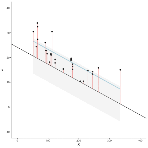
There’s a lot going on in this graph. First, we are looking at a scatter plot of two variables, an X and Y variable. Each of the black dots are the actual values from these variables. You can see there is a negative correlation here, as X increases, Y tends to decrease. We drew a regression line through the data, that’s the blue line. There’s these little white dots too. This is where the line thinks the black dots should be. The red lines are the important residuals we’ve been talking about. Each black dot has a red line that drops straight down, or straight up from the location of the black dot, and lands directly on the line. We can already see that many of the dots are not on the line, so we already know the line is “off” by some amount for each dot. The red line just makes it easier to see exactly how off the line is.
The important thing that is happening here, is that the the blue line is drawn is such a way, that it minimizes the total length of the red lines. For example, if we wanted to know how wrong this line was, we could simply gather up all the red lines, measure how long they are, and then add all the wrongness together. This would give us the total amount of wrongness. We usually call this the error. In fact, we’ve already talked about this idea before when we discussed standard deviation. What we will actually be doing with the red lines, is computing the sum of the squared deviations from the line. That sum is the total amount of error. Now, this blue line here minimizes the sum of the squared deviations. Any other line would produce a larger total error.
Here’s an animation to see this in action. The animations compares the best fit line in blue, to some other possible lines in black. The black line moves up and down. The red lines show the error between the black line and the data points. As the black line moves toward the best fit line, the total error, depicted visually by the grey area shrinks to it’s minimum value. The total error expands as the black line moves away from the best fit line.
Whenever the black line does not overlap with the blue line, it is worse than the best fit line. The blue regression line is like Goldilocks, it’s just right, and it’s in the middle.
This next graph shows a little simulation of how the sum of squared deviations (the sum of the squared lengths of the red lines) behaves as we move the line up and down. What’s going on here is that we are computing a measure of the total error as the black line moves through the best fit line. This represents the sum of the squared deviations. In other words, we square the length of each red line from the above animation, then we add up all of the squared red lines, and get the total error (the total sum of the squared deviations). The graph below shows what the total error looks like as the black line approaches then moves away from the best fit line. Notice, the dots in this graph start high on the left side, then they swoop down to a minimum at the bottom middle of the graph. When they reach their minimum point, we have found a line that minimizes the total error. This is the best fit regression line.
library(ggplot2)
d <- mtcars
fit <- lm(mpg ~ hp, data = d)
d$predicted <- predict(fit)   # Save the predicted values
d$residuals <- residuals(fit) # Save the residual values
coefs<-coef(lm(mpg ~ hp, data = mtcars))
#coefs[1]
#coefs[2]
x<-d$hp
move_line<-seq(-5,5,.5)
total_error<-c(length(move_line))
cnt<-0
for(i in move_line){
  cnt<-cnt+1
  predicted_y <- coefs[2]*x + coefs[1]+i
  error_y <- (predicted_y-d$mpg)^2
  total_error[cnt]<-sum(error_y)
}
df<-data.frame(move_line,total_error)
ggplot(df,aes(x=move_line,y=total_error))+
  geom_point()+
  theme_classic()+
  ylab("sum of squared deviations")+
  xlab("change to y-intercept")

OK, so we haven’t talked about the y-intercept yet. But, what this graph shows us is how the total error behaves as we move the line up and down. The y-intercept here is the thing we change that makes our line move up and down. As you can see the dots go up when we move the line down from 0 to -5, and the dots go up when we move the line up from 0 to +5. The best line, that minimizes the error occurs right in the middle, when we don’t move the blue regression line at all.
Lines
OK, fine you say. So, there is one magic line that will go through the middle of the scatter plot and minimize the sum of the squared deviations. How do I find this magic line? We’ll show you. But, to be completely honest, you’ll almost never do it the way we’ll show you here. Instead, it’s much easier to use software and make your computer do it for. You’ll learn how to that in the labs.
Before we show you how to find the regression line, it’s worth refreshing your memory about how lines work, especially in 2 dimensions. Remember this?
\(y = ax + b\), or also \(y = mx + b\) (sometimes a or m is used for the slope)
This is the formula for a line. Another way of writing it is:
\[y = slope * x + \text{y-intercept} \nonumber \]
The slope is the slant of the line, and the y-intercept is where the line crosses the y-axis. Let’s look at some lines:
library(ggplot2)
ggplot()+
  geom_abline(slope=1,intercept=5,color="blue")+
  geom_abline(slope=-1, intercept=15, color="red")+
  lims(x = c(1,20), y = c(0,20))+
  theme_classic()

So there is two lines. The formula for the blue line is \(y = 1*x + 5\). Let’s talk about that. When x = 0, where is the blue line on the y-axis? It’s at five. That happens because 1 times 0 is 0, and then we just have the five left over. How about when x = 5? In that case y =10. You just need the plug in the numbers to the formula, like this:
\[y = 1*x + 5 \nonumber \]
\[y = 1*5 + 5 = 5+5 =10 \nonumber \]
The point of the formula is to tell you where y will be, for any number of x. The slope of the line tells you whether the line is going to go up or down, as you move from the left to the right. The blue line has a positive slope of one, so it goes up as x goes up. How much does it go up? It goes up by one for everyone one of x! If we made the slope a 2, it would be much steeper, and go up faster. The red line has a negative slope, so it slants down. This means \(y\) goes down, as \(x\) goes up. When there is no slant, and we want to make a perfectly flat line, we set the slope to 0. This means that y doesn’t go anywhere as x gets bigger and smaller.
That’s lines.
Computing the best fit line
If you have a scatter plot showing the locations of scores from two variables, the real question is how can you find the slope and the y-intercept for the best fit line? What are you going to do? Draw millions of lines, add up the residuals, and then see which one was best? That would take forever. Fortunately, there are computers, and when you don’t have one around, there’s also some handy formulas.
It’s worth pointing out just how much computers have changed everything. Before computers everyone had to do these calculations by hand, such a chore! Aside from the deeper mathematical ideas in the formulas, many of them were made for convenience, to speed up hand calculations, because there were no computers. Now that we have computers, the hand calculations are often just an exercise in algebra. Perhaps they build character. You decide.
We’ll show you the formulas. And, work through one example by hand. It’s the worst, we know. By the way, you should feel sorry for me as I do this entire thing by hand for you.
Here are two formulas we can use to calculate the slope and the intercept, straight from the data. We won’t go into why these formulas do what they do. These ones are for “easy” calculation.
\[intercept = b = \frac{\sum{y}\sum{x^2}-\sum{x}\sum{xy}}{n\sum{x^2}-(\sum{x})^2} \nonumber \]
\[slope = m = \frac{n\sum{xy}-\sum{x}\sum{y}}{n\sum{x^2}-(\sum{x})^2} \nonumber \]
In these formulas, the \(x\) and the \(y\) refer to the individual scores. Here’s a table showing you how everything fits together.
| scores | x | y | x_squared | y_squared | xy |
|---|---|---|---|---|---|
| 1 | 1 | 2 | 1 | 4 | 2 |
| 2 | 4 | 5 | 16 | 25 | 20 |
| 3 | 3 | 1 | 9 | 1 | 3 |
| 4 | 6 | 8 | 36 | 64 | 48 |
| 5 | 5 | 6 | 25 | 36 | 30 |
| 6 | 7 | 8 | 49 | 64 | 56 |
| 7 | 8 | 9 | 64 | 81 | 72 |
| Sums | 34 | 39 | 200 | 275 | 231 |
We see 7 sets of scores for the x and y variable. We calculated \(x^2\) by squaring each value of x, and putting it in a column. We calculated \(y^2\) by squaring each value of y, and putting it in a column. Then we calculated \(xy\), by multiplying each \(x\) score with each \(y\) score, and put that in a column. Then we added all the columns up, and put the sums at the bottom. These are all the number we need for the formulas to find the best fit line. Here’s what the formulas look like when we put numbers in them:
\[intercept = b = \frac{\sum{y}\sum{x^2}-\sum{x}\sum{xy}}{n\sum{x^2}-(\sum{x})^2} = \frac{39 * 200 - 34*231}{7*200-34^2} = -.221 \nonumber \]
\[slope = m = \frac{n\sum{xy}-\sum{x}\sum{y}}{n\sum{x^2}-(\sum{x})^2} = \frac{7*231-34*39}{7*275-34^2} = 1.19 \nonumber \]
Great, now we can check our work, let’s plot the scores in a scatter plot and draw a line through it with slope = 1.19, and a y-intercept of -.221. It should go through the middle of the dots.
library(ggplot2)
x<-c(1,4,3,6,5,7,8)
y<-c(2,5,1,8,6,8,9)
plot_df<-data.frame(x,y)
ggplot(plot_df,aes(x=x,y=y))+
  geom_point()+
  geom_smooth(method="lm",se=FALSE, formula=y ~ x)+
  theme_classic()
